Table of Contents >> Show >> Hide
- What “Thunder AF-685” Actually Is
- Thunder AF-685 Color Profile
- How Lighting Changes Thunder AF-685
- Where Thunder AF-685 Looks Best
- Coordinating Colors That Pair Beautifully With Thunder
- Choosing the Right Paint Product and Finish
- How to Sample Thunder AF-685 Without Regret
- Prep and Application Tips for a Finish You’ll Actually Like
- Common “Thunder AF-685” Mistakes (and How to Avoid Them)
- Real-World Experiences With Thunder AF-685 Paint (500+ Words)
- Conclusion
If you’ve ever wanted a paint color that can politely shake hands with both “warm and cozy” and “cool and modern,”
Thunder AF-685 is that rare neutral that doesn’t pick a fight with your sofa, your flooring, or your sanity.
It’s the kind of shade that looks sophisticated in a living room, grown-up in a bedroom, and quietly heroic in an open-concept space
where every wall is basically in a long-term relationship with every other wall.
This article breaks down what Thunder AF-685 is, how it behaves in real light, the best finishes to pair with it, and how to sample it without
falling into the “it looked different at 2 p.m.” trap. (Spoiler: it will look different at 2 p.m. That’s not a bug; that’s paint.)
What “Thunder AF-685” Actually Is
Thunder (AF-685) is a Benjamin Moore paint color from the Affinity® Color Collection, a curated set designed
so the colors work together from room to room with less guesswork. Thunder sits in that practical, design-friendly zone often described as
“a neutral with range”not too beige, not too gray, and not so trendy that it’ll feel dated by the time your painter finds a parking spot.
One helpful technical clue: Thunder has an LRV (Light Reflectance Value) of 47.58, which places it around the mid-range.
In normal terms, it reflects a moderate amount of lightmeaning it won’t vanish in bright rooms, and it won’t feel like a storm cloud
in average light (even if the name is “Thunder,” which is admittedly a bit dramatic).
Thunder AF-685 Color Profile
Undertones: the “warm meets cool” balancing act
Benjamin Moore describes Thunder as an easy-to-use neutral with an “ideal mix of warm and cool.” That’s exactly why it’s popular for
spaces where you want calm, grounded color without committing to a strongly warm greige or a steely cool gray.
Think of Thunder as a neutral that can “borrow” the mood of the room. Pair it with warm woods, brass, and creamy whites, and it leans cozy.
Pair it with crisp whites, charcoal accents, and cooler lighting, and it leans more modern. This is why sampling mattersThunder is flexible,
but it’s not psychic (it needs context).
LRV: why 47.58 is a big deal in the real world
LRV is the percentage of visible light a color reflects on a 0–100 scale. The higher the number, the brighter the color tends to appear.
Thunder’s 47.58 puts it in a comfortable “mid-tone neutral” lane: it can add depth on big walls without turning a room into a cave.
And if you’re dealing with a dimmer exposure (hello, north-facing rooms), LRV becomes extra important because you’re basically negotiating
with sunlight like it’s a busy contractor.
How Lighting Changes Thunder AF-685
Room direction: north vs. south isn’t just a compass problem
Natural light changes paintsometimes dramatically. Sherwin-Williams notes that north-facing rooms tend to have cooler light,
and recommends avoiding colors with cool undertones there, leaning instead toward warmer neutrals and paying attention to LRV.
Thunder’s balanced profile can work, but in a north-facing room it may read a bit coolerespecially if the space is also low-light.
In south-facing rooms with steadier warm light, Thunder often looks softer and slightly warmer. The key is that it won’t usually
“go orange” the way some warmer neutrals can, but it can feel more inviting and less gray.
Artificial lighting: your bulbs are secretly painting too
This Old House points out a classic lighting twist: fluorescent lighting tends to read cooler, while incandescent or warm LED
lighting can push colors warmer. If your home uses warm LEDs at night (many do), Thunder may feel more “greige.” Under cool white bulbs, it can feel
more “stone/gray.” The move: test your sample under both daylight and nighttime lighting before you commit.
Where Thunder AF-685 Looks Best
Living rooms and open layouts
Thunder’s mid-range depth is excellent for open-concept spaces where you want one color to connect multiple zones. It’s neutral enough to work with
varied furniture styles (modern, transitional, even “my couch came from three different decades and we’re making it work”).
In these spaces, Thunder acts like a visual “reset” that makes your art, textiles, and wood tones feel intentional.
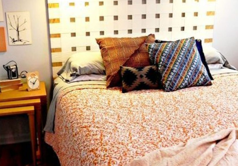
Bedrooms that need calm without feeling sterile
If bright whites feel too stark and dark colors feel too heavy, Thunder is a comfortable middle. It can support soft bedding palettescream, oatmeal,
dusty blue, muted olivewithout competing. In bedrooms, pairing Thunder with an eggshell or matte finish can keep it serene and low-glare.
Kitchens and baths (yes, with the right finish)
Thunder can work in kitchens and bathrooms as long as you choose a finish that matches the room’s reality. Sherwin-Williams notes that satin or
semi-gloss is often preferred in bathrooms because it can handle moisture better. For kitchen walls, durability and washability matterthink satin/pearl
or a product known for scrubbability.
And if you’re painting cabinetry or trim in Thunder, a tougher enamel-like product (such as a waterborne alkyd) can give you that smoother,
more furniture-like finish.
Coordinating Colors That Pair Beautifully With Thunder
Benjamin Moore’s own coordinating suggestions for Thunder include colors like Vapor AF-35, Dolphin AF-715,
Cloud White 967, and Smoke 2122-40. In plain English: you can go lighter, deeper, crisper, or moodier while staying in a
sophisticated lane.
Palette idea 1: calm and airy
Use Thunder on the walls, Cloud White 967 on trim/ceilings, and keep decor light: linen textures, pale oak, soft black accents.
This creates a clean look that still feels warm enough for daily living (and forgiving enough for fingerprints, depending on sheen).
Palette idea 2: modern contrast
Pair Thunder with deeper neutrals like Smoke 2122-40 as an accent (a single wall, built-ins, or a powder room vanity).
Add brushed nickel or matte black hardware and a crisp white countertop. The result: modern, but not cold.
Palette idea 3: “whole-house flow” that doesn’t feel copy-pasted
Architectural Digest highlights a key strategy for cohesion: keep undertones consistent across your home so the palette feels intentional.
Thunder is a strong “connector” coloruse it as the common thread, then shift rooms slightly warmer/cooler with adjacent neutrals or mid-tones.
Choosing the Right Paint Product and Finish
Finish basics (because shine changes everything)
Benjamin Moore explains sheen as how much light reflects off a painted surface, and notes that different sheens can affect how color appears.
Their common interior sheens include flat, matte, eggshell, satin/pearl, semi-gloss, and high glosseach with typical use cases (walls vs. trim vs. cabinets).
In general: lower sheen hides wall imperfections better; higher sheen is easier to wipe and more reflective.
Sherwin-Williams echoes the same practical idea: room function matters (bathrooms need moisture tolerance, kitchens need cleanability),
and higher-traffic areas often benefit from more durable finishes like satin or semi-gloss.
If Thunder is going on walls
For most homes, Thunder looks great in matte or eggshell on walls: matte for a softer, modern look; eggshell when you want a bit more
wipe-ability without too much shine. If you have kids, pets, or a hallway that functions like a small airport, consider a more durable finish like satin/pearl.
If Thunder is going on trim, doors, or cabinets
A popular choice for a smoother, tougher finish is Benjamin Moore’s ADVANCE® (a waterborne alkyd). The product description highlights a durable,
hard “furniture-quality” finish and notes it’s low VOC even after tinting. Typical specs listed include coverage around 400–500 sq. ft./gal,
dry time 4–6 hours, and recoat time around 16 hours (which is a polite way of saying: don’t rush it).
ADVANCE also lists multiple application methods (brush, roll, spray), a cleanup method (soap and water), and an application temperature range of about
50–90°F. For cabinet projects, those details matter because they translate into real-life planning: ventilation, downtime, and a schedule that’s
more “weekend plus” than “one chaotic afternoon.”
How to Sample Thunder AF-685 Without Regret
Benjamin Moore emphasizes what many homeowners learn the hard way: screen colors may differ, so sampling is essential before committing.
If you want the most authentic preview, a liquid sample is recommended.
Option 1: an 8 oz color sample (liquid)
Benjamin Moore’s 8 oz sample for Thunder AF-685 is designed for real testing: it’s intended to cover about a 2 ft. x 2 ft. area with two coats,
and it’s in an eggshell finish (a good middle ground for evaluating color). You can brush it directly on the wall or onto foam board for a movable sample.
Option 2: peel & stick samples and smart viewing habits
Benjamin Moore’s sampling tips include moving the sample around the room and even wrapping it around edges to see how it looks in corners and changing light.
They also recommend adding a white border (like placing a chip against white paper) to keep your existing wall color from messing with your perception.
In other words: don’t let your current paint gaslight you.
Prep and Application Tips for a Finish You’ll Actually Like
1) Plan for the real timeline, not the fantasy timeline
If you’re painting trim or cabinets, respect dry and recoat times. A hard, durable finish is usually earned, not granted.
For example, ADVANCE lists dry times in hours and recoat time around 16 hoursso you’ll want a plan that includes overnight curing time,
low dust, and minimal “just one more thing” touching.
2) Match the finish to the abuse level
Paint sheen is not just aestheticsit’s performance. Benjamin Moore’s finish guide maps common uses (walls vs. doors vs. cabinets) across sheens,
and Sherwin-Williams similarly suggests more durable options for kitchens, baths, and trim. If you love matte walls but your hallway sees daily traffic,
consider a durable product line or a slightly higher sheen to keep maintenance manageable.
3) Ventilateeven with low-VOC paints
Low VOC is great, but “low” isn’t the same as “none,” and paint products can still contribute to indoor air pollutants. The U.S. EPA recommends steps like
providing maximum ventilation during painting and discarding supplies you won’t use. Meanwhile, CDC/NIOSH guidance stresses that paints and coatings
shouldn’t be used in unventilated or closed spaces; general exhaust ventilation may be sufficient for short-term/occasional use, and more robust controls
are recommended where painting is frequent.
4) If your home is older, take lead paint seriously
If your home was built before 1978, the EPA notes it may have lead-based paint, and recommends determining whether lead is present before renovation.
For DIY work, the EPA outlines lead-safe practices like setting up safely, minimizing dust, cleaning thoroughly, and controlling waste. Translation:
sanding old paint without precautions is a terrible hobby.
Common “Thunder AF-685” Mistakes (and How to Avoid Them)
Skipping the sample because “it’s just a neutral”
Thunder is balanced, but it still shifts with lighting, sheen, and surrounding finishes. Sampling on multiple walls and viewing at different times of day
is the difference between “effortlessly elegant” and “why does this look different every time I walk in here?”
Using the wrong sheen in the wrong room
Matte everywhere can be gorgeous… until you need to scrub a kitchen splatter that looks like a modern art experiment. Use sheen guidance from
reputable paint brands to match function to finishespecially in bathrooms, kitchens, hallways, and kids’ rooms.
Forgetting that cohesion is about undertones, not matching labels
“Neutral” isn’t a single undertone. For a cohesive home, focus on consistent undertones and coordinate with existing floors, counters, and cabinetry.
Thunder’s flexibility helps, but you still want your palette to look intentional rather than “random neutrals I grabbed while hungry.”
Real-World Experiences With Thunder AF-685 Paint (500+ Words)
People often approach Thunder AF-685 with a very reasonable expectation: “It’s a neutral. It’ll behave.” And thenlike all neutrals with any personality
it starts reacting to its environment. In many homes, the first noticeable “experience” with Thunder is how differently it can read from wall to wall.
On the brightest wall (usually the one catching the most daylight), Thunder may look lighter and more airy. In the darker corner or the hallway that
gets minimal natural light, it can deepen and read more stone-like. This isn’t Thunder being inconsistent; it’s Thunder being honest about your lighting.
Another common experience is how well Thunder plays with natural materials. Homes with warm oak or medium-tone hardwoods often find that Thunder
feels “settled” rather than stark. It can soften the contrast between wood flooring and white trim without making the room feel beige or old-fashioned.
In spaces with cooler finishesgray tile, stainless steel, crisp white countersThunder can lean more modern, especially if the lighting is cooler or the
decor is high-contrast. This flexibility is why Thunder is frequently chosen for open layouts: it doesn’t fight the kitchen while still looking appropriate
in the adjoining living room.
People also report that Thunder is a “trusty backdrop” color for artwork and textiles. Bold art pops without the wall color stealing the show.
Softer palettescream, tan, muted greens, dusty blueslayer nicely and make the room feel designed rather than “painted and done.” If you like to switch
out pillows, rugs, or seasonal decor, Thunder tends to stay compatible. It’s not so distinctive that it locks you into one style, but it’s not so bland
that it feels like an unfinished rental.
Where Thunder can surprise people is under artificial lighting. Many households use warm LEDs at night, and warm light can pull out warmer notes in a color.
So someone might see Thunder in daylight and think “perfectly neutral,” then see it at 9 p.m. and think “oh, that’s cozier than I expected.”
Conversely, in a room lit by cooler bulbs (or older fluorescent lighting), Thunder can skew more gray. Homeowners who test only in daylight sometimes
end up repainting not because the color is wrong, but because the lighting setup is doing extra credit they didn’t ask for.
On trim, doors, or cabinets, the experience changes againmainly because sheen changes everything. A higher sheen reflects more light, which can make the
same color look brighter, cleaner, and slightly more “present.” When Thunder is used in a tougher enamel-style product for cabinets or trim, many people
like the refined, furniture-like effect: it reads tailored and intentional rather than “we ran out of white.” The tradeoff is patience: cabinet-grade finishes
often need proper recoat time and curing time, and rushing the process can lead to sticking, dents, or a finish that doesn’t live up to its potential.
The best experiences tend to come from the boring stepsletting coats dry, ventilating well, and not reinstalling hardware like you’re racing a game show clock.
Finally, one of the most positive “Thunder experiences” is how it supports whole-house flow. Because it’s part of a curated collection designed to coordinate,
Thunder can be used as a main wall color while adjacent rooms shift slightly lighter or deeper without clashing. People who want a cohesive home often describe
the end result as “calm” and “finished,” which is exactly what you want from a neutral: not a conversation starter, but a consistent, flattering presence
that makes everything else in the room look like it was chosen on purpose.
Conclusion
Thunder AF-685 is a balanced neutral with enough depth to feel intentional and enough flexibility to work across styles, rooms, and lighting conditions.
If you sample it properly, choose the right sheen for the room, and respect the realities of light and use, it can deliver that “designer neutral” look
without the dramadespite the name.