Table of Contents >> Show >> Hide
- What Exactly Is Pingo?
- How to Read a Color Clock (Without Guessing Like It’s a Mood Ring)
- Why Use Colors Instead of Hands?
- What’s Inside Pingo? (The Glowy Guts)
- DIY Build Notes That Save You From the Classic LED Headache
- Is a Color Clock Practical? YesWith a Few Smart Design Choices
- How Pingo Fits Into the Bigger Trend of “Secret” Clocks
- Should You Build (or Borrow the Idea of) a Pingo-Style Color Clock?
- Experiences: What It’s Like Living With a Color Clock (500+ Words)
- 1) The “Wait…that’s a clock?” moment (for everyone who visits)
- 2) You start checking the “feel” of the day, not just the number
- 3) Your brain learns the pattern faster than you expect
- 4) It makes “micro-stress time checking” a little harder
- 5) Brightness matters more than you think
- 6) You’ll create your own “favorite mode” personality
- 7) It’s unexpectedly good as a “soft anchor” during routines
- Conclusion
Most clocks are very honest about what they are. They’ve got hands. They’ve got numbers. They’ve got that smug little second hand
that ticks like it’s keeping score.
Pingo is different. At first glance, it doesn’t look like a clock at allmore like a glowing, color-soaked art piece that wandered
out of a modern gallery and decided to live on your desk. But it is a clock. And once you learn the “secret,” it becomes a
surprisingly readable oneusing color matching instead of visible hands.
This article breaks down what Pingo is, how you read it, what’s inside it (spoiler: lots of LEDs), and why a “color clock” can be
both a fun design flex and a real conversation starter for your space.
What Exactly Is Pingo?
Pingo is a DIY-style analog clock concept created by maker illusionmanager. The name “Pingo” means “I paint” in Latin,
which is fitting because the clock “paints” time as shifting color across a circular face.
Instead of mechanical hands or a digital readout, Pingo uses a glowing, diffused set of concentric LED zones: a center area (hours),
an outer ring (minutes), and a middle rainbow ring that acts like a reference scale. The clock automatically sets time via the internet
and even adjusts its look based on sunrise and sunset.
Why it’s more than a novelty
Plenty of clocks get weird (binary clocks, word clocks, “fuzzy” clocks). Pingo’s twist is that it keeps the analog “clock face” idea,
but hides the hands inside color logic. That makes it feel like art until you know how to decode itlike a magic trick you can hang on a wall.
How to Read a Color Clock (Without Guessing Like It’s a Mood Ring)
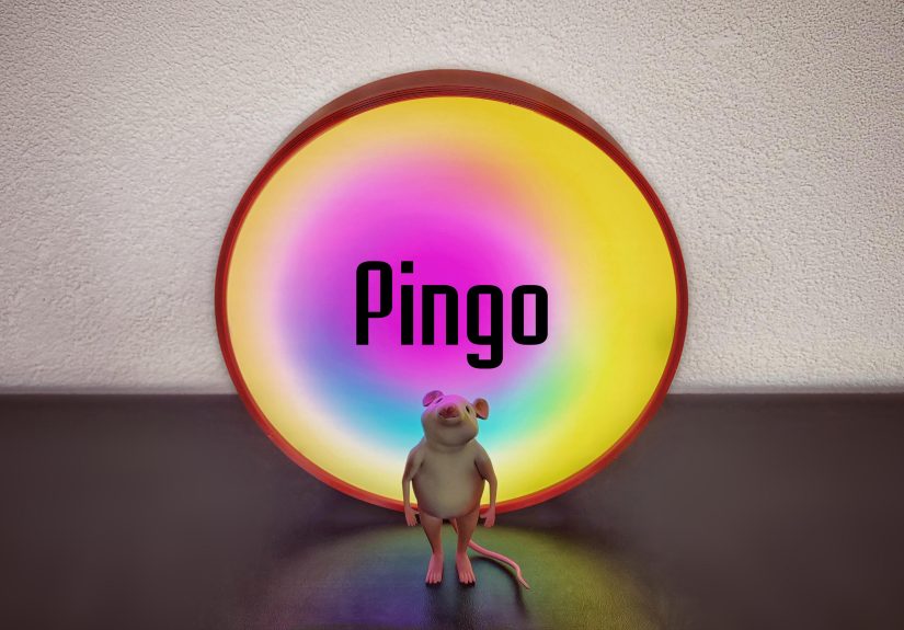
Pingo’s face is divided into three circular zones. The middle zone is always a complete rainbow, wrapping all the way around the clock.
The center and the outer ring each show a single solid color (or a dominant color effect) that “points” to the correct spot by matching
the rainbow at that position.
The three zones
- Inner disk: hour “hand” (shown as a solid color)
- Middle ring: full rainbow reference
- Outer ring: minute “hand” (shown as a solid color)
A concrete example: 10:10
Imagine the rainbow ring has magenta at the 10 o’clock position and yellow at the “10 minutes” position. If the inner disk
turns magenta and the outer ring turns yellow, you read the time as 10:10.
The neat part: the rainbow itself can rotate or animate and it still works, as long as the inner and outer colors keep matching the rainbow
at the correct hour/minute locations. That means Pingo can be calm and static, or subtly dynamic and hypnoticwithout losing the time.
“But I want it to be more obvious sometimes”
If you want a more traditional display, Pingo can also provide a clearer indication of the hands (so it doesn’t have to be a permanent puzzle).
And for accessibility, alternate faces can make it readable even if color isn’t doing you any favors.
Why Use Colors Instead of Hands?
Functionally, hands are hard to beat. They’re fast. They’re universal. They work in a blackout if you’ve got glow paint and optimism.
So why replace them?
Because Pingo isn’t just about telling time. It’s about experiencing timeambiently, visually, and (if we’re being honest) a little dramatically.
It turns a routine utility object into a piece of moving light art.
It doubles as “ambient status” for the day
Pingo’s default behavior treats the outer ring as a day/night mood indicator:
- Day: yellow
- Sunrise/sunset: red
- Night: purple
That means you can walk past it and instantly know, “Ah, we’re in the daytime zone,” or “Yep, evening’s here.” It’s timekeeping with vibes.
It even reduces brightness after sunset and restores it at sunrise, so it can stay present without trying to outshine your entire living room.
What’s Inside Pingo? (The Glowy Guts)
Pingo looks complex on the outside, but the core recipe is approachable for maker-style electronics:
addressable RGB LEDs + a microcontroller + diffusion + an enclosure.
The key hardware ingredients
- Addressable RGB LEDs (WS2812B / NeoPixel-style): arranged in concentric rings on a circular PCB (241 pixels total in one common build)
- ESP8266 NodeMCU development board: controls the LEDs and connects to Wi-Fi
- Diffuser cover: semi-translucent acrylic (commonly ~3mm) to blend the LEDs into a smooth glow
- 3D-printed enclosure: holds everything together and keeps the build tidy
How it keeps accurate time
Pingo updates the time through its network connection. In plain English: it talks to internet time services using standard time-sync methods
(commonly via NTP) so it doesn’t drift like a cheap clock that slowly invents its own time zone.
The built-in web interface
One of the most practical choices in the design is the self-hosted user interface. Since the ESP8266 is already on Wi-Fi, it can serve a simple
web page you open from a phone or computer. That UI lets you:
- switch between color/effect modes
- adjust brightness
- set an alarm
- let the clock automatically update time via the network
Settings are saved so you don’t have to reconfigure everything every time it powers up. That’s the difference between a “cool demo”
and a thing you actually keep around.
DIY Build Notes That Save You From the Classic LED Headache
Addressable LEDs are fun right up until they aren’t. The good news: most problems are predictablepower stability, signal integrity,
and “why is everything flickering like a haunted arcade cabinet?”
Power planning: don’t guess, estimate
With NeoPixel-style LEDs, current draw depends on brightness and color. At maximum brightness white (red + green + blue), a single pixel can
draw up to about 60 mA. Multiply that by 241 pixels andyesyou can theoretically hit very high current if you run full white at full blast.
In real use, animations and mixed colors are usually lower, but it’s smart to size your power supply with breathing room.
Stability upgrades that are basically mandatory
- Add a large capacitor across + and – near the LEDs (commonly 500–1000 µF) to smooth sudden brightness changes.
- Add a resistor on the data line (often a few hundred ohms) between the microcontroller and the first LED to reduce spikes and signal weirdness.
- Connect ground first and disconnect it last when plugging/unplugging power to avoid glitchy behavior and damage risks.
3.3V microcontroller, 5V LEDs: the “logic level” reality check
Many ESP8266 boards output 3.3V logic, while many LED setups are happiest with a 5V data signal when powered at 5V.
A logic level shifter can improve reliabilityespecially as wiring gets longer or environments get noisier.
Diffusion: the secret sauce of the “premium” look
If you’ve ever seen a raw LED ring without diffusion, you know the vibe: “spotted UFO landing lights.”
A diffuser (like semi-translucent acrylic) spreads each LED point into a uniform glow so the clock reads like smooth color fields,
not a ring of individual pixels.
Is a Color Clock Practical? YesWith a Few Smart Design Choices
Pingo is readable once you learn it. But practicality is also about who else might use itand under what conditions.
Color vision deficiency matters (and it’s not rare)
Many people have some form of color vision deficiency, often making red/green differences hard to distinguish. That doesn’t mean Pingo is a bad idea
it just means a “color-only” clock needs options.
- Offer alternate faces that don’t rely purely on hue (more contrast, clearer “hand” cues, or brightness-based indicators).
- Use palettes with strong contrast differences (not just different colors, but different lightness levels).
- Make “traditional hands” mode easy to toggle when guests are over (or when you’re half-awake and time feels personal).
Night use: bright light is a real thing
A glowing clock in a dark bedroom can be either cozy or annoying. Research on light at night suggests that blue-heavy light can be particularly disruptive
for sleep-related biology, and even dim light can affect circadian rhythms. Pingo’s built-in dimming after sunset is the kind of feature that makes
a decorative clock more livableespecially if you place it where it’s visible at night.
How Pingo Fits Into the Bigger Trend of “Secret” Clocks
Makers love clocks because they’re a perfect playground: you can combine electronics, design, software, and a little performance art.
The most memorable DIY clocks often follow the same pattern:
They don’t look like clocks until you know how to read them.
That’s the same philosophy behind projects like binary clocks disguised as architectural models, where the display is beautiful first and functional second.
Pingo takes that “hidden readability” idea and modernizes it with addressable LEDs and color logic.
Why this kind of clock keeps showing up
- It turns utility into décor: a clock you don’t need to hide when you’re trying to make a room look nice.
- It sparks conversation: guests ask what it is, and you get to say, “It’s a clock,” which is always fun.
- It encourages presence: it’s harder to obsess over the exact minute when time is represented as color fields.
Should You Build (or Borrow the Idea of) a Pingo-Style Color Clock?
If you like design objects that do somethingand you also like the satisfaction of a DIY build that feels “finished”Pingo is a strong inspiration.
It combines approachable parts (ESP8266 + addressable LEDs) with thoughtful touches (diffusion, day/night behavior, and a web interface).
And even if you never build one, the concept is useful: color is a powerful UI element. You can apply the same idea to ambient displays for calendars,
pomodoro timers, reminders, or “quiet” notifications that don’t scream for attention.
Experiences: What It’s Like Living With a Color Clock (500+ Words)
A color clock changes the way you notice time, mostly because it doesn’t behave like a normal clock. Here are a few real-life-style scenarios
you’re likely to experience if you put something like Pingo on a desk, shelf, or wallbased on how the display is designed to work.
1) The “Wait…that’s a clock?” moment (for everyone who visits)
The first experience is almost guaranteed: someone walks in, sees a glowing disk of blended color, and assumes it’s a lamp, a speaker,
or some kind of modern art. When you tell them it’s a clock, you get the follow-up question: “Okay, but how do you read it?”
That’s when the “color matching” trick becomes a mini party tricklow effort, high payoff. It’s the most social a timepiece can be
without becoming a smartwatch.
2) You start checking the “feel” of the day, not just the number
A normal clock is obsessed with precision: 10:12, 10:13, 10:14. A color clock invites you to notice broader phasesmorning, midday,
eveningespecially when the outer ring shifts character around sunrise and sunset. You end up glancing at it the way you glance out a window:
it tells you what “time it is” emotionally, not just mathematically.
3) Your brain learns the pattern faster than you expect
At first, you’ll decode it deliberately: “Inner disk matches here, outer ring matches there.” After a few days, it becomes more automatic.
Your brain starts recognizing common times you see frequentlylike your usual lunch hour, the moment school or work starts, or the time you always
swear you’ll go to bed. It turns into a visual habit, the same way you learn the layout of buttons in a car without thinking.
4) It makes “micro-stress time checking” a little harder
With a digital clock, you can obsess over every minute. With a color clock, you can still read the exact timebut you’re less tempted to.
That can be a feature. If you’re working on a creative project, studying, or trying to stay focused, the clock is present without constantly
yanking your attention into “how late am I?” mode.
5) Brightness matters more than you think
In daylight, you want the glow strong enough to look saturated and “intentional.” At night, you want it to stop acting like a tiny indoor sunrise.
The best experience is when brightness control is easy and predictableeither scheduled (dim after sunset) or quickly adjustable.
When it’s tuned well, it feels cozy. When it’s tuned poorly, it feels like a polite but persistent notification from the universe.
6) You’ll create your own “favorite mode” personality
Some people will prefer a slow, calm rainbow with minimal motion. Others will like a subtle rotation because it makes the clock feel alive.
And some will lock the outer ring into a favorite color because it fits a room’s palette. Over time, the clock becomes part display and part décor,
and you’ll tweak it the way you’d tweak lightinguntil it matches your space.
7) It’s unexpectedly good as a “soft anchor” during routines
A color clock is great for routines that don’t need second-by-second accuracy: getting ready in the morning, timing study sessions,
winding down at night, or keeping an eye on whether you’re drifting into “doomscroll o’clock.” It gives you time awareness without demanding attention.
That’s a surprisingly modern skill for an analog clock to have.
Conclusion
Pingo proves you can reinvent an analog clock without turning it into a gadget that needs an app, a subscription, and your emotional availability.
By using color matching instead of visible hands, it becomes both a functional timepiece and a piece of ambient light artreadable once you learn it,
attractive even when you don’t.
If you’re into DIY electronics, it’s a great example of what happens when good diffusion, solid power habits, and a thoughtful interface come together.
If you’re into design, it’s a reminder that “showing information” doesn’t have to look like a dashboardsometimes it can look like a glow.