Table of Contents >> Show >> Hide
- What Color Is Off-Black No. 57, Exactly?
- Why Designers Love Off-Black No. 57 Paint
- Where Off-Black No. 57 Works Best
- Best Color Pairings for Off-Black No. 57
- How to Use Off-Black Without Regret
- When Off-Black No. 57 Might Not Be the Right Choice
- Final Verdict: Is Off-Black No. 57 Worth It?
- Experiences With Off-Black No. 57 Paint: What It Feels Like in Real Life
- SEO Tags
If pure black paint feels a little too formal, too severe, or too “I only drink espresso from a tiny cup,” Off-Black No. 57 steps in with better manners. This Farrow & Ball shade has become a favorite among designers and homeowners because it delivers drama without turning a room into a cave of despair. It is dark, yes. Moody, absolutely. But it is also surprisingly flexible, which is why it keeps showing up on kitchen cabinets, front doors, fireplaces, trim, and even full walls.
The magic of Off-Black No. 57 paint is that it does not read like a flat, one-note black. Instead, it lands somewhere between charcoal, slate, and softened ink. That nuance matters. In good light, it can feel rich and velvety. In lower light, it becomes cozy and atmospheric rather than harsh. In other words, this is black paint for people who want sophistication, not a visual jump scare.
This guide breaks down what Off-Black No. 57 actually looks like, why designers reach for it so often, where it works best, what colors pair well with it, and how to avoid the common mistakes people make with very dark paint. If you are considering this shade for your home, think of this as your no-nonsense, slightly paint-splattered field manual.
What Color Is Off-Black No. 57, Exactly?
Off-Black No. 57 is best described as a soft black paint color. That sounds a little like saying “jumbo shrimp,” but in paint language it makes perfect sense. A soft black is not a true, absolute black. It has subtle undertones that make it feel more livable, more dimensional, and easier to pair with other colors and finishes.
What makes Off-Black stand out is its gentler character. Compared with stronger black paints, it feels milder and less icy. It does not lean as heavily into cool blue territory as some darker competitors, which gives it a more grounded and flattering look beside other materials. Put it next to marble, brass, aged wood, warm whites, plaster, linen, or stone, and it behaves beautifully. Put it next to pure optic white, and it still looks sharp, but with less glare and more grace.
That is a big reason why the color has such staying power. It is dramatic enough to make a statement, yet restrained enough to live with every day. Think of it like a black cashmere sweater instead of a patent leather trench coat. Both are dark. Only one is easier to commit to.
Why Designers Love Off-Black No. 57 Paint
1. It gives you drama without the brutality
Some black paints can feel severe, especially in homes with softer architecture or warmer finishes. Off-Black avoids that problem. It has enough depth to create contrast, but enough softness to keep rooms from feeling sharp-edged or overly formal. If you want boldness without making guests feel like they should whisper, this is the lane.
2. It reacts well to light
One of the most appealing things about Off-Black is how it shifts throughout the day. Morning light can pull out a charcoal quality. Evening light can make it feel cocooning and velvety. That dynamic quality is part of why it works so well in living spaces, bedrooms, bars, and dining rooms, where mood matters almost as much as color.
3. It flatters nearby colors
Because it is not a brutally pure black, Off-Black tends to be kinder to surrounding shades. Warm whites look creamier, not dirty. Wood tones feel richer. Metals like brass and bronze look more expensive. Deep greens, navy blues, rust tones, and muted terracottas all gain a little swagger when they sit nearby.
4. It works across styles
You can use Off-Black in a traditional home, a modern farmhouse, a city apartment, a coastal exterior, or a contemporary kitchen. It is one of those rare colors that can look tailored and classic in one room, then relaxed and moody in another. That versatility explains why it appears in everything from polished pantries to mountain cabins to airy, designer-led kitchens.
Where Off-Black No. 57 Works Best
Kitchen cabinets and islands
Off-Black is excellent on cabinets when you want a dark kitchen that still feels refined. It has enough softness to keep the space from looking too stark, especially when paired with white walls, natural wood flooring, or stone countertops. It also looks great as a kitchen island color if full dark cabinetry feels like too much commitment. This is a classic “dip your toe into moodiness without repainting your entire life” move.
Published design projects have used Off-Black on galley kitchen cabinets, pantry cabinetry, and bar areas with great success. The shade gives even small kitchens a handsome, tailored presence. The trick is balance: combine it with lighter walls, reflective surfaces, good task lighting, and hardware that adds contrast.
Front doors, shutters, and exterior trim
If you want curb appeal that looks timeless rather than trendy, Off-Black is a strong choice for a front door. It has the authority of black, but with a little more softness and complexity. On white, cream, stone, or weathered wood exteriors, it looks polished and expensive. On shutters and trim, it creates definition without screaming for attention.
It also works on larger exterior applications, including siding, when the architecture and setting can support a darker look. In rustic or wooded settings especially, Off-Black can feel grounded and practical. It hides dirt better than bright whites, holds its own against natural surroundings, and gives an exterior a quieter kind of drama.
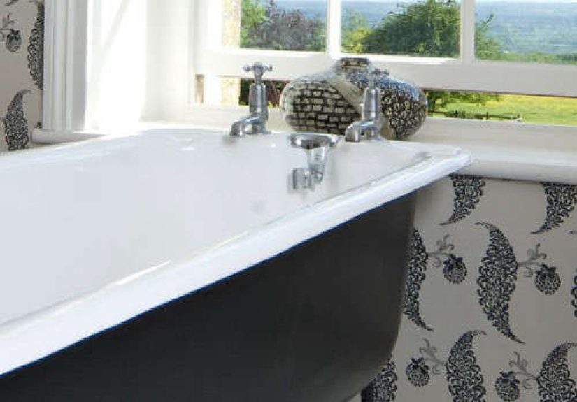
Fireplaces and built-ins
A fireplace painted in Off-Black can instantly become the anchor of a room. Brick, wood, stone, and metal all look more intentional next to it. The color is dark enough to create a focal point, but soft enough to avoid looking like a black hole in the middle of your living room. That is a delicate balance, and Off-Black handles it well.
Built-ins, bookcases, media units, and bars also benefit from this shade. It adds depth to shelving, makes collected objects pop, and gives millwork a custom feel. If you have a room that lacks architectural interest, painting the built-ins in Off-Black can fake a lot of sophistication very quickly.
Trim, doors, and metalwork
For people who are color-curious but not ready to commit to black walls, Off-Black on interior doors or trim is an excellent gateway move. It frames a room, sharpens sightlines, and makes pale walls look intentional. On metalwork and exterior details, it reads classic and strong without tipping into industrial severity.
Small rooms and moody spaces
Counterintuitive but true: very dark paint can work beautifully in small rooms. Powder rooms, studies, TV rooms, and snug bedrooms can all benefit from a deep shade that blurs corners and adds intimacy. Off-Black is especially good here because it does not feel as aggressive as a truer black. Instead of shouting, it murmurs something expensive.
Best Color Pairings for Off-Black No. 57
Crisp and cool whites
If you want a clean, modern look, pair Off-Black with a cool white. Farrow & Ball officially pairs it with Blackened, and that makes sense. A cooler white keeps the palette looking sharp and architectural while allowing Off-Black to show off its softer complexity.
Warm neutrals
Off-Black also plays very nicely with warm beige, greige, mushroom, taupe, putty, and creamy off-white. These combinations feel layered and welcoming rather than high-contrast and graphic. If your home has lots of oak, walnut, linen, jute, or antique wood, warm neutrals help Off-Black feel integrated rather than imported from another design planet.
Deep greens and blues
Forest green, olive, deep teal, navy, and smoky blue all look rich beside Off-Black. These pairings feel upscale and moody, especially in libraries, dining rooms, and kitchens. Because Off-Black is softer than a true black, it does not bulldoze neighboring saturated colors. It lets them have a little conversation.
Brass, bronze, marble, and natural wood
This is less about paint and more about the total look, but it matters. Off-Black tends to look especially good with warm metals, veined marble, soapstone, unlacquered brass, and natural wood grain. Those materials keep the room from feeling flat and add visual warmth, which dark paint always appreciates.
How to Use Off-Black Without Regret
Sample it in multiple lights
Dark paint is famous for shape-shifting. Off-Black can look more charcoal in one room and more ink-like in another. Always test a large sample on more than one wall and check it in morning light, afternoon light, lamplight, and cloudy weather. Paint is a little dramatic. Let it perform before you commit.
Think about sheen and surface
Very dark colors will look different depending on the finish. A more matte finish can make Off-Black feel velvety and architectural, while a glossier finish can sharpen the color and reflect more light. On cabinets, doors, and trim, sheen becomes especially noticeable, so choose based on the mood you want and the wear the surface will get.
Balance it with contrast
Off-Black almost always looks better when something around it provides relief. That might be white walls, pale stone counters, warm oak floors, aged brass hardware, or lighter upholstery. The point is not to dilute the drama, but to shape it. Dark paint needs contrast the way cake needs frosting. Technically optional. Emotionally important.
Use lighting like a grown-up
If you are painting a room dark, invest some thought in lighting. Layer ambient, task, and accent light. Off-Black can look luxurious under good lighting and muddy under bad lighting. A beautiful paint color cannot save a room lit like a dentist’s waiting area.
When Off-Black No. 57 Might Not Be the Right Choice
Off-Black is versatile, but it is not magic. If your room has very little light, a lot of cool gray finishes, and not much contrast, it can feel heavier than you want. If you are looking for a crisp, true, fashion-editor black, this might also feel too soft. And if you hate seeing dust, lint, fingerprints, or pet hair, remember this: dark paint can be honest. Brutally honest. Your golden retriever may become an unintentional design critic.
It is also worth noting that dark colors on high-touch surfaces need thoughtful maintenance. Cabinets, doors, and trim may show smudges more easily than mid-tone colors, especially in flatter finishes. That does not make Off-Black a bad choice; it just means you should go in with open eyes and a nearby microfiber cloth.
Final Verdict: Is Off-Black No. 57 Worth It?
Yes, especially if you want a black paint color that feels layered, elegant, and livable. Off-Black No. 57 paint works because it delivers the mood of black without the rigidity of true black. It is softer, more adaptable, and more flattering to a wide range of materials and companion colors.
Used well, it can make cabinetry look custom, fireplaces look sculptural, front doors look stately, and small rooms feel intimate rather than cramped. That is a pretty impressive résumé for one paint color. If your goal is timeless drama with a pulse, Off-Black deserves a serious look.
Experiences With Off-Black No. 57 Paint: What It Feels Like in Real Life
Living with Off-Black No. 57 tends to surprise people in the best way. The first surprise is that it rarely feels as dark as expected once it is actually on the wall, door, cabinet, or fireplace. On a tiny paint chip, it can seem intimidating. On a real surface, especially next to trim, stone, wood, or fabric, it often reads as a rich charcoal-black that feels more tailored than gloomy. That is why people who swear they are “not black paint people” sometimes end up very much becoming black paint people after one weekend and two rollers.
Another common experience is how much the color changes with the day. In bright natural light, Off-Black can feel almost smoky, like a worn leather jacket or a deep pencil line. By evening, it usually turns moodier and softer, which makes rooms feel settled and intimate. In kitchens, that shift can be especially appealing: the cabinets look crisp and architectural in daylight, then warmer and more atmospheric once pendant lights and under-cabinet lighting take over.
People also tend to notice how well Off-Black behaves around other finishes. Brass hardware suddenly looks more deliberate. White walls appear cleaner. Marble veining becomes more dramatic. Wood floors gain richness. Even simple objects like books, pottery, and framed art show up with more presence against it. A painted built-in in Off-Black can make a whole room feel more decorated before you have added a single trendy accessory you will regret by next spring.
On exteriors, the experience is slightly different but just as strong. A front door in Off-Black often feels classic from day one, as if it has always belonged there. It can make a light-colored exterior look sharper and more grounded without feeling too modern or too farmhouse-by-numbers. On shutters, trim, or siding, people often appreciate that it feels substantial without looking flat. It reads as intentional color, not just “default dark paint.”
There are practical experiences too, because romance is nice but fingerprints are real. On cabinets and doors, Off-Black can show smudges, especially if you have children, pets, frequent snack traffic, or all three. Matte finishes can be gorgeous, but they may need a bit more care on busy surfaces. The good news is that most people who choose Off-Black seem to feel the depth and character are worth the occasional wipe-down. In design terms, that is called a healthy relationship. In household terms, it is called keeping a cloth in the junk drawer.
Perhaps the most telling experience is emotional: rooms painted in Off-Black often feel finished. Not busy. Not loud. Finished. The color gives spaces a sense of gravity and polish that lighter neutrals sometimes struggle to achieve. It can make a modest room look collected, a plain room look intentional, and a beautiful room look unforgettable. That is a lot to ask from paint, but Off-Black No. 57 is one of the rare shades that usually shows up ready to work overtime.