Table of Contents >> Show >> Hide
- The Color I Chose and Why It Still Works
- What I Learned After Living With a Dark Blue for a Full Year
- How to Choose the Right Dark Blue Wall Color
- How I Styled My Dark Blue Walls (Without Making It Look Like a Theme Restaurant)
- Other Great Dark Blue Paint Colors If You Want Options
- Common Mistakes I’d Avoid If I Were Painting Dark Blue Again
- One Year Later: Is Dark Blue Still My Favorite?
- Extra Experience Notes: Living With My Favorite Dark Blue Wall Color for a Full Year
- Conclusion
A year ago, I did the thing every cautious decorator warns you about: I painted a major wall (okay, several walls) a deep, moody dark blue. Friends reacted in two camps. Camp A said, “That’s going to look amazing.” Camp B said, “That room is going to feel like a cave.” One year later, I’m happy to report that Camp A gets bragging rights.
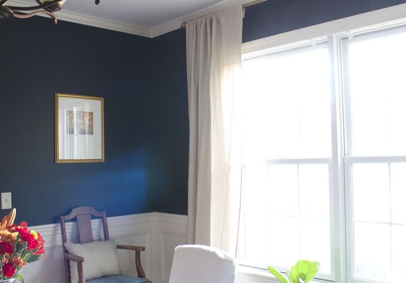
My favorite dark blue wall color is still Benjamin Moore Hale Navy, and I like it even more now than I did on day one. That’s saying a lot, because dark paint colors can be dramatic in the best way and mildly chaotic in the wrong lighting. In this year-later review, I’ll break down why this color worked, what changed once I lived with it through all four seasons, and what I’d do differently if I were painting it again.
If you’re considering a deep blue for your home, this guide will help you avoid the classic mistakes: picking a shade from a tiny chip, ignoring undertones, and discovering at 8:14 p.m. that your “elegant navy” looks suspiciously black. Been there. Learned things.
The Color I Chose and Why It Still Works
My pick: Benjamin Moore Hale Navy
Hale Navy is one of those rare dark blue paint colors that manages to feel classic, modern, and cozy at the same time. It has a smoky, muted quality that keeps it from looking too bright or overly nautical. In practical terms, that means it plays nicely with a lot of design styles: traditional millwork, warm wood furniture, modern black accents, brass hardware, soft linen drapesyou name it.
What makes it especially useful is that it behaves like a “colorful neutral.” It has enough depth to create contrast and mood, but it doesn’t scream for attention the way a more saturated cobalt or royal blue can. Hale Navy gives you drama without demanding a spotlight in every single room.
Why dark blue feels so timeless
Navy and dark blue shades are popular for a reason: they bridge the gap between bold and livable. Designers often use them on cabinets, entryways, living rooms, and accent walls because they add visual weight without feeling trendy in a blink-and-you-miss-it way. A good dark blue has the same staying power as charcoal, forest green, and warm whiteit’s a staple, not a stunt.
That was exactly my goal. I wanted a wall color that felt grounded and stylish but wouldn’t make me redecorate the whole room in six months. One year later, mission accomplished.
What I Learned After Living With a Dark Blue for a Full Year
1) Lighting changes everything (and I mean everything)
The biggest surprise wasn’t the color itselfit was how much the same color changed over the course of the day. In the morning, my dark blue walls looked softer and a little grayer. By afternoon, they looked richer and more obviously blue. At night, under warm lamps, the room felt cocoon-like and cozy.
This isn’t your imagination if you’ve noticed it in your own space. Natural light direction, time of day, and even the type of bulbs you use can shift how paint reads. If you’re testing dark blue paint colors, don’t judge them at one time of day and call it done. That is how people end up repainting on a weekend they had very different plans for.
2) Undertones matter more with dark colors
If you only remember one thing from this article, let it be this: dark blues can have very different undertones. Some lean gray, some lean green, some feel inky and almost black, and some have a cleaner blue base. Those undertones become very obvious once you put the color next to flooring, trim, countertops, and furniture.
Hale Navy’s grayed-down look is exactly why I love it. It feels sophisticated and calm rather than sharp or electric. But if your room has very warm finishes (like yellow oak floors or creamy beige stone), another dark blue might harmonize better. Undertone mismatch is one of the fastest ways to make a color feel “off” even when it looked perfect in a photo online.
3) Dark walls are easier to live with than people think
I heard every warning before I painted: “It’ll be too dark.” “It’ll feel smaller.” “You’ll get tired of it.” I get the concern, but in practice, the opposite happened. The room feels more intentional, not smaller. Dark blue helped the room’s edges recede visually, which actually made the space feel more polished and put together.
The trick is balance. Dark blue walls look best when there’s contrast somewhere elsewhite trim, warm wood, metal finishes, art, textiles, or good lighting. If everything in the room is dark, yes, it can start to feel heavy. But a dark wall color plus layered materials? That’s where the magic happens.
How to Choose the Right Dark Blue Wall Color
Test paint on the wall, not just the chip
Paint chips are useful for narrowing options, but they are terrible at showing how a dark color will actually behave in a real room. Before I committed, I tested large samples on multiple walls and checked them in morning light, afternoon light, and evening lamp light. That step saved me from choosing a blue that looked gorgeous online and weirdly green in my house.
If you’re deciding between two or three dark blues, paint sample swatches side by side. Compare them near trim, flooring, and furniture. Dark colors reveal their differences quickly when they’re next to each other.
Pay attention to room direction
North-, south-, east-, and west-facing rooms all change how color reads. If your room gets cool light, your dark blue may look moodier and grayer. If it gets warm afternoon light, the same paint can feel richer and warmer. This is why a dark blue that looks perfect in your friend’s sunny living room might feel completely different in your hallway.
My advice: test your top color on the wall that gets the most light and the wall that gets the least. If you still like it in both spots, you’ve probably found a winner.
Choose the right sheen for the room
Sheen is not just a technical detailit changes how your color looks. Higher sheens reflect more light, which can make a dark blue look brighter (and sometimes shinier than you expected). Lower sheens absorb more light and look softer, which is often what people want from a moody blue wall.
For most living spaces, an eggshell or low-sheen finish is a sweet spot: enough durability for everyday life, but not so shiny that the wall looks flashy. In higher-traffic spots like kitchens or hallways, satin may make more sense if you want easier cleaning. Just know that darker shades can look more reflective in higher sheens.
Prep work is boring and absolutely worth it
A dark color is not forgiving on badly prepped walls. It can highlight texture, patchy areas, and uneven roller marks if the surface wasn’t cleaned and prepped properly. Before painting, I cleaned the walls, patched small imperfections, sanded repairs, and made sure everything was dry. Was it thrilling? No. Did it make the final result look 10x better? Yes.
Dark blue also benefits from consistent application. If you’re painting a larger space, mix your paint together (“boxing” the paint) so slight can-to-can differences don’t show on the wall. Tiny variation is a lot more obvious when the color is deep and saturated.
How I Styled My Dark Blue Walls (Without Making It Look Like a Theme Restaurant)
1) Crisp whites for contrast
White trim and dark blue walls are a classic pairing for a reason. The contrast looks clean and architectural. I used a soft white on trim and ceiling to keep the room from feeling flat. The dark blue became the feature, and everything else had room to breathe.
2) Warm wood to prevent a cold look
Dark blue can feel cool, especially in rooms with limited natural light. Warm wood tonesoak, walnut, rattan, even a slightly rustic wood coffee tablehelp balance that. This is one of my favorite tricks because it makes the room feel layered instead of matchy.
3) Brass and gold accents for a little sparkle
If dark blue is the tuxedo, brass is the jewelry. I added a brass lamp, a couple of frames, and one small side table detail. Nothing over-the-top, just enough to catch light and keep the room from feeling too matte. Navy with gold tones almost always looks more expensive than it has any right to.
4) Soft textiles so the room stays comfortable
Linen curtains, textured throw pillows, and a lighter rug made a huge difference. Dark walls need texture. Otherwise, the room can look like a paint swatch exploded and left no survivors. Fabric softens the edges and helps the space feel lived-in.
Other Great Dark Blue Paint Colors If You Want Options
I still love Hale Navy, but it’s not the only dark blue worth considering. If you’re building a shortlist, these are all solid options depending on the mood you want:
- Sherwin-Williams Naval – A classic rich navy that feels grounded and elegant. Great if you want a deep, timeless blue with a calm, confident vibe.
- Valspar Indigo Cloth – A cool undertone dark blue with a very low LRV, excellent for dramatic spaces and color-drenched rooms.
- Behr Midnight Blue – A deep blue-gray option with a lot of depth, especially nice for doors, trim, or a formal accent wall.
- Benjamin Moore Hidden Sapphire – A jewel-toned navy that feels a bit more luxurious and bold.
- Sherwin-Williams Gale Force – Versatile, moody, and easy to pair with natural materials.
- PPG Oceania – Not a true navy, but a dark neutral aqua with a turquoise undertone if you want something moodier and slightly more coastal.
The best approach is to choose three shades that are close, test them in your room, and let your lighting decide. Your walls are brutally honest, and that’s a good thing.
Common Mistakes I’d Avoid If I Were Painting Dark Blue Again
- Skipping samples: This is the fastest path to regret. Dark paint colors must be tested in real light.
- Ignoring undertones: Blue-green undertones and blue-gray undertones can feel completely different next to your finishes.
- Using the wrong sheen: Too glossy can make dark walls look uneven. Too flat in a high-traffic area can be hard to maintain.
- Rushing prep: Dark paint shows poor patching and dust more than mid-tone colors do.
- Forgetting a touch-up strategy: Keep a labeled sample jar for future scuffs. Future-you will be grateful.
- Not balancing the room: Dark walls look best with contrasttrim, lighting, art, wood, or textiles.
One Year Later: Is Dark Blue Still My Favorite?
Absolutely. In fact, I trust it more now because I know how it behaves in real life. I’ve seen it in bright mornings, gray afternoons, cozy evenings, and every season in between. It still feels sophisticated, calm, and slightly dramatic in the best possible way.
The biggest compliment I can give a wall color is this: I don’t notice it as a “paint choice” anymore. I notice it as part of the room. It supports the furniture, the art, the light, and the mood. It feels intentional. It feels finished. And most importantly, it still makes me happy when I walk in.
If you’re thinking about painting your walls dark blue, take your time choosing the shade, test it properly, and don’t panic when it looks different at 9 a.m. than it does at 9 p.m. That’s not a flawthat’s the fun part.
Extra Experience Notes: Living With My Favorite Dark Blue Wall Color for a Full Year
Since you asked for a year-later perspective, here’s the real-life versionthe part you don’t always get from a pretty before-and-after photo. In week one, I was obsessed. In week three, I had one tiny moment of panic because the room looked much darker on a rainy day than it did when I painted it. Then I adjusted the lighting, added a table lamp on the dim side of the room, and everything clicked again. That was my first lesson: dark blue walls don’t just need “good taste,” they need a lighting plan.
Another thing I noticed over time is that dark blue changes the way you decorate, but in a good way. I became more intentional about what I brought into the room. Random clutter looked more obvious against a deep, moody wall, while curated pieces looked incredible. A simple wood frame suddenly looked designer. A brass floor lamp looked more polished. Even a stack of books felt more decorative. The wall color kind of forced me to stop tossing random stuff around and start thinking in layers and contrast.
Cleaning was much easier than I expected. I chose a practical wall sheen, and everyday marks came off with a gentle wipe. I do recommend keeping leftover paint for touch-ups, especially if the room gets a lot of traffic. Dark colors are surprisingly forgiving in some ways (they hide a lot of visual noise), but a pale scuff mark can show up fast. I kept a small labeled container and a decent brush in a cabinet, and that made maintenance easy instead of annoying.
Through the seasons, the room mood shifted in a way I actually loved. In summer, the blue felt crisp and cool, especially with brighter daylight and lighter fabrics. In fall, it looked richer and more cocoon-like, especially with warm bulbs and heavier textures. During winter, the dark blue made the room feel cozy rather than gloomy. I added a cream throw, a warm wood tray, and a lamp with a soft shade, and suddenly the room felt like a place you’d want to stay for hours. In spring, with more daylight, the same walls looked cleaner and slightly brighter again. It felt like I got four versions of the same room without repainting.
If I were doing it all over again, I would still choose a dark blue, and I’d probably still choose Hale Navy. The only thing I’d change is that I would test my bulbs earlier in the process. Paint and lighting are a team sport. I learned that a cool bulb made the walls feel flatter and less inviting, while a warmer bulb pulled out the richness and made the room feel balanced. Once I figured that out, the color looked right all the time, not just during the “good light” part of the day.
So yes, one year later, I’m still fully on board with dark blue walls. They’re dramatic but not loud, timeless but not boring, and bold without feeling risky once you understand undertones, sheen, and lighting. If you’re on the fence, consider this your sign: test a few dark blues, trust your room more than the paint chip, and let the color settle in. The right dark blue doesn’t just change a wallit changes the whole personality of the room.
Conclusion
My favorite dark blue wall color, a year later, is still the best design decision I made for that room. It gave me the moody, elevated look I wanted, and it held up beautifully once I learned how to support it with lighting, finish, and contrast. If you’re looking for a wall color that feels sophisticated and cozy at the same time, a well-chosen dark blue is hard to beat.
Start with samples, check the color in real light, choose the right sheen for your lifestyle, and prep your walls properly. Do that, and your dark blue walls won’t just look great in photosthey’ll still look great a year later.