Table of Contents >> Show >> Hide
- Why a Coffee-Inspired Palette Feels So Good
- The Core Colors in the Palette
- How to Use the Palette Room by Room
- The Designer Trick That Makes This Palette Work: Layering
- What to Pair With Coffee Tones So They Do Not Feel Dated
- Mistakes to Avoid
- How to Try the Trend Without Repainting the Entire House
- Why This Palette Has Staying Power
- Experiences: What Living With a Coffee-Inspired Palette Actually Feels Like
- Conclusion
- SEO Tags
If your home has been feeling a little too crisp, too gray, or a bit like it’s trying very hard to win “Most Emotionally Unavailable Room of the Year,” designers have good news: a coffee-inspired palette is here to rescue it. Think espresso brown, creamy latte beige, caramel, cinnamon, cocoa, and soft whipped-cream white. In other words, the colors of your favorite café order are now doing side hustles in living rooms, bedrooms, kitchens, and entryways.
This is not the same old brown-on-brown look that once haunted suburban dens and made every sofa feel like a baked potato. The new version is softer, more layered, and far more sophisticated. It mixes warm neutrals with texture, natural materials, and a little contrast, so the result feels comforting rather than heavy. It is cozy without being sleepy, stylish without trying too hard, and timeless enough to outlast whatever hyper-specific microtrend the internet invents next Tuesday.
Designers love this palette because it creates instant warmth. Homeowners love it because it is forgiving, flexible, and easy to live with. And honestly, rooms dressed in coffee-inspired colors just look like they know how to make a decent biscotti. That matters.
Why a Coffee-Inspired Palette Feels So Good
There is a reason this palette keeps showing up in beautifully designed homes. Browns, creams, taupes, and caramel-toned shades feel grounded. They pull from nature, echo wood, stone, clay, leather, and woven fibers, and create a visual sense of calm. Unlike icy whites or cooler grays, they do not make a room feel distant. They make it feel inhabited.
That matters in modern homes, where people want rooms that look polished but still feel human. A coffee-inspired palette helps bridge that gap. It can look elegant in a formal dining room, relaxed in a family room, restful in a bedroom, and surprisingly fresh in a kitchen. It also works across design styles. Warm minimalism, traditional, rustic-modern, European-inspired, vintage, and even contemporary homes can all wear these shades well.
The real magic is in the balance. Rich browns bring depth. Creams and milky whites keep things light. Caramel and cinnamon add movement. Wood tones create continuity. A touch of black, charcoal, muted blue, olive, or brass gives the whole scheme some structure. That is why designers keep returning to this family of colors: it is hard to make it look flat when you layer it properly.
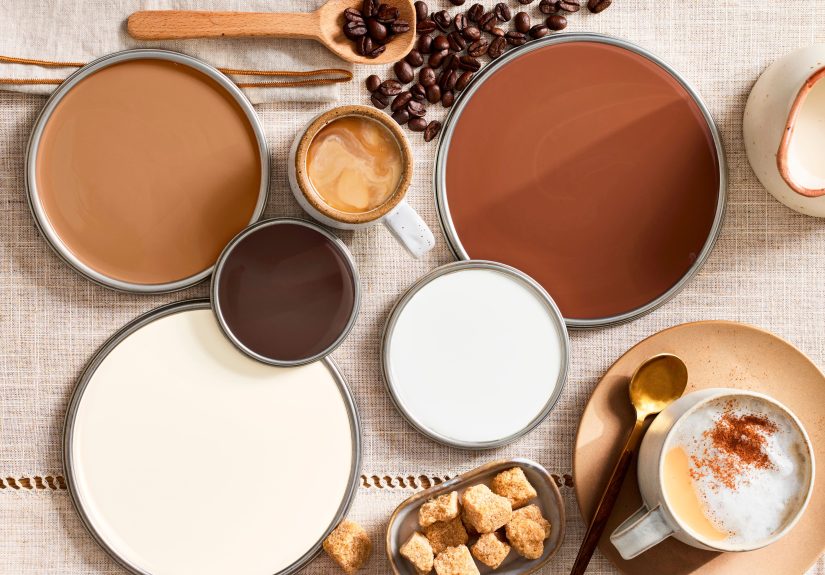
The Core Colors in the Palette
Espresso
Espresso is the dramatic anchor. It is deep, moody, and slightly luxe. Use it on built-ins, a library wall, a bathroom vanity, dining chairs, or a statement piece of furniture. It gives a room instant gravity and works especially well with cream, marble, brass, and warm wood. If you are nervous about going dark, start with accents rather than four full walls. Espresso likes to make an entrance, but it does not always need the whole stage.
Mocha
Mocha is probably the MVP of this palette. It sits between taupe and chocolate, which means it offers warmth without overwhelming the room. It is a smart choice for wall paint, larger rugs, upholstered headboards, or cabinetry. Mocha can lean modern, classic, or earthy depending on what you pair it with.
Latte and Cappuccino
These are the easygoing middle notes. They soften stronger browns and help rooms feel airy. If espresso is the tailored wool coat, latte is the cashmere sweater you never want to take off. These shades are excellent for larger wall areas, slipcovered furniture, curtains, and textured bedding. They create that mellow, cocooning effect designers keep talking about.
Cream and Milky White
Warm whites matter here. Stark, blue-based whites can make coffee tones feel harsh by contrast. A creamy white, however, creates a gentler transition. It brightens the room while preserving the cozy mood. Trim, ceilings, upholstery, and lampshades all benefit from a warm, whipped-cream kind of white.
Caramel, Cinnamon, and Raw Sugar
These shades are what keep the room from looking too safe. They bring movement, sweetness, and visual variety. Add them through wood finishes, throw pillows, leather chairs, ceramics, patterned textiles, or even a painted accent piece. They are the little flourish that keeps the palette from becoming one giant beige shrug.
How to Use the Palette Room by Room
Living Room
The living room is where this palette really shines. Start with a creamy or latte-toned backdrop, then layer in mocha upholstery, walnut or smoked oak furniture, and a darker brown accent such as a side table, fireplace surround, or framed artwork. Texture does a lot of the heavy lifting here. Bouclé, wool, linen, leather, velvet, and woven natural fibers all help the room feel rich rather than monotone.
If the room gets plenty of natural light, you can go deeper with brown walls or ceiling beams. If it is darker, keep the largest surfaces light and use brown in your furniture, rug pattern, and accessories. A single black or charcoal accent can sharpen the look. Think of it as eyeliner for the room: not essential, but very effective.
Bedroom
A bedroom should feel restful, and coffee-inspired colors are basically sleep’s favorite wardrobe. Consider soft mocha or cappuccino walls, cream bedding, a warm wood bed frame, and cinnamon or cocoa accents in pillows or a throw. If you want something moodier, a chocolate-toned accent wall behind the bed creates a cocoon effect without swallowing the whole room.
Bedrooms also benefit from subtle shine. Brass sconces, antique bronze hardware, or a small mirrored tray add just enough polish to keep all the soft tones from blending into one sleepy blur.
Kitchen
Yes, kitchens can absolutely wear brown again, and no, they do not have to look stuck in 1994. The key is contrast and material mix. Cream cabinets, warm beige walls, or off-white tile pair beautifully with deeper brown stools, wood shelving, bronze hardware, or a rich tile backsplash. Brown can also show up through natural walnut cabinetry, stained islands, leather counter stools, or café-inspired details like pleated shades and small lamps.
One of the smartest ways to use this palette in a kitchen is to lean on stone and texture. A honed countertop, zellige tile, handmade ceramics, or rattan lighting immediately makes the space feel warmer and more collected.
Bathroom
Bathrooms are often where people play it safe, which is exactly why a coffee palette feels so refreshing here. Brown-and-cream checkerboard tile, deep brown zellige, stone-look finishes, walnut vanities, or plaster-like wall treatments can make a bathroom feel like a boutique hotel instead of a backup utility closet with plumbing.
Keep the look clean with warm white towels, simple hardware, and one or two natural accents such as a wooden stool or woven basket. Suddenly your bathroom is giving spa, not gas station.
Entryway and Dining Room
These spaces are ideal for taking a little more risk. An entryway can handle darker paint, especially when paired with creamy trim, a vintage rug, and warm lighting. A dining room is another great place for deeper browns because the room is often used in the evening, when lower light makes rich tones feel especially intimate and flattering. If candlelight had a favorite color family, it would be this one.
The Designer Trick That Makes This Palette Work: Layering
The reason some neutral rooms feel delicious and others feel like a waiting area at a tax office comes down to layering. Designers do not stop at “brown plus cream.” They stack undertones, materials, and finishes so the room has range.
For example, a successful coffee-inspired room might combine:
- cream walls
- mocha drapery
- walnut furniture
- camel leather seating
- a nubby oatmeal rug
- bronze or brass metal accents
- stone, travertine, or plaster-like surfaces
Notice what is happening there: no single item is shouting. The room becomes cozy because everything is speaking the same language in different tones and textures. It is less “matching set” and more “beautifully curated coffee flight.”
What to Pair With Coffee Tones So They Do Not Feel Dated
Brown’s only real enemy is bad styling. If you pile on the wrong finishes, it can slide from chic to gloomy in record time. The easiest fix is to pair brown with materials and colors that feel current and breathable.
Use warm whites, not icy ones
Bright white can look jarring next to warm browns. Choose creamy whites, alabaster, or soft ivory instead.
Add one cool counterpoint
Muted blue, dusty sage, olive, or gray-blue keeps the room from feeling overly sweet. It also makes brown look more intentional and layered.
Bring in stone and plaster
Travertine, limestone looks, ceramic tile, and limewash or Venetian-plaster-style finishes give the palette a collected, high-design feel.
Mix wood tones thoughtfully
You do not need every wood finish to match, but they should relate. A room tends to feel best when the woods share a similar warmth, even if one is lighter and one is darker.
Let texture do the talking
Brown becomes infinitely more interesting when it appears in velvet, suede, boucle, grainy wood, woven cane, brushed metal, or handmade tile. Flat surfaces alone can make the palette feel lifeless.
Mistakes to Avoid
Using only one shade of brown. A room needs variation. Mix light, medium, and dark tones.
Choosing stark white trim. It can create too much contrast and make the room feel colder.
Ignoring lighting. Warm neutrals shift throughout the day. Always test paint before committing, especially in north-facing rooms.
Skipping contrast. Add a little black, bronze, blue, olive, or darker wood so the room has definition.
Forgetting softness. Even if your walls are perfect, the palette needs tactile elements to feel cozy. Curtains, rugs, throw blankets, and upholstered furniture matter.
How to Try the Trend Without Repainting the Entire House
Not everyone is ready to coat the walls in mocha and whisper “I live here now” to a gallon of paint. Fair enough. You can still bring in the palette through lower-commitment pieces.
- Swap cool gray pillows for camel, cocoa, or cream ones.
- Add a warm-toned rug with brown, beige, and rust notes.
- Style your coffee table with wood, stone, and ceramic accessories.
- Choose pleated lampshades or soft ambient lighting.
- Replace chrome-heavy accents with antique brass or oil-rubbed bronze.
- Bring in a leather chair, walnut side table, or dark wood frame.
Even one or two of these changes can shift a room from cool and generic to warm and welcoming. It is the decorating equivalent of adding steamed milk to a harsh espresso shot.
Why This Palette Has Staying Power
Unlike some trends that rely on novelty, this one works because it taps into materials and colors people have always found comforting. Brown is back, yes, but it is returning in a more nuanced way. Designers are using it with cream, plaster, marble, brass, walnut, linen, and subtle color accents to create rooms that feel grounded and current. That is a recipe for longevity.
In a time when many people want their homes to feel calmer, softer, and more personal, coffee-inspired colors make perfect sense. They invite you to slow down. They flatter natural light. They look good in every season. They make old pieces feel intentional and new pieces feel less sterile. Best of all, they can be dressed up or down depending on your style.
So if you want a home that feels cozier without tipping into cabin cosplay, this palette is worth a serious look. Rich browns, creamy whites, and warm earth tones create a space that feels collected, restful, and deeply livable. Which, if we are being honest, is exactly what most of us want from our homes. Also from our coffee.
Experiences: What Living With a Coffee-Inspired Palette Actually Feels Like
Here is the part designers understand well and homeowners notice almost immediately: this palette changes how a room feels when you are actually living in it. On a bright morning, cream walls and latte-toned upholstery catch the sunlight in a soft way that feels gentle rather than glaring. Instead of a room bouncing light around like a dentist’s office, the space feels mellow and flattering. Your coffee cup looks better. Your breakfast looks better. Frankly, even your unopened mail seems less aggressive.
By afternoon, the deeper tones begin to do their best work. Walnut furniture, caramel wood frames, and mocha textiles start showing more dimension. The room feels layered even if nothing in it is particularly fussy. This is one reason people often describe coffee-inspired interiors as “effortless.” They are not necessarily simpler; they just hide the machinery better. The palette works quietly in the background, making everyday life look a little more composed.
Then evening arrives, and this is where the whole thing starts to show off. Lamp light bounces warmly off cream shades and brass details. Brown walls or darker furniture absorb just enough light to make the room feel intimate. A sofa in a cappuccino tone suddenly looks impossibly inviting. A textured throw becomes not just decor, but a genuine life choice. People tend to sit longer, read more, and scroll less in rooms like this because the space itself encourages a slower rhythm.
There is also something emotionally useful about these colors. They do not demand attention the way louder palettes do, but they still have personality. They feel mature, calm, and slightly indulgent. Living with them can make routines feel more pleasant. Making tea in a warm-toned kitchen, folding laundry in a softly painted bedroom, or stepping into a brown-and-cream bathroom at the end of a long day all feel subtly more comforting. No, paint cannot solve your inbox. But it can make the room you check it in feel less hostile.
Another experience people mention is that coffee-inspired rooms age gracefully. Trend-driven colors can feel thrilling for six months and exhausting by month seven. This palette tends to settle in. It becomes part of the architecture of your life. Scratches on wood can feel character-rich instead of tragic. Vintage pieces fit right in. New purchases are easier to integrate. Holiday decor looks better against it. Even pets somehow seem more coordinated, which is not a design principle, but it is satisfying.
Most of all, the palette encourages a home to feel personal. It leaves room for books, inherited furniture, handmade ceramics, favorite blankets, and slightly imperfect objects. It does not require everything to be pristine. That is part of its charm. A coffee-inspired home can be elegant, but it does not need to feel untouchable. It is a palette made for living, not just photographing. And that may be the coziest luxury of all.
Conclusion
A coffee-inspired palette is more than a passing design crush. It is a practical, beautiful way to make a home feel warmer, softer, and more inviting. By layering espresso, mocha, caramel, latte, and cream with tactile materials and thoughtful contrast, you can create spaces that feel timeless instead of trendy. Whether you go all in with paint or ease in through furniture and accessories, this palette has a rare talent for making a house feel immediately more lived-in, more relaxed, and a whole lot cozier.