Table of Contents >> Show >> Hide
- The Short Answer: Yes, Moody Paint Colors Are Still Trendy
- Why Designers Still Love Moody Paint Colors
- What Has Changed About the Moody Paint Trend?
- Which Moody Paint Colors Feel Most Current Right Now?
- Best Rooms for Moody Paint Colors
- How to Make Moody Paint Colors Look Expensive, Not Heavy
- When Moody Paint Colors Can Start to Feel Dated
- Real-World Experiences: What It’s Actually Like to Live With Moody Paint Colors
- Final Verdict
- SEO Tags
If you have spent the last few years staring lovingly at deep green dining rooms, inky blue libraries, and bedrooms that look like they deserve their own dramatic soundtrack, you are not alone. Moody paint colors have had a serious run. The real question now is whether they are still trendy or whether they have officially joined the ranks of other design experiments that seemed like a good idea right up until the second coat dried.
The good news for fans of dark, cocooning interiors is this: moody paint colors are absolutely still in style. The even better news is that they have grown up a little. Designers are not abandoning rich, dramatic shades. They are just using them with more nuance. Instead of defaulting to flat black walls and calling it “elevated,” they are reaching for complex burgundies, earthy plums, smoky teals, warm chocolate browns, deep olive greens, and softened navy blues. In other words, the trend did not disappear. It got smarter.
That shift matters. Today’s best dark paint colors are less about shock value and more about atmosphere. They add depth, intimacy, personality, and a collected feel that plain white walls often struggle to deliver on their own. Designers also say moody colors feel more timeless when they are balanced with the right lighting, materials, and finishes. So yes, moody paint colors are still trendy, but the version that feels current in 2026 is richer, warmer, and a lot less try-hard.
The Short Answer: Yes, Moody Paint Colors Are Still Trendy
Designers are still embracing dark wall colors because they make a room feel intentional. A moody shade can turn a bland box into a space with presence. It can make a dining room feel intimate, a bedroom feel restful, a powder room feel jewel-box chic, and a den feel like it belongs to someone who casually says things like, “Let’s discuss this over espresso.”
What has changed is the way designers define moody. A few years ago, the look often leaned heavily on cool charcoal, true black, and crisp contrast. Now the palette is broader and softer around the edges. The most current moody paint colors tend to have warmth or complexity built in. Think oxblood instead of primary red, aubergine instead of bright purple, olive instead of kelly green, and deep teal instead of plain navy. These shades still bring drama, but they do it with more subtlety.
Why Designers Still Love Moody Paint Colors
They make rooms feel finished
One of the biggest reasons moody paint colors remain popular is that they instantly make a room feel designed. Light neutrals can be beautiful, but they often need help from art, texture, furniture, and styling to feel complete. Darker colors do more of the heavy lifting on their own. They create mood from the start, which is a big reason designers continue to rely on them.
They bring warmth and depth
There is a reason so many current paint trends are leaning warm, earthy, and saturated. People want homes that feel comforting, personal, and layered. Moody colors fit that brief perfectly. A deep brown can feel grounded and luxurious. A dusty plum can feel romantic. A dark green can read classic and calming at the same time. These colors add emotional texture to a space, which is far more interesting than a wall color that simply exists and politely minds its own business.
They work beautifully with today’s materials
Moody paint colors pair especially well with the finishes people already love: warm wood, unlacquered brass, aged bronze, marble, linen, boucle, leather, and natural stone. That compatibility keeps dark hues relevant. A deep olive wall next to walnut cabinetry looks sophisticated. A rich blue room with brass sconces looks tailored. A burgundy powder room with a vintage mirror looks like a very good decision.
What Has Changed About the Moody Paint Trend?
If you are wondering whether the moody look is still current, the answer depends less on whether the paint is dark and more on how it is used. Designers are moving away from the copied-and-pasted version of the trend. You know the one: stark black wall, random faux-modern decor, one sad fiddle-leaf fig in the corner, and a room somehow trying to be dramatic and generic at the same time.
The updated approach is more layered. Instead of choosing the darkest possible shade, designers are choosing colors with personality. Warmed-up jewel tones, earthy browns, gray-blues, velvety greens, muted aubergines, and red-based darks feel fresher than flat black or icy charcoal. They are also using dark colors as part of a full-home palette, not as an isolated stunt wall that looks like it wandered in from another house.
Finish matters more now, too. A matte, limewash, plaster-like, or softly textured finish can make a dark color feel timeless and enveloping. High-gloss can still work, but it tends to read more formal and deliberate. The point is that the paint color alone is no longer the whole story. Tone, sheen, texture, and surrounding materials all help determine whether the room feels chic or dated.
Which Moody Paint Colors Feel Most Current Right Now?
Deep greens
Forest green, olive, moss, and dark sage continue to dominate because they function like elevated neutrals. They feel natural, grounding, and easy to live with. They also bridge classic and modern styles surprisingly well. In a traditional room, they feel stately. In a contemporary room, they feel calm and architectural.
Complex blues
Moody blue is not going anywhere, but it is shifting. Instead of bright coastal navy, designers are leaning into smoky blue, denim blue, slate blue, deep teal, and ultramarine with violet undertones. These colors feel more collected and less predictable. They are especially effective in bedrooms, dining rooms, and cabinetry.
Burgundy, oxblood, and aubergine
These shades are having a moment because they feel rich without being cartoonishly bold. Burgundy walls can look cozy and glamorous. Aubergine reads moody and artistic. Oxblood has that rare quality of feeling both old-world and fashion-forward. Used thoughtfully, these tones bring real character to a room.
Chocolate and espresso browns
Dark browns are one of the biggest signs that moody colors are evolving rather than fading. Brown has warmth, softness, and gravitas. It creates drama without the harshness of true black. In rooms with natural wood, layered textiles, and creamy trim, chocolate tones feel especially current.
Gray-blue and smoky neutrals
Cool gray as a trend may have lost its crown, but grays with depth, warmth, or blue-green undertones are still relevant. These shades work well for people who want a moody look without committing to something obviously colorful. Think subtle sophistication, not builder-grade gray apocalypse.
Best Rooms for Moody Paint Colors
Dining rooms
Designers consistently love dark paint in dining rooms because the space is used mostly in the evening and benefits from a cocooning effect. Candlelight, metallic accents, and darker walls are a famously good trio.
Bedrooms
Moody bedroom paint colors can feel restful and luxurious, especially when paired with plush bedding, warm wood, and soft lighting. Deep blue, muted plum, dark olive, and smoky taupe all work well here.
Powder rooms
If there is one room where you can take a dark color risk with relatively low commitment, it is the powder room. Small spaces often look fantastic in saturated color because the drama feels intentional rather than overwhelming.
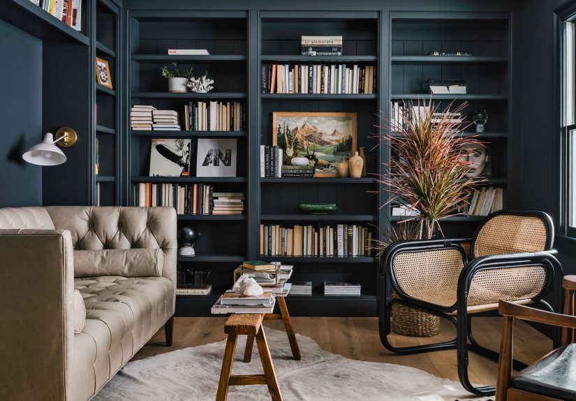
Libraries, dens, and media rooms
These are natural homes for dark wall colors. Moody paint enhances the cozy, tucked-away feel and pairs beautifully with bookshelves, paneling, and layered lighting.
Kitchens and cabinetry
Moody kitchen colors are still very much alive, but they are becoming more varied. Designers are using deep green, smoky blue, berry tones, and dark brown on cabinets, islands, and pantries. This adds character without forcing the whole room into darkness.
How to Make Moody Paint Colors Look Expensive, Not Heavy
Pay attention to undertones
This is where dark paint succeeds or fails. A color that looks sophisticated in one room can look muddy in another depending on natural light and surrounding materials. Test samples at different times of day and watch what the undertones do. South-facing light can soften a dark shade. North-facing light can make it go cold and flat.
Use contrast on purpose
Dark walls need something to bounce off. That does not mean everything has to be white. Contrast can come from trim, art, upholstery, lighting, stone, brass, warm woods, or even a rug with lighter notes. A moody room without contrast can feel sleepy. A moody room with thoughtful contrast feels dynamic.
Layer texture
Texture keeps dark rooms from falling flat. Linen curtains, boucle chairs, velvet pillows, aged metals, woven shades, wood grain, and plaster finishes all help a moody color look dimensional and warm.
Think beyond the walls
One reason dark rooms can feel timeless is that the color appears throughout the space. Designers often repeat the shade in cabinetry, trim, upholstery, wallpaper, or accessories. That repetition creates cohesion. If the wall color is the only dramatic move in the room, it may feel like a trend decision instead of a design decision.
When Moody Paint Colors Can Start to Feel Dated
Dark paint is not automatically timeless just because it is dramatic. It can absolutely start to feel stale if it is handled without intention. The quickest path to a dated look is choosing a trendy dark shade and then pairing it with equally trendy decor that has no relationship to the rest of the home.
Rooms can also feel outdated when they rely on cold black, cool gray, or overused navy without enough warmth. Another common problem is poor lighting. A gorgeous deep color can look sophisticated in one room and gloomy in another. Finish is another culprit. Sometimes the issue is not the color at all; it is the wrong sheen making the room feel harsh, flat, or oddly shiny.
The fix is usually not to give up on dark paint. It is to refine the recipe. Warm up the palette. Add texture. Improve the lighting. Introduce layered contrast. Swap in a more nuanced hue. Moody paint still works; it just likes good company.
Real-World Experiences: What It’s Actually Like to Live With Moody Paint Colors
Here is the part design photos do not always tell you: living with moody paint colors is often better than people expect, but only when the choice matches the room’s job. In real homes, the most successful dark spaces tend to feel deeply relaxing rather than visually loud. Bedrooms painted in smoky blue or muted green often end up being the room people love most at night. A color that looked bold on the swatch can feel surprisingly soothing once the lamps are on, the bedding is layered, and the room stops trying to act like a blank white showroom.
Dining rooms are another place where homeowners tend to become instant converts. During the day, a moody dining room can feel polished and slightly dramatic. At night, it becomes magical. Candlelight bounces differently, metallic finishes sparkle more, and even takeout can look like a deliberate event. That is part of the secret sauce of dark color: it elevates ordinary rituals. Tuesday pasta suddenly has ambiance.
Powder rooms may be the biggest crowd-pleaser of all. People who are nervous about dark paint often start there, and for good reason. A small room in a rich plum, olive, navy, or chocolate shade feels charming, not overwhelming. Guests notice it immediately. It becomes the room that gets compliments, which is funny considering it is also the room where people mostly go to wash their hands and check whether they have spinach in their teeth.
That said, real-life experience also teaches a few hard truths. Dark paint in a room with weak lighting can feel underwhelming fast. What looked luxurious online can go muddy or gloomy if the undertone is wrong. This is especially true in north-facing rooms or spaces with limited windows. People often blame the whole moody trend when the real villain is bad lighting and a hastily chosen sample. A warmer deep tone, layered lamps, or a softer finish often solves the problem.
Another common experience is that moody paint changes how people decorate. Once the walls have personality, the room tends to ask for better supporting actors. Art looks more dramatic. Wood looks richer. Brass looks warmer. Cheap decor can suddenly feel very cheap, while textured, thoughtful pieces look better than ever. This does not mean you need an enormous budget. It just means the room responds well to intention. Even a vintage lamp, a wool throw, and a good mirror can make the whole space click.
There is also a psychological shift that comes with darker interiors. Some homeowners initially worry a moody room will feel smaller, but many end up saying the opposite. Dark colors can blur edges, soften corners, and create an enveloping effect that makes a space feel deeper rather than tighter. The room stops feeling exposed and starts feeling protective. That sensation is a big reason moody paint continues to resonate. In a world that is loud, bright, and permanently online, a darker room can feel like a very stylish form of emotional insulation.
The most practical lesson from real-world experience is simple: moody paint works best when it reflects how you want to feel in a room, not just how you want the room to photograph. If the goal is comfort, richness, intimacy, and character, dark paint often delivers beautifully. If the goal is to copy a trend without considering light, finish, furniture, or function, that is when regret comes knocking. Usually wearing black. Ironically.
Final Verdict
So, are moody paint colors still trendy? Yes, absolutely. But the trend has evolved into something more sophisticated than a blanket obsession with black walls. Designers still love dark paint because it adds depth, intimacy, and a polished sense of personality. The difference now is that the best moody interiors rely on complexity: warmer undertones, earthy influence, layered materials, better lighting, and colors that feel collected rather than copied.
If you want a look that feels current, skip the harshest version of the trend and choose a shade with nuance. Deep green, smoky teal, dusty plum, oxblood, rich brown, and softened navy all feel right at home in today’s interiors. Use them where they make emotional sense, support them with texture and contrast, and your room will feel less like a passing trend and more like a place you genuinely want to be.
And that, really, is the whole point. A stylish room is nice. A stylish room that also makes you want to linger is better. Moody paint colors still do that beautifully.