Table of Contents >> Show >> Hide
- 1) Outdoor Lighting That’s Too Small, Too Cold, or Just… Missing
- 2) “Materialitis”: Too Many Materials Fighting for Screen Time
- 3) A Front Door That Doesn’t Get the Spotlight
- 4) Landscaping That’s Overgrown, Bare, or the Wrong Scale
- 5) A Walkway or Driveway That Looks Like an Obstacle Course
- 6) The “Small Stuff” That Screams Neglect: Paint, Grime, Numbers, and Clutter
- A Quick 30-Minute “Curb Appeal Audit” (Do This Before You Spend Money)
- Conclusion: Make the Outside Match the Inside
- Real-World Curb Appeal Stories and Lessons (Extra Field Notes)
- SEO Tags
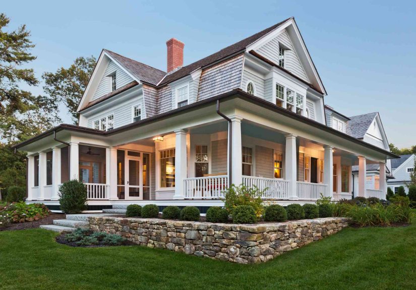
Your home’s exterior is basically its profile picture. People see it, judge it in 0.7 seconds, and decide whether your house
gives “welcome home” energy or “I swear I’m fine, I just haven’t slept since 2019” vibes.
The good news: designers and real estate pros agree most curb appeal problems aren’t “tear down the façade” problems. They’re
“swap a few things, clean a few things, stop doing that one weird thing” problems. Below are six of the biggest exterior
offendersand how to fix them without taking out a second mortgage or becoming a full-time landscaper.
1) Outdoor Lighting That’s Too Small, Too Cold, or Just… Missing
If your exterior lighting is undersized or poorly placed, your house can look unbalanced in daylight and downright unwelcoming
at night. Designers call out scale as a top issueespecially when tiny fixtures are trying to “compete” with large garage doors
and wide front elevations.
What makes it look bad
- Tiny sconces next to a giant garage door (like earrings that got lost in a winter coat).
- Harsh, blue-white bulbs that make your entry feel like a parking lot.
- Outdated or awkward placement that highlights the wrong things (hello, trash cans).
- No path lighting, so guests wander like they’re in a spooky movie trailer.
Designer-approved fixes
Start with the fixtures you already have wired, then size up. Larger fixtures often look more intentional and proportional.
Next, switch to warm-toned bulbs for a softer glow that flatters architecture and landscaping after dusk.
- Upgrade to larger wall lights that match your home’s scale (especially around garages and the front door).
- Choose warm light (think “cozy porch,” not “interrogation scene”).
- Add subtle path lights or uplights to guide people and highlight greenery.
- Make sure everything actually works (a burned-out bulb screams “unfinished”).
2) “Materialitis”: Too Many Materials Fighting for Screen Time
Designers have a name for the exterior that tries to do everything: “materialitis.” It’s when a home stacks brick, stone,
mixed siding, random trim accents, and decorative panelsoften in small patches that feel more like samples than a plan.
What makes it look bad
- One-off accents that don’t repeat anywhere else, so they feel accidental.
- Fake-looking masonry used like wallpaper instead of something structural.
- Too many textures competing at once, making the façade feel busy and dated.
How to make it look intentional (without rebuilding your house)
The goal isn’t “one material forever.” It’s a cohesive exterior palette: fewer materials, used in bigger, repeatable ways.
If you’re updating, pick a primary finish and one supporting finish. Then repeat them so the home feels designednot decorated.
- Limit the exterior to a simple, coordinated mix (for many homes: 2–3 materials is plenty).
- Repeat accent materials in more than one place so they read as a theme, not a typo.
- When adding stone/brick veneer, detail it so it looks believableespecially around corners and transitions.
3) A Front Door That Doesn’t Get the Spotlight
Designers love a “wow moment” at the entry. If your front door fades into the backgroundor looks tired, scuffed, or over-covered
your whole façade can feel blah, even if the rest is fine.
What makes it look bad
- Faded paint or a door color that clashes with the home’s architecture.
- Worn hardware (tarnished handle sets, squeaky knobs, sad doorbells).
- No visual focusnothing draws the eye to the entry.
- A bulky security/screen door that blocks the “welcome” moment.
Easy upgrades with big curb appeal ROI
Paint is the headline act here: a fresh, intentional front door color can transform the first impression quickly. Just make sure
it works with the roof and the home’s style so it looks curated instead of random. Then layer in the supporting cast: upgraded
hardware, a clean doormat, and a pair of planters that frame the entry like parentheses.
- Choose a door finish that fits the home’s style (classic, modern, coastaldon’t fight your own architecture).
- Coordinate door and trim undertones with the roof so the palette feels cohesive.
- Swap dated hardware for a timeless finish (matte black, aged brass, satin nickelpick one and commit).
- Keep décor simple: one great wreath beats five “Live Laugh Love” signs every time.
4) Landscaping That’s Overgrown, Bare, or the Wrong Scale
Landscaping is supposed to frame the homenot swallow it, not ignore it, and definitely not confuse it. Pros consistently point to
three curb appeal killers: overgrowth, emptiness, and plants that don’t match the house’s scale.
What makes it look bad
- Overgrown shrubs hiding windows or covering the façade.
- A bare yard with little greenery, which can feel stark and uninviting.
- Plants that block the house instead of framing it (big trees can be gorgeousuntil they become a curtain).
- Tiny “confetti landscaping”too many small plants scattered everywhere with no structure.
- Neglected beds with weeds, dead plants, or tired mulch.
Make it look designed (not accidental)
Think in layers: low plants near the walkway, medium shrubs to define edges, and taller plantings to create balancewithout blocking
the architecture. Also, pick a simple palette. Repetition looks polished. Randomness looks like you planted whatever was on sale.
- Trim and shape hedges so the home is visible and the lines look clean.
- Add a few structural plants (evergreens or tidy shrubs) to give the yard “bones.”
- Use containers along the walkway or porch for instant color without long-term commitment.
- Plant in the right place (sun/shade needs mattersad plants make everything look sad).
5) A Walkway or Driveway That Looks Like an Obstacle Course
Designers talk a lot about “the path to the house” because it’s literally the user experience of your exterior. If the route feels
confusing, cracked, dirty, or neglected, visitors read it as a warning sign: If this is the outside, what’s the inside like?
What makes it look bad
- Cracks, stains, and weeds in driveways or walkways.
- Dirty hardscaping that hasn’t been pressure-washed in years.
- No clear transition from street to porch (no definition, no “arrival” moment).
- Clutter along the routehoses, bins, toys, or extra planters that narrow the path.
Fixes that make the whole exterior feel “new”
Start with cleaning and simple repairs: pressure washing, pulling weeds, patching cracks. Then elevate the “arrival” experience:
define the walkway edges, add lighting, and create a small in-between space (like a porch moment or simple seating area) that makes
the entry feel intentional.
- Pressure wash driveways, walkways, steps, and porch floors for a fast refresh.
- Remove weeds from cracks and address stains so surfaces look cared for.
- Define the path with edging, planters, or low lighting to guide guests naturally.
- If space allows, add a porch or entry “pause” zonesomething that signals, “You’re here.”
6) The “Small Stuff” That Screams Neglect: Paint, Grime, Numbers, and Clutter
This is the category designers and agents notice instantly because it’s about maintenance and details. A home can be architecturally
beautiful and still look bad if it’s dirty, peeling, or visually chaotic.
Paint problems (and color problems)
Peeling or faded paint makes a home look uncared forperiod. But even “fresh” paint can backfire if the palette doesn’t match the
roof undertone or ignores the home’s architectural style. When color and style don’t align, people may not know why it feels off
they’ll just feel it.
- Touch up or repaint visibly peeling areas before they broadcast “deferred maintenance.”
- Coordinate siding/trim/door colors with the roof and the home’s style for a cohesive look.
- If a full repaint isn’t happening, focus on high-impact zones: trim, shutters, and the front door.
Grime: the silent curb appeal assassin
Dirt, mildew, and buildup can make even nice siding look dull. The fix is not glamorous, but it’s powerful: clean windows, wash
siding, clear cobwebs, and handle minor repairs like loose gutters or cracked edges. Clean reads as “cared for.”
- Wash siding and trim; clean windows so the whole façade looks brighter.
- Fix small issues promptly (loose gutters, cracked spots, broken trim) so the exterior feels maintained.
- Keep outdoor fixtures and railings cleantiny details add up fast.
Outdated house numbers and a sad mailbox
Your house numbers are tiny, but they’re one of the first things visitors (and delivery drivers) look for. Chipped numbers or a
leaning, rusty mailbox can pull the whole exterior down. Matching these details to your home’s style is a quick win.
- Replace worn numbers with a readable, modern set that fits the home’s character.
- Upgrade or straighten the mailboxbonus points for coordinating finishes with door hardware and lighting.
Front porch clutter and “kitsch overload”
Designers aren’t anti-fun. They’re anti-chaos. A porch stuffed with extra furniture, too many accessories, or novelty décor can
make the entry feel smaller, messier, and dated. Keep it edited: a couple of quality pieces, a plant, and breathing room.
- Scale furniture to the spacetoo much or too large overwhelms.
- Swap kitschy yard décor for elevated accents: planters, a seasonal wreath, or a simple lantern.
- Keep the porch functional and welcoming, not crowded and confusing.
A Quick 30-Minute “Curb Appeal Audit” (Do This Before You Spend Money)
Before you buy anything, take a lap: stand at the curb, then walk to the front door as if you’ve never seen your house before.
If something feels off, it’s usually one of these categories:
- Balance: Are lights and landscaping scaled to the home?
- Cohesion: Do materials and colors look intentional together?
- Cleanliness: Are surfaces bright and cared for?
- Clarity: Is the path obvious and inviting?
- Focus: Does the front door feel like the star?
- Editing: Is the porch styledor cluttered?
Conclusion: Make the Outside Match the Inside
The fastest way to make your home’s exterior look better isn’t a massive renovation. It’s thoughtful proportion, a cohesive palette,
clean surfaces, and a welcoming entry sequence. Fix the lighting scale. Simplify materials. Let your front door shine. Keep the
landscaping framed, not frantic. Clean and repair what’s tired. And for the love of curb appeal, give the gnomes a sabbatical.
Real-World Curb Appeal Stories and Lessons (Extra Field Notes)
Designers and agents tend to describe the same “before” scenes again and againnot because homeowners are careless, but because
exterior problems are sneaky. They build slowly, and then one day you look up and your house is wearing mismatched socks in public.
Here are a few real-world patterns that show how the six issues above typically play outand what actually changes the outcome.
The Case of the Tiny Sconces
A classic: a wide front elevation with a two-car garage and two petite lights that look like they were borrowed from a dollhouse.
In daylight, the home feels oddly flat; at night, the entry looks dim and disconnected. The fix isn’t fancyjust properly scaled
fixtures and warm bulbsbut the perception shift is huge. The house suddenly reads “finished,” not “builder basic.” People may not
compliment the new lights directly; they’ll just say the home looks “more expensive.” That’s the magic of proportion.
The “Material Sample Board” Exterior
This happens when homeowners try to add character by sprinkling materials: a little stone here, a little shake siding there,
one accent panel over a window “for interest,” and suddenly the façade looks busy. The lesson designers repeat: fewer materials,
used more confidently, look higher-end. If you can’t change the materials, you can still reduce the visual noise by repeating
one element elsewhere (matching trim color, echoing a texture in planters, or unifying accents with consistent hardware finishes).
Cohesion is what makes a home look deliberate.
The Front Door That’s Technically Fine (But Emotionally Invisible)
A door can be in perfect working condition and still tank curb appeal if it’s visually tired: scuffed paint, dated brass,
a doormat that has seen too much, and a storm/security door blocking the view. The “experience” fix is simple: refresh the door
with a style-appropriate color, upgrade the hardware, and clean up the entry zone. Add one strong accent (like symmetrical planters)
and stop there. When the front door becomes the focal point, the whole exterior feels more welcomingeven if nothing else changes.
The Yard That’s Either a Jungle or a Desert
Overgrown landscaping hides architecture and makes maintenance feel overwhelming. A bare yard can feel stark, like the home is
unfinished. The sweet spot is structure plus softness: trimmed greenery that frames the house, a few layered plant heights, and
a simple palette that repeats. Homeowners often think curb appeal requires constant work; designers usually aim for
low-maintenance choices that look tidy with minimal effort. When landscaping matches the scale of the house, the home looks calmer.
And calm reads as “well designed.”
The Walkway That Doesn’t “Welcome”
Walkways become curb appeal liabilities when they’re dirty, cracked, or unclear. Guests hesitate. Delivery drivers squint.
The fix is often unsexy: pressure washing, weed removal, patching, and defining edges. But that’s exactly why it works
it removes friction. Add a little path lighting and suddenly the route feels intentional. One pro trick is to create a “sequence”:
a clear path, a small pause point (porch or landing), and a front door moment. That sequence makes a home feel thoughtfully planned.
The Details That Quietly Drag Everything Down
This is the category that surprises homeowners most. They’ll repaint a door and plant flowers, yet the house still looks “off”
because the numbers are chipped, the mailbox leans, the gutters sag, and the windows are grimy. These details don’t scream; they
whisperconstantly. The best strategy is a detail sweep: replace house numbers, straighten or upgrade the mailbox, clean windows,
and handle small repairs. You don’t need perfection. You just need the exterior to stop broadcasting “I’ll get to it someday.”
Once those details are aligned, the bigger design choices finally get the credit they deserve.