Table of Contents >> Show >> Hide
- What the Fourier Transform Really Does
- Why Visualization Makes the Idea Click
- Time Domain vs. Frequency Domain
- How to Visualize Magnitude and Phase
- A Classic Example: The Square Pulse
- The FFT: Why the Fourier Transform Became Practical
- Visualizing the Fourier Transform in Audio
- Visualizing the Fourier Transform in Images
- The Convolution Theorem, Also Known as “Math Being Helpful for Once”
- The Three Big Traps: Aliasing, Leakage, and Pretty Lies
- Real-World Applications of Fourier Transform Visualization
- How to Build Intuition Fast
- Conclusion
- What Learning and Using the Fourier Transform Actually Feels Like
The Fourier transform has a reputation problem. The minute it walks into the room, half the class reaches for coffee, the other half reaches for panic, and one brave soul says, “So… it’s just a graph, right?” Not exactly. But also, weirdly, yes. At its heart, the Fourier transform is a way to look at a signal from a different angle. Instead of asking, “What is this signal doing over time?” it asks, “Which frequencies are hiding inside it, and how strong are they?”
That shift sounds simple until you see what it unlocks. Suddenly, music becomes a stack of tones, images become patterns of spatial frequency, and a messy waveform stops looking like a tragic plate of spaghetti. It starts looking like structure. That is why visualizing the Fourier transform matters so much. The math is powerful, but the intuition is what makes it useful in real signal processing, image analysis, filtering, compression, audio tools, and engineering work.
In this guide, we will make the Fourier transform feel less like a wizard spell and more like a very smart pair of glasses. We will look at how to picture the time domain and frequency domain, how phase and magnitude work together, why the FFT made the whole thing practical, and where people get tripped up by aliasing, leakage, and other sneaky gremlins. Along the way, we will use specific examples so the topic stays grounded in reality instead of floating off into a cloud of symbols.
What the Fourier Transform Really Does
The simplest explanation is this: the Fourier transform rewrites a signal as a combination of sinusoids. If you have a waveform in the time domain, the transform tells you how much of each frequency is present. That means the original signal and its frequency-domain version contain the same information, just organized differently. Think of it like switching from a paragraph to a spreadsheet. Same data, different superpower.
If the signal is a musical chord, the Fourier transform can separate the low note, the high note, and the harmonics sitting in between like tiny overachievers. If the signal is an image, the transform can reveal slow changes, repeating textures, sharp edges, and fine detail. In both cases, the Fourier transform helps you see what is hard to spot in the raw signal.
This is the first key idea in visualizing the Fourier transform: you are not destroying the original information. You are changing coordinates. Time domain and frequency domain are two views of the same thing. One view shows when events happen. The other shows how fast they wiggle.
Why Visualization Makes the Idea Click
Most people understand the Fourier transform the first time they see it instead of the first time they read the formula. A time-domain signal is usually drawn left to right as the signal changes over time. A frequency-domain plot is drawn with frequency on the horizontal axis and amplitude on the vertical axis. Where the time-domain graph may look complicated, the frequency-domain graph often looks almost suspiciously honest.
Imagine a signal made from two sine waves: one at 5 Hz and one at 20 Hz. In the time domain, that combination may look like a wavy noodle riding a bigger wavy noodle. In the frequency domain, it becomes two clean peaks. That is the magic. Fourier analysis turns “What on earth is this?” into “Oh, two frequencies. Rude of them to hide, but fine.”
This is why Fourier transform visualization is so useful in education and in practice. Once you can see peaks, bandwidth, noise floors, repeated patterns, and dominant frequencies, you stop treating the transform like abstract math and start using it like a tool.
Time Domain vs. Frequency Domain
The Time Domain
The time domain shows how a signal changes moment by moment. Audio waveforms, vibration measurements, ECG traces, and sensor outputs all live here naturally. This view is excellent when you care about timing, transients, and duration. If a drum hit happens at 2.3 seconds, the time domain tells you exactly where it lands.
The Frequency Domain
The frequency domain shows how much energy or amplitude sits at different frequencies. This is the home of spectral analysis. It is the better view when you want to know whether a signal contains a hum at 60 Hz, whether a voice has strong harmonics, or whether an image contains mostly smooth regions or lots of fine detail.
Neither domain is “more correct.” They answer different questions. The best engineers and data analysts learn to switch between them the way good drivers switch between mirrors. You do not marry one mirror. You use the one that keeps you from hitting something expensive.
How to Visualize Magnitude and Phase
When people first see a Fourier transform, they usually focus on magnitude, because it is the obvious part. Magnitude tells you how much of a given frequency is present. On a graph, this is the height of a peak. If the 50 Hz component is large, the 50 Hz bar stands tall and proud like it has been going to the frequency gym.
Phase is trickier. Phase tells you where a frequency component sits relative to a reference. In audio and signals, phase affects alignment and waveform shape. In images, phase carries a surprising amount of structural information. Magnitude can tell you what frequencies exist, but phase often helps determine where features appear. That is why phase is not decorative math glitter. It is part of the actual identity of the signal.
If you want to visualize the Fourier transform clearly, separate those two mental jobs. Magnitude answers “how much.” Phase answers “where and how aligned.” Ignoring phase is like identifying a band by volume alone. Loud helps, but it does not tell you who is playing.
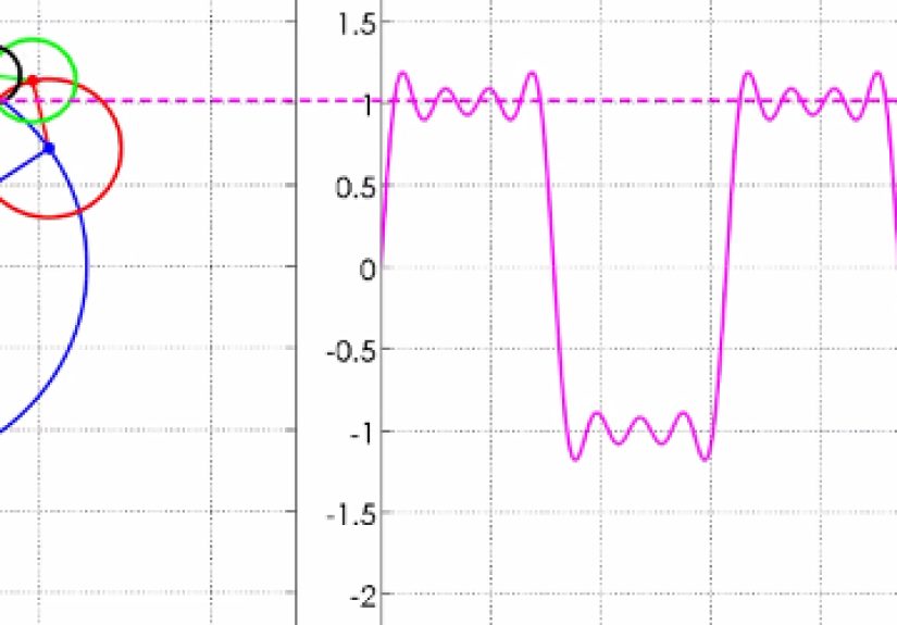
A Classic Example: The Square Pulse
One of the best examples for building intuition is the square pulse. In the time domain, it looks simple: the signal turns on, stays flat for a short time, then turns off. Very clean. Very innocent. Then you take the Fourier transform, and suddenly the spectrum spreads across many frequencies with a sinc-shaped pattern.
This teaches a deep lesson: signals that are tightly localized in time tend to spread out in frequency. Sharp transitions require lots of frequency content. Smooth, slowly varying signals usually have more concentrated spectra. In other words, a clean edge in time is not cheap. The frequency domain sends you the bill.
That is also why edges in images show up as high-frequency content. A blurry image has fewer high spatial frequencies. A sharp image has more. So if you are visualizing the Fourier transform of an image, the frequency plot is telling you how rapidly brightness changes across space.
The FFT: Why the Fourier Transform Became Practical
The discrete Fourier transform, or DFT, is what computers use for sampled data. But computing it directly can be expensive for large signals. That is where the fast Fourier transform, or FFT, changes the game. The FFT is not a different transform. It is a faster algorithm for computing the same result.
This matters because modern signal processing lives on sampled data: audio clips, digital images, biomedical recordings, seismic traces, communication signals, and sensor logs. Without the FFT, a lot of practical spectral analysis would be painfully slow. With the FFT, frequency-domain analysis becomes fast enough to use in everything from music software to medical imaging to real-time monitoring systems.
When people say they “ran an FFT,” what they usually mean is that they computed the Fourier transform of sampled data efficiently. It is a bit like saying you “drove the highway” instead of “used a paved transport infrastructure network.” Accurate enough. Less exhausting.
Visualizing the Fourier Transform in Audio
Audio is one of the friendliest ways to learn this concept. A pure tone creates a sharp peak at its frequency. A musical instrument creates a fundamental plus harmonics. Noise spreads energy across many frequencies. A low-pass filter removes high-frequency components, so the sound becomes duller or smoother. A high-pass filter does the opposite, trimming low-frequency rumble and emphasizing crisp detail.
That is why equalizers, pitch detectors, tuners, speech analyzers, and music visualizers lean so heavily on Fourier tools. The time-domain waveform can tell you when sound happens, but the frequency domain tells you what the sound is made of. If you have ever looked at a spectrum analyzer while music played, you have already seen a practical visualization of the Fourier transform.
Visualizing the Fourier Transform in Images
Images use a two-dimensional Fourier transform, which sounds intimidating until you realize it is just the same idea in two directions. Instead of frequencies over time, you now have spatial frequencies across width and height. Slow spatial changes correspond to broad, smooth regions. Fast spatial changes correspond to fine textures, stripes, and edges.
In many image Fourier plots, the center represents low frequencies and the outer areas represent high frequencies. A bright center often means the image has lots of smooth variation. Strong energy away from the center often signals repetitive detail or edges. Regular stripes in an image create distinct patterns in the spectrum. Rotate the stripes, and the spectral pattern rotates too. The transform is basically tattling on the geometry.
Image filtering in the frequency domain is especially useful because some operations become simpler there. Instead of performing a large spatial convolution directly, you can transform the image, apply a filter in frequency space, and transform it back. This is one reason the convolution theorem is such a big deal.
The Convolution Theorem, Also Known as “Math Being Helpful for Once”
The convolution theorem says that convolution in one domain becomes multiplication in the other. In practical terms, if you want to apply a filter to a signal or image, the Fourier transform can make the job easier. Blur, sharpen, denoise, and pattern filtering often become more intuitive once you can see what frequencies you are boosting or suppressing.
This theorem is the reason Fourier methods show up everywhere in linear systems, communications, optics, control, image processing, and audio engineering. It turns a bulky operation into a cleaner one. That is not just mathematically elegant. It is computationally useful.
The Three Big Traps: Aliasing, Leakage, and Pretty Lies
Aliasing
Aliasing happens when you sample too slowly. Frequencies above the Nyquist limit fold into lower frequencies and pretend to be something they are not. The resulting spectrum lies to you with a straight face. This is why sampling rate matters. If your data acquisition is sloppy, your Fourier transform will faithfully analyze the wrong signal. Very polite. Very unhelpful.
Spectral Leakage
Leakage appears when your finite data window does not line up cleanly with the signal’s periodic structure. Energy from one frequency spreads into neighboring bins, smearing peaks that should look tidy. Windowing functions help reduce this effect. They do not create miracles, but they do stop the spectrum from acting like it just spilled paint on itself.
Zero Padding
Zero padding can make a spectrum look smoother and can help you visualize peaks more clearly, but it does not create new information. It improves the display, not the underlying truth. This is important because a prettier graph is not always a smarter graph. The Fourier transform has enough drama already without fake glow-ups.
Real-World Applications of Fourier Transform Visualization
Once you learn to visualize the Fourier transform, entire fields become easier to understand. In MRI, the measured data lives in k-space and is turned into an image through an inverse Fourier process. In CT and other imaging systems, Fourier-based methods help reconstruction and filtering. In compression, signals and images can be represented efficiently because many components are small enough to discard or reduce. In communications, Fourier methods help analyze channels, modulation, and bandwidth. In scientific computing, they support filtering, solving differential equations, and studying periodic structure.
The transform is not important because it is old or famous. It is important because it keeps solving real problems across disciplines. That is a much better resume line than “historically respected.”
How to Build Intuition Fast
If you want to understand visualizing the Fourier transform without drowning in formulas, start with a few experiments. First, add two sine waves and compare the waveform to the spectrum. Second, shift the signal in time and see how phase changes. Third, make the signal shorter in time and watch the spectrum widen. Fourth, test a sampled signal at different rates and observe aliasing. Fifth, view an image and its 2D spectrum side by side. Once these patterns click, the theory stops feeling mysterious.
The biggest breakthrough usually comes when you realize the Fourier transform is not showing “extra” information. It is exposing structure that was already there. You were always looking at the same signal. You just finally switched on the right flashlight.
Conclusion
Visualizing the Fourier transform turns an intimidating mathematical object into a practical language for understanding signals, images, and systems. It reveals hidden frequencies, clarifies filtering, explains sampling mistakes, and helps connect time, space, and structure in a way that raw waveforms often cannot. Once you learn to read magnitude, respect phase, and recognize the effects of windowing and aliasing, the transform stops being a wall of notation and becomes a map.
And honestly, that is the best way to think about it: a map. The time domain tells you where you are walking. The frequency domain tells you what kind of terrain you are standing on. Both matter. But when the ground gets complicated, the Fourier transform is the friend who points at the landscape and says, “See? It was stripes, harmonics, and sampling errors all along.”
What Learning and Using the Fourier Transform Actually Feels Like
There is a very specific emotional arc to learning the Fourier transform. At first, it feels like everyone else got a secret memo and you somehow missed it while opening email or staring at a textbook index in quiet despair. You see symbols, exponentials, complex numbers, and plots with mysterious peaks, and you start to suspect the topic was invented by someone who had an ongoing feud with plain English. Then, usually after a few examples, something shifts.
The first memorable moment often comes from audio. You load a sound clip, run an FFT, and suddenly the abstract becomes visible. A sung note becomes a dominant peak. A guitar string produces a stack of harmonics. Background hum shows up exactly where it should. That is when the Fourier transform stops feeling like theory and starts feeling like x-ray vision. You are no longer guessing what is in the signal. You are seeing its ingredients.
Then comes the second stage: false confidence. You think, “I get it now.” Five minutes later, phase enters the chat. Or windowing. Or aliasing. Or the unsettling discovery that a cleaner-looking spectrum can still be misleading. This is usually where the real learning begins. You stop asking only what the plot shows and start asking why it looks that way. Was the sample rate high enough? Did the time window cut through the waveform awkwardly? Are you looking at magnitude only? Did zero padding simply make the graph prettier?
For many people, the most satisfying experiences come from images. Looking at a photograph and then at its 2D Fourier spectrum feels almost magical the first time. Patterns that seemed invisible in the image become obvious in frequency space. Repeating textures announce themselves. Sharp edges spread energy outward. A blur pulls the energy inward. You begin to understand that the transform is not a second object. It is the same image speaking a different dialect.
Using Fourier methods in real projects is even better. A noisy sensor signal becomes easier to clean. A vibration problem reveals a suspicious resonance. A speech recording shows its formants and harmonics. A filtering task that looked messy in the original domain becomes almost elegant in frequency space. That practical payoff is what makes the whole subject stick. The transform earns your trust by being useful over and over again.
And perhaps that is the most relatable experience of all: the Fourier transform rewards patience. It rarely feels friendly on day one. On day ten, it starts making sense. On day thirty, you begin reaching for it automatically. At some point, without fanfare, it stops being “that scary chapter” and becomes one of the most reliable tools in your mental toolbox. The formulas are still there, of course, looking dramatic as ever. But now you know what they mean, and that changes everything.