Table of Contents >> Show >> Hide
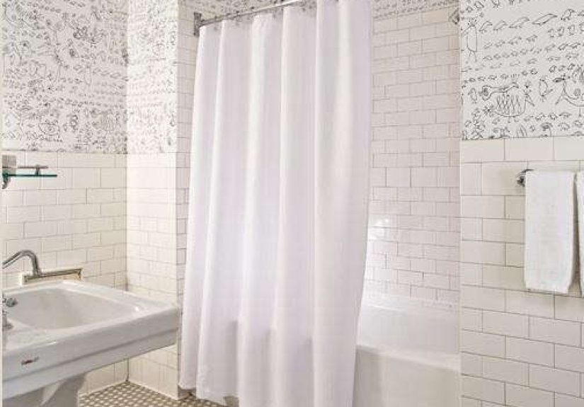
There are hotel bathrooms, and then there are hotel bathrooms that make you stand there for an extra minute, pretending you are “just checking the lighting” when in fact you are mentally redesigning your entire house. The bathroom at Soho Grand in New York belongs firmly in that second category. It is crisp, graphic, glamorous, and just mischievous enough to avoid feeling like a sterile showroom. In other words, it is what happens when a classic white bathroom moves downtown, develops good taste, and starts reading art books.
Originally shaped by designer William Sofield, the Soho Grand aesthetic has long been admired for blending old New York character with an artistic edge. In the bathrooms, that formula becomes especially clear: glossy white surfaces, vintage-minded fixtures, practical hotel-grade simplicity, and one major style wink in the form of illustrated wallpaper. The result is clean but not cold, elegant but not precious, and polished without slipping into that “please don’t touch anything” luxury. It feels lived in, loved, and slightly smarter than the average bathroom.
If you want to steal this look at home, the good news is that you do not need penthouse square footage, a celebrity budget, or a butler named Sebastian. What you do need is a clear design hierarchy. The Soho Grand bathroom works because every element plays a role. The tile brings order. The wallpaper brings wit. The chrome brings shine. The floor adds rhythm. And the whole room understands the power of restraint. Nothing screams for attention, yet the room is impossible to forget.
Why the Soho Grand Bathroom Still Looks So Good
Some bathrooms age like milk. Others age like a black blazer: not flashy, not trendy, just stubbornly chic. The Soho Grand bath falls into the second camp because it is built on timeless ingredients. White subway tile has staying power because it is durable, light-reflective, and easy to pair with almost anything. A hex mosaic floor adds that old-school New York note that instantly makes a room feel grounded and architectural. A pedestal sink keeps the silhouette open and unfussy. Then, just when the space risks becoming too polite, the wallpaper arrives and says, “Relax, darling, we have personality.”
That combination matters. Plenty of bathrooms do “classic.” Plenty of bathrooms do “bold.” Very few do both without looking confused. Soho Grand’s version succeeds because the base is practical and disciplined, while the decorative layer is witty and memorable. It is not maximalism. It is not minimalism. It is controlled charisma.
There is also something deeply New York about the look. It nods to older city bathrooms with their tile-heavy envelopes and compact planning, but it filters that history through a boutique-hotel lens. The room feels like it understands cast iron, newspaper cartoons, downtown lofts, and excellent martinis. That is a narrow emotional niche, sure, but it is a fun one.
The Signature Elements That Define the Look
1. Glossy white subway tile
The tile is the visual backbone. In a Soho Grand-inspired bathroom, white subway tile is not background filler; it is the steady beat that keeps the whole song together. Glossy tile bounces light around the room, making even a small bath feel brighter and more composed. It also gives you that hotel-grade sense of cleanliness, which is exactly what you want in a space dedicated to soap, steam, and your ongoing war with hard water.
Classic running bond installation works beautifully here, though you can push the look slightly more tailored with neat grout lines and careful transitions at the edges. The point is not to reinvent subway tile. The point is to use it with conviction. Soho Grand proves that a classic can still feel sharp when surrounded by the right supporting cast.
2. A hex mosaic floor with vintage energy
If the walls are the tailored white shirt, the floor is the patterned tie. Hex mosaic tile brings movement and history to the room without overwhelming it. It references old urban bathrooms in the best possible way: classic, hardworking, and just decorative enough to keep the eye entertained. A soft black-and-white or gray-and-cream palette tends to work best if you want the floor to feel period-aware instead of overly precious.
This is also one of the smartest ways to make a white bathroom feel layered. Without the mosaic floor, the room could drift into “nice but forgettable.” With it, the space gains texture, rhythm, and a bit of swagger.
3. Graphic wallpaper that adds the joke
The most memorable part of the Soho Grand bathroom is the illustrated wallpaper associated with Saul Steinberg’s work. It gives the room a jazzy, kinetic edge that saves the all-white palette from looking too clean-cut. This is the design equivalent of rolling up the sleeves on a formal shirt. Suddenly the whole thing loosens up.
If you are recreating the look, you do not have to track down the exact paper. What matters is the mood: black-and-white, sketch-like, intelligent, slightly quirky, and more graphic than floral. Avoid anything too sweet or too rustic. This bathroom is witty, not whimsical. It wants line drawings, visual rhythm, and a downtown point of view.
Wallpaper also helps bridge the gap between bathroom utility and hotel fantasy. Tile says, “I am practical.” Wallpaper says, “I contain multitudes.” Put them together, and the room starts telling a story.
4. A pedestal sink and polished metal faucet
The sink area in this style should feel lean and elegant. A pedestal sink is especially effective because it keeps the footprint visually open and lets the tile, wallpaper, and lighting breathe. It also reinforces the hotel vibe. Vanities are useful, yes, but pedestals have that old-school hospitality polish that instantly feels more tailored.
Pair the sink with polished chrome or polished nickel hardware. This is not the place for chunky matte black industrial fittings or rustic oil-rubbed bronze. The Soho Grand mood is cleaner, glossier, and a little more dressed up. The metal should catch light without becoming flashy.
If storage is a concern, and it usually is because real people own things, you can compromise by using a slender vanity with legs or a console sink that preserves some visual openness. The key is to avoid anything bulky. This look likes breathing room.
5. Mirror, sconces, and one slim shelf
Small details do a lot of heavy lifting here. A simple framed mirror in metal, flanked by or paired with well-scaled sconces, creates that elegant boutique-hotel symmetry. This is one of the easiest ways to elevate an ordinary bathroom without moving a single pipe. Good lighting makes every tile look more expensive and every morning feel slightly less rude.
A narrow glass or metal shelf is another subtle but important move. It offers just enough utility for soap, a tumbler, or a candle without cluttering the sink area. Again, the trick is editing. Soho Grand style is not about adding fifty cute objects. It is about choosing six good ones and letting them breathe.
6. Crisp white textiles and disciplined accessories
The shower curtain should be bright white and simple. Not ruffled. Not monogrammed. Not covered in inspirational language about bubbles and blessings. Just white. Let the wallpaper do the talking. Likewise, towels should feel plush but restrained. White is best, charcoal is acceptable, and neon tropical stripes should probably sit this one out.
Accessories should look collected but not fussy: a handsome mug for grooming tools, a glass jar, a tray, maybe a small dish for jewelry. This is a bathroom, not a gift shop. Every extra item should earn its keep.
How to Recreate the Soho Grand Bathroom at Home
Start with the shell. If you are remodeling, choose glossy white subway tile for the wet areas and a small-scale hex or mosaic tile for the floor. These two moves establish the vintage-meets-hotel foundation immediately. From there, layer in polished metal fixtures, a sink with a clean profile, and lighting that feels tailored rather than trendy.
Next, choose your wallpaper carefully. This is the moment that determines whether your bathroom feels merely nice or genuinely memorable. Go for something graphic, high-contrast, and urban in mood. Think illustrated, linear, or artful. Think less “garden party” and more “downtown gallery opening where someone wears enormous glasses and somehow pulls it off.”
Then focus on proportion. One reason the Soho Grand look works so well is that nothing in the room tries too hard. The mirror is not too grand. The sink is not too chunky. The shelf is not too long. The room reads as composed because the pieces feel scaled to the space. Measure carefully, especially in a smaller bathroom, where one oversized fixture can make the whole room feel cramped and clumsy.
If you are working on a budget, prioritize the elements people actually notice. Wallpaper, lighting, mirror, and textiles will usually transform the room faster than replacing every single fitting. You can also keep standard white tile affordable while spending more on one great faucet or one standout wall covering. That is a very Soho Grand move, actually: disciplined basics with one sly flourish.
Common Mistakes That Miss the Mark
The biggest mistake is making the room too busy. Because the Soho Grand bathroom includes both tile and wallpaper, it is easy to assume more is more. It is not. You do not need ornate mirrors, loud rugs, sculptural stools, scented bead curtains, and seventeen tiny framed prints. Pick your hero elements and stop there.
Another mistake is choosing the wrong kind of wallpaper. If it feels overly cute, heavily floral, or aggressively farmhouse, the room will lose its downtown intelligence. The Soho Grand look needs a little bite. It should feel crisp, graphic, and just a touch irreverent.
Finally, do not ignore lighting. A beautifully tiled bathroom with bad lighting is like a great outfit under supermarket fluorescents. Tragic. Use sconces or flattering layered light and give the room the glow it deserves.
Why This Look Still Works in 2026
Design trends come and go, and subway tile occasionally gets dragged into online debates as if it personally offended someone. But the Soho Grand bathroom is a useful reminder that materials are not the whole story. Context is everything. White subway tile on its own can feel basic. White subway tile paired with hex flooring, polished fixtures, and clever wallpaper feels intentional, tailored, and enduring.
That is why this bathroom still lands. It does not chase novelty for novelty’s sake. It builds a timeless envelope, then injects personality in a measured way. Homeowners can learn a lot from that. When the bones are classic, you can refresh the attitude without gutting the room every five years. Your budget will thank you. Your grout may still complain, but your budget will not.
The Experience of a Soho Grand-Style Bathroom
What makes this look so appealing is not just how it photographs. It is how it feels when you are actually in it. Imagine coming in from a loud New York street, your brain still vibrating from traffic, conversations, espresso, and whatever mysterious city soundtrack is playing outside. Then you step into a bathroom that is bright, ordered, and cool without being icy. The white tile immediately settles the room. The floor pattern gives your eye somewhere to land. The metal catches the light. The wallpaper makes you smile. Suddenly, the whole space functions like a pause button.
That is the magic of a well-designed hotel bathroom: it turns routine into ritual. Washing your face feels more deliberate. Folding a towel feels oddly satisfying. Even setting down your watch on a little shelf feels cinematic, which is ridiculous, of course, but also delightful. A Soho Grand-inspired bathroom captures that exact mood. It is not trying to be a spa in the usual beige-and-bamboo sense. It is more urban than that, more tailored, more awake. It says luxury can be crisp, clever, and slightly playful.
There is also a confidence to the space that many home bathrooms lack. It does not over-explain itself. It does not beg for compliments. It simply knows what it is. The tile says classic. The wallpaper says artistic. The fixtures say polished. Together, they create a room that feels collected rather than assembled from a panic scroll through twelve online carts at midnight.
And that confidence changes how you move through the room. In the morning, the space feels energizing because the palette is clean and the graphic lines are sharp. At night, the same room can feel moody and cocooning under softer light, especially if the sconces cast a warm glow across the wallpaper and mirror. It is surprisingly versatile that way. You get discipline by day, atmosphere by night, and a little downtown glamour all the time.
For guests, this kind of bathroom is memorable because it feels intentional. People may not remember the exact faucet model or the brand of tile, but they remember the overall impression. They remember that the room felt cool. They remember that it looked expensive without being flashy. They remember the wallpaper because, let’s be honest, good wallpaper is the design world’s equivalent of a great line in a movie: it sticks.
For homeowners, the experience is even better because it makes an everyday room feel special without requiring absurd maintenance or impossible styling. The materials are hardworking. The palette is forgiving. The personality comes from a few smart decisions rather than endless decoration. That means the room can still function like a real bathroom, with steam, damp towels, and actual humans in it, while delivering that boutique-hotel thrill.
In the end, that may be the real lesson of the Soho Grand bathroom. A beautiful room does not need to be louder. It needs to be clearer. Give it a strong foundation, one or two unforgettable gestures, and enough confidence to let the rest stay simple. That is how you create a bathroom that feels like New York: stylish, self-aware, and a little bit impossible to stop thinking about.
Final Take
If you want to steal the Soho Grand bathroom look, do not get distracted by trying to copy every object down to the soap dish. Copy the formula instead. Build a clean white envelope. Add a vintage-minded floor. Bring in polished metal and elegant lighting. Then finish with wallpaper that has brains, humor, and just enough attitude to keep the room from behaving too well. That is the real secret.
Done right, this style gives you a bathroom that feels both classic and current, both practical and dramatic. It is not a trend trap. It is a mood. And frankly, if your bathroom can make you feel like the main character while brushing your teeth, that seems like a pretty good investment.