Table of Contents >> Show >> Hide
- Why Belgian Interiors Still Matter
- Axel Vervoordt: The Patron Saint of Quiet Rooms
- Vincent Van Duysen: Minimalism with a Pulse
- Dries Van Noten: Proof That Belgian Interiors Can Love Color
- Ann Demeulemeester and the Poetics of the Object
- The Belgian Counterargument: Color, Play, and Personality
- What American Homes Keep Borrowing from Belgium
- 500 More Words on the Experience of Belgian Interiors
- Conclusion
Some interiors whisper. Belgian interiors, at their best, practically meditate. They do not beg for attention with neon bravado or a chandelier the size of a moon landing. Instead, they work through atmosphere: chalky walls, weathered wood, linen that looks better wrinkled, and rooms that feel as though they were discovered rather than aggressively decorated. That moodquiet, soulful, edited to within an inch of perfection and then loosened up againhas made Belgian designers essential study for anyone who cares about interiors.
And that is why Belgian designers and their interiors deserve the label required reading. Not because every house should look like a monastery with excellent taste, but because Belgian creatives have mastered something harder than decorating: they know how to make restraint feel emotional. In a design culture that often swings between maximalist fever dream and sterile showroom minimalism, Belgian interiors offer a third way. They are spare, yes, but never cold. They are refined, but not prissy. They are serious about materials and proportion, yet relaxed enough to let a room breathe.
This is the lesson plan: study Axel Vervoordt for serenity and patina, Vincent Van Duysen for disciplined warmth, Dries Van Noten for color and cultivated eccentricity, Ann Demeulemeester for poetic objects, and the younger wave for proof that Belgian design is not all beige with a side of existential fog. Read them closely and you begin to understand why Belgian interiors have influenced everyone from luxury hoteliers to American homeowners who suddenly feel very strongly about limewash.
Why Belgian Interiors Still Matter
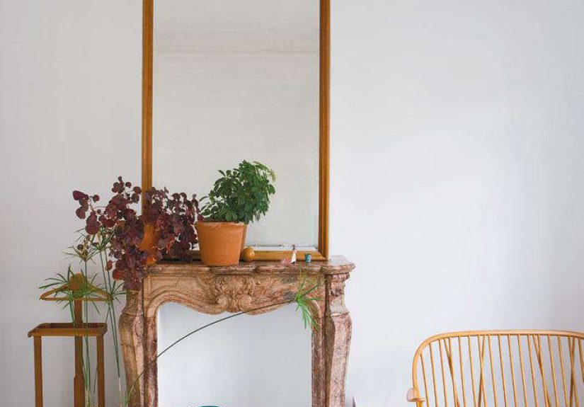
Belgian interiors remain influential because they solve a modern problem: how to create rooms that feel elevated without feeling fake. The Belgian approach starts with honesty. Materials should look like themselves. Wood should show its grain. Stone should keep its irregularities. Linen should not pretend to be silk on its best behavior. Plaster should have texture. Antiques should be allowed to age with dignity rather than being polished into oblivion like a nervous wedding speech.
Just as important, Belgian interiors understand that emptiness is not the enemy. Space is part of the composition. A room does not need fifty decorative objects to prove it has a personality. Sometimes one rough-hewn table, one sculptural lamp, one worn bench, and one very good bowl are enough. It is the design equivalent of someone speaking softly and still owning the room.
That idea has traveled especially well in the United States, where designers and editors have long admired Belgian rooms for their balance of old and new, rustic and refined, monastic and livable. The style’s signatureslimewashed walls, oversized slipcovered seating, muted earth tones, understated luxury, and reverence for craftsmanshiphave become part of the global design vocabulary. But the best Belgian interiors are not a formula. They are a mindset.
Axel Vervoordt: The Patron Saint of Quiet Rooms
If Belgian interior design had a high priest, Axel Vervoordt would be standing in a linen shirt somewhere near an ancient wooden table, adjusting a branch in a ceramic vessel until the universe felt properly aligned. Vervoordt’s genius is not merely that he mixes antiques with contemporary art. Plenty of people do that. His brilliance lies in making those combinations feel inevitable.
His interiors are famous for pigment-washed walls, long tables, weathered surfaces, restrained palettes, and a mood that suggests time itself has been invited in for tea. In a Vervoordt room, a contemporary painting can sit beside an archaeological fragment and somehow neither one looks like it is trying too hard. The room feels collected, not staged. It feels lived with, not merely looked at.
That “found, not made” quality is central to Vervoordt’s influence. He treats interior design less as a shopping exercise and more as a search for spiritual equilibrium. That may sound dramatic for a discussion involving sofas, but then you see the rooms. They have gravity. They make silence feel luxurious. They make many other interiors look like they had three espressos and a branding consultant.
What Designers Learn from Vervoordt
First, atmosphere matters as much as furniture. Second, patina is not damage; it is character. Third, the mix of ancient and modern can be transcendent when united by tone, scale, and restraint. And fourth, a house should reflect how you want to live, not how you want strangers on the internet to react for seven seconds before scrolling away.
American design culture has borrowed heavily from Vervoordt’s world: the pale, earthy palette; the reverence for old materials; the appetite for rooms that feel grounded rather than glamorous. His influence can be seen in countless “organic modern” interiors, although the copycats often miss the point. Vervoordt is not about trend-chasing minimalism. He is about emotional depth.
Vincent Van Duysen: Minimalism with a Pulse
Where Vervoordt is atmospheric and almost painterly, Vincent Van Duysen is architectural. His interiors are stripped down, but never sterile. He is often described as monastic, and that is fair as long as we remember this is a monastery with very good plaster, beautifully aged wood, and an elite grasp of proportion.
Van Duysen’s rooms are defined by precision: quiet lines, subdued colors, tactile finishes, and just enough softness to stop the whole thing from turning into an elegant punishment. He works in the space between rigor and comfort. The result is minimalism that people actually want to live in.
That distinction matters. A lot of minimalist interiors are admirable in the way glaciers are admirable: beautiful, majestic, and not where you want to relax with a blanket. Van Duysen avoids that trap by prioritizing texture and mood. Velvety plaster, matte wood, shadowy neutrals, and carefully controlled light do the emotional heavy lifting. His rooms are sparse, yet they feel full of intention.
The Van Duysen Lesson
Belgian design is often reduced to “neutral and natural,” but Van Duysen shows that the real magic lies in discipline. Every line counts. Every material choice matters. Nothing is included merely because it is fashionable. In his work, restraint is not an aesthetic gimmick. It is a method for making architecture, furnishings, and atmosphere speak the same language.
This explains why his influence stretches so well across residences, hotels, and product design. Whether he is shaping a home, a penthouse, or a hospitality project, the message is consistent: reduce noise, honor materials, build warmth through texture, and let stillness become a design feature instead of a design failure.
Dries Van Noten: Proof That Belgian Interiors Can Love Color
Now for the delightful plot twist. If Axel Vervoordt and Vincent Van Duysen represent Belgian restraint, Dries Van Noten reminds us that Belgian taste can also be lush, layered, and gloriously strange. His home and studio world suggests that restraint is not the only road to sophistication. The other road is lined with flowers, textiles, garden clippings, and a fearless eye for color harmony.
Van Noten’s interiors feel deeply personal. They are cultivated rather than decorated, filled with atmosphere, references, and visual rhythm. His rooms do not reject Belgian editing; they simply apply it differently. Instead of removing all visual stimulation, he arranges it with uncommon intelligence. Color appears, but it is never random. Pattern appears, but it is never chaotic. The effect is generous, layered, and deeply alive.
This is a crucial part of the Belgian story. Too many people think “Belgian interior” means one giant beige shrug. Van Noten proves otherwise. He shows how gardens, textiles, art, and floral abundance can coexist with discipline. His work makes the case that elegance does not require deprivation.
Why Van Noten Belongs in the Conversation
Because he broadens the definition of Belgian design. He connects fashion thinking to interiors, demonstrating how color, texture, and composition can create mood without tipping into visual chaos. His example also reveals something deeply Belgian: an obsession with nuance. Even when the palette is richer, the eye behind it remains exacting.
Ann Demeulemeester and the Poetics of the Object
Belgian design has always had a strong crossover between fashion, interiors, and objects, and Ann Demeulemeester is one of the clearest examples. Her contribution to the home is not about grand decorating gestures. It is about atmosphere built from objects: sharp cutlery, sculptural candleholders, glassware with a little tension in the line, pieces that feel both useful and lyrical.
Demeulemeester’s homeware sensibility translates the same qualities that defined her fashion work: mood, restraint, shadow, romance, and edge. In a world of cheerful tabletop collections that look designed by committee and focus group, her work feels wonderfully intentional. Slightly dark. Very elegant. The kind of objects that make plain bread and butter seem like a conceptual dinner party.
Her place in this Belgian reading list matters because interiors are not built by architecture alone. They are completed by the object world: glassware, lamps, ceramics, hardware, table settings, and those small elements that quietly determine whether a room feels generic or unmistakably itself.
The Belgian Counterargument: Color, Play, and Personality
To understand Belgian design fully, you also need to study the designers who push against its most famous stereotype. Enter Dries Otten, whose color-blocked kitchens and playful interiors reject the idea that Belgian rooms must always whisper in mushroom tones. Otten uses bold color, curved forms, stripes, and surprising materials with wit and confidence.
What makes his work especially interesting is that it is still recognizably Belgian in one key sense: it is thoughtful. Even when the palette gets louder, the composition stays controlled. There is functionality beneath the fun. The forms are whimsical, but not sloppy. It is a reminder that Belgian design culture is broader than the serene-linen-industrial-wood starter pack that social media sometimes sells.
Gert Voorjans belongs here too, representing another exuberant branch of Belgian taste. Antwerp itself helps explain why: it is a city where fashion, antiques, art, architecture, and commerce overlap in unusually fertile ways. That environment produces both editors and eccentrics, minimalists and maximalists, monks and magpies.
What American Homes Keep Borrowing from Belgium
The American fascination with Belgian interiors is not hard to understand. U.S. homeowners want rooms that feel calm but not boring, luxurious but not flashy, practical but still cultured. Belgian design delivers that with uncanny efficiency. It offers a form of softness that is more intellectual than cozy-cute. Less throw-pillow theater, more material intelligence.
The borrowings are now familiar: plaster walls, pale oak, limestone, vintage stools, generous linen upholstery, earthy neutrals, sculptural ceramics, and a preference for pieces that look handmade or timeworn. But the deeper borrowing is philosophical. Belgian designers taught American interiors to edit. To leave some walls alone. To let texture speak louder than color. To choose fewer pieces and choose them better.
That said, the best American interpretations avoid copying Belgian rooms item by item. The real lesson is not to recreate Antwerp in a suburban zip code. It is to understand why Belgian interiors work: clarity, patina, mood, honesty, and the confidence to stop before a room starts shouting.
500 More Words on the Experience of Belgian Interiors
To really understand Belgian interiors, you almost have to think less like a shopper and more like a visitor. Imagine walking into a room shaped by Belgian sensibilities for the first time. Nothing lunges at you. No sofa screams for applause. No coffee table is straining to become “the moment.” Instead, the room unfolds slowly. First you notice the light sliding across a plaster wall. Then the grain of an old table. Then the way a linen curtain softens the edge of a window. Ten minutes later, you realize the room has done something radical: it has calmed your brain down.
That experience is the secret power of Belgian interiors. They reward attention. In a loud visual culture, they make quiet feel rich. You begin to appreciate details that would be invisible in a busier room: the difference between chalky white and creamy white, the dignity of a chair that has aged well, the almost musical rhythm of rough and smooth surfaces placed together. It is not flashy design. It is cumulative design. The effect builds one texture, one shadow, one proportion at a time.
There is also an emotional honesty to these interiors that many trend-driven spaces lack. Belgian rooms often feel slightly imperfect in the best possible way. A vessel may be irregular. A beam may be weathered. A floor may look better because it is a little worn. These details make a house feel inhabited rather than performed. You do not get the sense that someone fluffed the room five minutes before you arrived and then hid in terror. The room seems settled in itself, which is more than can be said for a lot of modern life.
Another memorable part of the experience is how Belgian interiors shape behavior. People tend to slow down in them. Conversations become less frantic. Meals stretch longer. You sit differently in a room that is this composed. You pay attention to the table, the light, the objects, the mood. This is not because Belgian design is precious. Quite the opposite. It is because the environment has been edited so well that it leaves space for living. The room is not competing with the people inside it.
And then there is the surprise many first-time observers feel: Belgian interiors are warmer than expected. On paper, a palette of stone, flax, ash, and mud sounds like a very stylish weather report. In person, though, those tones can feel deeply comforting. The warmth comes from material truth, from hand-finished surfaces, from texture layered against texture. It comes from the confidence to let a room be quiet without making it feel empty. That is not easy to pull off, which is exactly why these designers remain worth studying.
So yes, Belgian interiors are beautiful. But the more interesting point is how they make beauty behave. They pull it away from spectacle and return it to atmosphere, ritual, touch, and time. They remind us that a great room does not always need more. Sometimes it needs better editing, better materials, better light, and a little more courage to leave things unresolved. That is the experience Belgian designers offer, and it is why their work still reads as both timeless and unexpectedly modern.
Conclusion
Belgian designers matter because they understand that interiors are not just visual arrangements. They are emotional settings. Axel Vervoordt teaches the value of stillness and patina. Vincent Van Duysen shows how minimalism can feel warm and deeply human. Dries Van Noten proves that richness and restraint can coexist. Ann Demeulemeester reminds us that objects carry poetry. Dries Otten and others keep the story from hardening into stereotype.
Taken together, they form a design education in atmosphere, editing, and authenticity. That is why Belgian designers and their interiors remain required reading. Not because everyone should copy them, but because everyone can learn from them. Especially anyone who has ever stared at a room and thought, “Why does this look expensive, but feel exhausted?” The Belgian answer is usually the same: fewer things, better things, real materials, more soul.