Table of Contents >> Show >> Hide
- What makes Penrose-style tiles so fascinating?
- A quick honesty break: Penrose tilings, wave tiles, and the internet’s naming habits
- Why 3D printing is such a good match for this project
- How to make them look good instead of merely “technically printed”
- Where these tiles work best in a home
- Why they make such a strong conversation starter
- Common mistakes to avoid
- How to style them so they feel intentional
- Experience section: what it is actually like to print, arrange, and live with these tiles
- Final thoughts
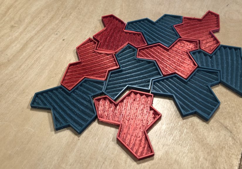
Some home decor whispers politely. Penrose wave tiles walk into the room, adjust their imaginary glasses, and say, “Would you like to discuss geometry over coffee?” That is the charm of these mathematically inspired tiles. They are decorative, brainy, a little mischievous, and almost absurdly good at making guests ask questions.
If you enjoy projects that live at the intersection of math, art, and maker culture, printing your own Penrose-style wave tiles is a delight. You get the visual payoff of a pattern that feels organized without looking predictable, plus the satisfaction of making something that does not resemble another beige rectangle from a big-box store. In other words, it is custom decor with a secret superpower: it gives people something to talk about besides the weather and whether the guacamole is “a little extra.”
What makes Penrose-style tiles so fascinating?
The magic starts with the idea of aperiodic tiling. In plain English, that means a pattern can spread across a surface without gaps or overlaps, yet it never repeats in the regular wallpaper way your brain expects. Traditional tiling loves repetition. Squares repeat. Rectangles repeat. Hexagons repeat. Penrose-style systems do something sneakier. They create order without falling into a simple loop.
That odd balance is why these tiles feel so alive. Your eye recognizes harmony, but it cannot settle into a dull rhythm. The result is visual motion without chaos. It looks deliberate, intricate, and almost impossible, which is exactly why it works so well as a conversation piece. People do not just glance at it. They linger. They squint. They point. Someone eventually says, “Wait, does that pattern repeat?” and that is when the fun begins.
There is also a deeper story behind the beauty. Penrose tilings became famous because they showed mathematicians and scientists that a pattern could have long-range order without regular translational repetition. Later, that idea became important in understanding quasicrystals, materials whose atomic arrangements also show organized structure without behaving like ordinary repeating crystals. So yes, the thing on your coffee table can absolutely lead to a sentence that includes “materials science.” That is not a bug. That is a feature.
A quick honesty break: Penrose tilings, wave tiles, and the internet’s naming habits
Because the web is the web, not every maker project uses tiling terminology with mathematical precision. The catchy phrase “Penrose wave tiles” often gets used loosely for eye-catching, non-repeating printable tiles. Strictly speaking, classic Penrose tilings usually refer to famous aperiodic systems built from families like kites and darts or thick and thin rhombs. More recent viral geometry projects sometimes lean into the look and spirit of Penrose-style non-repetition while actually drawing from the newer family of aperiodic monotiles, including the much-discussed “hat” tile.
Does that ruin the project? Not even slightly. For a decor-maker article, the useful takeaway is this: you are printing tiles inspired by the same irresistible idea of structured non-repetition. The technical family tree matters if you are writing a math paper. For a shelf, wall, or tabletop display, what matters is that the pattern feels intelligent, unusual, and handmade.
Why 3D printing is such a good match for this project
This is one of those rare projects that feels born for a desktop 3D printer. The shapes can be precise, repeatable, and easy to scale. You can print a small test piece before committing to a full set. You can play with wave textures, raised rims, color changes, and layered finishes. You can make half a dozen tiles for a framed art panel or fifty for a larger installation if your printer, patience, and coffee supply all remain cooperative.
PLA is usually the easiest starting material, and for good reason. It is beginner-friendly, widely available, and comes in enough colors and surface effects to make even restrained adults behave like overly excited kindergarten art teachers. Matte PLA can look refined. Silk PLA can look dramatic. Speckled PLA can make the tiles feel almost ceramic from a distance. If your goal is decorative wall art or tabletop display, PLA is often the sweet spot between easy printing and attractive finish.
That said, these are best treated as decorative pieces, not high-abuse building materials. A plastic print can look fantastic on a wall, in a frame, on a tray, or under glass. But as actual floor tile? That is the part where the idea turns from “conversation starter” into “household liability.” Decorative use is the smart lane.
How to make them look good instead of merely “technically printed”
1. Prioritize surface quality
Penrose-style tiles succeed because the eye studies them up close. That means the finish matters. Use a quality print profile, slow down enough for clean top layers, and avoid rushing the first layer like you are trying to catch the last train home. A neat surface gives the pattern authority. A rough surface gives it “prototype left on the printer at 2 a.m.” energy.
2. Give the design enough thickness
Thin, flat pieces can print quickly, but they also risk curling, flexing, or feeling flimsy. For decorative tiles, enough wall thickness makes a big difference. You want a piece that feels intentional in the hand, not like an edible cracker that accidentally learned CAD.
3. Use texture strategically
The “wave” concept works because it adds depth to a pattern that is already visually rich. Instead of printing a plain flat polygon, the internal wave texture gives light something to do. Shadows move across the surface. The tile changes personality depending on where it sits and how the room is lit. Morning light makes it crisp. Lamplight makes it moody. Harsh noon sunlight makes it look like it has a PhD and opinions about symmetry.
4. Think in sets, not single pieces
One tile is interesting. A cluster is where the story really starts. Even a small arrangement of six to twelve pieces can create the non-repeating feel that makes people stop and stare. If you want the “Wait, how is this working?” reaction, you need enough tiles to let the eye wander.
5. Choose colors like a grown-up with impulse control
Black and white is timeless and graphic. Monochrome neutrals feel architectural. Earth tones can make the pattern feel warmer and less “museum gift shop in a good way.” Metallics or pearlescent filaments can look incredible, but use them with care. One dramatic filament choice can look sophisticated. Four dramatic filament choices together can look like the tiles won a talent show and never recovered emotionally.
Where these tiles work best in a home
The beauty of Penrose-style wave tiles is that they can function as either a focal point or a supporting accent. They are flexible that way.
Framed wall art
This is probably the easiest win. Print a cluster, mount it on a contrasting backing board, and frame it like geometric sculpture. Because the pattern resists repetition, it feels richer than ordinary wall art made from repeated shapes. It also works beautifully in small apartments, offices, and entryways where every object needs to earn its square footage.
Coffee table or console display
Loose tiles arranged on a tray can make a tabletop feel curated rather than cluttered. They read as both object and puzzle. Guests will absolutely pick one up. This is the decor equivalent of setting out a really good art book, except lighter and more likely to trigger a debate about whether math is beautiful.
Desk decor for home offices
If you work from home, these tiles do something rare: they make your background look smart without screaming for attention. On camera, they suggest creativity and intention. Off camera, they give your eyes somewhere pleasant to land during moments of digital despair.
Under-glass inserts
Want a safer, more finished application? Arrange the tiles under glass on a side table, desktop, or shadow-box panel. You get the visual complexity and protection at the same time. The pattern stays crisp, dusting becomes less annoying, and nobody “accidentally helps” by rearranging your hard-won composition.
Why they make such a strong conversation starter
Great conversation pieces usually do three things. First, they catch the eye. Second, they invite a closer look. Third, they reward curiosity with a story. Penrose-style wave tiles check all three boxes.
Visually, the geometry grabs attention because it feels both ancient and futuristic. It can remind people of Islamic geometric art, modernist pattern design, science-center exhibits, or some mysterious artifact from a future civilization that apparently had excellent taste in wall decor. Conceptually, the story gets even better: the pattern is ordered but non-repeating, linked to serious mathematical ideas, and connected to the same big picture that helped scientists think about quasicrystals. Not bad for something that started life as a spool of filament and an overconfident slicing profile.
There is also a tactile angle. Many decor items are “look, don’t touch.” These tiles invite handling. Their edges, texture, and interrelationship make people want to test how they fit. That physical engagement matters. Once people touch an object, the conversation usually becomes more animated and memorable.
Common mistakes to avoid
Confusing complexity with clutter
The pattern already brings a lot of energy. If you surround it with too many busy finishes, loud fabrics, or unrelated statement objects, the room can feel visually overcaffeinated. Give the tiles a little breathing room.
Printing too few test pieces
Before printing a whole army of tiles, print one or two samples. Check the fit, the finish, the scale, and the texture depth. It is much better to discover that your “elegant sculptural wave” looks like lasagna ridges after two tiles instead of twenty-six.
Using the wrong application
Decorative tiles are wonderful. Heat, moisture, heavy abrasion, and high-traffic flooring are less wonderful. If you are working with standard PLA, think art object, not industrial material.
Ignoring lighting
Wave textures live or die by shadow. Good side lighting makes them sing. Flat overhead lighting can make them look less dramatic. If you are creating a display panel, test the piece where it will actually live before declaring victory.
How to style them so they feel intentional
If your room is already minimal, Penrose-style wave tiles can act as the hero piece. Let them be the star. Use simple furnishings around them, and the geometry will do the heavy lifting.
If your room already has personality, use the tiles as a controlled counterpoint. Geometric patterns often shine when paired with solid colors, natural wood, metal, or smooth wall surfaces. That contrast keeps the composition balanced. The pattern feels sharper when it is not competing with six other visual monologues.
Scale matters too. Tiny tiles can feel fussy if they are meant to be viewed from across the room. Larger tiles often work better for statement art, while smaller versions are excellent for desk pieces, coasters, or teaching tools. Think about viewing distance. You are not just making shapes. You are making an experience.
Experience section: what it is actually like to print, arrange, and live with these tiles
The most fun part of a Penrose-style wave tile project is that it changes character at every stage. On the screen, it looks like a clever geometry exercise. On the print bed, it becomes a tiny manufacturing drama where you suddenly care deeply about first-layer squish and whether the corners behave. In your hand, it turns into a tactile object that feels more substantial than expected. And once several pieces are arranged together, it starts acting like decor with a personality.
The first experience most people notice is surprise. You expect a pattern piece. What you get is something more interactive. Even a single tile has presence because the waves catch light in a way flat graphics cannot. Then you print a second tile, then a third, and suddenly you are not just making parts. You are building a language. The pieces begin to talk to each other. Rotate one tile and the composition shifts. Swap colors and the whole mood changes. Spread them out and they feel airy. Pack them tighter and they feel almost architectural.
Then comes the guest test, which is where these tiles earn their keep. People rarely ignore them. Some want to know if they are ceramic. Some ask whether the pattern is historical. Some assume they are puzzle pieces and immediately try to solve them like a very stylish emergency. Others ask the best possible question: “How did you make this?” That is a wonderful kind of interaction because the object opens the door to creativity, math, design, and making things by hand, all at once.
There is also a quieter experience that happens after the novelty wears off. Good geometric decor does not become invisible as fast as ordinary objects. The tiles keep offering small rewards. A different shadow in the afternoon. A new mini-pattern you did not notice before. A better arrangement after you shift three pieces by half an inch. They have that rare quality of feeling stable but never stale.
Printing them can be calming, too. There is something satisfying about turning abstract theory into repeatable physical form. You start with an idea that sounds loftyaperiodic tiling, non-repeating order, mathematical structureand end with a very concrete result sitting on your desk. It is an appealing reminder that math is not trapped in textbooks. It can become texture, color, object, and atmosphere.
Perhaps the most memorable part of the whole experience is that these tiles make people feel smarter just by standing near them. Not in a snobbish way. In an inviting way. They encourage curiosity. They tell visitors that the room belongs to someone who likes beauty with a side of ideas. They also signal that handmade things can be elegant, and that a desktop 3D printer is not just for brackets, clips, and mystery plastic objects nobody in the household can identify.
In the end, living with Penrose-style wave tiles feels less like owning decor and more like hosting a tiny ongoing exhibit. Sometimes they are art. Sometimes they are a puzzle. Sometimes they are a lesson in symmetry, asymmetry, and visual rhythm. Most of the time, they are simply delightful. And in a world stuffed with mass-produced sameness, delight is not a small thing.
Final thoughts
Printing yourself a set of Penrose-style wave tiles is the kind of project that rewards both curiosity and taste. It gives you a mathematically rich pattern, a customizable decor piece, and a built-in story people genuinely want to hear. It is part maker project, part design experiment, and part social lubricant for anyone who has ever wanted their wall art to say something more interesting than “I was on sale.”
If you want decor that looks smart, feels handmade, and invites people to lean in for a second look, this project absolutely delivers. Print a set, frame a panel, arrange a tabletop cluster, and enjoy the moment when someone says, “Hold on… why doesn’t this repeat?” Congratulations. Your decor has officially started the conversation for you.