Table of Contents >> Show >> Hide
- What Makes a Movie Poster Minimalist?
- A Short History of Minimalist Movie Posters
- Why Film Nerds Are Obsessed With Minimalist Posters
- Iconic Minimalist Posters Film Nerds Love
- How to Read a Minimalist Poster Like a True Film Nerd
- How to Start Your Own Minimalist Poster Collection
- Want to Design Your Own Minimalist Movie Posters?
- Real-Life Experiences: Living With Minimalist Movie Posters
- Conclusion
If you’re the kind of film nerd who owns more director’s cuts than pairs of shoes, minimalist movie posters are basically wall candy. They’re clever, stylish, and just cryptic enough that only fellow cinema obsessives will “get it.” Forget giant floating faces and explosions minimalist posters whisper the story instead of shouting it.
This style of movie art strips a film down to one sharp idea: a single color, a tiny symbol, a simple line. The fun part? Your brain fills in the rest. For film fans, that’s irresistible. It turns your living room into a quiet trivia game where the prize is bragging rights and the occasional “Wow, nice poster.”
What Makes a Movie Poster Minimalist?
Minimalism isn’t about doing less work it’s about doing smarter work. A minimalist movie poster uses fewer elements, but every element has a job. Instead of throwing in every character and plot point, the designer chooses one core visual idea and runs with it.
Core Principles of Minimalist Movie Posters
- Simplicity of shapes: Think clean silhouettes, basic geometry, and simple icons. A circle, a line, and a block of color can say “space epic” better than a busy collage.
- Limited color palettes: Many minimalist posters stick to two or three colors. Strong contrasts make the design pop from across the room.
- Negative space: Empty space is not wasted space. It directs your eye to what matters and gives the design that calm, high-end look.
- Symbolism over literal scenes: Instead of showing the hero’s face, a minimalist poster might use one prop, one shape, or one moment that captures the film’s essence.
- Typography as a design element: The title font, size, and placement become part of the composition, not an afterthought slapped on at the end.
Done right, a minimalist poster feels like a visual haiku: short, simple, and surprisingly emotional.
A Short History of Minimalist Movie Posters
Minimalist movie posters may feel like a very “internet era” thing, but the roots go back much further. Early 20th-century poster artists were already simplifying forms, flattening color, and relying on bold shapes to sell everything from bicycles to silent films.
Art movements like Art Deco and later modernist design pushed posters toward stronger geometry and cleaner layouts. By the 1960s and 1970s, designers were experimenting with stripped-down imagery and bolder color blocking. In the 1980s, some movie campaigns leaned into minimalism with memorable one-image concepts: a single symbol, a powerful silhouette, or a stark visual pun.
The current wave of minimalist movie posters really exploded online. Designers and illustrators began reimagining classic films as fan-made posters not official studio art, but passion projects. These designs spread on blogs, Tumblr, Pinterest, Reddit, and design portfolios, turning “minimal movie poster” into its own micro-genre of fan art and commercial prints.
Why Film Nerds Are Obsessed With Minimalist Posters
Minimalist movie posters and film nerds are a perfect match. Here’s why this style hits so hard for people who quote directors the way others quote sports stats:
1. They’re Built on Inside Jokes
A minimalist design usually hinges on one reference: the spinning top from a mind-bending sci-fi thriller, a red balloon from a horror classic, a yellow road for an iconic fantasy quest. If you recognize it, you’re instantly in the club. If you don’t, the poster just looks cool and mysterious.
2. They Reward Rewatchers
Some designs reference small details you only notice after multiple viewings background props, side characters, brief moments. That reward loop is catnip for cinephiles who love picking apart scenes frame by frame.
3. They Look Great in Grown-Up Spaces
Minimalist posters let you decorate with fandom without turning your home into a dorm room. Clean lines and tasteful color schemes mean you can hang them in the living room, office, or bedroom and still look like someone who pays taxes on time.
4. They Tell You a Lot About the Owner
Which movies someone chooses to display says a lot about their taste. A wall of minimalist posters can reveal if you’re more “arthouse and foreign language” or “comic books and cult sci-fi.” It’s a personality test in gallery form.
Iconic Minimalist Posters Film Nerds Love
There are thousands of minimalist redesigns out there, but a few ideas show up again and again because they’re just too good:
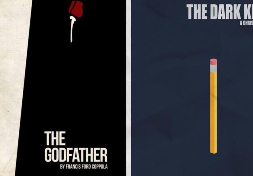
- The lone object poster: One unforgettable prop a ball, a glove, a ticket, a shark fin centered on a plain background. It’s like an instant memory shortcut to the movie.
- The abstract scene poster: A movie’s key moment broken into simple shapes: a staircase made of rectangles, a beam of light, a road vanishing into darkness.
- The “poster as puzzle” design: Cryptic posters that challenge you to guess the movie with as little information as possible. Perfect for film-quiz nights.
- The director tribute set: A whole series dedicated to one filmmaker, using consistent colors and layout for every film. Line them up and your wall becomes a mini retrospective.
Many creators release full collections of these designs entire careers boiled down into clean, clever visuals. For collectors, that’s dangerously tempting. “I’ll just get one” turns into “I guess I own twelve now.”
How to Read a Minimalist Poster Like a True Film Nerd
Minimalist posters may look simple, but they’re loaded with meaning. Next time you see one, try breaking it down like a critic:
1. Start With the Color
Is the poster using warm tones, cold tones, or a stark black-and-white scheme? Color can echo the movie’s emotion: bright, saturated palettes for comedies or adventures; desaturated or monochrome for serious dramas and thrillers.
2. Find the Focal Point
Most minimalist posters have one clear focal element: a shape, character silhouette, or symbol. Ask yourself: why this object? Why this moment? It’s almost always referencing a major theme or turning point.
3. Pay Attention to Space
Where is the object placed dead center, near the edge, tiny at the bottom? Lots of empty space can make a subject feel isolated, threatened, or monumental.
4. Read the Typography
The font choice and layout aren’t random. A hand-lettered script might hint at nostalgia or romance. A bold condensed font might suggest action or intensity. Sometimes the type interacts with the artwork, creating visual wordplay.
5. Notice What’s Missing
Minimalism is as much about subtraction as addition. No faces, no explosions, no tagline what does that absence say? Often, it shifts focus from the actors to the story or the mood.
Once you start reading posters this way, every new design becomes a mini film-studies exercise.
How to Start Your Own Minimalist Poster Collection
If your walls are as blank as a theater screen before the previews, minimalist posters are an easy way to add personality. Here’s how to build a collection you’ll actually love long-term:
1. Pick a Theme
Instead of buying random designs, choose a through line:
- One director (e.g., a full set of a favorite auteur’s films)
- One genre (sci-fi, horror, rom-coms, animation)
- One era (1980s classics, 1990s indies, early 2000s blockbusters)
- One visual motif (all black-and-white, all circle-based designs, all red accents)
That theme will make your wall look curated, not chaotic.
2. Mix Fan Art and Official Prints
Plenty of artists sell minimalist prints through online marketplaces, galleries, and print-on-demand shops. Some studios also release official minimalist variants for special editions or re-releases. Mixing both gives your collection personality and variety.
3. Invest in Framing (Your Posters Deserve It)
A clean black or natural wood frame turns a simple print into “actual art.” For a cohesive gallery wall, use the same frame style and size for your whole set. It also protects your posters from fading and creasing essential if you’re building a long-term collection.
4. Curate the Layout Like a Gallery
Hang posters at eye level and leave breathing room between them. Minimalist designs look best when they’re not crammed together. Consider a grid layout, a clean row above a sofa, or a vertical pair near a bookshelf.
Want to Design Your Own Minimalist Movie Posters?
You don’t have to be a professional designer to make a minimalist movie poster. You just need a basic design tool, a clear concept, and a willingness to delete anything that isn’t essential.
1. Choose One Core Idea From the Film
Ask yourself: if I had to represent this movie with a single object, shape, or moment, what would it be? It might be a prop (a ring, a mask, a letter), a location (a road, a staircase, a doorway), or an abstract idea (a pattern, a symbol, a color gradient).
2. Sketch in Black and White First
Start with simple shapes in pure black and white before you add color. If the poster doesn’t work in monochrome, no amount of color tweaking will save it. This forces you to prioritize composition and readability.
3. Limit Yourself to 2–3 Colors
Pick one dominant color that matches the film’s mood icy blue for a sci-fi, warm yellow for a nostalgic drama, deep red for a tense thriller and one or two accent colors. Resist the urge to add more unless there’s a strong reason.
4. Use Typography Intentionally
Choose a font that fits the era and tone of the movie (retro serif for period pieces, clean sans-serif for modern stories, quirky display type for offbeat comedies). Keep the title large and legible; supporting text (taglines, credits) can be tiny or omitted entirely if you’re making art for your own walls.
5. Embrace Negative Space
Step back from your design and ask: can I remove anything without losing the idea? Minimal posters often feel the most powerful when they’re almost too empty.
6. Test the “Guess the Film” Game
Show your draft to a fellow film nerd without telling them the title. If they can name the movie quickly, you nailed it. If they say, “Is that… a cereal commercial?” maybe refine the concept.
Real-Life Experiences: Living With Minimalist Movie Posters
For film nerds, minimalist posters don’t just decorate space they change how you experience your home and your hobby. Here are some real-world ways this style plays out in everyday life (or at least in the life of someone who alphabetizes their Blu-rays).
1. The Icebreaker Wall
Imagine you’ve lined a hallway with minimalist posters: a single yellow road on a deep blue background, a tiny silhouette falling through empty space, a lone red balloon floating into a white sky. Friends who love movies stop immediately and start pointing. “Is that the one with the dream heist? Wait, I know this!” People who aren’t movie buffs still enjoy the art they just see bold, graphic prints. Either way, you’ve turned a blank hallway into an instant conversation starter.
2. Movie Night Upgrades
Hosting a horror marathon or a sci-fi double feature? Minimalist posters can set the tone before you even press play. One fan might hang a stark, high-contrast print near the TV that hints at the night’s theme without giving anything away. Guests walk in, see the poster, and start guessing the lineup. The movie experience becomes a little more theatrical and a lot more fun.
3. Tiny Apartments, Big Personality
If you’re short on space, minimalist art is a lifesaver. One or two well-chosen posters add character without visually crowding the room. A small studio can feel chaotic with loud, detailed movie collages, but a simple design one bold color, one shape, one title acts like a stylish visual anchor. It’s fandom that plays nicely with your furniture.
4. The “Work Zoom Flex” Background
Many film nerds quietly sneak their passion into their professional lives by hanging minimalist posters behind their desks. On video calls, the art reads as tasteful and modern to most people. But occasionally, another cinephile spots the reference and sends a message: “Is that actually based on that one cult sci-fi sequel?” Congratulations, you’ve just found a new friend for movie nights.
5. Learning Design Through Fandom
Creating minimalist posters is also a surprisingly good way to learn design basics. You start thinking about hierarchy, contrast, alignment, and symbolism because you want the poster for your favorite film to feel “right.” A lot of designers first practiced with movies they loved reimagining classics, experimenting with colors, tweaking layouts late at night. Over time, those experiments turn into a portfolio, and that portfolio might even turn into freelance work or a full-time creative career.
6. Evolving Taste on the Wall
One underrated joy of collecting minimalist posters is watching your taste change. Maybe you start with only your comfort-watch blockbusters. Later, you replace one with a quiet foreign film you discovered at a festival, or a documentary that blew your mind. The wall becomes a visual history of your evolving movie brain fewer loud logos, more thoughtful compositions, more riskier choices. In a way, your posters are a diary you can see from across the room.
Minimalist movie posters sit at the intersection of design, storytelling, and fandom. For film nerds, that’s the sweet spot: smart visuals, emotional connections, and just enough mystery to keep you staring a little longer than you meant to.
Conclusion
Minimalist movie posters prove that you don’t need explosions, crowds, or star-studded floating heads to sell a story. With a few smart choices a single symbol, a careful color palette, a precise bit of typography you can capture an entire film in one elegant image.
For film nerds, that’s the magic. These posters aren’t just decoration; they’re tiny visual essays about the movies you love. They invite conversation, spark nostalgia, and quietly tell everyone who walks into your space, “Yes, I really do care this much about cinema.”