Table of Contents >> Show >> Hide
- Why “La Tempesta Di Mare” Practically Illustrates Itself
- Listening Like an Illustrator: A Fast Musical Map
- How Baroque Form Becomes Visual Composition
- Turning Sound Into Sight: My Practical “Storm Translation” Toolkit
- My Composition Blueprint: Building a Storm That Holds Together
- Color and Light: Baroque Drama Meets Ocean Reality
- Baroque Easter Eggs (Subtle Ones, Not the “Sticker Pack” Kind)
- Step-by-Step: How I Actually Make the Illustration
- Making It Web-Ready (Without Killing the Art)
- Studio Journal: of Making “La Tempesta Di Mare”
- Conclusion
- SEO Tags
Some people hear a Baroque concerto and think, “How elegant.” I hear Vivaldi’s La tempesta di mare and think,
“Quicksomebody hand me a pencil before the violins start throwing whitecaps at my face.”
This is the story (and the practical, artist-friendly breakdown) of how I turned Vivaldi’s stormy energy into an illustration:
waves that feel like fast bow strokes, light that flashes like a ritornello returning, and a calm center that holds the chaos
together like a steady heartbeat in a squall.
Why “La Tempesta Di Mare” Practically Illustrates Itself
“La tempesta di mare” translates to “The Storm at Sea,” and Vivaldi didn’t exactly whisper the ideahe painted it with sound.
Even better (for artists who love options), the title shows up on more than one Vivaldi concerto. The most commonly referenced
in flute-land is the Flute Concerto in F Major, RV 433 (Op. 10, No. 1). There’s also a
Violin Concerto in E-flat Major, RV 253 (Op. 8, No. 5) that carries the same stormy nickname.
Same concept, different instrument “weather report.”
Vivaldi himself was basically built for drama: a Venetian composer, violinist, and teacher famously nicknamed the
“red-haired priest.” His world included the Ospedale della Pietà, a girls’ orphanage and music school where the level
of performance was so high it attracted visitors like a magnet. If you’ve ever tried to draw “motion,” “virtuosity,” and
“show-off brilliance” without making it look like spaghetticongratulations, you’ve already been living in Vivaldi’s neighborhood.
Listening Like an Illustrator: A Fast Musical Map
Before I draw a single line, I listen with a specific question in mind:
Where does the music push, where does it breathe, and where does it snap?
That’s the whole visual plan hiding in plain hearing.
Movement 1: Fast Water, Sharp Wind
The opening is the ocean deciding it has opinions. The energy surges, pauses, surges again. This is where the Baroque
concerto engine shines: the orchestra states a main idea, the soloist darts away, and the main idea returnslike a wave pattern
that keeps re-forming even when the surface is chaos.
Movement 2: The Eye of the Storm
The slow movement is that eerie, suspended moment when the sky goes quiet and you realize the storm hasn’t endedit’s just
thinking. Visually, this is where you let the page breathe: fewer marks, softer transitions, and a focal glow that
feels like distance.
Movement 3: The “Hold My Cape” Finale
The final burst is pure spray and velocity. If the first movement is waves, the last is the wind grabbing the waves by the collar
and yelling “FASTER.” This is where linework gets sharper, diagonals get louder, and contrast gets bold enough to bite.
How Baroque Form Becomes Visual Composition
Here’s the trick: you don’t need to be a music theorist to “see” the structure. You just need a few translations that work
reliablylike a tiny dictionary between sound and image.
Ritornello = Repeating Visual Anchor
Vivaldi’s concertos often use ritornello form in fast movementsrecurring orchestral material that returns as a structural
pillar. In illustration terms, that’s your repeating anchor: a shape, a light pattern, a wave arc, a motif that keeps coming back
so the viewer never feels lost at sea.
Solo Episodes = Detail Sprints
When the soloist runs off into flourishes, I mirror that with tight, energetic detail zones: foam filigree, whipping spray, rope lines,
or sharp ink hatch that feels like speed.
Fast–Slow–Fast = Value Plan
I map the three movements to value and density:
- Fast: high contrast, busy marks, strong diagonals.
- Slow: softer contrast, fewer marks, broader gradients.
- Fast: contrast returns, marks tighten, motion ramps up.
Turning Sound Into Sight: My Practical “Storm Translation” Toolkit
1) Rhythm Becomes Line Direction
Repeated rhythms become repeated strokes. If the music feels like rapid pulses, I use short, repeating marks. If it feels like long
arcs, I draw long, sweeping curves. A storm lives on diagonals, so I bias my lines toward slanting movementlike wind carving
the whole page.
2) Dynamics Become Contrast
Loud passages get bolder blacks and brighter highlights. Softer passages get mid-tones and gentle transitions. When the music jumps,
I jump with a contrast switch: dark-to-light, tight-to-loose, sharp-to-soft.
3) Timbre Becomes Texture
Strings can feel like spray: thin, fast lines. Low continuo can feel like deep water: heavier shading, broader shapes. If your medium
allows it, mix textures the way an orchestra mixes instrumentssmooth wash for the sea body, gritty marks for foam, crisp lines for wind.
4) “Seeing Music” Without Needing Synesthesia
Some people literally experience sound-color synesthesia (seeing colors when hearing sounds). Most of us don’tand we still can build
consistent sound-to-color rules. I pick a palette logic and stick to it:
cold hues for distance, warmer flashes for lightning, and neutral shadows to keep the storm believable.
My Composition Blueprint: Building a Storm That Holds Together
The biggest danger with storm art is accidentally making “random chaos.” Music solves chaos with structure, and your illustration can too.
Here’s the layout plan I use for La Tempesta Di Mare:
Step A: Establish the Horizon (Your Musical “Home Key”)
Even if the sea is wild, the horizon gives stability. I keep it slightly tilted or partially obscured for tension, but it’s still a reference
pointlike the listener’s sense that the piece is going somewhere on purpose.
Step B: Choose One Focal Event
Pick one “main event” so the viewer knows where to look:
- a small ship silhouette (fragile, brave, slightly doomedclassic),
- a mast or sail shape caught in diagonal wind,
- or a lightning break in the clouds as a dramatic spotlight.
Step C: Create a Repeating Motif (Your Ritornello)
Mine is a triple-wave arc that repeats across the image: foreground wave, mid-wave, distant waveeach echoing the last but changing
size, angle, and intensity. That repetition keeps everything “composed,” not scattered.
Step D: Use Diagonals Like Wind
Storms don’t move politely left-to-right. I aim diagonals through the compositionclouds slashing one way, waves pushing anotherso the page feels
like it’s being physically pulled. If your eye can’t sit still, you’re doing it right.
Color and Light: Baroque Drama Meets Ocean Reality
Baroque art loved dramaespecially dramatic light. That’s useful, because storms are basically light theater:
the world goes dark, then suddenly a bright slice happens, and your brain goes “OH, THERE’S THE SHIP.”
My Palette Rules
- Deep water: dark blue-green base with muted transitions.
- Foam and spray: cool whites with hints of gray-violet to keep them from looking like frosting.
- Lightning/light breaks: a warm, pale gold or icy whiteone accent hue only, so it feels intentional.
- Sky depth: layered grays with subtle temperature shifts (cooler above, slightly warmer near the light source).
If I want an extra Baroque nod, I lean into high contrastalmost a chiaroscuro effectso the focal area feels lit like a stage,
while the rest recedes into moody darkness.
Baroque Easter Eggs (Subtle Ones, Not the “Sticker Pack” Kind)
I like details that reward a second look without hijacking the piece:
- Venetian hint: a barely-there silhouette of arches in the distant haze (not literal landmarksjust an atmospheric wink).
- Musical gesture: wave crests shaped like repeating “phrases,” so the sea feels like it’s speaking in motifs.
- Instrument echo: thin line clusters that mimic fast flute tonguingvisual “articulation.”
Step-by-Step: How I Actually Make the Illustration
- First listen (no drawing): I write five words that describe the piece (example: “surge, whip, shimmer, hush, snap”).
- Second listen (thumbnail sketches): 6–10 tiny compositions. I keep them ugly on purpose so I don’t get precious.
- Pick the anchor motif: a repeating wave arc or cloud spiral that returns across the image.
- Value map: three big value zonesdark mass, mid-tone field, bright focal break.
- Line pass: I draw the wind diagonals first. Then waves. Then spray.
- Texture pass: I add detail only where the “soloist” would betight, energetic zones that feel virtuosic.
- Color wash: broad layers first, accents last (lightning is dessert, not breakfast).
- Final contrast: I sharpen edges at the focal point and soften everything else to push depth.
Making It Web-Ready (Without Killing the Art)
If you’re publishing this kind of piece online, small presentation choices matter:
- Title format: keep “La Tempesta Di Mare” plus “Vivaldi” in the headline for search clarity.
- Alt text: describe what’s actually visible (stormy sea, dramatic light, ship silhouette) without keyword stuffing.
- Process images: one thumbnail sketch, one line stage, one final. Readers love seeing the storm get built.
- Caption tone: a little humor goes a long waystorms are scary, but your reader doesn’t have to be.
Studio Journal: of Making “La Tempesta Di Mare”
I started this illustration the way I start most music-inspired pieces: by assuming I’d be “totally chill and methodical,” and then immediately
getting emotionally steamrolled by the first fast passage.
On the first listen, I didn’t draw anything. I just sat there, letting the tempo do what tempo does: rearrange my pulse. I wrote down a few
blunt notes like “wind diagonals,” “foam scribbles,” and “calm = dangerous.” It felt silly, like I was taking dictation from a storm, but the
notes were right. The music was already storyboarding my page.
The second listen was thumbnails. Tiny, messy rectangles. I tried a dramatic ship in the foreground, but it felt too heroiclike a movie poster.
The music didn’t feel like a hero; it felt like nature showing off. So I pushed the ship smaller, more vulnerable, tucked between wave arcs that
looked like they could swallow it with a shrug. That single change made the whole piece more honest.
Then I chased the “ritornello” idea visually. Every time I felt the music returning to its main material, I wanted the eye to land on something familiar.
I tested repeating wave shapes, repeating cloud hooks, even repeating lightning angles. The wave arcs wonnot because they were fancy, but because
they could vary endlessly while staying recognizable. Big wave, medium wave, distant wave. Same “phrase,” different register.
The slow movement was the hardest, and not because it’s complicated. It’s hard because quiet is unforgiving. In a loud section, you can hide a lot inside
motion. In a quiet section, every mark feels like it’s shouting. I forced myself to leave spaceactual space. Fewer lines. Softer edges. A gentle light
opening in the clouds that suggested the storm might be thinking about mercy. (Not promising it. Just considering it.)
When the finale hit, I tightened everything again: sharper diagonals, more spray texture, stronger contrast at the focal point. I treated the brightest
highlight like a conductor’s cueif it was too big, it stole the whole performance; if it was too small, the scene went flat. I nudged it until the page
felt like it could move without literally animating.
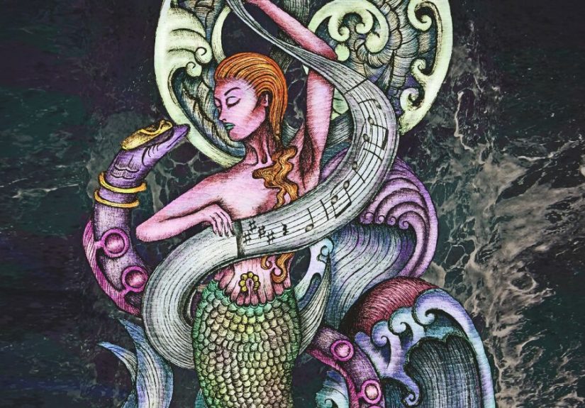
The best part of finishing was realizing I didn’t “illustrate the music” so much as build a place where the music could keep happening. When I look at the
final piece, I can almost hear the opening surge againand that’s the goal. Not a literal soundtrack in ink, but a visual weather system with Baroque DNA.
Conclusion
La Tempesta Di Mare is a gift for illustrators because it already thinks in motion: repeating anchors, wild episodes, sudden light, and a calm center
that makes the chaos feel meaningful. If you borrow Vivaldi’s structural tricksespecially repetition with variationyou can make a storm that feels alive
rather than random. And if your pencil starts windsurfing halfway through the finale… don’t fight it. That’s the point.