Table of Contents >> Show >> Hide
- What “Painting” With Beads and Buttons Actually Means
- Why This Medium Works (Even If Your Brain Says “Is This Allowed?”)
- Supplies: The No-Regrets Starter Kit
- Two Core Approaches
- Design Tips That Keep It From Looking Like a Button Avalanche
- How to Make It Durable (So Your Art Doesn’t Shed Like a Glittery Pet)
- Safety Stuff (Because Tiny Objects Have Big Opinions)
- Project Ideas That Look Great (Without Requiring a Craft Store Takeover)
- Common Mistakes (and Easy Fixes)
- Conclusion: Texture Is a Love Language
- Experiences: What I’ve Learned While Painting With Beads and Buttons (About )
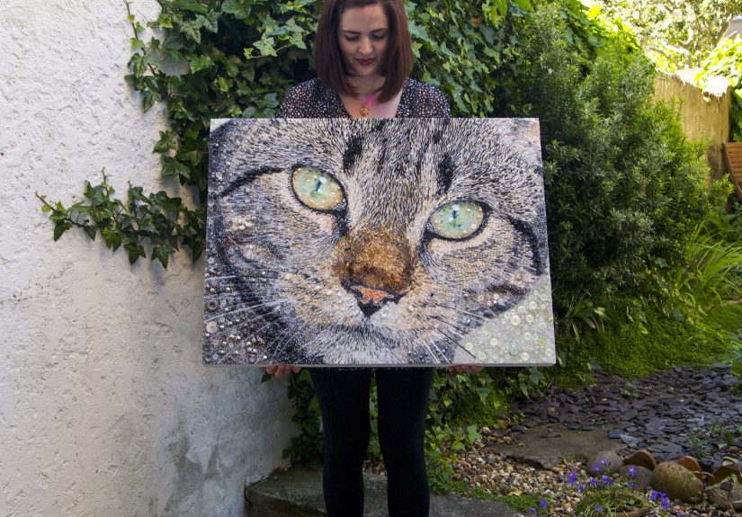
Some people paint with oils. Some paint with acrylics. I paint with beads and buttonstiny, shiny, oddly
satisfying little objects that used to live quiet lives in sewing tins and jewelry organizers until I drafted them
into service as “pigment you can hear.” (Because yes: this kind of art has a soundtrack. It’s mostly
plink-plink-plink followed by a dramatic where did that one go?!.)
If you’ve ever looked at a canvas and thought, “This needs more texture… and also the emotional energy of a
craft drawer exploding,” welcome. Beads-and-buttons painting is mixed media at its most playful: part collage,
part sculpture, part color theory, and part treasure hunt. Done well, it’s not clutterit’s dimension. It catches
light, rewards close-up viewing, and turns an ordinary wall into something people can’t resist touching
(which is flattering… and also why we talk about sealing and durability later).
What “Painting” With Beads and Buttons Actually Means
You’re still composing an image the way a painter doesplanning color, value (light vs. dark), edges, and focal
points. The twist is that your “brushstrokes” are physical objects. A pearl bead can behave like a highlight.
A matte button can read like a shadow. Metallic seed beads can become glittering midtones that shift as you
move across the room.
Think of it as building a picture out of tiny surfaces. Instead of blending paint wet-into-wet, you blend with:
size, spacing, sheen, and layering. Your gradient might go from small dark beads to larger warm buttons to a
ring of pale, glossy beads that act like reflected light. Same art fundamentalsmore tactile tools.
Why This Medium Works (Even If Your Brain Says “Is This Allowed?”)
1) Texture does half the storytelling for you
Flat paint is powerful, but texture is a shortcut to drama. Raised surfaces create real shadows. That means your
work has contrast even in soft lighting, and it stays interesting from multiple angles.
2) Light becomes a collaborator
Beads and buttons reflect differently depending on finish: glossy, satin, matte, transparent, iridescent, metallic.
Your piece can feel calm in the morning and electric at night under a lamp. That “alive” quality is the magic.
3) It’s secretly a great way to upcycle
Old buttons from a thrift jar, a broken bracelet, leftover beads from one ambitious jewelry phase… all of it can
become art. (Finally: a retirement plan for the single mystery button that has been haunting your home.)
Supplies: The No-Regrets Starter Kit
Surfaces
- Stretched canvas (easy, lightweight, classic)
- Canvas panel (less flex = better for heavy embellishments)
- Wood panel (most stable; great if you’re going dense and dimensional)
If you’re going thicklots of buttons, layered beads, chunky focal pieceschoose a rigid surface. Flexing can
weaken adhesion over time.
Beads, buttons, and “found sparkle”
- Assorted buttons (mix sizes; include a few “hero” buttons)
- Seed beads for gradients and detail
- Round beads for highlights and texture
- Flat-backed gems or sequins (optional, but dangerously fun)
Adhesives and mediums
- Acrylic gel or matte medium (acts like a clear, paint-friendly adhesive)
- Strong craft glue for quick, targeted bonding
- Fabric glue if you’re attaching to fabric or using stitch-based approaches
- Two-part epoxy (optional) for unusually heavy pieces
A helpful rule: the heavier the object, the more you want a thicker adhesive bed and a more stable surface.
Also: avoid rushing. “It seemed dry” is how buttons end up in your carpet like tiny landmines.
Tools that save your sanity
- Fine-tip tweezers (your new best friend)
- A sorting tray or muffin tin (yes, really)
- Palette knife or old gift card for spreading medium
- Pencil + eraser for sketching
- Soft brush for sealing coats
Two Core Approaches
Method 1: Glue-and-Place “Button Painting” (Relief Collage)
This is the classic approach: paint a background, sketch your design, then build the image by gluing beads and
buttons into place like tactile pixels.
- Paint your underlayer. A simple gradient background can do a lot of work. Let it dry fully.
-
Sketch your design lightly. Keep it simple at first: a tree silhouette, a heart, a monogram,
a flower, a skyline. -
Dry-fit your palette. Sort by color family and finish (matte vs. shiny). Pick 3–5 main colors.
Too many colors can read as “craft spill,” not “intentional composition.” -
Place the biggest shapes first. Large buttons define the structure. Think of them as your
“blocked-in” paint shapes. -
Fill gaps with mid-size buttons. This is where rhythm happens: alternating sizes creates a more
natural flow. -
Use seed beads like shading. Seed beads can create smooth transitions. Cluster them more densely
in shadow areas and sparsely in highlights to simulate value shifts.
Pro tip: For strong bonds, apply adhesive to both the surface and the back of what you’re attaching,
then press gently. You’re aiming for contact without squeezing out a glue volcano.
Method 2: Stitch-and-Mount (Bead Embroidery Meets Canvas)
If you love precisionor you want the security of thread plus glueborrow techniques from bead embroidery.
You stitch beads onto a fabric base, then mount that fabric onto a canvas or panel. This is excellent for linework,
outlines, and controlled patterns.
-
Choose a fabric ground. A sturdy fabric (or a specialty beading foundation) is ideal.
Avoid stretchy knits unless you enjoy chaos. - Draw your design on the fabric. Keep lines clean and clear.
-
Anchor focal pieces. Glue down larger elements first (like a center “gem” or statement button),
then stitch around them for stability. -
Use bead backstitch for outlines. It’s a foundational bead embroidery technique: beads form a line
while the thread locks them into place in segments. -
Finish edges thoughtfully. Once stitched, mount the finished fabric to your canvas/panel with a
strong, even adhesive layer.
This method shines for mandalas, florals, typography, or any design where crisp edges matter. It also gives you a
more “textile art” vibeelegant, detailed, and surprisingly durable.
Design Tips That Keep It From Looking Like a Button Avalanche
Limit your palette like a painter would
Try a “dominant–supporting–accent” approach: one main color family, one supporting neutral, and a small accent pop
(like gold, turquoise, or bright white). The restraint makes the texture feel intentional.
Plan value (light and dark) before you plan sparkle
Sparkle is fun, but value is what makes the image readable across a room. Squint at your design: can you still
tell what it is? If not, add darker beads/buttons where shadows belong and reserve the brightest pieces for the
focal point.
Use size like brushstroke width
Large buttons act like broad strokes. Seed beads act like fine detail. If everything is the same size, your piece
can look flateven though it’s physically raised. Mix scale to create visual hierarchy.
Let negative space breathe
Not every inch needs embellishment. Leaving painted space around the beaded area makes the texture feel more
dramatic and gives the eye a place to rest.
How to Make It Durable (So Your Art Doesn’t Shed Like a Glittery Pet)
Let layers cure, not just “dry”
Acrylic paint and acrylic mediums can feel dry to the touch quickly, but they continue to cure. If you seal too
soon, you can trap moisture, dull finishes, or create cloudy topcoats.
Seal thoughtfully: isolation + varnish logic
For mixed media, a common professional approach is a clear sealing layer to even out absorbency, then a protective
varnish. The goal is an even surface that’s easier to clean and less likely to collect dust in every tiny crevice.
Apply topcoats flat, in thin layers
Gravity is not your friend here. Work with the canvas flat so varnish doesn’t pool around beads and buttons.
Multiple thin coats beat one thick coat every time.
Pick your finish based on the vibe
- Gloss: maximum depth and shine (great for jewel tones)
- Matte: softer, modern look (great if you want texture without glare)
- Satin: the diplomatic middle child
If your piece is extremely dimensional, consider whether a full varnish coat is practical. In some cases, careful
spot-sealing and a display strategy (like placement away from dust-heavy areas) can be smarter than flooding
intricate texture with liquid finish.
Safety Stuff (Because Tiny Objects Have Big Opinions)
Beads and small buttons are a choking hazard for young children and pets. If kids are involved, use age-appropriate
materials, supervise closely, and avoid tiny loose parts entirely. For anyone using adhesives or spray finishes:
ventilate your space, follow label directions, and keep food and drinks out of the work area.
Also: pick products labeled for safe use and pay attention to standards and certification marks on art materials.
“Non-toxic” still doesn’t mean “snackable,” despite what a golden retriever might believe.
Project Ideas That Look Great (Without Requiring a Craft Store Takeover)
Button-and-bead florals
Paint a loose stem-and-leaf background, then build blossoms with layered buttons. Use seed beads as pollen, sparkle
highlights, or soft color transitions.
Textured typography
Sketch a single word (“HOME,” “BREATHE,” “YES”) and fill the letters with beads in an ombré. Keep the background
simple so the word reads instantly.
Night sky landscapes
Create a painted dusk gradient, then use beads as stars: smaller and denser near the horizon, larger and brighter
near your focal constellation. Add a few buttons as planets for whimsy.
Memory-map collages
Use buttons from old clothing, beads from a broken accessory, or colors tied to a place or person. Arrange them
into a heart, a state outline, a bouquetsomething symbolic. Texture turns nostalgia into something you can hang.
Common Mistakes (and Easy Fixes)
“My buttons slid around like they were on an ice rink.”
Use a thicker adhesive layer, work in small sections, and start with larger pieces so you’re not bumping tiny beads
out of place. Let one section set before moving on.
“The glue dried cloudy.”
Some adhesives haze when applied too thick or when humidity is high. Apply thinner layers, avoid overworking, and
test a small area firstespecially if transparency matters.
“The canvas warped.”
Too much wet medium on a flexible surface can cause warping. Switch to a panel/wood support, or apply wet products
more evenly (front and back sealing can help on some supports).
“It looks busy, not bold.”
Reduce colors, repeat a few shapes, and add negative space. If everything is a focal point, nothing is.
Conclusion: Texture Is a Love Language
Painting with beads and buttons is delightfully rebellious: it turns “leftovers” into highlights, transforms
ordinary shapes into dramatic texture, and makes art that rewards both distance and close inspection. Start simple,
commit to a limited palette, build from large to small, and finish with patience. The result is a piece that
doesn’t just sit on a wallit performs.
And if you step back and think, “This might be too much sparkle,” remember: sparkle is simply confidence in a
physical form.
Experiences: What I’ve Learned While Painting With Beads and Buttons (About )
The first time I tried painting with beads and buttons, I underestimated two things: gravity and my own ability to
accidentally glue my sleeve to a canvas. I had a beautiful sketch, a tidy palette, and the kind of optimism usually
reserved for people who think they can carry six groceries in one trip. Then I tilted the canvas slightly to “check
the composition,” and my carefully placed seed beads performed a coordinated escape maneuver.
That’s when I learned the first studio truth: flat is your friend. Not “mostly flat,” not “flat-ish.”
Flat like a pancake that’s afraid of heights. Working horizontally instantly improved everythingplacement,
drying, sealing, and my blood pressure.
Next lesson: start bigger than you think. I used to begin with detail (because it’s fun), but detail
without structure is just… confetti with ambition. Once I started placing the largest buttons first, the whole
piece snapped into clarity. The big shapes created the “read” from across the room, and the small beads became
finishing touches instead of desperate attempts to rescue a chaotic middle.
I also learned that sorting is not procrastination; it’s pre-success. The day I used a muffin tin
to organize by color and finish, I felt like I’d unlocked a cheat code. Suddenly I could build gradients on purpose
instead of rummaging for “one more tiny teal bead” like a raccoon with a deadline. Sorting also made it obvious when
I had too many competing colors. If your tray looks like a candy store, your canvas will probably look like one too.
Adhesive taught me humility. Some glues grab fast but don’t forgive repositioning. Others give a luxurious working
time but require patience while they cure. I started testing adhesives on scraps the way bakers test oven
temperaturesbecause the project is too pretty to sacrifice to guesswork. My favorite moment is still pressing a
button down, seeing it settle into a clear medium, and realizing it’s not just stuckit’s embedded, like the
canvas just decided to keep it forever.
The biggest surprise was how emotional this medium can be. Buttons aren’t neutral objects. They carry history:
the coat someone wore, the shirt from a first job interview, the cardigan a loved one always reached for. When I
started using “meaningful” buttons alongside ordinary beads, the work changed. It stopped being only decorative
and became quietly personal. People would lean in, point, and ask, “Where did you get that one?”and suddenly the
art was a conversation, not just a surface.
Finally, I learned to leave space. The temptation is to fill every gap, because empty areas feel like unfinished
thoughts. But negative space is what makes texture feel dramatic. A calm painted background turns beads into stars,
buttons into petals, and tiny highlights into moments worth noticing. When I stop before I’m “done-done,” the piece
usually looks more intentionallike I meant to make art, not prove I own every bead ever manufactured.