Table of Contents >> Show >> Hide
- Why Watercolor Feels Like a Dream Machine
- Materials That Make the Portal Stronger
- Techniques That Turn Watercolor Into Fantasy
- How I Build a Fantasy Painting Step-by-Step
- Color Palettes That Feel Like Dreams (Not Mud)
- Keeping the Magic From Fading
- Common Fantasy Watercolor Mistakes (And How I Fix Them)
- Conclusion: Watercolor as My Personal Escape Hatch
- Extra: of Personal Experience Painting Dream Worlds in Watercolor
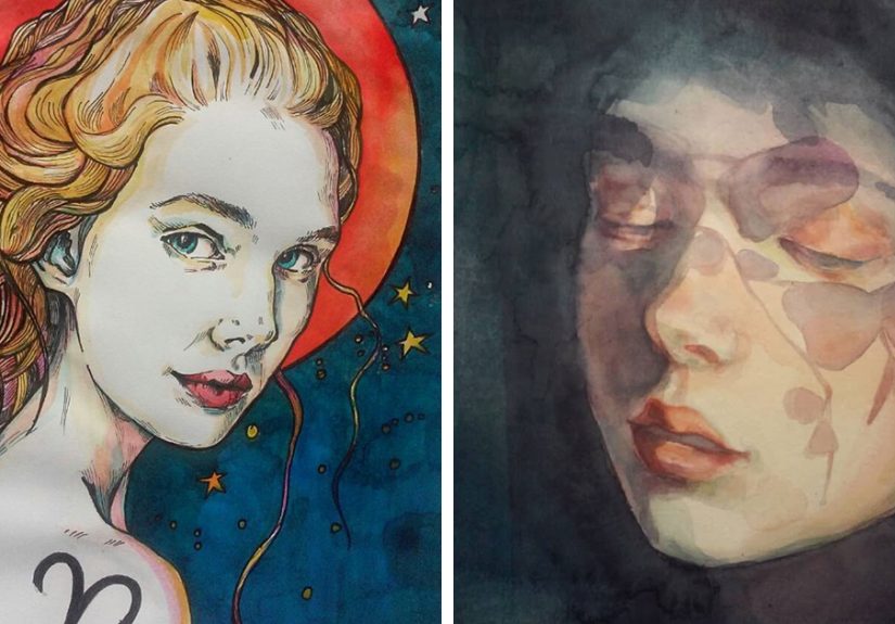
Some people escape into fantasy novels. Some escape into video games. I escape into a cup of water, a messy palette,
and a sheet of paper that’s about to become a portal. Watercolor is basically legal teleportation: one minute I’m
staring at an inbox; the next I’m painting moonlit forests, floating islands, and the kind of clouds that look like
they’re keeping secrets.
If you’ve ever looked at a watercolor and thought, “That feels like a dream,” you’re not imagining it. Watercolor’s
transparency, soft edges, happy accidents, and glow-from-within color are tailor-made for fantasy art. And yes, I
said “happy accidents” with a straight facebecause when watercolor behaves, it’s beautiful, but when it misbehaves,
it’s often magical.
Why Watercolor Feels Like a Dream Machine
Fantasy is less about “realism” and more about believable wonder. Watercolor helps because it naturally creates:
- Luminous layers: Transparent washes stack like stained glasslight passes through, not just over.
- Atmosphere on demand: Mist, fog, glow, haze, and “is that a spirit or just pigment?” happen fast.
- Soft transitions: Wet paint blooms and blends like thoughts drifting between waking and sleep.
- Texture with personality: Granulation, salt, and blooms can look like stone, stardust, or ancient ruins.
In other words: watercolor doesn’t just illustrate fantasy. It acts like fantasy.
Materials That Make the Portal Stronger
You can paint fantasy on anything, but if you want that crisp glow and controlled chaos, your materials matter more
than people like to admit (especially people trying to sell you a $4 sketch pad as “professional grade”).
Paper: The Stage Your Dream Performs On
Watercolor paper isn’t just paperit’s an engineered surface with texture and sizing (the treatment that controls
absorbency). The paper decides whether your wash glides, sinks, backruns, or throws a tantrum.
- Hot press: Smooth surface. Great for crisp details, ink lines, tiny stars, and illustrated fantasy.
- Cold press: Light texture. The versatile “storybook default” for landscapes and soft blends.
- Rough: Heavy texture. Amazing for gritty cliffs, storm clouds, and “ancient parchment” vibes.
If I’m painting a floating city with delicate windows and sharp silhouettes, I go smoother. If I’m painting a forest
where the trees look like they were grown from old spells, I want texture.
Paint: Pigment Choices That Keep Your World Alive
Fantasy worlds should be timeless… which is tricky when certain pigments are not. If you plan to frame or sell work,
pay attention to lightfastness ratings (how well a color resists fading). A gorgeous neon pink that
disappears in sunlight is basically a magic spell with a terrible warranty.
Pro tip: build your core palette from reliable, lightfast pigments, then treat fugitive colors like fireworksfun,
brief, and not ideal for permanent architecture.
Brushes: Your Wand Collection
I keep it simple because I’d rather paint dragons than shop for 47 brushes:
- A round brush: The all-purpose hero. Details, washes, and shapes with one tool.
- A mop brush: Big watery skies, fog, and dreamy transitions.
- A flat or bright: Clean edges, architectural fantasy shapes, and quick gradients.
If your brush holds water well and comes to a point, you’re in business. If it sheds bristles like a stressed-out cat,
it’s not a brushit’s a prank.
Techniques That Turn Watercolor Into Fantasy
Dreamlike watercolor isn’t just “paint loosely.” It’s a toolbox. Here are the techniques I use most when I want the
painting to feel like a doorway.
1) Wet-on-Wet: Instant Mist, Magic, and Soft Light
Wet-on-wet is when you lay paint into damp paper so edges blur and mingle. It’s the fastest way to create fog,
glowing skies, and ethereal transitions. For fantasy, it’s perfect for:
- Moonlit clouds that fade into nowhere
- Background forests that feel distant and mysterious
- Underwater scenes with floating particles of light
The secret is restraint: fewer brushstrokes, more patience. Let the water do the choreography.
2) Glazing: Layered Color That Glows
Glazing is stacking transparent layers after the previous layer dries. It’s how you get that “lit from within”
fantasy glowespecially in lanterns, spell circles, and sunsets behind mountains.
Example: I’ll paint a pale golden wash for a lantern’s aura, let it dry, then glaze a warmer amber in the center.
Suddenly the lantern looks like it has a tiny sun trapped inside it (which, in my fantasy worlds, it often does).
3) Negative Painting: Carving Shapes Out of Light
Negative painting is shaping your subject by painting around it. It feels backwards at first, but it’s incredible
for fantasy scenes where you want luminous formsglowing mushrooms, fairy wings, misty brancheswithout outlining
everything like a coloring book.
I use it when I want the scene to feel discovered, like the viewer is seeing a hidden world through fog.
4) Lifting: Making Highlights and Ghostly Effects
Lifting is removing paint with a damp brush or tissue to pull out light. It’s fantastic for:
- Moon beams cutting through clouds
- Reflective water highlights
- Soft “spirit forms” that appear and disappear
Lifting works best on certain papers and with non-staining pigments, so test firstunless you enjoy the thrill of
learning through regret.
5) Texture Tricks: Salt, Alcohol, and Controlled Chaos
For fantasy, texture is storytelling. A few strategic effects can suggest stone, bark, cosmic dust, or cursed sand.
Some artists use additives like salt or alcohol drops to create textures. Used lightly, these can look like:
- Stars clustered in a nebula
- Crystalline frost on a window
- Weathered castle walls
The key word is strategic. Too much texture and your enchanted forest becomes “oops, I spilled
something.”
How I Build a Fantasy Painting Step-by-Step
Let’s walk through a concrete example: a floating castle over a sea of clouds. The goal is to make it
feel dreamy, not cartoony, and magical, not muddy.
Step 1: The “Dream Blueprint” Sketch
I sketch lightly and keep the design simple: big shapes first (castle silhouette, cloud mass, distant mountains),
then a few detail anchors (towers, windows, a tiny airship for scale). Fantasy needs clarity: the viewer should know
what they’re looking at before you start bending reality.
Step 2: Big Atmosphere Washes
I wet the sky area and drop in a soft gradientcool blues at the top, warmer near the horizon. Then I tint the cloud
sea with pale violets and warm grays. Nothing is “white”; it’s just lightly colored light.
Step 3: Establish the Glow
Before the castle gets dark, I map the light. Maybe the sun is behind the clouds, or the castle has enchanted lamps.
I paint the glow areas first in pale transparent washes (gold, peach, soft mintwhatever matches the mood).
Step 4: Castle Shape and Edges
Once the background dries, I paint the castle with controlled washes, sharper edges on the focal tower, softer edges
on distant parts. The sharper the edge, the closer it feels. The softer the edge, the more dreamlike it becomes.
Step 5: Glaze for Depth
I glaze shadows in thin layers rather than one thick dark pass. That keeps the color alive. This is where watercolor
becomes cinematiclike you’re lighting a stage, not filling in a silhouette.
Step 6: Micro-Story Details
A fantasy scene becomes memorable when something hints at a story:
- A ribbon of smoke from a tiny chimney (someone lives there)
- A glowing window (someone is awake)
- A small bird or airship (scale + movement)
I add only a few. Too many details and the dream turns into a spreadsheet.
Color Palettes That Feel Like Dreams (Not Mud)
Dream palettes usually share a few traits: limited colors, gentle contrast, and one “spark” hue that feels magical.
Here are three palettes I lean on:
1) Moonlit Mystery
- Indigo / Payne’s gray
- Muted violet
- Cool green
- Warm gold accents (tiny, like fireflies)
2) Sunrise Enchantment
- Coral / rose
- Golden ochre
- Soft lavender shadows
- Ultramarine for contrast
3) Forest Spellbook
- Sap green and deep olive
- Earthy browns
- Cool blue shadows
- One bright “magic” color (teal or magenta) used sparingly
If you’re new to watercolor fantasy art, pick one palette and commit for an entire painting. Your world will feel
cohesive, and your shadows won’t turn into swamp soup.
Keeping the Magic From Fading
Here’s the unglamorous truth: light can damage art on paper, and the damage adds up. If you want your watercolor
dreams to last, treat them like delicate relics (because they are).
- Avoid direct sunlight: Bright windows are not your painting’s friend.
- Use archival framing: Acid-free mats and proper materials help protect paper over time.
- Consider UV-filter glazing: Helpful, though it doesn’t make art “sun-proof.”
- Rotate display: Museums rotate works on paper for a reasonlimit long exposure.
The irony is delicious: we paint light, but we must protect the painting from light. Watercolor is poetic like that.
Common Fantasy Watercolor Mistakes (And How I Fix Them)
1) Everything is equally sharp
Fix: reserve crisp edges for the focal point. Let the rest dissolve softly. Dreams are not outlined in permanent marker.
2) The painting gets muddy
Fix: fewer layers, more drying time, and a simpler palette. Also: stop “petting” the paper with your brush.
3) The scene feels random
Fix: add one story cluea path, a doorway, a light source, a small traveler. Fantasy needs narrative gravity.
4) The glow doesn’t glow
Fix: paint the glow early and keep it transparent. Darken around it with glazes instead of trying to paint “brightness” on top.
Conclusion: Watercolor as My Personal Escape Hatch
Watercolor fantasy painting is a partnership between intention and surrender. I plan the story, the composition, the
lightingand then I let water do what water does: drift, bloom, merge, and surprise me. That’s the real escape.
Not leaving reality forever, but stepping out long enough to return with a pocketful of wonder.
If you’re tempted to try, start small: paint one dream objecta glowing lantern, a floating rock, a door in a tree.
Let it be imperfect. Let it be strange. Your fantasy world doesn’t need to be “correct.” It just needs to feel alive.
Extra: of Personal Experience Painting Dream Worlds in Watercolor
The first time I realized watercolor could be an escape, I wasn’t trying to paint fantasy at all. I was just trying
to calm down. It had been one of those days where everything felt loudnotifications, deadlines, news, the subtle
hum of modern life insisting I should be doing something “productive.” I sat down with a travel palette and a cheap
cup of water and decided to paint a simple sky. Nothing ambitious. Just a wash.
The sky turned into a storm. Not a realistic stormmore like an emotional storm wearing a nice gradient. The pigment
bloomed into soft veins, the edges feathered, and suddenly it looked like a cloud bank opening into another world.
I remember thinking, “Okay… this is either a mistake or a doorway.” I chose doorway. I added a tiny silhouette of a
floating island (because why not), then a few warm lights like windows, and I watched my brain unclench. That was the
moment watercolor became less of a medium and more of a ritual.
Over time, I noticed a pattern: my best fantasy watercolor paintings rarely start with a fully detailed plan. They
start with a mood. If I’m anxious, I paint fogsoft wet-on-wet layers that refuse to be controlled, like the paper is
teaching me to loosen my grip. If I’m tired, I paint moonlightgentle glazes where the slow build of value feels like
breathing. If I’m restless, I paint movement: wind in grass, clouds spilling over mountains, or an airship drifting
across a sky that never existed until I wet the page.
I also learned that “escaping” doesn’t mean avoiding reality; it means metabolizing it. When I paint a glowing door
in a tree, I’m not just making a cute fantasy prop. I’m painting the feeling of wanting an exit. When I paint a
lantern-lit village floating above clouds, I’m painting safetywarmth suspended over the unknown. And when I paint a
dragon made of mist (yes, I do that), I’m painting fear in a form I can soften, reshape, and finally understand.
Practically speaking, my process has become a set of small, comforting habits. I tape down the paper (the sound is
weirdly satisfying). I mix a “dream gray” (a neutral shadow color made from two complements so nothing looks flat).
I test a wash on scrap paper because I’ve been betrayed by overconfident pigment more times than I’d like to admit.
Then I start with atmosphere firstalways. If the air doesn’t feel right, the fantasy won’t either. Only after the
background sings do I place the story elements: the castle, the doorway, the lights, the traveler.
And here’s the most surprising part: the more I paint these imagined places, the more real life feels expandable.
Like there’s room for wonder again. Watercolor doesn’t fix everything, obviously. It won’t answer emails. It won’t
fold laundry. But it does something quietly radical: it reminds me I can still create beauty out of water, pigment,
and a few minutes of attention. That’s not just escape. That’s repair.