Table of Contents >> Show >> Hide
- What Is Color Therapy, Exactly?
- Why Color Can Change the Way You Feel
- What Different Colors Tend to Do to Mood
- Blue: Calm, clarity, and a cooler emotional temperature
- Green: Restoration, balance, and nature energy
- Yellow: Optimism, brightness, and mental lift
- Red: Energy, urgency, and emotional heat
- Orange and coral: Warmth without the drama
- Purple: Comfort, creativity, and introspection
- Neutrals: Stability, simplicity, and emotional breathing room
- Where Color Therapy Works Best in Everyday Life
- What Color Therapy Can and Cannot Do
- How to Try Color Therapy Without Turning Your House Into a Box of Markers
- Conclusion
- Experience-Based Scenarios: What People Often Notice With Color Therapy
- SEO Tags
Note: This article treats color therapy as a complementary wellness practice, not a replacement for medical or mental health care.
Color therapy sounds a little like something invented by a very optimistic paint store manager. But the basic idea is not as strange as it first appears. The colors around you can influence how you feel, how alert you are, how relaxed you become, and even how well you sleep. That does not mean a yellow throw pillow can solve a rough week or that painting your bathroom sage green will instantly turn you into a Zen monk. It does mean color can shape mood in small, meaningful, surprisingly practical ways.
At its best, color therapy is less about mystical promises and more about thoughtful choices. It lives in the bedroom lighting that helps you wind down, the soft blue wall that makes a room feel calmer, the burst of orange that gives a workspace some energy, and the green houseplant that somehow makes life feel 8% more manageable. If your environment affects your nervous system, attention, and daily habits, then color is part of that story too.
So how does color therapy improve your mood? The short answer is this: it works through emotional associations, sensory stimulation, environmental cues, and the powerful relationship between light and the brain. The longer answer is much more interesting.
What Is Color Therapy, Exactly?
Color therapy, sometimes called chromotherapy, is the idea that certain colors or colored light can influence emotional and physical well-being. In everyday life, this usually shows up in simple ways: choosing soothing colors for rest, energizing colors for productivity, or warm, soft light to create comfort. In more alternative wellness spaces, color therapy may be presented as a healing system with stronger claims. That is where it helps to stay grounded.
The most believable and practical version of color therapy is not “blue fixes sadness” or “red cures fatigue.” It is that color can shape mood, behavior, and perception in context. Some effects are psychological. Some are behavioral. Some are biological, especially when light exposure is involved. In other words, color is not a magic wand. It is more like a quiet background DJ, changing the vibe before you consciously notice it.
Why Color Can Change the Way You Feel
1. Colors carry emotional associations
Humans consistently connect colors with emotions. We talk about “feeling blue,” “seeing red,” and “green with envy” for a reason. Some of these associations are cultural, some are personal, and some seem surprisingly widespread. Bright, lighter colors often feel more positive. Darker shades can feel heavier, more serious, or more subdued. Warm colors may feel lively. Cooler colors may feel calmer.
That does not mean everyone reacts the same way to every shade. A bold red might feel exciting in a restaurant, stressful in a bedroom, and motivating in a gym. A pale blue might feel peaceful to one person and chilly or bland to another. Context matters. Memory matters. Personality matters. Even the room itself matters. A color never arrives alone; it shows up with lighting, texture, culture, and your own emotional history.
2. Light affects your brain clock
This is where the science gets especially interesting. Light is not just something that helps you see your laundry pile more clearly. It also helps regulate your circadian rhythm, the internal clock that influences sleep, alertness, mood, and energy. Different types of light affect this system differently.
Blue-enriched light during the day can help support alertness and signal the brain that it is time to be awake and focused. That is useful in the morning and daytime hours. At night, though, heavy exposure to blue light from screens and bright LEDs can suppress melatonin, delay sleepiness, and mess with your rest. And when sleep gets sloppy, mood often follows. Anyone who has become emotionally dramatic after sleeping badly already knows this in their bones.
This is one reason color therapy often overlaps with lighting design. Soft amber or dim red-toned light at night can feel gentler and more relaxing than harsh, cool-toned light. Morning sunlight or bright daytime light can improve alertness and, for some people, support mood during darker seasons. In other words, the “color” of light can change your emotional state partly because it changes your biological timing.
3. Color changes attention and behavior
Color influences what grabs your attention, how a space feels, and what behaviors it encourages. Warm, vivid tones tend to feel more stimulating. Cooler, muted tones often create a sense of ease. That is why restaurants sometimes lean into reds and oranges, while spas practically bathe in blue, green, beige, and the occasional whisper of eucalyptus-colored self-importance.
When a room feels calmer, people may breathe a little slower, linger a little longer, and feel less overstimulated. When a room feels brighter and more energizing, people may talk more, move more, or feel more alert. These shifts may sound subtle, but subtle changes in environment can stack up across a day. Mood is not shaped only by major life events; it is also shaped by the thousand tiny signals your brain receives from your surroundings.
What Different Colors Tend to Do to Mood
Blue: Calm, clarity, and a cooler emotional temperature
Blue is often associated with calm, stability, and mental spaciousness. In a room, softer blues can feel peaceful and grounding. They work well in bedrooms, reading nooks, meditation corners, and other spaces meant for decompression. Blue can be helpful when your life feels like twelve browser tabs are open in your brain at once.
That said, blue is a two-sided character. In lighting, blue-rich light at night can interfere with sleep and make it harder to unwind. So blue walls and blue daylight are not the same thing. A dusty blue throw blanket? Lovely. A glowing blue phone screen at 12:47 a.m. while you watch conspiracy videos about ancient bread? Less helpful.
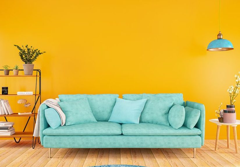
Green: Restoration, balance, and nature energy
Green often feels restful because it is strongly associated with nature. People commonly describe green as balancing, fresh, and quietly reassuring. It sits in that sweet spot between lively and calm. For many people, green can make a room feel healthier, softer, and less mentally noisy.
This is one reason plants, green accents, and natural views can be so emotionally appealing. Green does not usually scream for attention. It exhales. That can make it useful in offices, living rooms, and recovery spaces where you want to feel refreshed without becoming sleepy.
Yellow: Optimism, brightness, and mental lift
Yellow is associated with sunshine, warmth, and cheerfulness. In the right amount, it can make a space feel friendlier and more upbeat. It can also add a mental “wake up” effect, especially in kitchens, breakfast nooks, or creative areas.
But yellow is a classic example of why color therapy is not just about the color itself. A soft butter yellow can feel cozy and hopeful. A super-intense neon yellow can feel like your wall is yelling at you. Used well, yellow can lift a mood. Overused, it can feel jittery or visually exhausting.
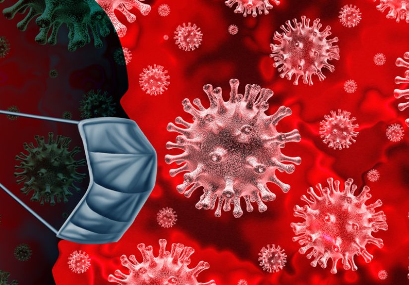
Red: Energy, urgency, and emotional heat
Red is powerful. It can feel bold, exciting, passionate, confident, urgent, or intense. In small doses, red can energize a space and increase stimulation. It can work well in exercise areas, dining spaces, or places where you want a spark of momentum.
Too much red, especially in an already stressful environment, can feel overwhelming. If your goal is relaxation, a giant wall of fire-engine red may not be your best friend. Red is the espresso shot of colors: useful, dramatic, and maybe not ideal right before bed.
Orange and coral: Warmth without the drama
Orange carries warmth and sociability, often with a more playful vibe than red. Softer versions like peach, terracotta, and coral can feel welcoming, creative, and emotionally open. These tones can brighten a room without making it feel aggressive.
Purple: Comfort, creativity, and introspection
Purple often gets linked with imagination, reflection, and a little bit of luxury. Softer lavenders may feel soothing, while richer purples can feel moody or dramatic. Purple can be great for creative spaces, especially if you want something calming that still has personality.
Neutrals: Stability, simplicity, and emotional breathing room
White, beige, gray, cream, and soft earth tones do not always get enough credit. They can create visual quiet, which helps the brain feel less cluttered. But neutrals work best when they do not feel sterile. A room with warm neutrals, natural textures, and layered lighting can feel peaceful. A room that is all icy gray and overhead glare can feel like a tax form with furniture.
Where Color Therapy Works Best in Everyday Life
The real strength of color therapy is not in grand promises. It is in daily design choices that support how you want to feel.
At home
Your home can support mood through color and light more than most people realize. Bedrooms benefit from softer, restful palettes and warm nighttime lighting. Workspaces often do well with balanced, energizing accents like green, blue-green, or controlled amounts of yellow. Shared spaces can feel more inviting with warm neutrals, muted terracotta, or natural greens.
At work
Offices do not need to look like a beige apology. Strategic use of color can improve comfort, reduce visual boredom, and support task-specific energy. Cooler colors may help focus, while small warm accents can prevent a space from feeling lifeless. Even a simple shift in lighting temperature can change how mentally draining a room feels.
In self-care routines
Color can also support mood through rituals. Think of a soft lamp for evening reading, a bright morning window seat, a calming journal with colors you enjoy, or even adult coloring books, which many people find grounding because they redirect attention and encourage present-moment focus. Sometimes color therapy is not about staring at a wall. Sometimes it is about engaging your senses in a gentle, intentional way.
What Color Therapy Can and Cannot Do
Color therapy can improve mood by shaping environment, signaling safety or stimulation, supporting routines, and helping you regulate your emotional state. It can make you feel calmer, more awake, more focused, more cozy, or less overwhelmed. It can also help you create spaces that match your needs instead of fighting them.
What it cannot do is replace evidence-based care for depression, anxiety disorders, trauma, bipolar disorder, or chronic sleep problems. If someone is struggling with persistent low mood, panic, major insomnia, or emotional distress that interferes with life, the answer is not “buy a teal pillow and hope for the best.” Color can help, but help has layers. Good therapy, medical care, sleep habits, sunlight, movement, social support, and stress management still matter.
The healthiest way to think about color therapy is this: it is a supportive tool, not a solo hero.
How to Try Color Therapy Without Turning Your House Into a Box of Markers
Start with the feeling, not the paint chip
Ask yourself how you want a room to feel. Calm? Focused? Cozy? Energetic? Then choose colors that support that purpose.
Use lighting as part of the plan
Bright, natural, or blue-enriched light works best earlier in the day. In the evening, shift to dimmer, warmer light. Your brain likes this more than it likes being told it is noon at midnight.
Test accents before making dramatic decisions
Try pillows, art, throws, lampshades, plants, or curtains before painting an entire room. It is easier to remove one mustard-yellow chair than an entire mustard-yellow lifestyle.
Pay attention to your real response
Color therapy is personal. If a shade that is “supposed” to be calming makes you feel bored or uneasy, trust your own reaction. Your mood matters more than trend forecasts.
Think beyond walls
Clothing, desktop backgrounds, bedding, notebooks, mugs, and lighting all contribute. Color therapy can be tiny, affordable, and flexible.
Conclusion
So, how does color therapy improve your mood? Not through magic, and not with one-size-fits-all rules. It works by influencing emotional associations, attention, energy, comfort, and sleep-supportive routines. Some colors calm the mind. Some energize it. Some create a sense of safety, warmth, or freshness. The color of light can even help steer your brain toward wakefulness or rest.
The smartest use of color therapy is practical, personal, and realistic. Use calming colors where you rest, energizing tones where you work, natural greens where you want balance, and warm evening light when your brain needs to power down. Small environmental changes will not erase every bad mood, but they can make daily life feel more supportive. And honestly, that is no small thing. Sometimes feeling better starts with a big life decision. Sometimes it starts with finally replacing that harsh overhead bulb that makes your living room feel like an interrogation room.
Experience-Based Scenarios: What People Often Notice With Color Therapy
One common experience people describe is that certain rooms seem to change their mood before they even sit down. A bedroom painted in a soft blue, muted green, or warm neutral often feels easier to settle into. People say they breathe a little deeper, scroll a little less, and feel less mentally “buzzed.” They may not call it color therapy, but the effect is real in practice: the room gives fewer signals of stress and more signals of rest.
Another frequent experience shows up in workspaces. A person might add a plant, switch from cold overhead light to a desk lamp, or bring in a few yellow or coral accents. Suddenly the space feels less flat. They feel more willing to start tasks, less irritated by being at the desk, and a little more mentally awake. It is not that color turns them into a productivity robot. It simply reduces friction. The environment starts cooperating instead of competing.
People also notice color therapy most clearly when they change lighting habits. Bright daylight or morning light exposure can make mornings feel sharper and more structured. On the other hand, dimmer, warmer light in the evening often creates a strong “wind-down” cue. Many people say they fall asleep more naturally when they stop blasting their eyes with cool-toned light at night. In that case, the mood benefit comes partly through better sleep, and better sleep is one of the least glamorous but most powerful emotional upgrades available to humanity.
There are also emotional experiences tied to memory. Someone may love green because it reminds them of hiking trails, a grandparent’s garden, or summer afternoons outside. Another person may find navy calming because it feels orderly and dependable. Someone else may dislike yellow because it reminds them of a stressful old apartment with terrible lighting and a landlord who answered maintenance requests with the speed of continental drift. Personal associations matter, which is why color therapy works best when it is tailored rather than generic.
Creative activities create another layer of experience. Many people find coloring, painting, or arranging colorful objects soothing because it gives the mind something structured and sensory to focus on. Instead of spiraling through anxious thoughts, attention moves to shapes, tones, and simple choices. What shade do I want here? Does this feel balanced? That gentle focus can be surprisingly calming. It is one reason adult coloring books remain popular: they are easy, absorbing, and pleasantly low stakes. No one expects a masterpiece. The point is the process.
Finally, people often report that the best mood shifts from color therapy are not dramatic. They are subtle but steady. A room feels less draining. Evenings feel softer. Morning routines feel brighter. A workspace feels more inviting. A person feels more “like themselves” in their own space. That is the sweet spot. Color therapy usually works best not as a lightning bolt, but as a quiet adjustment that makes the day easier to live in.