Table of Contents >> Show >> Hide
- What Is the Mountain or Valley Illusion?
- Your Brain’s Favorite Shortcut: “Light Comes from Above”
- The Science Behind It: Shape From Shading (Without the Math Hangover)
- Real-World Examples: Where This Illusion Shows Up (and Causes Drama)
- How to Tell Whether You’re Seeing a Mountain or a Valley
- Why This Illusion Matters (Beyond Making You Doubt Your Eyeballs)
- Try This at Home: Three Quick Experiments
- Conclusion
- Experiences People Have With the Mountain or Valley Illusion (500-Word Bonus)
Ever stared at a shaded map or a grayscale “blob” and felt your brain do a full-on
somersaultis that a mountain… or a valley? If you’ve ever rotated an image 180 degrees
and watched the terrain flip like a pancake, congratulations: you’ve met the
Mountain or Valley illusion (often discussed alongside the crater illusion).
This illusion isn’t a glitch in your eyesight. It’s a totally normal “feature” of human vision
the same feature that helps you recognize faces in weird lighting, judge bumps vs. dents,
and avoid tripping over your own shoelaces (most days). The funny part? That feature can be
tricked by a few pixels of shading.
What Is the Mountain or Valley Illusion?
The Mountain or Valley illusion happens when a 2D image uses shading to suggest 3D shape
but your brain can’t decide whether it’s looking at a raised bump (a mountain) or a recessed dip
(a valley). The “data” on the page stays the same; what changes is your brain’s interpretation
of where the light is coming from.
In one moment, a shaded circle looks like a smooth dome. Rotate it, and suddenly it becomes a crater.
On satellite images, lunar photos, and shaded-relief maps, this can make real terrain appear inverted
valleys pop up, ridges sink down, and your confidence leaves the chat.
Common names you’ll see online
- Crater illusion or crater/dome illusion (especially in astronomy and Earth imaging)
- Shape-from-shading ambiguity (the vision science term that sounds like a superhero origin story)
- Relief inversion (common in cartography and terrain visualization)
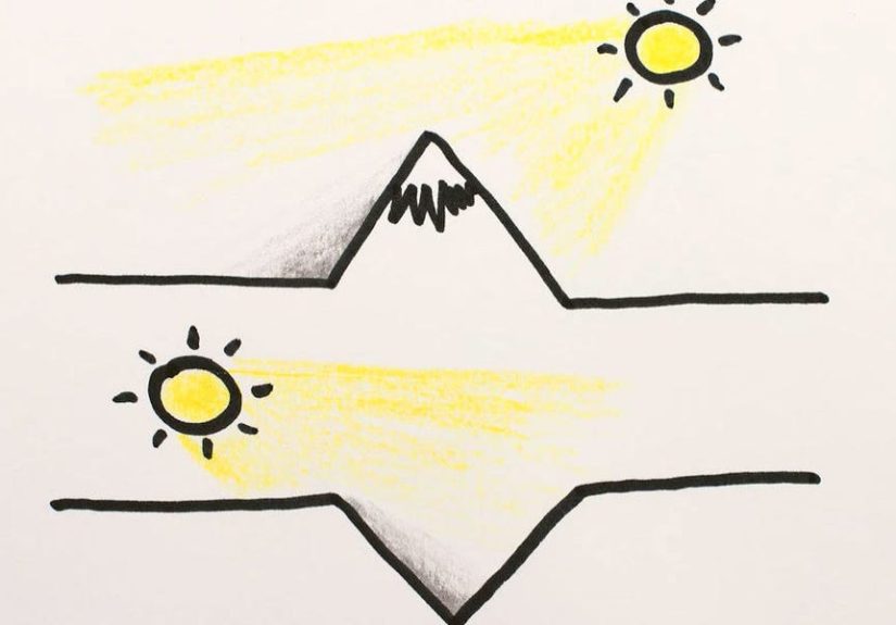
Your Brain’s Favorite Shortcut: “Light Comes from Above”
The core engine behind the illusion is something researchers call the
light-from-above bias. In plain English: your brain assumes light usually comes from above,
because on Earth it usually does (hello, Sun). That assumption is so strong that it can override
what the image actually implies.
When a surface is lit from above, the upper part tends to be brighter and the lower part darker
(or it casts a shadow downward). So when your brain sees a gradientbright-to-darkit tries to
reverse-engineer a 3D shape that would create that shading under a top-down light.
So why does rotation flip the terrain?
Because rotation flips the shading relative to “up.” If your brain insists the light is above you,
then turning the image upside down makes the shading pattern look like it was produced by the opposite shape:
bumps become dents, dents become bumps. Same pixels. Different story.
The Science Behind It: Shape From Shading (Without the Math Hangover)
Vision scientists call this process shape from shading: using brightness gradients to infer
surface orientation and depth. The catch is that shading is ambiguous. A bright top and dark bottom could mean:
- a convex bump lit from above, or
- a concave dip lit from below.
Since the image alone can’t tell you which is “correct,” your brain uses prior expectationsmental defaults
built from experience in the real world. Two priors show up a lot in research:
- Light-from-above prior: light is more likely to come from overhead.
- Convexity bias: in many everyday settings, raised/solid shapes are more common and more useful to detect quickly.
Why your brain relies on priors (and why that’s actually smart)
The world is messy: lighting changes, shadows hide details, and objects don’t come with labels like
“Hi, I’m a crater.” Priors help your brain make fast, mostly-correct guesses. The illusion happens when
the “mostly” part clocks out early.
Real-World Examples: Where This Illusion Shows Up (and Causes Drama)
1) Moon craters and planetary photos
Astronomical images are a greatest-hits album of the crater/dome illusion. When sunlight hits terrain at low angles,
shadows get long and contrastyperfect for confusing a brain trained on overhead lighting. A crater can look like a bubble,
especially if the highlight-shadow pattern doesn’t match your assumed light direction.
This isn’t just a fun party trick for telescope nerds. In mission planning and robotics, interpreting surface shape correctly
matters. Lighting conditions without atmospheric “fill light” can make shadows harsher and reduce detail in dark regions,
complicating navigation and hazard detection.
2) Shaded relief maps and topographic visualizations
Cartographers have known for ages that illumination direction can make or break terrain readability.
A common convention is lighting from the upper left (often northwest on north-up maps) because many viewers
interpret it most naturally. If the light comes from the “wrong” direction, hills may invert and valleys may pop.
That’s why hillshades often look “more correct” from certain lighting angles. Your visual system isn’t being picky;
it’s being consistent with its favorite assumption.
3) UI design: buttons, toggles, and “why does this look pressed?”
If you’ve ever designed a button with a shadow and highlight, you’ve made a tiny negotiation with the light-from-above prior.
A highlight on top and shadow beneath reads as raised. Flip it and it reads as pressed-in. This is why “skeuomorphic” UI styles
(and even modern subtle shadows) can feel weird if the lighting cues aren’t consistent across the interface.
4) Aerial photos, LiDAR, and “I swear that ridge just moved”
In aerial and LiDAR-derived hillshades, switching the sun azimuth can reveal features that were invisible before
but it can also trigger relief inversion for some viewers. Analysts often compare multiple illumination directions to confirm
whether something is truly a ridge, a channel, or just a trick of shading.
How to Tell Whether You’re Seeing a Mountain or a Valley
If the illusion is messing with you, don’t worryyou don’t need a PhD or a third eye. Try these practical checks:
Rotate the image 180 degrees
This is the fastest test. If the feature flips from bump to dip (or vice versa), shading ambiguity is doing the heavy lifting.
Your brain is anchoring to “light from above,” and rotation changes what “above” means.
Look for cast shadows and context
A clean gradient is ambiguous, but real scenes often include hints:
nearby objects, consistent shadow directions, or known reference shapes. A cast shadow that falls in a consistent direction
across multiple features can reveal the true light sourceand stabilize the interpretation.
Use contour lines or texture cues
Cartographers love contour lines for a reason: they add non-shading structure. Texture gradients, occlusion,
and edge information can also reduce ambiguity. In short: the more cues you have, the less your brain has to “guess.”
Change the lighting direction (if you control the visualization)
In mapping software or 3D tools, adjust the sun azimuth. If the terrain inverts under one direction but looks stable under another,
you’ve found a lighting setup that better matches human perception. Many workflows intentionally test several angles.
Why This Illusion Matters (Beyond Making You Doubt Your Eyeballs)
Cartography and geospatial analysis
Hillshades guide decision-making in geology, hydrology, urban planning, and hazard assessment. If a map’s shading causes relief inversion,
an analyst could misread a slope direction, misinterpret a channel, or overlook a subtle landform. Good cartography doesn’t just look pretty
it reduces perceptual errors.
Astronomy and planetary science
In space imagery, lighting can be extreme and unfamiliar. The crater/dome illusion can affect casual viewing and even initial interpretation.
That’s why planetary images are often presented with consistent illumination conventions, annotations, or complementary data (like elevation models).
Human factors, training, and safety
Any field that relies on rapid interpretation of shaded imageryaviation training materials, remote sensing,
scientific visualizationbenefits from understanding how easily shading can flip depth perception.
Design and communication
Whether you’re building a dashboard, illustrating a medical scan, or creating an infographic, shading cues should be consistent.
Mixed lighting directions across components can make a clean design feel strangely “off,” even if viewers can’t explain why.
Try This at Home: Three Quick Experiments
Experiment 1: The “Phone Flip”
Find a shaded relief map image online (or any crater/dome illusion picture). Stare at one feature until it feels “locked in”
as a mountain. Now rotate your phone 180 degrees. If it flips into a valley, you just watched your light-from-above bias change lanes.
Experiment 2: The “Light Source Lie”
Look at the same image and consciously tell yourself: “The light is coming from below.” Repeat it like a mantra.
Some people can force a flip without rotating anythingproof that interpretation isn’t only in the pixels; it’s in your assumptions.
Experiment 3: Add a cue
Draw a tiny arrow on the image indicating the light direction, or add a simple cast shadow to one edge of the shape.
Notice how quickly your perception stabilizes once the scene includes an extra clue your brain trusts.
Conclusion
The Mountain or Valley illusion is a reminder that vision is not a camerait’s a meaning-making machine.
Your brain uses smart shortcuts like the light-from-above bias to turn flat shading into 3D shape,
and most of the time that works beautifully. But with the “wrong” lightingor a perfectly ambiguous gradientthose shortcuts can
flip mountains into valleys and craters into domes.
The good news: once you know the trick, you can outsmart it. Rotate the image, check shadow consistency, add context,
or adjust illumination direction. Your brain will still try to be helpfuljust with slightly better instructions.
Experiences People Have With the Mountain or Valley Illusion (500-Word Bonus)
The funniest “experience” with the Mountain or Valley illusion is how quickly it turns confident adults into confused toddlers.
People often describe the same pattern: you glance at a shaded map and instantly “know” what you’re seeingthen someone rotates it,
and your certainty dissolves like cotton candy in the rain. It can feel oddly personal, like the image is gaslighting you.
What’s really happening is more wholesome: your brain is trying to be efficient, not embarrassing.
A common place this shows up is in casual stargazing. Someone pulls up a photo of the Moon on their phone and points at a “bubble.”
Another person says, “That’s a crater.” The first person insists it’s sticking out, not going in.
Then the phone rotates, and everyone laughs because the Moon apparently changed geology in real time. What people remember later
isn’t the science termit’s the moment they realized their eyes weren’t “wrong,” just interpreting a clue (shading) with a default rule
(light from above).
Map readers have their own version. Hikers browsing a shaded relief layer sometimes report that certain ridges look like trenches,
especially when the hillshade “sun” is set from the lower right. Even experienced outdoors folks can hesitate for a second,
because the illusion can override learned terrain sense. That’s why some people prefer topo maps with contour lines:
contours feel like “hard facts,” while shading feels like “a vibe”a very persuasive vibe, but still a vibe.
Designers run into this illusion in a sneakier way: interface elements can look pressed when they were meant to look raised.
A subtle highlight and shadow combo might read perfectly on one screen and weirdly inverted on another, especially if the overall
page lighting cues conflict. Designers often describe a moment of frustration“Why does this button look inside-out?”followed by
the realization that the entire UI needs consistent light direction. Once they unify the shadows, everything suddenly looks calmer,
like the interface stopped arguing with itself.
There’s also a learning curve experience that people find surprisingly satisfying. After you practice flipping the interpretation
a few timesrotating the image, imagining the light direction, looking for cast shadowsyou start to feel the “switch” happen on command.
Viewers describe it like learning to wiggle one ear: pointless, delightful, and somehow empowering. It’s a small reminder that perception
is interactive. You’re not just receiving an image; you’re actively constructing a 3D world from incomplete cues.
The most useful takeaway people report is practical: once you’ve been fooled, you become more cautious (in a good way) with shaded imagery.
You start asking, “Where’s the light?” You compare layers, rotate views, and look for context before making decisions. That’s not paranoia
it’s visual literacy. And honestly, in a world full of dashboards, satellite images, and glossy UI shadows, visual literacy is a superpower
that costs exactly zero dollars and maybe one bruised ego.