Table of Contents >> Show >> Hide
- What Are Jewel Tones, Exactly?
- The Secret Sauce: Balance, Not Bravery
- Choose Your “Hero Color” (Then Cast the Supporting Characters)
- Room-by-Room: Where Jewel Tones Shine Brightest
- Texture: The Cheat Code That Makes Jewel Tones Look Expensive
- Metals, Mirrors, and Shine: How to Make Jewel Tones Glow
- Patterns and Art: The Maximalist-Friendly Way to Mix Jewel Tones
- Common Mistakes (So You Don’t Accidentally Create a Castle Dungeon)
- A Quick Jewel-Tone Checklist (Small Changes, Big Payoff)
- Bonus: Real-World Experiences People Share After Going Jewel Tone (About )
- Conclusion
Neutrals had a great run. They were dependable, polite, and never once started a fight at the dinner table. But if your home is currently giving “unbuttered toast,” jewel tones are here to help. Think emerald, sapphire, ruby, amethystcolors so rich they look like they have a retirement account.
Jewel tones don’t just add color; they add plot. They make a room feel intentional, a little moody, and oddly expensive (even if your “antique” mirror is from a big-box store and your “velvet” pillow is actually “velvet-ish”). The trick is using these saturated shades with a steady hand, smart lighting, and just enough restraint that your living room doesn’t resemble a children’s birthday party hosted inside a gemstone mine.
What Are Jewel Tones, Exactly?
Jewel tones are deeply saturated hues inspired by gemstonesemerald green, sapphire blue, ruby red, amethyst purple, garnet, topaz, and the occasional peacock-teal that makes you whisper, “Who said you could look this good?” They’re bolder than pastels, richer than brights, and they read as classic because they show up in art, fashion, and interiors across decades.
They also have range: jewel tones can feel glamorous and formal (hello, velvet drapes), cozy and cocoon-like (a navy library wall), or modern and graphic (deep green cabinets with crisp hardware). Your vibe depends on how you balance them.
The Secret Sauce: Balance, Not Bravery
Yes, jewel tones are dramatic. No, you don’t need to paint every surface “Midnight Royal Sapphire Abyss” to make an impact. The fastest way to create a bold, dramatic home that still feels livable is to choose a dominant jewel tone and support it with calmer partnerswarm neutrals, natural materials, and a couple of lighter notes so the room can breathe.
A simple color formula that actually works
If you like rules that don’t feel like rules, try a flexible version of the 60–30–10 approach:
- 60%: a grounding base (warm white, taupe, soft gray, natural wood, or a gentle greige)
- 30%: your main jewel tone (walls, a sofa, cabinets, large rug)
- 10%: accent zing (a second jewel tone, metallic, patterned pillows, art)
This keeps jewel tones from overwhelming the space and helps your color choices feel curated instead of chaotic. If you’re nervous, start with the 10% firstpillows and art are forgiving. Walls… are less forgiving. (Paint is reversible, but your weekend may never recover.)
Choose Your “Hero Color” (Then Cast the Supporting Characters)
Pick one jewel tone to lead the story. Then add supporting shades that make it look even better.
Classic pairings that rarely fail
- Emerald green + warm white + brass + walnut wood
- Sapphire/navy + creamy ivory + cognac leather + warm metals
- Amethyst/plum + soft gray + black accents + smoky glass
- Ruby/garnet + taupe + dark wood + gold or aged bronze
- Teal + sand/beige + rattan or oak + brushed brass
Want to mix multiple jewel tones? You canjust keep them in the same “intensity family.” A deep emerald and a deep sapphire are best friends. Emerald + baby pink can work too, but now you’re doing “fashion week,” not “classic study.” Both are valid. Know your goal.
Room-by-Room: Where Jewel Tones Shine Brightest
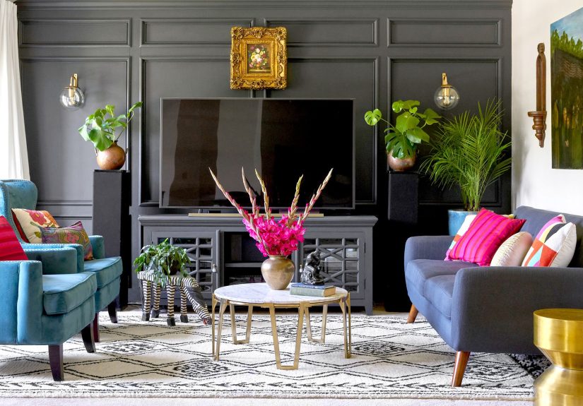
Living Room: The Statement-Sofa Strategy
The living room is the easiest place to go bold because it already has big furniture that can carry color. If you want drama without repainting, choose one anchor piece:
- a velvet emerald sofa
- a sapphire area rug with pattern
- floor-to-ceiling curtains in deep aubergine
Then keep the rest calm: lighter walls, neutral chairs, and a few accents that echo the hero color (art, a throw, a lamp shade). Add one “sparkle” elementbrass, a mirror, or glossy ceramicso the jewel tone reads as intentional and luxe.
Bedroom: Moody, Cozy, and Slightly Mysterious
Bedrooms love jewel tones because they naturally create a cocoon effect. Two easy moves:
- Color-drench light: paint the walls a deep tone and keep trim slightly lighter or satin so it reflects light.
- Headboard moment: choose a plush, jewel-toned upholstered headboard and keep bedding mostly neutral with jewel accents.
Pro tip: in bedrooms, texture matters as much as color. Matte walls + velvet pillows + crisp cotton sheets = rich but breathable. Like a fancy hotel, minus the tiny shampoo that never opens correctly.
Dining Room: Go Full “Jewel Box”
If there’s one room that can handle theatrical color, it’s the dining room. Deep colors flatter candlelight, make artwork pop, and instantly turn takeout into “an experience.” Consider a saturated wall color, then layer:
- wood table (walnut, oak, or even black-stained)
- metallic chandelier or sconces
- bold art with hints of your jewel palette
Finish with one unexpected elementlike patterned drapery or a vintage rugso the room feels collected, not catalog.
Kitchen: Cabinets, Tile, or a Single Daring Island
Jewel tones in the kitchen can look unbelievably high-end. If full cabinetry feels like a commitment (it is), choose one zone:
- Island in emerald or navy with lighter perimeter cabinets
- Backsplash in sapphire or green glass tile to bounce light
- Statement range hood or painted pantry door as a “surprise color”
Pair jewel tones with warm metals (brass, champagne bronze) for glow, or with black hardware for modern edge. Keep counters and walls simpler so the color feels like a designed focal point, not an accident involving paint and confidence.
Bathroom: Small Space, Big Drama
Powder rooms are basically permission slips for bold design. Jewel tones make them feel like tiny luxury lounges. A few winning combos:
- deep green walls + brass mirror + white sink
- inky navy + crisp marble-look surfaces + warm wood vanity
- plum paint + graphic wallpaper on one wall + soft lighting
In small, dark rooms, lighting and reflectivity are everything. Add a mirror (or two) and choose fixtures that create a soft glow rather than harsh overhead glare.
Entry and Hallways: The “First Impression” Flex
If you want a bold, dramatic home without touching the main living spaces, start at the entry. A jewel-toned hallway feels deliberate and stylishlike your house put on a blazer. Paint the walls deep, then keep artwork frames and trim crisp so it doesn’t feel cave-like. Add a runner rug with a hint of the same jewel tone to tie it together.
Texture: The Cheat Code That Makes Jewel Tones Look Expensive
Jewel tones become truly irresistible when they’re not just paint, but materials. Texture gives saturated color depth, keeps it from looking flat, and signals “designer energy.” Try layering:
- Velvet (pillows, sofas, ottomans) for instant richness
- Silk or satin (small accents) for a soft sheen
- Leather (cognac, oxblood) to warm up cooler jewel tones
- Natural wood to ground the palette
- Stone and ceramic to add weight and permanence
Even a neutral room can feel jewel-toned if you add a few plush textiles and one saturated focal piece. This is great news for anyone who wants drama but also wants their space to still be “Tuesday-functional.”
Metals, Mirrors, and Shine: How to Make Jewel Tones Glow
Jewel tones love companyespecially reflective company. Metals and mirrors bounce light around and keep deep colors from feeling heavy.
Metal choices (and the mood they create)
- Brass / gold: warm, classic, glamorous
- Bronze: cozy, vintage, moody
- Chrome / nickel: crisp, modern, cooler
- Matte black: graphic, contemporary, grounded
Mirrors are the underrated MVP here. They reflect light, visually expand the space, and help dark, saturated walls feel intentional rather than “oops, it got gloomy.” If your room is jewel-toned, give it at least one reflective surface that catches the lightmirror, glossy lamp, lacquered tray, or even a framed print with glass.
Lighting: The difference between “luxury lounge” and “basement vibe”
Deep color needs layered lighting. Aim for three types:
- Ambient (overall glow): a chandelier, flush mount, or recessed lights on a dimmer
- Task (practical): reading lamps, under-cabinet lights
- Accent (mood): sconces, picture lights, candles, LED strips behind shelving
Skip harsh, single-point overhead lighting when possible. If your jewel-toned room looks “flat” at night, it’s usually not the paint’s faultit’s the lighting’s personality problem.
Patterns and Art: The Maximalist-Friendly Way to Mix Jewel Tones
Jewel tones are perfect for pattern because they already come with built-in richness. If you want to layer multiple jewel shades without chaos, let a pattern do the organizing:
- Persian-style rugs that include navy, ruby, and emerald
- botanical wallpaper with deep greens and warm reds
- geometric prints with sapphire + gold
Art is also a cheat code: one large piece that includes your jewel palette can guide everything else. Pull two colors from the artwork for pillows and accessories, and suddenly the room looks “styled,” not “randomly colorful.”
Common Mistakes (So You Don’t Accidentally Create a Castle Dungeon)
- Going dark without adding shine: Deep walls need mirrors, metals, or glossy accents to keep them lively.
- Too many competing hero colors: Pick one lead jewel tone, then support it with quieter partners.
- Ignoring undertones: Emerald can lean blue or yellow; whites can be warm or stark. Test samples in your lighting.
- Forgetting negative space: Let some areas stay calmsolid neutrals are the “rest” in the music.
- Over-accessorizing: A few intentional pieces beat a sea of tiny objects screaming for attention.
A Quick Jewel-Tone Checklist (Small Changes, Big Payoff)
- Swap in jewel-toned throw pillows with mixed textures (velvet + linen).
- Add a deep-toned throw blanket over a neutral sofa.
- Bring in a bold rug that includes at least two jewel tones.
- Upgrade hardware to brass or matte black for contrast.
- Hang a large mirror opposite a window to amplify light.
- Use a dimmer switch (the unsexy hero of dramatic rooms).
Bonus: Real-World Experiences People Share After Going Jewel Tone (About )
When people first try jewel tones, the most common reaction is: “Why didn’t I do this sooner?” The second most common reaction is: “Waitwhy does it look amazing in daylight but slightly intense at night?” That second one is where real-world lessons kick in.
Lesson 1: Lighting isn’t optional; it’s the whole deal. In homes where jewel tones look polished, there’s almost always layered lighting. A single overhead fixture can make deep paint feel heavy. Add a table lamp, a floor lamp, and one warm accent light, and suddenly that same wall color reads as cozy, not cavernous. People also notice that a dimmer switch turns jewel tones into a mood on demandbright for cleaning, low for “fancy lounge” energy.
Lesson 2: The “sample first” advice is boringuntil it saves you. Saturated colors shift dramatically depending on exposure, bulbs, and surrounding materials. Folks who skip sampling sometimes end up with emerald that looks perfect… until it turns almost black in the corner that gets no sun. The homeowners who are happiest tend to test two to three similar shades and look at them morning, afternoon, and night. It’s not overthinking; it’s future-you being grateful.
Lesson 3: Jewel tones feel more expensive when the room has something natural in it. Again and again, people report that wood, stone, and woven textures keep jewel tones from feeling “too formal” or “too theatrical.” A navy wall with a warm wood console? Instant sophistication. Emerald cabinets with a light natural wood shelf? Suddenly it feels modern and welcoming. Even adding a simple jute runner or a wood-framed mirror can make a saturated room feel grounded.
Lesson 4: One big jewel-toned move beats ten tiny ones. A lot of people start by sprinkling jewel tones everywhereone small vase here, one tiny pillow there. The result can look tentative, like the room isn’t sure it’s allowed to be colorful. The spaces that get compliments usually have one confident statement: a jewel-toned sofa, a bold rug, or a painted dining room. Then smaller accents echo that choice. It’s the difference between “decor” and “design.”
Lesson 5: Your home will tell you what it can handle. Some rooms love full color drenching. Others prefer an accent wall and a patterned rug. People who lean into the architecturebig windows, high ceilings, trim detailsoften find jewel tones look even richer. In tighter spaces, the most successful approach is usually to add reflectivity (mirrors, glossy finishes) and keep at least one element lighter (a ceiling, trim, or art) so the room doesn’t feel compressed.
The best takeaway from these shared experiences is simple: jewel tones are bold, but they’re not “high maintenance.” When you pair saturated color with good light, natural texture, and one clear focal point, the room becomes dramatic in the best waylike a movie scene where the set looks incredible, and nobody is worried about spilling popcorn.
Conclusion
Decorating with jewel tones is less about being fearless and more about being strategic: choose one hero shade, balance it with neutrals and natural materials, add shine and layered lighting, and let texture do the heavy lifting. The result is a home that feels bold, dramatic, and genuinely livablelike it has great stories, great taste, and possibly a secret velvet smoking jacket hidden somewhere (even if it’s just a throw blanket).