Table of Contents >> Show >> Hide
- What Is Color Therapy, Exactly?
- Why Everyone Is Suddenly Obsessed With It
- How Different Colors Tend To Feel
- How To Use Color Therapy at Home Without Going Overboard
- Color Therapy Beyond Paint
- What Color Therapy Can and Cannot Do
- The Real Secret: Your Home Should Feel Like It Likes You Back
- Experiences With Color Therapy: What It Actually Feels Like in Real Life
- Conclusion
- SEO Tags
Every so often, a trend comes along that feels equal parts stylish, sensible, and just a tiny bit mystical. Right now, that trend is color therapy. Not in the “paint your kitchen lime green and suddenly become a fully healed forest sprite” kind of way, but in the more practical, grown-up, and surprisingly useful sense: the idea that color can shape mood, influence energy, and change how a space feels.
And honestly? That tracks. We already know color affects how we shop, decorate, dress, and even describe our emotions. We feel blue. We see red. We talk about green with envy and rosy outlooks like language itself has been mood-boarding for centuries. So it is no wonder people are newly obsessed with using color more intentionally at home, at work, and in their daily routines.
The modern fascination with color therapy sits at the intersection of wellness, interior design, psychology, and a little bit of “I am tired of beige making me feel like a tax form.” It is about using hue, tone, saturation, and light to create environments that support calm, focus, comfort, or joy. Some of it is backed by research. Some of it is rooted in long-standing tradition. And some of it is simply common sense dressed in very attractive paint chips.
So if you have been wondering whether color therapy is actually worth the hype, here is the honest answer: yes, with nuance. No single shade can solve burnout, heartbreak, bad sleep, or the emotional damage caused by overhead fluorescent lighting. But color can absolutely influence how a room feels and how you experience it. That is not magic. That is environment.
What Is Color Therapy, Exactly?
Color therapy, often called chromotherapy, is the practice of using colors or colored light to support physical or emotional well-being. In its broadest sense, it includes everything from bright light therapy used for seasonal depression to the intentional use of calming greens, grounding earth tones, or energizing yellows in a home or workspace.
That broad definition matters, because “color therapy” is often used to describe three different ideas that people casually lump together:
1. Color Psychology
This is the study of how colors influence mood, attention, perception, and behavior. It is not a crystal-ball science, but it does offer useful insight into why certain shades feel stimulating, restful, cozy, dramatic, or fresh.
2. Light Therapy
This is the more evidence-based medical lane. Bright light therapy is widely used for winter-pattern seasonal affective disorder, and different wavelengths of LED light are used in dermatology for concerns such as acne or inflammation. That is real medicine, not a mood board with a stethoscope.
3. Decorative or Lifestyle Color Therapy
This is where most people live day to day. It is the intentional use of paint, textiles, lighting, art, and accessories to support how you want to feel in a space. Think soft blues in a bedroom, warm peach in a powder room, or a kitchen that wakes you up without yelling at you before coffee.
The important distinction is this: color therapy is most useful when it is treated as a supportive tool, not a cure-all. It can help shape atmosphere, routine, and comfort. It cannot replace therapy, medical care, sleep, boundaries, or a vacation.
Why Everyone Is Suddenly Obsessed With It
The obsession with color therapy makes perfect sense in a world where people are trying to make their homes do everything. Today, one room may need to be a workspace, a refuge, a content backdrop, a reading nook, and occasionally a place where someone panic-folds laundry while rethinking life choices. We are asking more from our spaces, so naturally we are paying more attention to the emotional effect of color.
There is also a deeper shift happening. People are moving away from decorating solely for trends and toward decorating for feeling. That means fewer rooms designed to impress strangers on the internet and more rooms designed to support actual human life. Cozy, moody, restorative, uplifting, cocooning, cheerful, grounded: these are emotional goals, not just aesthetic labels.
Color therapy fits that mindset beautifully because it is both expressive and functional. It lets you personalize your environment without needing a full renovation. A wall color, lamp shade, throw blanket, or piece of art can radically change the tone of a room. That is a fairly affordable emotional upgrade, especially compared with buying a new sofa because you are convinced it will fix your week.
How Different Colors Tend To Feel
Let us be clear: color response is not one-size-fits-all. Your personal history, culture, climate, taste, and even the amount of natural light in a room can change how a color lands. Still, some color patterns show up often enough to be useful.
Blue: The Calm Professional
Blue is the reliable overachiever of color therapy. It is frequently associated with calm, stability, trust, and restfulness. Soft blue bedrooms often feel airy and quiet, while dusty or deeper blues can feel cocooning and sophisticated. If your nervous system needs a polite email instead of a group text in all caps, blue is a strong choice.
Green: The Nature Reset
Green often feels restorative because it is so closely tied to nature. Sage, olive, eucalyptus, moss, and muted celadon can make a room feel grounded without becoming sleepy. Green is a favorite for bedrooms, offices, and living spaces because it walks that nice line between calm and alive.
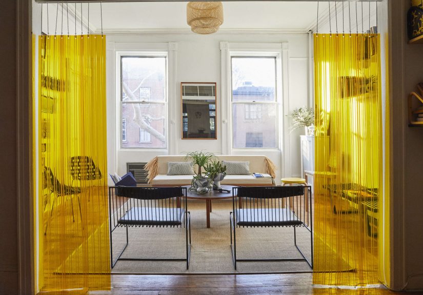
Yellow: The Instant Espresso Shot
Yellow brings brightness, optimism, and creative energy. The trick is using it wisely. A buttery yellow can feel warm and welcoming, especially in kitchens or breakfast nooks. A super-saturated neon yellow, however, can make your eyeballs file a complaint. With yellow, tone matters more than enthusiasm.
Red and Orange: High Energy, Big Personality
Warm colors tend to feel social, bold, and stimulating. Red can feel passionate, dramatic, or intense. Orange feels playful, expressive, and energetic. These shades can work beautifully in dining areas, entryways, or small doses where you want momentum and warmth. They are less ideal in spaces where you are trying to lower your heart rate and stop replaying awkward conversations from 2017.
Pink and Purple: Softness With a Plot Twist
Pink has evolved far beyond sugar-sweet stereotypes. Dusty rose, blush, clay pink, and salmon can feel flattering, comforting, and warm. Purple ranges from introspective and moody to luxe and whimsical, depending on the depth. Lavender, in particular, often reads as both calm and creative.
Neutrals: The Quiet Heroes
Neutrals are not boring when used well. Warm whites, creamy beiges, mushroom tones, greiges, and soft taupes can create a soothing backdrop that makes a space feel breathable. The key is undertone. A cold gray can feel sterile in one room and chic in another. A warm neutral can feel like a soft exhale.
How To Use Color Therapy at Home Without Going Overboard
The biggest myth about color therapy is that you need to repaint your entire home in dramatic, emotionally strategic hues. You do not. In fact, the best color therapy often starts small and gets more specific as you notice what actually works for you.
Start With the Mood, Not the Shade
Before you ask what color to choose, ask how you want the room to feel. Rested? Focused? Cheerful? Grounded? Romantic? Once you know the goal, color becomes easier to use with intention instead of panic-ordering sample pots at midnight.
Match the Room to the Function
Bedrooms usually benefit from softer, more restful tones. Home offices often work well with balanced greens, muted blues, or warm neutrals that support concentration. Kitchens and dining spaces can handle a bit more energy. Living rooms are flexible, but the best ones often mix soothing base colors with warmer accents so the room feels welcoming, not sleepy.
Use Lighting Like a Co-Designer
Color never exists alone. The same paint can look serene in morning light and slightly unhinged by evening lamp glow. Warm lighting can soften a color, while cool lighting can sharpen it. If you are serious about color therapy, think beyond paint and consider bulbs, lamp placement, dimmers, and how a room changes throughout the day.
Try Color in Layers
Walls are just one piece of the puzzle. Art, pillows, books, bedding, rugs, curtains, vases, candles, and even flowers contribute to the emotional palette of a room. If painting feels like a commitment issue waiting to happen, start with accents and see how you respond.
Pay Attention to Saturation and Brightness
Not all blues are calming. Not all yellows are cheerful. A muted shade behaves very differently from a bright one. Often, softer or slightly grayed versions of a color feel more livable for everyday use, while brighter tones are better as accents.
Color Therapy Beyond Paint
One of the best things about this obsession is that you do not need a contractor to try it. Color therapy can show up in small, low-risk, delightfully practical ways.
You can wear colors that reflect the energy you need. A crisp blue shirt for focus. A warm coral sweater when you want a little lift. A green notebook that makes your desk feel less like a cubicle and more like a functioning ecosystem.
You can use color in routines. Warm amber light in the evening can help set a wind-down mood, while brighter, cooler light in the morning can support alertness. A cheerful mug, a calming phone wallpaper, or a set of towels in a shade you genuinely love may sound minor, but tiny visual cues add up.
Even food gets involved here. Bright produce, colorful plates, and visually pleasing table settings can subtly affect appetite, mood, and the sense that you are maybe, just maybe, doing better than eating crackers over the sink again.
What Color Therapy Can and Cannot Do
Here is where we keep things honest. Color therapy can change atmosphere. It can support rest, improve comfort, influence the perception of warmth or freshness, and help a space feel more emotionally aligned with your needs. It can make habits easier by turning a room into a cue: this is where I focus, this is where I rest, this is where I breathe.
What it cannot do is function as a substitute for medical or mental health treatment. If you are dealing with depression, anxiety, chronic stress, or sleep issues, color may support your environment, but it should not carry the whole job alone like a wildly underpaid intern.
It is also worth remembering that there is no universal rulebook. Some people find deep navy soothing; others find it heavy. Some people love energizing red; others feel like it raises the volume in their brain. The best color therapy is personal, observant, and flexible.
The Real Secret: Your Home Should Feel Like It Likes You Back
That is really what this current obsession is about. Color therapy is less about chasing perfect symbolism and more about creating spaces that cooperate with your life. A calming bedroom. A cheerful kitchen. A home office that does not feel like a fluorescent punishment box. A reading corner that feels like a reward instead of an afterthought.
When color is chosen with intention, even ordinary rooms can start to feel more supportive. Not because paint has supernatural powers, but because environment matters. Human beings are sensory creatures. We respond to light, sound, texture, temperature, scent, and yes, color. Once you start noticing that, you cannot really unsee it.
So the next time you find yourself weirdly attached to a certain green, a comforting cream, or a moody blue that feels like emotional background music, trust that instinct. Your home may not be speaking in full sentences, but color is one of the clearest ways it communicates.
Experiences With Color Therapy: What It Actually Feels Like in Real Life
Color therapy becomes most interesting when it moves from theory into lived experience. Ask almost anyone who has changed the color of a room, switched out harsh bulbs for warmer ones, or started wearing certain shades on purpose, and you will hear the same thing: it is subtle, but it is real. The shift usually does not arrive with fireworks. It arrives with a feeling. A room suddenly seems easier to be in. Morning feels less abrasive. Bedtime feels less chaotic. You stop avoiding a corner of your home that used to feel oddly cold or flat.
One of the most common experiences people describe is discovering that their favorite color is not always the best color for their walls. Someone may love bright red in fashion, lipstick, or art, then realize a red office makes them feel restless. Another person may think beige is dull until they find the right warm neutral and realize the room finally feels peaceful instead of empty. That is one of the funniest truths about color therapy: the right shade is less about your identity and more about the job the room needs to do.
Bedrooms are often where people notice the effect fastest. Switching from a bright, cool white light to dimmer warm lighting in the evening can make the space feel instantly more restful. Adding soft blue-green bedding or muted sage curtains can create a visual signal that says, “We are done performing for the day.” It does not put you to sleep like a magic spell, but it can remove some of the sensory friction that keeps your mind buzzing.
Workspaces tell a different story. People often report feeling more focused in offices with grounded greens, balanced blues, or warm neutrals than in overly stark white rooms. A space that feels visually aggressive can make concentration harder. A space that feels calm but not sleepy can make it easier to settle in and stay there. Sometimes the change is as simple as adding artwork with natural greens, using a desk lamp with better warmth, or replacing clutter with a tighter color palette that gives your eyes fewer things to argue with.
Then there is the emotional side. Certain colors can become deeply personal anchors. A dusty rose may remind someone of a comforting childhood bedroom. A rich olive may feel stabilizing because it echoes nature. A soft yellow kitchen may make mornings feel more hopeful, especially during stressful seasons. These responses are not childish or imaginary. They are part of how memory, environment, and emotion work together.
That is why the best experiences with color therapy are rarely about rules. They are about noticing. Which colors make you unclench a little? Which ones make a room feel lighter, warmer, safer, clearer, more alive? Once you start asking those questions, color stops being decoration alone. It becomes a tool for making everyday life feel a bit more human.
Conclusion
Color therapy is having a moment, but it is more than a passing obsession. At its best, it is a thoughtful way to use color, light, and atmosphere to support how you want to feel in your space and in your routines. The science is stronger in some areas than others, but the practical takeaway is refreshingly simple: what surrounds you affects you.
You do not need to repaint your whole house, memorize a color wheel, or pretend that one shade of sage will transform you into a calmer, more hydrated person with flawless boundaries. You just need to start paying attention. Notice what energizes you, what settles you, and what makes your home feel more like a place that restores rather than drains.
That is the real charm of color therapy. It is accessible, expressive, and personal. It invites you to design for emotion, not just appearance. And in a world that can feel loud, flat, and overlit, that kind of intentional beauty feels less like a trend and more like smart survival.