Table of Contents >> Show >> Hide
- Why Bathroom Color Schemes Matter
- How to Choose the Right Bathroom Color Scheme
- 8 Bathroom Color Schemes That Actually Work
- 1. Warm White, Greige, and Natural Wood
- 2. Sage Green, Crisp White, and Brushed Brass
- 3. Dusty Blue, Soft Gray, and Chrome
- 4. Navy, Bright White, and Gold
- 5. Blush, Taupe, and Matte Black
- 6. Charcoal, White Oak, and Polished Nickel
- 7. Sand Beige, Cream, and Terracotta
- 8. Black, White, and Warm Metal
- Best Bathroom Color Schemes for Small Bathrooms
- How to Pair Paint With Tile, Vanities, and Hardware
- Mistakes to Avoid When Choosing Bathroom Colors
- Real-Life Experiences With Bathroom Color Schemes
- Conclusion
Your bathroom may be the smallest room in the house, but it has an almost supernatural ability to influence your mood. A good bathroom color scheme can make a rushed Monday morning feel a little less tragic and a late-night shower feel like a spa instead of a fluorescent regret chamber. That is why choosing the right palette matters more than people think.
The best bathroom color schemes are not just pretty on a paint chip. They work with your lighting, your tile, your vanity, your hardware, and the size of the space. They also survive steam, splashes, and the occasional moment when someone decides a bath mat counts as “decorating.” In other words, this is a room where style and practicality need to get along.
In this guide, you will find smart, stylish, and highly livable bathroom color schemes, plus tips on how to choose one that works for your home. Whether you love airy neutrals, moody drama, or a little color with a lot of charm, there is a palette here with your name on it.
Why Bathroom Color Schemes Matter
A bathroom color scheme does more than color the walls. It shapes how big the room feels, how warm or cool it looks, and how restful the overall space becomes. Soft whites, muted greens, and pale blues tend to create a calm, open feel. Deep navy, charcoal, and black can add richness and drama when used with intention. Warm beige, greige, blush, and clay tones make a bathroom feel less sterile and more welcoming.
Color also helps organize the room visually. In a well-designed bathroom, the wall color, vanity finish, tile, and metal accents feel connected rather than randomly assigned by a committee of tired appliances. A strong palette creates flow, especially if your bathroom connects to a bedroom, hallway, or primary suite.
One practical rule that works beautifully here is the classic 60-30-10 balance: use one dominant color for most of the room, a secondary color for major supporting surfaces, and a smaller accent color for punch. Think soft white walls, warm oak vanity, and black fixtures. Or sage green walls, white tile, and brushed brass accents. Simple. Effective. Very hard to hate six months later.
How to Choose the Right Bathroom Color Scheme
Look at Your Fixed Features First
Before you fall in love with a dreamy shade of misty blue, study the elements that are not changing. Tile, countertop, flooring, tub surrounds, and vanity finishes all carry undertones. A cool gray tile may clash with a creamy yellow-white wall. A warm travertine floor may look better with sand, mushroom, or olive than with icy blue.
Think About Light Like It Pays Rent
Bathrooms can be tricky because they often have small windows or no natural light at all. North-facing bathrooms can make colors feel cooler. Warm artificial lighting can soften crisp whites and deepen earthy tones. Always test paint swatches in the actual room at different times of day. A color that looks sophisticated at noon can look strangely minty at 9 p.m. under vanity lights.
Match the Mood to the Bathroom’s Job
A powder room can handle more drama because you are in it for shorter visits. A primary bathroom often benefits from soothing colors that age well. A kid’s bathroom can handle playful accents, but the base palette should still be easy to live with. In other words, save the wild personality crisis for wallpaper, not for permanent tile if you are nervous about commitment.
Choose Finishes That Can Handle Humidity
Bathrooms are wet spaces, so your paint choice should not be all beauty and no backbone. Moisture-resistant paint and the right sheen can help walls stand up better to steam and daily wear. The exact finish depends on the room and how heavily it is used, but durability matters just as much as color.
8 Bathroom Color Schemes That Actually Work
1. Warm White, Greige, and Natural Wood
This is the modern classic for people who want a bathroom that feels fresh without looking cold. Warm white walls keep the room bright, greige adds soft depth, and a natural wood vanity brings in texture and warmth. The result feels relaxed, expensive, and easy to style.
This color scheme works especially well in bathrooms with limited natural light because warm whites reflect light while greige keeps the palette grounded. Add brushed nickel or matte black hardware depending on whether you want a softer or more graphic finish.
2. Sage Green, Crisp White, and Brushed Brass
Sage green has become a favorite for a reason. It is calm, nature-inspired, and spa-like without feeling too themed. Paired with crisp white tile and brushed brass hardware, it feels polished and current. This is one of the best bathroom color schemes for homeowners who want color but do not want to shout about it.
Sage works beautifully with marble-look surfaces, beadboard, and light oak. If you want a bathroom that says “I drink water and probably own eucalyptus,” this is the one.
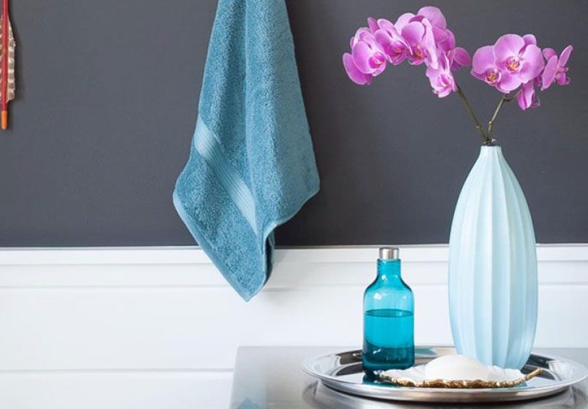
3. Dusty Blue, Soft Gray, and Chrome
Dusty blue is a dependable choice for a serene bathroom. It feels clean and timeless, and it plays nicely with gray tile, white porcelain, and chrome fixtures. This is a strong option for traditional, coastal, or transitional bathrooms.
To keep it from feeling chilly, layer in soft white towels, a warmer paint undertone, or a medium-tone wood stool or vanity. The goal is restful, not hospital corridor.
4. Navy, Bright White, and Gold
For a bathroom with more contrast and confidence, navy and white are hard to beat. Bright white keeps the look crisp, while navy adds depth and elegance. Gold or brass accents make the whole thing feel intentional and a little bit glamorous.
This palette works especially well in powder rooms, on vanities, or as an accent wall behind a mirror. In larger bathrooms, navy on cabinetry with white walls is often a safer long-term move than painting the entire room dark.
5. Blush, Taupe, and Matte Black
Blush is no longer reserved for nurseries, fancy stationery, or people who own far too many throw pillows. In the bathroom, a muted blush can feel warm, flattering, and surprisingly sophisticated. Pair it with taupe or mushroom tones and matte black hardware for contrast.
This scheme works well in vintage-inspired bathrooms, apartment bathrooms, or any space that needs softness without turning sugary. The key is choosing a dusty, muted pink rather than a candy-toned version.
6. Charcoal, White Oak, and Polished Nickel
Charcoal can be stunning in a bathroom when balanced with lighter materials. White oak vanity tones keep the space from feeling heavy, while polished nickel adds a clean, elegant finish. This color scheme feels contemporary, rich, and a little luxurious.
Use charcoal strategically in smaller bathrooms. It can look amazing on a vanity, lower wall paneling, or one statement wall. If the room lacks natural light, offset the dark tone with a large mirror and layered lighting.
7. Sand Beige, Cream, and Terracotta
If you want your bathroom to feel warm, earthy, and relaxed, this palette deserves your attention. Sand beige walls, creamy tile, and terracotta accents create a grounded look that feels both modern and timeless. It is especially good for bathrooms with Mediterranean, organic modern, or rustic influences.
Add woven textures, natural stone, and soft linen shower curtains to complete the look. This scheme is proof that neutral does not have to mean boring. Neutral can still have a pulse.
8. Black, White, and Warm Metal
Black and white remains one of the most iconic bathroom color schemes for a reason. It is crisp, versatile, and works across vintage, modern, farmhouse, and minimalist styles. The trick is to keep it from feeling flat by introducing a warm metal finish such as brass, copper, or aged bronze.
Try white walls, black floor tile, and a walnut vanity. Or use white subway tile with black grout and brass sconces. The contrast gives the room structure, while the warm accents keep it inviting.
Best Bathroom Color Schemes for Small Bathrooms
Small bathrooms often benefit from lighter colors because they reflect more light and help the room feel more open. Soft white, pale blue, muted green, light greige, and warm beige are all reliable choices. That said, dark colors are not forbidden. A small powder room can look dramatic and memorable in deep forest green, navy, or charcoal if you balance it with reflective surfaces and good lighting.
If your goal is to make a small bathroom feel bigger, keep contrast lower and use a palette with similar values. For example, soft gray walls, white trim, and pale stone tile create less visual interruption than sharp black-and-white contrast. You can also run tile higher on the wall or to the ceiling to make the room feel taller.
How to Pair Paint With Tile, Vanities, and Hardware
Tile
White tile gives you flexibility, but undertones still matter. Bright white tile works well with crisp whites, navy, charcoal, and cool blues. Creamier white tile looks better with warm whites, beige, taupe, and earthy greens.
Vanities
Wood vanities warm up cooler palettes and soften stark white bathrooms. Painted vanities in navy, black, or green can become the focal point of the room. If you already have a bold vanity, keep the wall color quieter so the room does not feel chaotic.
Hardware
Chrome and polished nickel feel clean and classic. Brass adds warmth and richness. Matte black gives modern contrast. Choose a metal finish that supports the mood of the palette rather than fighting it for attention.
Mistakes to Avoid When Choosing Bathroom Colors
Ignoring Undertones
A white is never just white, and a gray is rarely “just gray.” Compare samples next to your tile, countertop, and vanity before making a decision.
Choosing Trend First, Room Second
A trending color is not always the right color for your bathroom. If the room gets little light or has warm fixed finishes, forcing an icy designer shade may backfire.
Forgetting Contrast and Texture
A bathroom full of flat, similar finishes can look dull even if the color itself is lovely. Mix paint, tile, wood, glass, stone, and metal to give the palette dimension.
Skipping Sample Tests
This is the design equivalent of buying jeans without trying them on. Test first. Regret less.
Real-Life Experiences With Bathroom Color Schemes
One of the most useful lessons people learn from living with a bathroom color scheme is that the “perfect” paint chip is rarely the whole story. A friend of mine once chose a cool gray for a guest bathroom because it looked sleek in the store and elegant on social media. Once it was on the walls, though, the room felt flat and chilly. The space had no window, the vanity lights were warm, and the beige floor tile suddenly looked oddly pink beside the gray. After repainting the walls a softer mushroom color, the entire bathroom relaxed. The tile made sense, the mirror looked brighter, and the room finally felt intentional.
Another homeowner went in the opposite direction and used a deep navy on a powder room wall behind a white pedestal sink. On paper, it sounded risky. In reality, it looked fantastic because the room had strong lighting, bright trim, and a brass-framed mirror that bounced light around. Guests always commented on it because it felt bold but still classic. That is the funny thing about bathroom color schemes: sometimes the smallest room is the best place to take a chance.
People also discover that soft, nature-inspired colors tend to have the best staying power. Sage green, pale blue, sandy beige, and warm white may not sound dramatic, but they are colors homeowners rarely get tired of. They work across seasons, they flatter most materials, and they make everyday routines feel calmer. That matters more than people expect. When your bathroom feels easy on the eyes at 6:30 in the morning, you start to appreciate subtle design wins.
There is also a practical side to lived experience. Families with busy bathrooms often realize that the most successful color schemes are not only pretty but forgiving. Very bright white can show every splash, every scuff, and every mysterious toothpaste event. Deep black can show dust and dried water spots faster than you can say “who touched the faucet?” Mid-tone colors and layered finishes often strike the best balance between beauty and sanity.
Many people learn to love contrast in smaller doses. Maybe they wanted an all-dark bathroom at first, but ended up using charcoal on the vanity instead of every wall. Or maybe they were nervous about color and started with white walls, then added olive towels, terracotta accessories, and a painted stool. That is often how the best bathroom color schemes evolve: not through one giant dramatic decision, but through a series of smart little choices that start talking to each other.
Experience also teaches that bathrooms should relate to the rest of the home. A bathroom that completely ignores the surrounding style can feel disconnected, even if it is beautiful on its own. The most satisfying results usually borrow something from nearby rooms, whether that is a warm wood tone, a black metal finish, a favorite white paint, or a soft accent color repeated in artwork or textiles.
In the end, the best bathroom color scheme is the one that fits your space, your light, and your daily life. Not the one that looked trendy for five seconds on a phone screen. Not the one your cousin swears changed her life. Yours. The one that makes the room feel cleaner, calmer, brighter, warmer, moodier, or more polished in exactly the way you want. That is when color stops being decoration and starts feeling like good design.
Conclusion
The most successful bathroom color schemes combine style, comfort, and a little common sense. If you want a timeless look, start with warm whites, soft greiges, muted blues, or nature-inspired greens. If you want more character, bring in navy, charcoal, blush, terracotta, or black through vanities, accent walls, tile, or accessories. Pay attention to lighting, fixed finishes, and moisture-friendly paint, and always test samples before committing.
A beautiful bathroom does not need to be huge or wildly expensive. It just needs a color scheme that feels cohesive, flattering, and easy to live with. Get that right, and even your Tuesday morning toothbrush routine will feel like it has better production values.