Table of Contents >> Show >> Hide
- What “designers are skipping” really means
- 1) Pumpkin Overload (AKA: The Gourd Avalanche)
- 2) Veggie-Shaped Vessels and Novelty Ceramics
- 3) Oversaturated “All the Rust” Color Schemes
- 4) Seasonal Word Art Signs (“Hello Pumpkin,” We Need to Talk)
- 5) Faux Foliage and Fake Plants as “Instant Fall”
- 6) Fast-Fashion “Seasonal Hauls” and Mass-Produced “Wall Candy”
- 7) Open-Concept Everything (Especially When Fall Calls for Cozy)
- A designer-approved Fall 2025 refresh you can do in one weekend
- Real-World Experiences From Fall 2025: What People Learned (So You Don’t Have To)
- Conclusion: Skip the “Trend Costume,” Keep the Fall Feeling
Fall decorating is supposed to feel like a warm hug. But every year, the internet tries to convince us that “a warm hug” looks like a retail aisle exploded
in our living room. The good news? Plenty of designers were already side-eyeing certain Fall 2025 home trends before sweater weather even showed up.
Not because fall is “out,” but because homes are trending toward something better: cozy, collected, and actually livable.
This isn’t a list of “never do this again.” It’s a list of “do this with a little more taste and a little less… craft store panic.” If you love a trend, keep it.
Just keep it on a shorter leash.
What “designers are skipping” really means
Most design pros aren’t allergic to fun. They’re allergic to overdone, hard-to-style, looks-cheap-fast, or
doesn’t-age-well. Fall 2025’s biggest skip-worthy moments weren’t about autumn itselfthey were about decoration choices that felt too literal,
too temporary, or too “I bought this because TikTok told me to.”
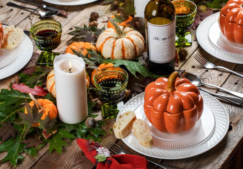
1) Pumpkin Overload (AKA: The Gourd Avalanche)
Why it gets skipped
Pumpkins are a fall classic. The problem starts when your home looks like it’s hosting a pumpkin conference. A dozen mini pumpkins on the mantel, pumpkin pillows,
pumpkin candle holders, pumpkin mugs, pumpkin-shaped… everything. When the same symbol shows up everywhere, it stops feeling seasonal and starts feeling like a theme park.
Do this instead
- Choose one “hero pumpkin” moment: a single statement bowl, a simple centerpiece, or a tasteful porch grouping.
- Mix in non-pumpkin fall cues: warm wood, wool, plaid, or dried florals that read “autumn” without screaming it.
- Use real produce as styling: a bowl of apples or pears looks intentional, not gimmickyand you can snack later (design win).
2) Veggie-Shaped Vessels and Novelty Ceramics
Why it gets skipped
Pumpkin mugs. Squash vases. Gourd-shaped bowls. They’re cute… for about two weeks. Then they become awkward to store, hard to style year-round,
and suddenly your shelf looks like a farmers market cosplay.
Do this instead
- Go “harvest-inspired,” not “harvest-shaped”: choose ceramics in earthy glazes, warm whites, chestnut browns, or mossy greens.
- Bring in fall through texture: stoneware, linen, wood, or hammered metal reads seasonal without turning into novelty décor.
- If you must do themed pieces: pick one or two, and make sure they can be styled beyond fall (neutral colors help).
3) Oversaturated “All the Rust” Color Schemes
Why it gets skipped
Autumn colors are gorgeous outside. Indoors, a full-on blast of orange-rust-burgundy-brown can swallow light and make rooms feel heavy fastespecially in smaller
spaces or homes with limited natural light. Designers weren’t avoiding warmth; they were avoiding the “everything is pumpkin spice” effect.
Do this instead
- Mute the palette: lean into dusty ochre, earthy olive, warm camel, or clay tones rather than high-saturation orange everywhere.
- Use deeper colors strategically: a moody throw, a velvet pillow, or one statement chair is plenty.
- Balance with breathing room: creamy whites, soft stone tones, and natural textures keep fall colors from feeling like a cave.
4) Seasonal Word Art Signs (“Hello Pumpkin,” We Need to Talk)
Why it gets skipped
Designers tend to avoid décor that literally announces the season like a billboard. It can feel generic, dated, and a little too on-the-noselike your living room
is trying to do stand-up comedy with catchphrases.
Do this instead
- Swap slogans for stories: vintage art, framed botanicals, moody landscapes, or even a family photo wall feels personal and warm.
- Use typography more subtly: if you love words, choose a meaningful quote in a timeless style, not seasonal pun décor.
- Let materials do the talking: a wool throw, a textured rug, or layered lighting says “cozy season” without spelling it out.
5) Faux Foliage and Fake Plants as “Instant Fall”
Why it gets skipped
Some faux stems are impressive these days. The issue is the ultra-glossy, uniform, obviously-plastic foliage that looks like a stage propespecially in bright light.
It tends to collect dust, flatten a space, and age poorly when it’s too artificial to read as natural.
Do this instead
- Forage (safely) and style simply: branches, seed pods, or dried grasses in a big vase look sculptural and modern.
- Try dried florals: pampas, eucalyptus, preserved hydrangea, or wheat tones read fall without looking fake.
- If you use faux: choose fewer stems, higher quality, and mix them with real elements (like real branches) for believability.
6) Fast-Fashion “Seasonal Hauls” and Mass-Produced “Wall Candy”
Why it gets skipped
Fall 2025 design talk leaned hard into the idea that homes should feel curated, not like a catalog page you clicked “add all” on at 1:00 a.m.
Quick-ship trend décor can look repetitive from house to house, and mass-produced art often reads like filler instead of personality.
Do this instead
- Buy fewer, better pieces: one great vintage lamp beats nine trendy tabletop objects.
- Layer like a collector: combine books, ceramics, and art that mean something (even if it’s “I found this at a thrift store and it felt right”).
- Try textiles with history: quilts, wool blankets, and woven throws bring warmth and characterwithout needing a seasonal slogan.
- Commission or source original art slowly: local artists, prints from small shops, and vintage finds build a home that looks like you.
7) Open-Concept Everything (Especially When Fall Calls for Cozy)
Why it gets skipped
Open plans aren’t “bad.” But by Fall 2025, a lot of homeowners were craving rooms that feel defined, quieter, and easier to keep cozy. When everything is open,
everything is visiblemess, noise, dishes, and that one chair that becomes a laundry landmark.
Do this instead
- Create zones: a reading corner with a lamp and chair, a game table area, or a “tea station” gives fall vibes without construction.
- Use soft dividers: curtains, bookcases, folding screens, or even a tall plant can separate space without closing it off completely.
- Embrace “door moments”: if you have doors, use themcoziness often comes from containment (and the ability to hide the kitchen).
A designer-approved Fall 2025 refresh you can do in one weekend
If you want the fall feeling without the trend fatigue, focus on the moves that feel good to live with:
- Swap textiles first: add a wool throw, a textured pillow, and a warmer-toned rug (even a small one) for instant coziness.
- Warm up lighting: add one table lamp or a soft-shade floor lamp. Cozy is mostly lighting pretending to be magic.
- Style one surface: choose a coffee table, console, or mantel. Keep it simple: books + a bowl + something organic (branch, dried florals, fruit).
- Edit before you add: remove the filler décor. If you don’t love it in January, it probably won’t look “intentional” in October.
Real-World Experiences From Fall 2025: What People Learned (So You Don’t Have To)
The funniest thing about seasonal decorating is how quickly it turns into a life lesson. Plenty of homeowners went into Fall 2025 with big intentions“I’m going to
make my place feel cozy!”and came out the other side with a storage bin full of items they didn’t even like. If that sounds familiar, welcome to the club;
membership includes one slightly sticky candle and at least three pillows you thought were a “neutral.”
One common experience: people realized that quantity doesn’t equal coziness. A room packed with small seasonal objects can feel cluttered, not comforting.
The spaces that felt best were usually the ones that made a few bigger moveslike a plush throw, a warmer rug, or layered lightingand then stopped. That’s the moment
the room shifts from “I decorated for fall” to “I like being here.”
Another lesson was the “novelty trap”. Those pumpkin-shaped mugs are adorable until you’re drinking coffee from a gourd in mid-February because you forgot
to put them away. People who bought fewer novelty pieces found they could style their home longerbecause earthy ceramics, wood bowls, and warm linens don’t have an expiration date.
They just quietly do their job: making the space feel inviting.
A lot of folks also discovered that fake foliage can backfire. In photos, it can look fine. In real life, the shiny plastic leaves can stand out, especially when
sunlight hits them. Many ended up swapping faux garlands for simple branches in a vase, dried florals, or even a bowl of fruitthings that look natural because they are.
The best part? They didn’t need “perfect” symmetry. Slightly imperfect arrangements often looked more high-end.
Then there was the emotional roller coaster of the fast-decor haul. Some people bought a cart full of trendy items, decorated in one afternoon, and still felt
like the room didn’t reflect them. The fix wasn’t “buy better trendy things.” It was curation: mixing in meaningful objects, thrifted finds, artwork they actually loved,
and textiles with texture. When a space has personal layers, it stops looking like a showroom and starts looking like a homeexactly what so many people wanted in 2025.
Finally, the coziest Fall 2025 spaces tended to share one surprising habit: they were okay with being a little real. Not everything was spotless. Not every corner was styled.
The rooms that felt best were designed to be usedmovie nights, soup dinners, rainy-day readingbecause the point of cozy season isn’t to impress your guests. It’s to make you
want to stay in and enjoy your own space.
Conclusion: Skip the “Trend Costume,” Keep the Fall Feeling
Fall 2025’s smartest design mindset wasn’t anti-fallit was anti-overkill. Designers were skipping anything that felt too literal, too disposable, or too copy-and-paste.
The upgrade is simple: fewer gimmicks, more texture; fewer hauls, more heart; fewer slogans, more story. When your home feels warm, layered, and personal, it doesn’t need a sign
to announce it’s fall. You’ll feel it the second you walk in.