Table of Contents >> Show >> Hide
- Why 2026 Is Saying Goodbye to So Many “Safe” Paint Choices
- 1. Cool Gray
- 2. Stark White
- 3. Builder-Grade Greige
- 4. Overused Sage Green
- 5. Millennial Pink
- 6. Heavy Black and Charcoal Walls
- What These Outdated Colors All Have in Common
- How to Update Your Home Without Repainting Every Single Wall
- Real-Life Experiences With Outdated Paint Colors in 2026
- Final Thoughts
- SEO Tags
Paint trends do not change overnight. They drift, they simmer, and then suddenly one day you walk into a room painted in cool gray with bright white trim and think, “Ah. This room was born in the age of open-concept house flips and stainless-steel obsession.” That, in a nutshell, is what 2026 feels like for paint: less icy perfection, more warmth, depth, and personality.
Designers are not saying every once-trendy shade is now illegal. Nobody is going to arrest your living room for having a gray wall. But the mood has clearly shifted. The colors losing favor tend to be the ones that feel overexposed, flat, or too eager to play it safe. In their place, designers are embracing muddier neutrals, creamy whites, smoky greens, earthy reds, chocolate browns, and tailored khakis that feel relaxed without being boring. In other words, 2026 wants your walls to feel collected, not copied from a builder-grade mood board.
Why 2026 Is Saying Goodbye to So Many “Safe” Paint Choices
For years, homeowners leaned on the same familiar formula: cool gray walls, crisp white everything, maybe a greige room if they were feeling adventurous, and a black accent wall when they wanted “drama.” It worked for resale photos. It worked for minimal staging. It worked for the era when people wanted homes to look clean, edited, and almost suspiciously free of personality.
But 2026 is pushing in the opposite direction. Current color forecasts and designer commentary point toward rooms that feel warmer, softer, and more lived in. Think tailored khaki instead of sterile gray. Think deep smoky jade instead of dusty sage. Think rich mahogany, earthy plum, mushroom, and plastery off-whites rather than blank-box white. The message is pretty clear: if a paint color makes your house feel like a waiting room, a spec home, or a social media backdrop with no pulse, it is probably on the way out.
1. Cool Gray
Let’s start with the obvious one: cool gray. Or, if you prefer its celebrity name, millennial gray. This shade ruled walls, cabinets, floors, and sometimes entire neighborhoods for so long that many homes now feel permanently stuck in a “before and after” renovation photo from 2017.
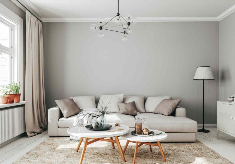
The problem is not that gray is inherently ugly. The problem is that cool gray often feels emotionally chilly. In natural light it can lean blue, lavender, or just plain lifeless. It can flatten wood tones, make upholstery feel dull, and pull the warmth out of a room faster than an overenthusiastic air conditioner. In 2026, designers are favoring grays with more complexity or skipping them entirely in favor of warmer neutrals that feel easier to live with.
What to use instead
Swap cool gray for warm taupe, mushroom, soft khaki, or a gray-brown hybrid with subtle depth. These shades still feel neutral, but they do not make your home look like it is waiting for a real estate photographer to arrive. If you love gray, choose one with earthy undertones and enough softness to play nicely with wood, stone, and warm metals.
2. Stark White
There was a time when stark white walls were treated like the ultimate design flex. They looked clean. They looked modern. They looked expensive in rooms blessed with giant windows, museum-grade art, and zero evidence of daily life. Unfortunately, most people live in homes rather than galleries, and stark white can quickly turn from “fresh” to “fluorescent dentist office.”
In 2026, designers are cooling on whites that feel too bright, too blue, or too paper-like. The issue is not white itself. White is timeless. The issue is that icy whites can read sterile, especially in rooms that need comfort, softness, and a little forgiveness. They also expose every shadow, scuff, and awkward undertone in your furniture. If your room feels one espresso shot away from becoming an operating theater, your white may be too white.
What to use instead
Look for warm off-whites, chalky creams, bone, plaster, or ivory-leaning shades. These colors still brighten a room, but they do it without the clinical edge. A softer white also makes trim, molding, textiles, and natural materials feel richer instead of washed out.
3. Builder-Grade Greige
Greige was supposed to solve the beige-versus-gray debate. Instead, it became the diplomatic but deeply unexciting compromise that spread across walls, hallways, rentals, flips, and every “neutral” room on the internet. Done well, a complex warm neutral can absolutely work. Done badly, greige looks like indecision with a paint swatch.
That is why designers in 2026 are backing away from generic, one-size-fits-all greige. The biggest complaint is not that it clashes. It is that it says absolutely nothing. After years of overuse, basic greige no longer reads sophisticated. It reads default. It is the color equivalent of replying “sounds good” to every text message. Functional? Yes. Memorable? Not even a little.
What to use instead
Choose a neutral with a clear point of view. Try mushroom, toasted almond, warm putty, dirty beige, cognac-tinted taupe, or earthy khaki. The best 2026 neutrals have a bit of visual mystery. They shift with the light, work with texture, and feel intentional rather than mass-produced.
4. Overused Sage Green
Sage green had a very strong run. It was soft, soothing, easy to style, and just outdoorsy enough to make everyone feel like they had a wellness routine. But when a color starts showing up on every kitchen cabinet, every nursery wall, every powder room vanity, and half the throw pillows in America, the fatigue sets in.
That is where sage is in 2026. Designers are not declaring war on all green paint. They are simply tired of the same dusty, safe, slightly muted sage that has become the default “I want color, but not too much color” choice. The overused versions can start to feel predictable and a little sleepy, especially when paired with pale woods and generic brass hardware.
What to use instead
Go greener with more depth or more complexity. Smoky jade, olive, moss, eucalyptus, blue-green, and moody teal are all fresher directions. These shades still feel organic and calming, but they bring more richness and character than the soft sage that has already done three full design cycles this decade.
5. Millennial Pink
Millennial pink had a moment so big it stopped being a color and became a cultural event. It lived on walls, branding, cafés, velvet chairs, packaging, and enough Instagram backgrounds to qualify as a historical period. The problem now is that the classic blush tone can make interiors feel frozen in a very specific late-2010s aesthetic.
In 2026, designers are less interested in sugary pinks that feel precious or theme-y. The old version can come off flat, overly sweet, or slightly juvenile depending on the room. And once you add brass, boucle, and a curved lamp, congratulations: your room has accidentally time-traveled.
What to use instead
Pink is not dead. It just grew up. Dusty rose, clay pink, mauve, blush with brown undertones, and even beet-like shades feel more current. These versions are moodier, more grounded, and easier to mix with woods, stone, burgundy, chocolate brown, and textured neutrals.
6. Heavy Black and Charcoal Walls
Black walls had their glam season. Charcoal had its brooding, moody, “look how daring I am” period too. And yes, in the right house, with the right architecture, they can still look fantastic. But in many everyday rooms, black and charcoal have become a shortcut to drama rather than a genuinely thoughtful design move.
The issue in 2026 is not darkness. Designers still love deep color. The issue is heaviness without warmth. Flat black or cold charcoal can swallow light, exaggerate dust, and make ordinary trim and furniture look harsher rather than more elegant. These colors often photograph better than they live. Great for the reveal shot, less great on a Tuesday afternoon when you are trying to find your phone charger in what now feels like a tasteful cave.
What to use instead
If you want depth, go warmer. Chocolate brown, espresso, oxblood, aubergine, deep olive, and mahogany-rich reds bring the same sense of mood with far more texture and sophistication. They feel dramatic, but they also feel human.
What These Outdated Colors All Have in Common
The six shades above are very different, but they share the same core problem: they no longer feel nuanced. They either became too common, too cold, too flat, or too tied to one very specific design era. That is exactly what 2026 is pushing against.
The strongest paint trends right now are not about chasing a random loud color for attention. They are about choosing shades with warmth, complexity, and emotional range. Colors that shift with daylight. Colors that make old wood look better. Colors that flatter real furniture, real books, real rugs, and real people who occasionally leave a coffee mug on the table. Imagine that.
How to Update Your Home Without Repainting Every Single Wall
If your home currently contains one or more of these fading favorites, do not panic and start ordering 37 sample pots at midnight. Not every room needs a dramatic repaint. Sometimes the fix is as simple as changing the trim color, repainting just one room, or warming up a too-cool wall with better lighting, wood tones, textiles, and art.
If your gray room feels cold, try creamy trim and warmer accessories first. If your white walls look stark, repaint the ceiling and molding in a softer tone before tackling the whole room. If your sage kitchen feels tired, swap hardware, add darker woods, or paint the island in a moodier green-blue. Paint trends are real, but context matters. A dated color becomes much less dated when it is balanced beautifully.
Real-Life Experiences With Outdated Paint Colors in 2026
One of the most common experiences homeowners describe after repainting is not “I chose the wrong color,” but “I chose the right color for a trend, not for my actual house.” That is the real trap with outdated paint colors. They often look fantastic in a showroom, on a mood board, or in a professionally lit social media post. Then you get them into a room with north-facing windows, medium-toned floors, a beige sofa you are not replacing, and a dog who sheds on everything, and suddenly the whole vision changes shape.
Cool gray is a perfect example. Plenty of people picked it because it felt modern and easy. But once they lived with it, they noticed the room felt colder in winter, duller in the morning, and strangely disconnected from wood furniture and warm-toned fabrics. What looked sleek in theory started to feel tired in practice. The same thing happened with stark white. People loved the clean look at first, then realized every shadow looked blue, every scuff was visible, and the room needed constant styling just to avoid feeling empty.
Greige caused a different kind of frustration. Homeowners often chose it because it seemed safe for resale, safe for open layouts, safe for family life, safe for everything. But after a while, many realized “safe” is not the same thing as satisfying. The walls blended into the floors, the trim, the hallway, and the next room until the whole house started to feel like one long neutral sentence with no punctuation.
Sage green and millennial pink taught another lesson: even charming colors can become exhausting when they are too trend-specific. A soft sage nursery can be adorable. A blush sitting room can be lovely. But if the exact shade is strongly tied to one design moment, the room can begin to feel dated much faster than a more layered version of the same color family. That is why richer blue-greens, clay pinks, and earthier tones are landing better now. They feel more personal and less copied.
The homeowners who seem happiest with their paint choices in 2026 are usually the ones who treat color as atmosphere, not just decoration. They test samples at different times of day. They look at the undertones against their flooring and upholstery. They pick colors that flatter the architecture instead of fighting it. Most importantly, they choose shades that still feel good when the room is messy, the light is weird, and no one is taking photos. That is the kind of experience trend-proof color creates. And honestly, that is a lot more useful than a wall color whose main talent is looking expensive on the internet.
Final Thoughts
The paint colors designers are tired of in 2026 are not necessarily “bad” colors. They are mostly colors that became too familiar, too formulaic, or too emotionally flat. Cool gray, stark white, builder-grade greige, overused sage, millennial pink, and heavy black walls all had their moment. Some had several moments. But the design mood has changed.
Now the best interiors feel warmer, richer, softer, and more individual. They use paint to create mood instead of just neutrality. They welcome complexity. They let wood, stone, fabric, and shadow do some of the work. So if you are repainting this year, skip the obvious defaults and choose a color with a pulse. Your walls do not need to scream. But in 2026, they definitely should not sound half asleep.