Table of Contents >> Show >> Hide
- A 60-Second Pre-Print Checklist (Do This Once, Save Hours Later)
- Way #1: Start With a Print-Ready File (Not a “Looks Fine on My Phone” File)
- Way #2: Match Paper, Ink, and “Media Type” Settings (This Is Where Quality Gets Real)
- Way #3: Get Color Management Right (Stop Letting Your Software and Printer Fight)
- Way #4: Print Settings and Habits That Consistently Produce “Wow” Prints
- Quick Troubleshooting: Fix the Most Common “Bad Print” Symptoms
- Real-World Experiences: What Actually Happens When You Print at Home (500+ Words)
- Conclusion
Your inkjet printer is basically a tiny, dramatic artist: it can create gorgeous photo prints… or it can
throw a tantrum and hand you a muddy, magenta-tinted disappointment. The difference is rarely “your printer is bad.”
More often, it’s the workflow: file prep, paper choice, color management, and a few settings that sound boring until you
realize they’re the difference between “gallery wall” and “recycling bin.”
Below are four practical, repeatable ways to print high quality photos on an inkjet printerat homewithout
sacrificing your entire weekend to trial-and-error. Expect specific settings, real-world examples, and the occasional
joke, because if we’re going to talk about ICC profiles, we deserve at least one laugh.
A 60-Second Pre-Print Checklist (Do This Once, Save Hours Later)
- Use the right paper preset (Media Type) for the paper you loaded (this controls ink limits and how the printer lays down ink).
- Decide who manages color: your editing app or the printer drivernever both.
- Pick “Best/High Quality/Max DPI” for final prints; save “Draft” for grocery lists and regrets.
- Run a quick nozzle check if you haven’t printed in a while (banding loves surprise appearances).
- Handle prints like fresh cookies: don’t stack them immediately, and let them cure before framing.
Way #1: Start With a Print-Ready File (Not a “Looks Fine on My Phone” File)
1) Match your image resolution to the final print size
For photo printing, resolution is less about bragging rights and more about matching detail to viewing distance.
A solid target is 240–300 PPI at the final print size. For example, an 8×10 print looks great when
your file is roughly 2400×3000 pixels (at 300 PPI). If you’re printing a 13×19 and people will view it from a couple
feet away, 240 PPI is often perfectly sharp.
The key: don’t blindly upsample a tiny file and expect miracles. Upsampling can help, but it can’t invent
true detailso prioritize starting with a good capture and sensible cropping.
2) Soft proof like a grown-up (your paper has feelings)
Your screen is backlit and punchy; your paper is reflective and… honest. That’s why soft proofing matters:
it previews how colors and contrast will translate to a specific printer/paper/ink combo using an ICC profile.
When you soft proof, you’ll usually notice:
- Deep shadows may need a slight lift (paper can’t go as dark as your monitor).
- Highly saturated colors (neon greens, intense blues) may clip on matte papers.
- “Perfect” screen contrast can print too dark if your display is set like a flashlight.
Practical example: if you’re printing a sunset on matte fine art paper, expect slightly less saturation and contrast
than glossy/luster. Soft proofing lets you make small, deliberate adjustments instead of reprinting the same sunset
four times while whispering “why?” into the void.
3) Sharpen for print (separately from screen sharpening)
Printing often benefits from output sharpening tuned to paper type. Glossy/luster papers hold detail well,
while matte papers can soften micro-contrast. A common approach is:
edit normally → soft proof → resize to print size → apply output sharpening.
If your print looks slightly soft compared to your screen, don’t panicyour screen is literally glowing. A small bump
in output sharpening (especially for matte) often brings the print to life.
Way #2: Match Paper, Ink, and “Media Type” Settings (This Is Where Quality Gets Real)
1) Choose paper like you’re choosing a frame: it changes the whole vibe
Photo paper isn’t just “paper.” It’s a finish, a coating, a texture, a thickness, and sometimes a personality.
Here’s the quick cheat sheet:
- Glossy: maximum punch and saturation; also maximum reflections and fingerprints.
- Luster/Satin: a popular sweet spotrich color with less glare and better handling.
- Matte/Fine Art: elegant, painterly, low glare; typically smaller color gamut than glossy/luster.
- Baryta/Fiber-style: “darkroom-inspired” look; fantastic depth, often used for gallery prints.
If you’re printing portraits, luster/satin is a crowd-pleaser (great skin tones, less glare). If you’re printing
graphic, high-contrast landscapes, glossy or baryta can make colors sing. Paper choice isn’t a minor detailit’s part
of the final image.
2) Always set the correct Media Type (even for third-party paper)
The Media Type (sometimes called “paper type”) in your printer driver is not a polite suggestionit tells
the printer how much ink to lay down and how to handle drying. Pick the wrong one and you can get dull prints, muddy
shadows, bronzing, or ink that takes forever to dry.
If you’re using third-party paper, use the paper maker’s recommended Media Type. When paper manufacturers provide ICC profiles,
they typically also specify the driver Media Type that profile was built around. Match them. Your printer behaves better when it
knows what it’s touching. (Relatable.)
3) Respect paper thickness and feeding (your printer has limits)
Heavy fine art sheets and thick glossy papers can be amazinguntil they scuff, skew, or jam. Many guides recommend feeding
thicker media one sheet at a time and using a rear/manual feed if your printer has it. If a paper is at the edge
of what your printer can handle, slow down and babysit the first print. It’s cheaper than replacing a bent art print and your pride.
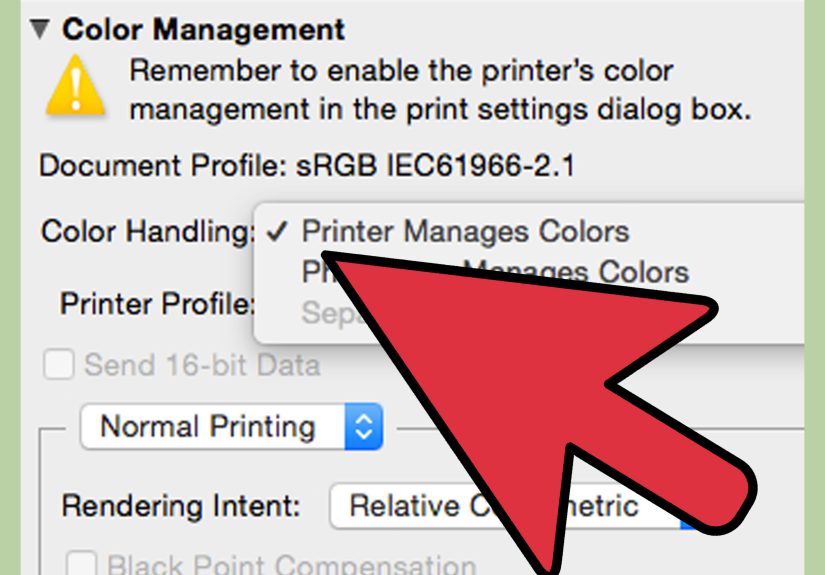
Way #3: Get Color Management Right (Stop Letting Your Software and Printer Fight)
The most common reason home prints look “off” isn’t the printer. It’s double color managementyour editing software
applies an ICC conversion, then your printer driver “helpfully” applies another. The result: weird color shifts, blocked shadows,
and skin tones that look like the subject is auditioning to be a tomato.
1) Pick one boss: your app OR your printer driver
For consistent, high-quality photo printing, many photographers choose application-managed color (Photoshop, Lightroom, etc.)
because it gives you control over:
printer/paper ICC profile, rendering intent, and soft proofing workflow.
The rule is simple:
If your app manages colors, set the printer driver’s color adjustment to Off/None/No Color Adjustment.
If the printer manages colors, then your app should not apply a paper ICC profile.
2) Use the correct ICC profile for your exact printer + paper
ICC profiles aren’t generic “make it nicer” buttons. They’re specific to a printer model, ink set, and paper surface/coating.
Use the profile made for your paper on your printer, ideally from the paper manufacturer or printer brand.
Switching papers without switching profiles is like changing lenses and wondering why your focal length feels different.
Tip: If your paper brand offers multiple profiles, pick the one that matches your printer driver’s Media Type recommendation.
A profile built around a “Luster” media setting won’t behave the same if you print it using a “Matte” media setting.
3) Calibrate your monitor (otherwise you’re editing with imaginary colors)
If your monitor is too bright (very common), you’ll edit your photos darker to compensatethen your prints come out too dark.
Calibration brings your display to known targets (white point, luminance, gamma), making screen-to-print matching far less painful.
Bonus: calibrating helps when you evaluate prints under consistent lighting. If you judge a print under a warm lamp at night and
compare it to a cool monitor during the day, you’re not comparing apples to applesyou’re comparing apples to a disco ball.
Way #4: Print Settings and Habits That Consistently Produce “Wow” Prints
1) Use “Best/High Quality/Max DPI” for final prints
High quality settings typically increase dot density, slow the print down, and improve fine detail and smoother gradients.
If your driver offers “Best” or “Max DPI,” use it for your final photo print. Save “Normal” for proof prints and
“Draft” for documents you don’t love.
2) Be cautious with borderless printing (it can crop and sometimes reduce quality)
Borderless prints look clean, but they come with tradeoffs: the printer often expands the image slightly to ensure ink reaches the edges,
which can crop important details. Many printers let you adjust borderless expansion (often “Min” vs “Max”).
“Min” preserves more of the image but risks a tiny white edge; “Max” guarantees no border but can trim the photo more aggressively.
If you want truly perfect edges, consider printing with a small border and trimming with a straightedge cutter. It’s less convenient,
but you’ll avoid surprise cropping and edge artifacts (and you’ll feel like a print wizard, which is always fun).
3) Let prints dryand fully curebefore stacking or framing
Many prints feel “dry to the touch” quickly, but full curing can take longer depending on ink coverage, paper coating, and humidity.
As a safe workflow: lay prints flat, avoid stacking until fully dry, and wait longer before framing or sealing behind glass.
Also: store photo paper in a cool, dry placehumidity can turn beautiful printing into “why is my ink smearing?” real fast.
4) Maintenance isn’t optional if you want consistent quality
Inkjet printers are happiest when used. If you print once every three months, clogs can show up like uninvited guests.
A quick routine helps:
- Nozzle check before an important print session
- Print head cleaning only when needed (don’t waste ink on a cleaning marathon)
- Head alignment if you see persistent softness or banding
- Keep paper paths clean to avoid scuffs and roller marks
Quick Troubleshooting: Fix the Most Common “Bad Print” Symptoms
- Print is too dark: calibrate monitor brightness; soft proof; lift shadows slightly.
- Colors are weird/oversaturated: check for double color management; confirm ICC profile selection.
- Banding or missing lines: run a nozzle check; clean heads if needed.
- Smudging or wet ink: confirm Media Type; use the correct side of photo paper; allow longer drying time; avoid stacking.
- Detail looks soft: use Best/Max DPI, turn off high-speed printing, and apply output sharpening.
Real-World Experiences: What Actually Happens When You Print at Home (500+ Words)
The first time I tried to print a “gallery-worthy” photo at home, I picked a dramatic landscapebecause of course I did.
It had deep shadows, glowing highlights, and a neon-blue twilight sky that looked incredible on my monitor. I hit Print,
confident in my artistic destiny… and the result came out looking like it had been lightly seasoned with sadness.
The shadows were plugged, the blues were muted, and the whole print felt flatter than a pancake under a steamroller.
Here’s what I learned: my monitor was set way too bright, so I’d been editing darker than I realized. The file looked
perfect on-screen because my screen was basically a tiny sun. Once I calibrated my display and softened the contrast in
the shadow areas (with soft proofing turned on), the next print looked dramatically better. Same printer. Same image.
Different reality check.
Next lesson: paper is not a neutral bystander. I once printed the same portrait on glossy and on luster/satin. Glossy
gave me pop and sparkle, but it also gave me glare that made the print hard to view under living-room lighting (plus
fingerprints appeared the second someone looked at it with enthusiasm). On luster, the skin tones looked smoother and
more natural, and the print was easier to handle without leaving evidence of human existence on the surface. That’s when
I realized paper choice isn’t “after the fact.” It’s part of the creative decisionlike picking a film stock, but for
your printer.
Then came the great “Why Is This Green So Weird?” incident. I was printing a photo with bright foliage and a teal dress.
On-screen: stylish. On paper: slightly alien. The culprit was classic double color managementmy editing app was applying
the ICC profile, and the printer driver was also “enhancing” color. Translation: two cooks, one very confused soup.
Once I set the driver to “No Color Adjustment” and let the application manage colors, everything snapped back into place.
The teal looked like teal again, and the plants stopped looking like they were auditioning for a sci-fi movie.
Finally, a humble story about patience. I printed a set of glossy photos for a small giftthen stacked them immediately
because I was feeling efficient. Ten minutes later, I discovered faint scuffs and a couple of smudges, which is the
universe’s way of saying, “Congrats, you played yourself.” Now I treat fresh prints like fresh cookies: they need a
cooling rack moment. I lay them out, let them dry, and avoid stacking until they’re truly ready. If I’m framing or
slipping prints into sleeves, I give them more time to cureespecially on heavy ink coverage areasbecause trapped
outgassing can cause weird issues later. The result: cleaner prints, fewer reprints, and a lot less dramatic sighing.
The biggest takeaway from all of this? High quality inkjet photo printing isn’t one magic settingit’s a chain.
Strong file prep + the right paper + correct ICC profile + sane printer settings + proper handling. Break one link and
your print quality drops. Strengthen the chain and your home printer starts doing things that make people say,
“Wait… you printed that yourself?”
Conclusion
Printing high quality photos on an inkjet printer is a craft, but it doesn’t have to be a mystery. Focus on the four
levers you can actually control: prepare a print-ready file, match paper and Media Type, manage color correctly with the
right ICC profile, and use quality-focused printer settings (plus a little drying-time patience). Do that consistently,
and your “home prints” stop looking like compromises and start looking like intentional, professional results.