Table of Contents >> Show >> Hide
- Table of Contents
- Why “Looks Dirty” Triggers Instant Shame
- The 30 Dirty-Looking Design Fails (And the Lesson in Each)
- 1) The rose-themed bedspread that looks… medically concerning
- 2) Plant-dyed underwear that looks like it lost a fight with nature
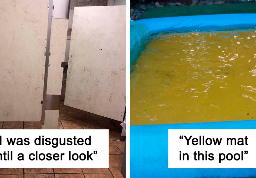
- 3) Restroom tiles that look permanently stained
- 4) “Clean-looking” coffee cups that look unclean by default
- 5) A kiddie pool with a yellow bottom that reads like… pee
- 6) A supermarket bathroom designed to look filthy
- 7) Pants that look like you peed yourself
- 8) Hotel hallway carpet that looks like blood tracks
- 9) Yellow toilet sanitizer that looks like someone didn’t flush
- 10) Designer jeans that look like poop stains
- 11) Yellow marble that looks like it’s made of… regret
- 12) A bathroom floor that looks permanently pee-stained
- 13) A table that looks like someone smeared poop on it
- 14) A rug that looks infested with ants or fleas
- 15) A wash basin that looks dirty even when it’s clean
- 16) A bathroom find that looks like a swirl of doom
- 17) A “clean” napkin printed to look used
- 18) Marble-pattern windows that look smeared
- 19) The thing you tried to clean… until you realized it’s the design
- 20) A “clean” table that looks covered in crumbs
- 21) A keyboard cover that’s “marble” but reads as grime
- 22) A straw that looks like it’s been collecting dirt for months
- 23) Clothes that make you wonder if it’s time to wash them… immediately
- 24) A fancy restaurant sink in San Francisco that looks stained on purpose
- 25) Tiles designed to look pre-worn and dirty
- 26) Marble-print silicone kitchen tools that look permanently gunked
- 27) “This sink is completely clean” (the design insists; your eyes disagree)
- 28) A hoodie with a bleach-stain aesthetic
- 29) “Poop smear” jeans (yes, again)
- 30) “Marble” style that just looks dirty
- Why Designers Keep Accidentally Doing This
- Extra: Real-World “Ew Design” Experiences & What They Teach
- Conclusion
There are design choices that whisper “luxury”, design choices that shout “innovation”, and then there are design choices that scream,
“WHO LEFT THIS IN A GAS STATION BATHROOM?”
The internet is remarkably forgiving about a lot of thingsbuffering wheels, tiny airplane seats, the fact that “wireless” still involves a cord somewhere.
But it is not forgiving when a brand ships something brand new that looks like it already survived a toddler, a ketchup bottle, and a mild crime scene.
Welcome to the strange, hilarious corner of product and interior design where “aesthetic texture” accidentally becomes “permanent stain.”
In this deep dive, we’ll look at 30 dirty-by-default design fails that got roasted onlineplus why our brains react so strongly, what these
mishaps teach us about good design, and how to avoid creating a product that looks like it needs antibiotics.
Table of Contents
- Why “Looks Dirty” Triggers Instant Shame
- The 30 Dirty-Looking Design Fails (And the Lesson in Each)
- Why Designers Keep Accidentally Doing This
- Extra: Real-World “Ew Design” Experiences & What They Teach
- Conclusion + SEO JSON Tags
Why “Looks Dirty” Triggers Instant Shame
If you’ve ever seen a “marble” pattern that reads like dried soup, you’ve felt the power of a visceral first impression. We don’t calmly evaluate the
geometry of the stain. We react. Fast.
That reaction isn’t just dramait’s biology and psychology doing their thing. Disgust is a protective emotion; it nudges us away from anything that looks
contaminated (even when it’s totally safe). Our brains also tend to treat “dirty-looking” as “dirty,” because in real life, it’s usually a helpful shortcut.
In design terms: you don’t get a second chance to explain the pattern is “intentional.”
And once a product trips the “ew” wire, everything else becomes harder: trust, credibility, perceived quality, even willingness to touch it. That’s why so many
of the designs below got publicly shamed. They didn’t just look odd. They looked like a problem.
The 30 Dirty-Looking Design Fails (And the Lesson in Each)
1) The rose-themed bedspread that looks… medically concerning
Floral bedding should feel cozy. This one reads like “something happened here.” When shadows and high-contrast blossoms cluster in the wrong places, your brain
interprets it as bruising, grime, or worse. Lesson: test patterns at real scale in real lightingnot just as a cute thumbnail.
2) Plant-dyed underwear that looks like it lost a fight with nature
Earthy dye can be beautiful. But underwear is the worst possible canvas for “organic blotches,” because people don’t assume artisan craftthey assume laundry
defeat. Lesson: context changes meaning; “natural” can still look unhygienic on intimate items.
3) Restroom tiles that look permanently stained
Bathrooms already fight a trust battle. Tiles that resemble grime or water damage make the entire space feel unmaintained, even when it’s spotless.
Lesson: in high-hygiene spaces, avoid patterns that mimic mildew, streaks, or splatter.
4) “Clean-looking” coffee cups that look unclean by default
A mug that appears tea-stainedeven when washedis a speedrun to customer paranoia. Nobody wants to play “Is this a design motif or yesterday’s latte?”
Lesson: food-contact items should visually signal cleanliness, not ambiguity.
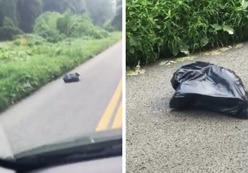
5) A kiddie pool with a yellow bottom that reads like… pee
The product may be innocent. The optics are not. Yellow in water = an immediate mental image nobody requested. Lesson: color associations
matter; avoid “body-fluid adjacent” palettes in anything wet.
6) A supermarket bathroom designed to look filthy
The cruel twist: it’s not dirtyit’s a pattern. Unfortunately, customers don’t reward conceptual art when they’re just trying to wash their hands.
Lesson: if users need to “take a closer look” to feel safe, the design failed.
7) Pants that look like you peed yourself
Fashion loves “edgy.” But nobody wants “bladder narrative.” Color pooling in the worst area turns a design into a social risk.
Lesson: simulate wear and movement to see where color gradients land on the body.
8) Hotel hallway carpet that looks like blood tracks
A carpet pattern that suggests dragging a body is… memorable. Not in a “five-star experience” way. Lesson: abstract patterns can accidentally
become literal storiesespecially in long, repeating corridors.
9) Yellow toilet sanitizer that looks like someone didn’t flush
Technically this is “cleaning,” but visually it’s “evidence.” People read color faster than they read signs. Lesson: choose cleaning materials
and finishes that don’t resemble the mess you’re trying to remove.
10) Designer jeans that look like poop stains
“Distressed” became “digestive.” When brown smears hit denim, the internet will do what it does best: roast. Lesson: distressing should mimic
wear (fray, fade, crease), not contamination.
11) Yellow marble that looks like it’s made of… regret
Marble is supposed to signal elegance. Yellow veining can tip into “aged plastic” or “bathroom incident” depending on tone. Lesson: luxurious
materials still need sane color choices.
12) A bathroom floor that looks permanently pee-stained
If the floor reads like an accident, no amount of signage will convince guests it’s fine. Lesson: in bathrooms, neutral doesn’t mean “muddy”;
it means “clean and calm.”
13) A table that looks like someone smeared poop on it
“Statement piece” is not supposed to be interpreted as “biohazard.” Lesson: brown-on-beige organic streaks are rarely “art” to the average eye.
14) A rug that looks infested with ants or fleas
The pattern might be playful up close, but from standing height it screams “bug problem.” Lesson: design for distanceespecially for floors,
where people expect cleanliness.
15) A wash basin that looks dirty even when it’s clean
Sinks are supposed to look like the place you go to remove grimenot a place that comes pre-grimed. Lesson: high-gloss “spot” patterns become
permanent “water stain” illusions.
16) A bathroom find that looks like a swirl of doom
Some color combos should be banned from certain rooms. Brown swirls in a bathroom? People will not assume “abstract art.” Lesson: don’t make
décor that resembles the worst-case scenario of the room it’s in.
17) A “clean” napkin printed to look used
Napkins exist to look fresh until they aren’t. Printing them with stain-like forms kills the whole ritual. Lesson: disposable hygiene items
should never look pre-disposed.
18) Marble-pattern windows that look smeared
From the street, these read like someone lost a very personal argument with the glass. Lesson: on large architectural surfaces, pattern scale
and contrast can turn “texture” into “stain.”
19) The thing you tried to clean… until you realized it’s the design
This is the signature move of dirty-by-default design: it tricks you into scrubbing. Lesson: if users instinctively clean it, you designed
a problem, not a style.
20) A “clean” table that looks covered in crumbs
A crumb-print surface creates an endless loop of wiping. Nobody wants to live in a permanent snack aftermath. Lesson: avoid micro-speckle
patterns on eating surfaces unless you enjoy human suffering.
21) A keyboard cover that’s “marble” but reads as grime
Hands touch this all day. If it already looks greasy, it will never feel clean. Lesson: high-touch items should minimize visual noise and
maximize “freshness cues.”
22) A straw that looks like it’s been collecting dirt for months
Straws are already a trust exercise. A “biodegradable” look that resembles buildup makes people opt out instantly. Lesson: sustainability
shouldn’t come with a side of “used.”
23) Clothes that make you wonder if it’s time to wash them… immediately
If the print looks like sweat marks or grime halos, the garment becomes a social gamble. Lesson: “washed” aesthetics should signal softness,
not bodily functions.
24) A fancy restaurant sink in San Francisco that looks stained on purpose
High-end venues love “raw materials.” But if the sink looks like it’s been attacked by hard water since 1987, guests lose faith fast. Lesson:
luxury design still needs obvious hygiene signalsespecially in restrooms.
25) Tiles designed to look pre-worn and dirty
“Vintage charm” becomes “I should call the health department” when the wear looks like filth instead of age. Lesson: distressing in interiors
must read as patina, not neglect.
26) Marble-print silicone kitchen tools that look permanently gunked
Kitchen tools need to look clean because they touch food. A mottled print makes them look stained forever. Lesson: for cookware, avoid patterns
that mimic burnt residue or grease shadows.
27) “This sink is completely clean” (the design insists; your eyes disagree)
A sink that visually resembles sand, grime, or residue creates constant uncertainty. Lesson: if a product requires reassurance, it’s not doing
its job.
28) A hoodie with a bleach-stain aesthetic
“Limited edition” or “laundry accident”? The crowd has opinions. Lesson: distressed fashion works best when it’s intentional in placement and
balanced with clean structureotherwise it looks like a mishap.
29) “Poop smear” jeans (yes, again)
When the internet sees brown streaks on denim, it reaches a unanimous verdict in record time. Lesson: if your design can be described with a
single gross phrase, it will be.
30) “Marble” style that just looks dirty
Marble prints are the repeat offender of this whole genre. On the wrong material, scale, or contrast, they look like stains instead of stone.
Lesson: some textures don’t translatereal marble works because it has depth, polish, and context.
Why Designers Keep Accidentally Doing This
Dirty-looking design fails usually happen for one of three reasons:
- Texture without context: Designers borrow “natural” textures (marble, stone, patina) and drop them onto objects where stains are the default interpretation.
- Bad scale decisions: A pattern that looks fine in a sample swatch becomes alarming when enlarged on a floor, wall, or bedding.
- High-touch reality: Some materials (hello, glossy black trim) show fingerprints, dust, and smudges so aggressively that they look dirty fasteven when new.
The core issue is that humans don’t experience design in a sterile render. We experience it while tired, hungry, distracted, and trying not to touch anything
questionable. Great design respects that reality. Bad design dares you to argue with your instincts.
Extra: Real-World “Ew Design” Experiences & What They Teach
Let’s talk about the part nobody puts in the mood board: what it feels like to live with a dirty-by-default design. Because the shaming online is funny,
surebut the experience is where the real lesson lives.
Imagine buying a brand-new mug that arrives with a “rust ring” look printed near the rim. Your first thought isn’t, “Ah, artisanal imperfection.” It’s,
“Did this come used?” You wash it. You wash it again. You hold it under brighter light like you’re analyzing evidence. Eventually you realize it’s decorative,
and now you have a mug that turns every guest into a detective. That’s the hidden cost: designs that look dirty create constant cognitive load.
Floors and countertops are even worse. A speckled table that resembles crumbs forces you into a weird daily ritual: wipe, squint, wipe again, give up, and
slowly accept that your home now looks like it’s always mid-snack. The surface might be technically clean, but it never delivers the emotional payoff of
cleanliness. And that payoff matterspeople don’t clean just for hygiene; they clean for the feeling of control and calm.
In bathrooms, the stakes go up. If the tile pattern resembles stains, you don’t just think “ugly”you think “unsanitary,” and you start avoiding contact.
You hover. You use paper towels to touch faucets. You leave faster. A design that visually suggests grime actively changes behavior, which is the opposite of
what good environmental design should do.
Then there’s the “looks fine in photos” trap. Glossy black finishes and certain plastics look gorgeous in controlled lighting, in perfectly staged marketing
shots, and in the designer’s head at 2 a.m. But in real life they collect fingerprints and dust the way a lint roller collects lintquickly and proudly.
Suddenly your brand-new interior looks like it’s been handled by a team of greased-up raccoons. When materials telegraph “dirty,” customers blame themselves
for not maintaining it… for about five minutes. After that, they blame the brand.
The most painful part is how avoidable this is. A quick prototype test with regular peopleunder normal lightingwould catch most of these. Ask them one simple
question: “What does this remind you of?” If three people say “stain,” you don’t need a fourth opinion. You need a redesign.
The takeaway isn’t “never use texture” or “never distress anything.” It’s this: design is interpretation. If your audience interprets your
aesthetic as dirt, then functionally, emotionally, and commercially… it’s dirt. And the internet will treat it accordingly.
Conclusion
Dirty-by-default design fails are funny because they’re so avoidableand so universal. We’ve all met the mug that looks unwashed, the tile that looks stained,
or the “marble” print that looks like a tragic spill. The pattern across all 30 examples is simple: when a design mimics the visual language of grime, our
brains don’t wait for an explanation. They decide. Immediately.
If you’re designing products, interiors, packaging, or even UI visuals, treat “clean-looking” as a usability feature. Test patterns at real scale. Respect
high-touch surfaces. And never forget: your audience is not judging your conceptthey’re judging what it looks like on a Tuesday when they’re tired and just
want something that doesn’t resemble an incident.