Table of Contents >> Show >> Hide
- Why Burgundy Works So Well in Kitchens
- 10 Kitchens with Burgundy Accents
- 1. White Kitchen with a Burgundy Island
- 2. Burgundy Lower Cabinets with Light Upper Cabinets
- 3. Burgundy Tile Backsplash in a Neutral Kitchen
- 4. Modern Black-and-White Kitchen with Burgundy Stools
- 5. Farmhouse Kitchen with Burgundy Pantry Doors
- 6. Burgundy Range or Small Appliances as Statement Pieces
- 7. Warm Wood Kitchen with Burgundy Textiles
- 8. Burgundy Open Shelving Backdrop
- 9. Burgundy and Brass Butler’s Pantry
- 10. Burgundy Accent Wall with Cream Cabinets
- Best Colors to Pair with Burgundy Kitchen Accents
- How to Use Burgundy Without Overdoing It
- Materials That Make Burgundy Look Expensive
- of Real-Life Experience and Practical Advice
- Conclusion
Burgundy is having a very stylish kitchen moment, and frankly, it looks like it knows exactly what it is doing. Somewhere between red wine, ripe cherries, antique velvet, and “I definitely own nice serving spoons,” burgundy brings warmth, drama, and polish without shouting across the room. In a kitchen, that matters. This is the room where toast gets burned, coffee saves lives, and everyone mysteriously gathers even when there are perfectly good chairs elsewhere.
The beauty of burgundy kitchen accents is that they can be bold or subtle. You can go big with a burgundy island, painted lower cabinets, or a moody tile backsplash. Or you can start small with bar stools, cookware, pendant lights, Roman shades, cabinet hardware, art, rugs, or countertop accessories. The color works because it feels rich but familiar. It has the cozy energy of warm earth tones, the elegance of jewel tones, and the appetite-friendly confidence of red without turning your kitchen into a diner booth from 1987.
Below are 10 kitchen design ideas with burgundy accents, each with practical styling notes, color pairings, and smart ways to make the look feel fresh, livable, and not like you accidentally matched your cabinets to a bottle of merlot.
Why Burgundy Works So Well in Kitchens
Burgundy sits in a sophisticated color family: red with purple, brown, or blue undertones. That depth makes it more flexible than bright red. It can lean traditional beside cream cabinets and brass hardware, modern beside charcoal and white quartz, rustic beside butcher block and terracotta, or glamorous beside marble and unlacquered brass.
It also solves a common kitchen problem: too many hard surfaces. Kitchens are packed with stone, tile, metal, glass, and appliances. Burgundy adds visual warmth, which helps the space feel more like a room and less like a stainless-steel laboratory where snacks go to be judged.
10 Kitchens with Burgundy Accents
1. White Kitchen with a Burgundy Island
A white kitchen with a burgundy island is the safest way to make a bold statement without repainting every cabinet in sight. The white perimeter keeps the room bright and open, while the island becomes the centerpiece. Think of it as the kitchen’s well-dressed host: confident, charming, and standing exactly where everyone wants to put their elbows.
Pair the burgundy island with a white quartz or marble-look countertop for contrast. Brass pulls, warm wood floors, and simple pendant lights can soften the look. If the kitchen is small, choose a slightly muted burgundy rather than a glossy wine red. A matte or satin finish feels more timeless and hides everyday fingerprints better than high shine.
This design works especially well in transitional kitchens where Shaker cabinets, clean lines, and classic materials meet. It also gives homeowners flexibility. If your taste changes later, repainting an island is easier than changing every cabinet, backsplash, and possibly your entire personality.
2. Burgundy Lower Cabinets with Light Upper Cabinets
Two-tone kitchens are perfect for burgundy because they keep the rich color grounded. Use burgundy on the lower cabinets and choose cream, warm white, pale greige, or natural wood for the upper cabinets. The darker shade anchors the kitchen visually, while the lighter top half keeps the room from feeling heavy.
This approach is especially helpful in galley kitchens, apartment kitchens, and rooms with limited natural light. Burgundy below the counter line adds character without closing in the walls. For countertops, consider honed white quartz, light marble, butcher block, or creamy limestone-style surfaces. Avoid pairing burgundy with cool blue-gray counters unless you want the room to feel a little chilly and confused.
For hardware, brushed brass is the crowd favorite, but bronze and aged nickel also work beautifully. Black hardware can look sharp, though it creates a moodier, more modern result.
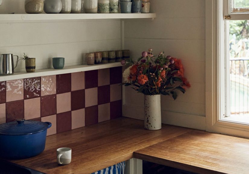
3. Burgundy Tile Backsplash in a Neutral Kitchen
If cabinetry feels like too much commitment, a burgundy backsplash can deliver personality in a smaller dose. Glossy burgundy subway tile reflects light and adds a polished, almost European feel. Handmade zellige-style tile brings movement and variation, which keeps the color from looking flat. For a more vintage look, try burgundy-and-cream patterned tile behind the range.
The key is balance. Let the backsplash be the star and keep surrounding elements simple: white or cream cabinets, warm wood shelves, and quiet countertops. Burgundy tile looks especially handsome with brass rails, open shelving, copper cookware, and ceramic dishes in ivory or soft pink.
One design tip: test tile samples in your actual kitchen lighting. Burgundy can shift from cranberry to plum to brownish red depending on the time of day. A color that looks romantic at noon may look like barbecue sauce under the wrong bulb. Lighting is powerful, and occasionally rude.
4. Modern Black-and-White Kitchen with Burgundy Stools
For a modern kitchen, burgundy bar stools are an easy win. A black-and-white palette can be beautiful, but it can also feel a little too serious, like it is waiting for someone to discuss quarterly earnings. Burgundy seating adds warmth, softness, and personality without disrupting the architecture of the room.
Choose leather, velvet, or performance fabric stools depending on how much real life happens in your kitchen. If kids, pets, or enthusiastic spaghetti nights are involved, performance upholstery is your friend. Burgundy leather works especially well with black cabinets, white counters, and warm wood floors.
To make the color feel intentional, repeat it once or twice elsewhere. A burgundy fruit bowl, framed art print, range knobs, or small rug can connect the palette. The goal is rhythm, not matching everything like a showroom decided to join a marching band.
5. Farmhouse Kitchen with Burgundy Pantry Doors
Burgundy fits surprisingly well in farmhouse kitchens, especially when used on pantry doors, hutches, or freestanding cabinets. Instead of the usual barn red, burgundy feels deeper and more refined. It gives country style a grown-up twist while still feeling welcoming.
Use it with creamy cabinets, apron-front sinks, natural wood counters, woven baskets, antique brass, and simple linen curtains. A burgundy pantry door can become a charming focal point at the end of a kitchen wall or breakfast nook. If your kitchen has beadboard, shiplap, or classic trim, the rich color highlights those architectural details beautifully.
This idea is also budget friendly. Painting one door or built-in cabinet gives the kitchen a custom look without a full renovation. It is the design equivalent of putting on lipstick before a video call: fast, effective, and nobody needs to know what happened before.
6. Burgundy Range or Small Appliances as Statement Pieces
For homeowners who love color but want flexible surfaces, burgundy appliances can be a smart accent. A burgundy range, stand mixer, toaster, espresso machine, or kettle introduces the color in a practical way. This is especially effective in kitchens with white cabinets, wood shelves, and stone counters.
A burgundy range makes a serious statement, especially when framed by a custom hood and simple backsplash. Smaller appliances offer a more affordable path. A burgundy mixer on the counter can look intentional rather than cluttered when it is paired with matching dish towels or a nearby art piece.
The trick is restraint. One major burgundy appliance can look chic. Five burgundy appliances, matching canisters, red towels, red mugs, and red curtains may start to feel like the kitchen is campaigning for office. Let one or two pieces carry the color.
7. Warm Wood Kitchen with Burgundy Textiles
Natural wood kitchens are trending because they feel warm, organic, and timeless. Burgundy textiles make them even richer. Try burgundy Roman shades, café curtains, a vintage-style runner, seat cushions, or linen dish towels. These accents are easy to swap seasonally, which makes them ideal for renters or cautious decorators.
Burgundy pairs especially well with walnut, oak, cherry, and medium-toned wood. It can also make pale wood feel less Scandinavian showroom and more cozy family kitchen. Add cream ceramics, aged brass hooks, and maybe a small lamp on the counter if you enjoy the current “kitchen as a real room” look.
Textiles are also forgiving. They let you test the color before committing to paint or tile. If you discover burgundy makes your heart sing, move on to bigger accents. If not, congratulations: you own some dramatic dish towels.
8. Burgundy Open Shelving Backdrop
Painting the wall behind open shelves burgundy is a clever way to add depth without painting the entire kitchen. The color creates a beautiful backdrop for white plates, glassware, copper pots, cookbooks, and small art pieces. It turns everyday items into display pieces, which is helpful if your plates are pretty and slightly less helpful if your shelves are mostly vitamins and a rogue bag of marshmallows.
This look works best when the shelves are edited. Leave breathing room between objects so the burgundy background can show. Choose shelves in warm wood, black metal, or painted cream. For a more refined look, use picture lights or under-shelf lighting to highlight the wall color.
Because the surface area is limited, this is a strong weekend project. It gives the kitchen a designer feel without requiring demolition, permits, or a long conversation about grout.
9. Burgundy and Brass Butler’s Pantry
A butler’s pantry, coffee bar, or beverage station is the perfect place to go darker. These smaller zones can handle drama because they are not the entire kitchen. Burgundy cabinets with brass hardware, glass fronts, mirrored backsplash, or marble counters can create a jewel-box effect that feels luxurious and practical.
This is where burgundy can lean glamorous. Add ribbed glass, warm lighting, polished stone, and a few display-worthy glasses. If the main kitchen is neutral, a burgundy pantry adds surprise and personality without overwhelming the open space.
For cohesion, pull one material from the main kitchen into the pantry. That might be the same countertop, flooring, cabinet profile, or hardware finish. The pantry should feel like the kitchen’s stylish cousin, not a random room that wandered in after a dinner party.
10. Burgundy Accent Wall with Cream Cabinets
A burgundy accent wall can work beautifully in kitchens with cream cabinetry, warm white trim, and natural light. Use it behind a breakfast nook, around open shelves, or on the wall opposite the main cabinet run. The color adds intimacy, especially in eat-in kitchens where you want the space to feel comfortable enough for pancakes, homework, and deep conversations about why nobody replaced the paper towels.
To keep it modern, avoid overly glossy finishes. Eggshell or satin paint usually works well in kitchens because it offers some cleanability without looking too shiny. Pair the wall with woven shades, a wood table, upholstered chairs, and a simple pendant light.
If you are nervous, start with a painted niche or a small wall section. Burgundy has presence, so even a little can make the kitchen feel designed rather than decorated by accident.
Best Colors to Pair with Burgundy Kitchen Accents
Cream and Warm White
Cream is burgundy’s most reliable partner. It softens the depth of the red and keeps the kitchen bright. Warm white cabinets, ivory tile, and creamy counters make burgundy feel elegant rather than heavy.
Brass and Bronze
Warm metals are natural companions for burgundy. Brass adds a classic glow, while bronze feels quieter and more old-world. Use them for cabinet pulls, faucets, pendant lights, pot rails, or shelf brackets.
Natural Wood
Wood keeps burgundy grounded. Oak, walnut, maple, and cherry all work, though the undertone matters. If the wood is very red, choose a deeper, browner burgundy so the palette does not become too loud.
Charcoal and Soft Black
For a moodier kitchen, pair burgundy with charcoal cabinets, black lighting, or soapstone-style counters. Add cream or wood to prevent the room from feeling too dark.
Blush, Dusty Pink, and Mauve
Soft pink tones can make burgundy feel fresh and modern. This pairing works well through textiles, artwork, dishes, or wall color in nearby rooms.
Sage, Olive, and Chartreuse
Green and burgundy are complementary enough to feel lively, especially when the green is earthy or botanical. Sage is subtle, olive is sophisticated, and chartreuse is for people who do not fear compliments from strangers.
How to Use Burgundy Without Overdoing It
The most successful burgundy kitchens use repetition and restraint. Repeat the color in two or three places, not twenty. For example, burgundy island, burgundy art, and burgundy rug: good. Burgundy cabinets, burgundy backsplash, burgundy lights, burgundy dishes, burgundy ceiling, and burgundy dog bowl: ambitious, but please take a breath.
Scale matters too. In a large kitchen with high ceilings, burgundy cabinets or a full island can feel balanced. In a small kitchen, use burgundy through stools, hardware, curtains, small appliances, or a compact accent wall. The less natural light you have, the more important it becomes to balance burgundy with reflective surfaces, light counters, and layered lighting.
Always test paint samples. Burgundy is especially sensitive to lighting because its undertones can shift. A blue-based burgundy may look elegant in daylight and purple at night. A brown-based burgundy may feel cozy in warm light but muddy in a shadowy corner. Sample first, then celebrate later.
Materials That Make Burgundy Look Expensive
Burgundy loves texture. Pair it with honed stone, marble-look quartz, handmade tile, unlacquered brass, walnut shelves, linen curtains, leather seating, and ceramic accessories. These materials add depth and keep the color from looking flat.
For countertops, white quartz, creamy marble, butcher block, soapstone, and warm terrazzo are strong options. For backsplashes, consider ivory subway tile, zellige tile, marble slabs, warm gray stone, or patterned tile with small hints of burgundy. Flooring can be oak, limestone, checkerboard tile, terracotta, or soft neutral porcelain.
Lighting also matters. Burgundy looks best with warm, layered lighting: pendants over the island, under-cabinet lighting, sconces near shelves, and possibly a small counter lamp. Yes, a kitchen lamp. It sounds rebellious until you try it, and then suddenly your kitchen feels like a charming café where the owner remembers your order.
of Real-Life Experience and Practical Advice
Living with burgundy accents in a kitchen is different from admiring them online. In photos, burgundy always behaves. In real life, it has opinions. It changes with daylight, reflects nearby surfaces, and can look totally different beside stainless steel than it does beside brass. That does not make it difficult; it simply means you need to treat it like a serious design color, not a random impulse buy made while standing in the paint aisle with too much confidence.
One of the best experiences with burgundy is how quickly it makes a kitchen feel warmer. A plain white kitchen can be clean and timeless, but sometimes it also feels like nobody is allowed to spill soup there. Add burgundy stools, a patterned runner, or a painted island, and suddenly the space feels more human. It says, “Yes, we cook here. Yes, we laugh here. Yes, someone left a spoon in the sink again, but the room still looks fantastic.”
The easiest starting point is textiles. A burgundy runner in front of the sink can completely change the mood of the room, especially if the kitchen has wood floors or light tile. Curtains or Roman shades are another excellent first step because they bring softness to a room full of hard surfaces. If you like the color after a few months, you can move on to bigger choices like paint, tile, or cabinetry.
Another practical lesson: burgundy looks better when it has friends. Not too many friends, but a few. If you use burgundy only once, it may look accidental. Repeat it in small ways. A burgundy island can connect to a small painting, a fruit bowl, or the pattern in a rug. Burgundy bar stools can connect to dish towels or a vase. These little echoes make the kitchen feel planned, even if you are still hiding takeout containers in the oven before guests arrive.
Maintenance is worth considering. Burgundy lower cabinets can hide scuffs better than white cabinets, but glossy finishes may show fingerprints. Matte finishes feel sophisticated, yet some matte paints need careful cleaning. For busy homes, satin cabinet paint or durable factory finishes are often more practical. On textiles, choose washable fabrics. On rugs, look for low-pile or indoor-outdoor options that can handle crumbs, coffee, and the occasional dramatic salsa incident.
If resale value matters, keep the boldest burgundy elements changeable. A burgundy island, stools, art, or curtains are safer than burgundy stone counters or permanent flooring. That way, the kitchen still has personality, but future buyers do not need to share your exact level of enthusiasm for wine-colored design choices.
The biggest lesson is this: burgundy works best when it feels intentional, balanced, and connected to the home’s overall palette. It should not be treated as a novelty color. It can be classic, cozy, modern, romantic, rustic, or glamorous depending on the materials around it. Used well, burgundy accents make a kitchen feel collected instead of copied, warm instead of plain, and memorable without being loud.
Conclusion
Burgundy kitchen accents are a smart way to add warmth, depth, and personality to the heart of the home. Whether you choose a painted island, lower cabinets, tile backsplash, stools, textiles, pantry doors, or a dramatic butler’s pantry, the color brings richness without needing to take over the entire room. The best burgundy kitchens balance the shade with cream, warm white, wood, brass, stone, and thoughtful lighting.
If you want a kitchen that feels cozy, stylish, and a little more interesting than another all-white copy-and-paste design, burgundy deserves a spot on your mood board. Start small if you are cautious. Go bold if your kitchen can handle it. Either way, this deep wine-inspired hue has enough charm to make even leftovers feel slightly more elegant.