Table of Contents >> Show >> Hide
- Why This Portland Kitchen Feels So Special
- The Design Story Behind the Space
- The Pearl Effect: Color, Light, and Mood
- Materials That Do the Heavy Lifting
- Why This Small Kitchen Works So Well
- What Homeowners Can Learn From This Kitchen
- What It Feels Like to Cook in a Space Like This
- Final Thoughts
- SEO Tags
Some kitchens try very hard to impress you. They wear dramatic marble, shout with oversized pendant lights, and generally behave like they are auditioning for a luxury real estate show. This Portland kitchen takes a different route. It is softer, smarter, and far more interesting. Instead of yelling, it whispers. Instead of flexing, it glows. And somehow, that makes it unforgettable.
Set inside a remodeled loft in Portland’s Pearl District, this cook space by Jessica Helgerson Interior Design feels like the design equivalent of a pearl: understated on first glance, luminous once the light hits, and built from layers of subtle beauty. The project belongs to homeowner Pam Williams, who chose renovation over relocation after seeing what thoughtful design could do in another unit in the same building. That decision paid off in a big way. What had felt worn down and nearly unfixable became a calm, artful, storage-savvy home with a kitchen that proves small spaces can absolutely bring the drama, just in a much more civilized tone.
And let’s be honest, that may be the dream. Not a kitchen that looks like it is permanently preparing for a photo shoot, but one that actually works, hides the clutter, flatters the architecture, and still makes you feel a little bit fancy while reheating soup.
Why This Portland Kitchen Feels So Special
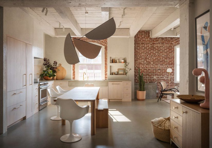
The magic starts with context. Portland’s Pearl District is known for its warehouse roots, red-brick buildings, cobblestone character, art culture, and modern loft living. That industrial history matters here because the kitchen does not ignore it. The design team stripped the loft back to its shell, preserving the original red-brick walls and windows, then layered in a softer interior language that makes the hard architectural bones feel warm, human, and quietly glamorous.
This is what gives the room its “pearl-like” quality. The kitchen is not flashy in a mirror-ball way. It is luminous in a low-key, rainy-Portland-morning sort of way. Pearly pinks, gray undertones, washed beams, pale wood, and matte surfaces create a palette that looks refined without becoming chilly. It is minimal, yes, but not cold. Calm, but not boring. Clean, but not clinical. In other words, it avoids the three most common sins of modern kitchen design: sterility, smugness, and looking like nobody has ever fried an egg there.
The Design Story Behind the Space
A Loft That Needed a Rethink, Not a Farewell
The homeowner had lived in the 1,075-square-foot Pearl District loft for years and was considering moving. But after seeing another redesigned apartment in the building, she realized the better move was not out, but inward. Jessica Helgerson’s team, including lead designer Mira Eng-Goetz, reimagined the apartment with a restrained material palette, space-saving built-ins, and a focus on creating maximum storage with minimum clutter.
That strategy matters even more in the kitchen, where every inch has to earn its keep. A compact cook space can either become a daily frustration or a master class in spatial discipline. This one chose the second option.
Industrial Bones, Soft Finish
One of the most effective choices in the kitchen is the tension between old and new. The red brick stays. The original windows stay. The loft soul stays. But the interventions are beautifully controlled: pale cabinetry, a custom concrete countertop-and-sink combination, Japanese tile, and built-in storage that feels architectural rather than tacked on.
The result is a room with contrast in all the right places. Brick gives it grit. Concrete gives it substance. Wood gives it warmth. Tile gives it texture. The pale palette keeps the whole thing from tipping into industrial gloom. It is a balancing act, and this kitchen sticks the landing.
The Pearl Effect: Color, Light, and Mood
If this kitchen were a personality type, it would be “serene friend with excellent taste and no need to mention it every five minutes.” Much of that mood comes from the color palette. The beams overhead were washed in white, and the overall scheme leans into pearly pinks and soft grays rather than stark black-and-white contrast.
That choice is especially clever in Portland, where natural light can be moody and shifting. Warm whites and faint blush tones have a way of catching gray daylight and making it feel intentional instead of gloomy. Remodelista notes Helgerson’s preference for Benjamin Moore White Opulence, now called Opulence, a white softened by the slightest pink tone. That tiny bit of warmth changes everything. It keeps the kitchen from reading flat and gives the room a subtle glow that earns the pearl comparison.
This is a useful lesson for anyone planning a kitchen remodel: white is not just white. Some whites bounce light harshly. Others soften it. In a space with brick, concrete, and pale wood, that distinction is the difference between “gallery cool” and “please hand me a cardigan.”
Materials That Do the Heavy Lifting
Pale Wood Cabinetry That Warms the Room
The cabinetry is simple, pale, and wonderfully disciplined. Elsewhere in the loft, bleached red oak storage cabinets echo the kitchen millwork, helping the apartment feel cohesive rather than chopped into separate design moments. That kind of continuity matters in an open loft, where the kitchen is always in conversation with nearby living areas.
The wood tone is a big part of why the room feels relaxed. Light oak and pale wood cabinetry have surged back into favor because they offer warmth without visual heaviness. They soften minimalist spaces, pair beautifully with neutral palettes, and age more gracefully than trendier painted finishes that can feel oddly specific a few years later. This kitchen understands that timeless does not have to mean bland.
A Concrete Countertop That Looks Sculptural
The custom all-in-one concrete countertop and sink are among the kitchen’s most memorable features. Visually, it is a terrific move. Concrete adds heft and a faintly industrial note that nods to the loft’s warehouse history. It also creates a monolithic, sculptural effect that helps the room feel custom.
But this is also where the design gets practical. Concrete can be customized in a way many off-the-shelf surfaces cannot. It can be shaped, integrated, and tailored to unusual spaces. That makes it especially appealing in small or architecturally quirky kitchens. The trade-off, of course, is that concrete is not a zero-maintenance angel. It typically requires professional fabrication and proper sealing, and some versions can stain or need upkeep over time. So yes, it is beautiful. No, it is not magic. But in the right hands, it is very close.
Japanese Tile for Texture and Precision
The backsplash introduces small Japanese-origin tiles that bring finesse without fuss. Tiny tile can go terribly wrong when it starts trying too hard to be cute. Here, it works because the scale adds delicacy, the color stays quiet, and the texture plays nicely against the smoother concrete and pale cabinetry.
There is also a precision to mosaic tile that suits this kitchen’s overall discipline. Nothing feels accidental. Nothing feels overly decorated. The tile gives the eye something to enjoy up close, which is exactly what a restrained palette needs.
Built-In Alcoves That Turn Storage Into Display
One of the loveliest details is the use of built-in tiled alcoves to showcase ceramics. According to Dwell, these niches display work from ceramic artists Kati Von Lehman and Ank Ceramics. That is a small touch with big payoff. It transforms storage from mere utility into visual storytelling.
And that is one of the smartest ideas in the whole project: if your kitchen is compact, the things left visible should be useful or beautiful, ideally both. A kitchen does not need many accessories. It just needs the right ones.
Why This Small Kitchen Works So Well
Concealed Appliances Reduce Visual Noise
Remodelista’s companion “Steal This Look” feature highlights deep cabinetry, concealed appliances, and a built-in wall cabinet beside the range. Those choices are not just stylish. They are strategic. In smaller kitchens, visible appliance bulk can make the whole room feel busier and tighter. Concealing what can be concealed lets the architecture read first and the equipment second.
This approach also aligns with the broader move toward the so-called invisible kitchen, where storage is integrated, surfaces are less cluttered, and the room blends more seamlessly into adjacent living space. In a loft, that matters even more. The kitchen is never fully offstage, so it needs to behave like part of the home, not a separate stainless-steel command center.
Built-Ins Beat Bulk
Small kitchens do not actually need more stuff. They need smarter stuff. This Portland cook space understands that built-ins are the real MVPs. Rather than filling the room with freestanding pieces or decorative distractions, the design folds storage into the architecture. The result is cleaner sightlines, better flow, and less countertop chaos.
That same strategy runs throughout the loft, from the rainy-day nook across from the kitchen to the storage concealed behind paneled walls elsewhere in the apartment. It is a whole-home philosophy: make the clutter disappear, then let the materials breathe.
The Palette Expands the Room
Design media love to say that light colors make a room feel bigger. Annoying phrase, yes. Still true. Pale wood, soft white, blush undertones, and reflective-but-not-glossy surfaces all help bounce light around without making the kitchen feel slippery or sterile. In a compact footprint, that is invaluable.
What is especially smart here is that the palette expands the room without erasing its personality. Too many small kitchens go aggressively white and end up feeling like they owe you a dental bib. This one keeps softness, contrast, and tactile depth.
What Homeowners Can Learn From This Kitchen
1. Warm Neutrals Beat Harsh Minimalism
If you love minimal design but fear the “doctor’s office with a fruit bowl” effect, take notes. Warm whites, pale wood, and muted pink-gray tones create a soft minimalist kitchen that still feels alive.
2. Let One Material Carry the Drama
Here, the concrete counter-sink combination does the heavy visual lifting. Because the rest of the materials stay restrained, the statement lands harder. Not every element needs to be the star. Frankly, that is how you end up with a design group project nobody survives.
3. Hidden Storage Is Not Boring; It Is Freedom
Integrated storage is one of the biggest reasons the space feels calm. Floor-to-ceiling cabinetry, concealed appliances, built-in cabinets, and carefully planned display zones help the kitchen stay useful without looking busy.
4. Display Less, Mean More
The ceramics in the tiled alcoves work because they are intentional. A few great pieces beat a crowded shelf of random jars every time. Curated beats clutter.
5. Respect the Architecture
This kitchen does not pretend the loft is a suburban new build. It honors the brick, the windows, and the industrial bones. Good renovation is not about wiping the slate clean. It is about knowing which marks are worth keeping.
What It Feels Like to Cook in a Space Like This
Now for the part design lovers never admit enough: beyond trends, finishes, and clever storage hacks, the real question is simple. What is it like to actually be in this kitchen?
Imagine a Portland morning when the sky is doing its usual soft-gray thing and the windows are pulling in cool daylight. In a harsher kitchen, that kind of weather can make the room feel dim and a little grumpy. Here, the palette catches the light and turns it velvety. The faint pink in the white, the pale wood grain, the quiet tile, and the softened beams all work together so the room seems to wake up gently rather than snap to attention. It is a kitchen that does not assault you before coffee, and that alone deserves a civic award.
As you move through the space, the hidden storage starts making emotional sense, not just practical sense. There is less visual noise. Fewer reminders that life is made of paper towels, charging cords, spice jars, and the mysterious lid that fits no container you own. The room feels composed, which has a sneaky effect on the person using it. You chop slower. You notice things. You rinse a cup immediately instead of forming a ceramic mountain range in the sink. The kitchen is not bossy, but it definitely encourages better behavior.
The concrete counter and sink likely change the experience too. They give the room gravity. There is a tactile seriousness to concrete that makes everyday tasks feel grounded. Setting down a bowl, slicing bread, washing herbs, leaning on the counter while waiting for water to boil, all of it feels just a touch more deliberate. Not precious, just present. The material says, “Yes, this is a kitchen for real cooking,” even while the rest of the room whispers, “But let’s keep it elegant, shall we?”
Then there are the small moments of delight: the tile detail you only notice while standing close, the ceramics tucked into the built-in alcoves, the way the brick reminds you this apartment had a life before this chapter. Those details matter because they make the kitchen feel inhabited rather than staged. You are not standing in a showroom. You are standing in a place where architecture, memory, and daily ritual have managed to agree on a common language.
At night, the room likely changes character again. The reflective qualities soften, the brick deepens, the wood glows warmer, and the kitchen becomes less of a crisp workspace and more of a backdrop for living. A friend pours wine. Someone tears bread. A pan hisses. The nearby loft spaces remain visually connected, so the cook is not isolated from the conversation. That is one of the best things about a well-designed open kitchen: it lets domestic life happen all at once.
Ultimately, the experience of this Portland kitchen is not about grandeur. It is about ease. It is about walking into a room that has been carefully edited so daily life feels lighter. It is about having enough storage, enough beauty, enough material contrast, and enough softness that cooking feels less like maintenance and more like a rhythm. That is a rare achievement. Plenty of kitchens look expensive. Far fewer feel this calm, this usable, and this quietly human.
Final Thoughts
“Kitchen of the Week: A Pearl-Like Cook Space in Portland, OR” works because it understands something bigger than style. A great kitchen is not just a collection of premium finishes. It is a mood, a workflow, a way of reducing friction while increasing pleasure. This one does that with pale wood cabinetry, a custom concrete counter-sink, Japanese tile, concealed storage, and a palette soft enough to glow under Portland light.
More importantly, it shows how to renovate with restraint. The designers did not erase the loft’s industrial character. They refined it. They did not overload the room with trendy tricks. They chose a few strong moves and executed them beautifully. That is why the kitchen feels memorable now, and why it will probably still feel good years from now, after trend cycles have done their usual chaotic little dance.
In short, this is not a kitchen that begs for attention. It earns it. And in a world full of loud renovations, that may be the most luxurious move of all.