Table of Contents >> Show >> Hide
- What Is the 2026 Garden Color of the Year?
- Why This Shade Makes So Much Sense in 2026
- How to Use the 2026 Garden Color of the Year at Home
- Best Plants for a Faded Petal Garden
- What Colors Pair Best With Faded Petal?
- Design Mistakes to Avoid
- Why Faded Petal Has Real Staying Power
- Experiences From Gardens Leaning Into the 2026 Garden Color of the Year
- Conclusion
- SEO Tags
If 2025 was the year gardens flirted with bold personality, 2026 is the year they learned how to whisper. And honestly? The result is gorgeous. After reviewing the biggest U.S. garden forecasts, plant-trend reports, and color stories for the year ahead, one shade keeps floating to the top like the prettiest petal in a watering can: Faded Petal.
This soft, ash-kissed blush pink is the 2026 garden color of the year in spirit, mood, and practical use. It is romantic without being sugary, nostalgic without feeling dusty, and elegant without requiring you to speak in a fake British accent while trimming roses. In other words, it is the rare trend color that feels both fresh and familiar.
What makes Faded Petal especially compelling is that it fits the way people actually want to garden right now. Gardeners are leaning toward calmer outdoor spaces, pollinator-friendly planting, native species, layered cottage-style borders, and colors that feel restorative instead of shouty. That makes this muted pink less of a random trend stunt and more of a perfect match for the moment.
What Is the 2026 Garden Color of the Year?
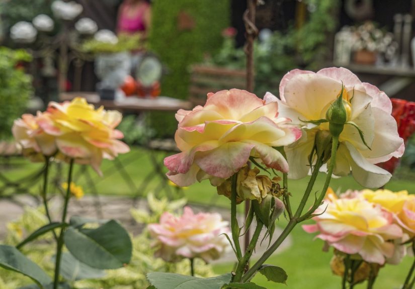
Faded Petal is a muted blush pink with a gray cast. Think less bubblegum, more pressed rose. Less flamingo floatie, more heirloom teacup. It sits inside the broader 2026 Kusumi palette, a family of smoky, weathered, softened tones that includes dusty lavender, pale peach, misty neutrals, powdery blue, and washed greens.
Unlike the super-saturated pinks that dominated after the Barbie wave, this year’s pink is quieter and far more versatile. It looks beautiful in flowers, foliage, containers, painted furniture, pottery, and even the overall emotional tone of a garden. That last part matters. In 2026, garden design is not just about what looks good in a photo. It is also about how a space feels when you are actually standing in it, coffee mug in hand, wondering whether that weed is artistic or rude.
Faded Petal wins because it creates mood. It makes gardens feel gentle, collected, and lived in. It plays especially well with white flowers, silver foliage, natural wood, aged metal, pale stone, and terracotta. It also bridges two big 2026 trends that might sound opposite at first: romantic cottage abundance and low-stress, sustainable planting.
Why This Shade Makes So Much Sense in 2026
1. It answers the demand for calmer outdoor spaces
One of the biggest themes in 2026 garden coverage is the move toward soothing, subdued colors. Gardeners want backyards, front yards, patios, and balconies to feel like sanctuaries. Faded Petal fits that brief beautifully because it softens a planting scheme without draining it of personality.
Bright colors still have a place, of course. A border full of jewel tones can be thrilling. But Faded Petal offers something different: emotional exhale. It gives your eye somewhere to rest. In an age of notifications, noise, and general world chaos, that is not a small thing.
2. It works with pollinator-friendly and native-minded gardens
The most important garden trend for 2026 is not really a color at all. It is purpose. Gardeners are planting with the planet in mind, choosing native and resilient species, reducing maintenance, and creating habitat for bees, butterflies, and birds. The nice surprise is that Faded Petal slides neatly into that eco-conscious direction.
You can build a pink-leaning garden without turning it into a frilly costume party. Coneflowers, cosmos, asters, bee balm, milkweed companions, roses, hydrangeas, and grasses can all contribute texture and pollinator value while staying within a soft, romantic palette. The result feels lush, but still useful to the ecosystem.
3. It complements the return of cottage-style planting
Cottage gardens are back in a big way, but the modern version is smarter than the old stereotype. Today’s cottage-inspired beds still overflow with flowers, fragrance, and movement, but they are planned with greater intention around bloom time, height, texture, and maintenance. Faded Petal is practically made for this look.
Because the color is muted, it reads as sophisticated rather than sugary. Mix it with airy cosmos, old-fashioned roses, peonies, sweet peas, salvia, and soft ornamental grasses, and suddenly your garden looks like it belongs in a novel where everyone writes letters and no one has to reset a Wi-Fi router.
4. It pairs naturally with the year’s favorite materials
Another reason this color is having a moment: it looks fantastic against what people are already using outdoors. Terracotta pots, weathered wood, white trellises, natural stone, pale gravel, wicker, and aged metal all flatter dusty pink tones. Faded Petal does not demand a total redesign. It slips into existing spaces with suspicious ease.
How to Use the 2026 Garden Color of the Year at Home
Build a tonal planting palette
The easiest way to use Faded Petal is to keep things tonal. Instead of filling a bed with one exact shade of pink, layer related colors: blush, shell pink, mauve, soft apricot, creamy white, and a little silvery green. That gives the space depth and keeps it from looking flat or too “matchy.”
This is where the Kusumi approach shines. Flowers do not have to be identical to feel cohesive. A pale pink dahlia next to a blush rose, a dusty cosmos, and a silvery artemisia can feel beautifully unified because the mood is consistent even when the hues vary.
Use white as a supporting accent
White is the best sidekick for Faded Petal. The broader design world may be obsessed with airy whites in 2026, and gardens can absolutely borrow that idea. White flowers brighten the palette, sharpen the edges of softer pinks, and keep the whole scheme feeling fresh rather than overly vintage.
Think white roses, white petunias, moonflower, white hydrangea, or creamy flowering shrubs. A white trellis or light planter can also help muted pink blooms pop without drama. It is the garden equivalent of good lighting.
Add contrast through foliage and form
Muted pink needs structure around it. Pair it with upright plants, mounding fillers, airy bloomers, and contrasting foliage so the garden feels dynamic. Deep green boxwood, feathery grasses, silver leaves, and even dark purple foliage can make soft pink read richer and more intentional.
This is especially useful in smaller gardens, where too much pastel can drift into “lovely but sleepy.” Add shape, rhythm, and a few stronger green anchors, and the entire space wakes up.
Try it in containers before committing to a whole bed
Not ready to go all in? Smart. Container gardening is the easiest way to test a trend without emotionally overinvesting. Start with a blush-toned thriller, a soft white filler, and a trailing plant with movement. A dusty pink rose, pale calibrachoa, or pastel petunia mixed with silver foliage can instantly make a porch or patio feel current.
Containers are also a great place to lean a little more stylish than practical. This is where you can use vintage-look pots, weathered urns, pale ceramic planters, and decorative stakes without turning your entire yard into a period drama.
Best Plants for a Faded Petal Garden
If you want to bring the 2026 garden color of the year to life, these plants fit the vibe especially well:
For flower beds and borders
Old garden roses, blush hydrangeas, peonies, coneflowers, cosmos, dahlias, astilbe, hellebores, and sweet peas all reflect the faded-petal mood. They deliver softness, movement, and that slightly nostalgic beauty gardeners are craving in 2026.
For pollinator value
Coneflowers and cosmos are especially useful because they offer beauty without checking out of the ecological conversation. Add bee balm, asters, and native-friendly companions nearby to keep the bed active with pollinators through more of the season.
For texture and late-season interest
Pink muhly grass is a star here. It is airy, romantic, and a little theatrical in the best way. Ornamental grasses also balance soft flower colors by adding movement and structure, which keeps a pastel-heavy scheme from feeling too precious.
For patios and small spaces
Compact roses, container hydrangeas, pastel zinnias, soft pink petunias, and trailing annuals make this trend easy to try in small doses. If your space is tiny, one great container can do the job. No one is grading you on acreage.
What Colors Pair Best With Faded Petal?
The best companions for the 2026 garden color of the year are:
Soft white: for brightness and contrast.
Silver and sage green: for calm, natural sophistication.
Dusty lavender: for a layered romantic palette.
Pale apricot and peach: for warmth without intensity.
Deep plum or burgundy: for a richer, moodier edge.
Terracotta and weathered brown: for grounding and texture.
If you want a foolproof combination, try faded pink flowers with white blooms, silvery foliage, and terracotta pots. It is hard to make that look bad. You would have to actively try.
Design Mistakes to Avoid
Do not make everything the exact same pink
Monochrome can be beautiful, but flat repetition usually is not. Mix related tones and textures so the garden feels layered rather than one-note.
Do not ignore foliage
Flowers get the headlines, but foliage does most of the heavy lifting. Soft pink blooms need greenery, silver leaves, or darker contrast to look intentional.
Do not force the trend into the wrong style
Faded Petal is flexible, but it does not have to dominate every design. In a desert-modern garden, use it in small accents. In a cottage border, let it bloom more generously. Trends should support your space, not bully it.
Do not forget seasonality
The prettiest spring pink means very little if your garden disappears by July. Plan for a sequence of bloom and texture so the feeling lasts beyond one glorious month of showing off.
Why Faded Petal Has Real Staying Power
Some trend colors arrive wearing novelty sunglasses and leave before the compost warms up. Faded Petal feels different. It has staying power because it is rooted in broader changes that are not going away anytime soon: softer living, more intentional design, ecological awareness, and a preference for gardens that soothe rather than perform.
It also translates beautifully across styles. You can use it in a formal border, a naturalistic pollinator bed, a modern patio arrangement, a front-yard flower patch, or a balcony container garden. That range matters. The best trend colors are not bossy. They are useful.
So yes, the 2026 garden color of the year may be pink. But it is not the pink of toy aisles, party balloons, or overcaffeinated spring marketing. It is the pink of weathered petals, old roses, dawn light, and flowers you almost miss because they are too elegant to shout.
Experiences From Gardens Leaning Into the 2026 Garden Color of the Year
The most interesting thing about Faded Petal is not how it photographs. It is how it changes the experience of being in a garden. In spaces that lean into this color story, people often describe the atmosphere as softer, slower, and somehow more welcoming. A patio with blush flowers, pale pottery, and silver-green foliage does not feel like it is trying to impress you. It feels like it is inviting you to stay a while.
That shift is especially noticeable in the morning. Soft pink blooms tend to catch early light in a flattering way, and paired with white flowers or gray-green leaves, they make a garden feel awake before it feels hot. The effect is subtle, but powerful. Instead of getting hit with a wall of color, your eye moves gently from one texture to the next. Roses look velvety. Cosmos seem to hover. Ornamental grasses add movement even when the flowers are resting. The whole garden feels like it has better manners.
There is also an emotional nostalgia built into this palette. Faded Petal often reminds gardeners of heirloom roses, old family gardens, pressed flowers in books, or the kind of cottage border that looks casually magical even though someone absolutely worked very hard on it. That memory factor is part of why the color lands so well in 2026. It feels current, but it also feels connected to something older and steadier.
In practical terms, gardeners who experiment with this look often find it easier to blend beauty with function. A blush-toned border can still include pollinator plants, native flowers, edible companions, and tough perennials. It does not demand high-maintenance divas only. That means the experience of the garden improves over time. You are not just admiring color; you are seeing bees visit coneflowers, noticing grasses glow in late afternoon light, and realizing your containers still look good when one plant takes a day off.
Another common experience with this trend is that it makes small spaces feel bigger and calmer. On balconies, porches, and compact patios, loud colors can visually crowd the scene. Faded Petal opens it up. Add white blooms, natural textures, and one or two trailing plants, and even a small setup feels airy and layered. It is a bit like tidying a room and fluffing the pillows, except the pillows are flowers and nobody argues about where they go.
Most of all, this color seems to encourage a different pace of enjoyment. Instead of racing through the garden looking for the boldest bloom, people pay attention to nuance: the fading edge of a rose, the soft haze of muhly grass, the way a pale hydrangea changes tone through the season. That is the real magic of the 2026 garden color of the year. Faded Petal is not just a shade. It is a mood, and one that makes the garden feel more human.
Conclusion
Introducing the 2026 garden color of the year means introducing a whole gardening mindset. Faded Petal is soft, romantic, flexible, and grounded in the bigger movements shaping outdoor spaces right now: calm design, sustainable planting, native-friendly choices, and layered gardens that feel good to live with. It pairs beautifully with white, sage, terracotta, and silver foliage, and it works whether you are planting an ambitious border or styling a humble front porch container.
If you are ready to refresh your outdoor space for 2026, this is a trend worth trying. Not because it is trendy, but because it genuinely makes gardens feel more restful, more elegant, and more alive. And in a year when so many people want their outdoor spaces to do more than just look pretty, that is exactly the kind of color story worth growing.