Table of Contents >> Show >> Hide
- What Does It Mean to Outline Text in GIMP?
- Before You Start: Set Up Your GIMP File
- Method 1: The Easiest Way to Outline Text in GIMP 2
- Method 2: Outline Text With Text to Path
- Method 3: Keep Text Editable With a Duplicate Layer
- How Thick Should a Text Outline Be?
- Best Color Combinations for Outlined Text
- How to Create a Double Outline in GIMP 2
- How to Make Hollow Outlined Text
- How to Fix Jagged or Messy Text Outlines
- Common Mistakes When Outlining Text in GIMP 2
- When Should You Use Each Method?
- Practical Example: Outlining Text for a YouTube Thumbnail
- Experience Notes: What I’ve Learned From Outlining Text in GIMP 2
- Conclusion
Outlining text in GIMP 2 is one of those small design tricks that can make a graphic look dramatically better in about two minutes. A plain word floating on a busy photo can disappear faster than your motivation after opening a 47-layer project. Add a clean outline, though, and suddenly that same text looks bold, readable, and ready for a poster, thumbnail, flyer, logo mockup, meme, invitation, or social media banner.
The good news: you do not need a paid design app to create outlined text. GIMP 2, especially GIMP 2.10, gives you several built-in ways to add a stroke around letters. The most beginner-friendly method uses Alpha to Selection, Select > Grow, and a new layer filled with your outline color. A more precise method uses Text to Path and Stroke Path. Both approaches work, and once you understand the difference, you can choose the right one for each design.
This guide explains how to outline text in GIMP 2 step by step, plus how to create thick outlines, thin strokes, double outlines, transparent hollow text, and cleaner edges. No mysterious plug-ins, no wizard hat, no yelling at your monitor. Just practical GIMP text effects that actually work.
What Does It Mean to Outline Text in GIMP?
To outline text in GIMP means to place a visible border, also called a stroke, around the outside of letters. The outline can be black, white, neon green, gold, or any color that fits your design. Designers use text outlines to improve contrast, separate words from a background, and create a more polished graphic style.
For example, white text on a beach photo may look fine over the blue sky but vanish over the sand. A dark outline solves that problem. Black text on a dark concert image may need a white or yellow stroke. A sports poster might use red letters with a white inner outline and a navy outer outline. The technique is simple, but it gives you a surprising amount of creative control.
In GIMP 2, outlined text is usually created by turning the shape of the letters into a selection or path, expanding that shape, and placing the expanded area behind the original text. Think of it as giving your letters a jacket. A stylish jacket, ideally. Not the giant winter coat your mom made you wear in third grade.
Before You Start: Set Up Your GIMP File
Open GIMP 2 and create a new image by going to File > New. Choose a canvas size that matches your project. For a YouTube thumbnail, 1280 by 720 pixels is a common size. For a square social post, 1080 by 1080 pixels works well. For a logo draft, you may want a transparent background so the text can be used later over different colors.
Select the Text Tool from the toolbox or press T on your keyboard. Click on the canvas and type your text. Choose a font, size, and color from the tool options. Bold fonts are easier to outline cleanly than very thin fonts, especially for beginners. A chunky sans-serif font will usually produce a stronger result than a delicate script font with tiny loops and hairline strokes.
Once your text is in place, look at the Layers panel. GIMP creates the text as its own text layer. This is important because the cleanest workflow uses a separate layer for the outline. Keeping the outline separate lets you edit, recolor, hide, or delete it without damaging the original text.
Method 1: The Easiest Way to Outline Text in GIMP 2
This is the most popular beginner method because it is fast, visual, and reliable. It uses the text layer’s transparency to create a selection, grows that selection outward, then fills the larger shape on a layer underneath the original text.
Step 1: Create Your Text
Use the Text Tool to type your words. For this example, imagine you are designing a small banner that says Summer Sale. Set the text color to yellow and place it over a photo background. Yellow may look fun, but on a bright image it can be hard to read. That is where the outline earns its paycheck.
Step 2: Create a Selection From the Text
In the Layers panel, right-click your text layer and choose Alpha to Selection. You can also use Layer > Transparency > Alpha to Selection. GIMP will place moving dotted lines, often called marching ants, around the shape of the letters.
This selection follows the visible pixels of the text. The opaque parts are selected, while transparent areas are ignored. In plain English: GIMP looks at your letters and says, “Ah yes, this is the shape we need.”
Step 3: Grow the Selection
Go to Select > Grow. A dialog box will appear asking how much you want to grow the selection. Enter a value in pixels. For small text, try 2 to 4 pixels. For large headline text, try 6 to 12 pixels. For dramatic poster-style text, you can go even higher.
If you are not sure what to choose, start with 5 pixels. That is the design equivalent of ordering fries with your burger: safe, useful, and rarely a bad idea.
Step 4: Add a New Transparent Layer
Create a new layer by clicking the new layer icon in the Layers panel or going to Layer > New Layer. Name it something clear, such as Text Outline. Choose Transparency as the fill option.
Now drag this new outline layer below the original text layer. This order matters. If the outline layer sits above the text, it may cover your letters. If it sits below, only the expanded border shows around the edges, which is exactly what you want.
Step 5: Fill the Outline Layer With Color
Select the new transparent outline layer. Set your foreground color to the outline color you want. Black is a classic choice for light text. White works beautifully around dark text. You can also use brand colors, bright accent colors, or a slightly darker version of the text color.
Go to Edit > Fill with FG Color, or use the Bucket Fill Tool inside the selected area. The grown selection will fill on the outline layer, creating a border around your original text.
Step 6: Deselect and Review
Go to Select > None to remove the marching ants. You should now see outlined text. If the stroke is too thin, undo and grow the selection by more pixels. If it is too thick, undo and choose a smaller value. GIMP is forgiving, as long as you make friends with Ctrl + Z.
Method 2: Outline Text With Text to Path
The Text to Path method is excellent when you want a cleaner, more controlled stroke. It converts the text into a path, which can then be stroked. Paths are especially useful for crisp typography, logos, and designs where the edge quality matters.
Step 1: Create and Position Your Text
Type your text as usual. Choose the font, size, spacing, and alignment before converting it to a path. You can still keep the original text layer, but the path itself will not behave like editable text.
Step 2: Convert Text to a Path
Right-click the text layer and choose Text to Path. You can also find text-related commands in the Layer menu when a text layer is active. After this step, open the Paths dialog by going to Windows > Dockable Dialogs > Paths if it is not already visible.
Step 3: Create a New Layer for the Stroke
Add a new transparent layer and place it below the text layer. Name it Path Stroke Outline so you know what it contains. Keeping your layers named properly may not feel exciting, but future you will be grateful. Future you is tired and does not want to decode “Layer copy copy #7.”
Step 4: Stroke the Path
In the Paths dialog, right-click the text path and choose Stroke Path. In the dialog box, choose your line width. You can stroke with a solid line or use a paint tool for more stylized results. Set the foreground color before applying the stroke.
This method can produce a sharp outline, but remember that a stroked path is usually centered on the path line. That means part of the stroke may overlap the text and part may extend outward. For many designs, that is fine. If you need an outside-only outline, the Alpha to Selection and Grow method may be easier to control.
Method 3: Keep Text Editable With a Duplicate Layer
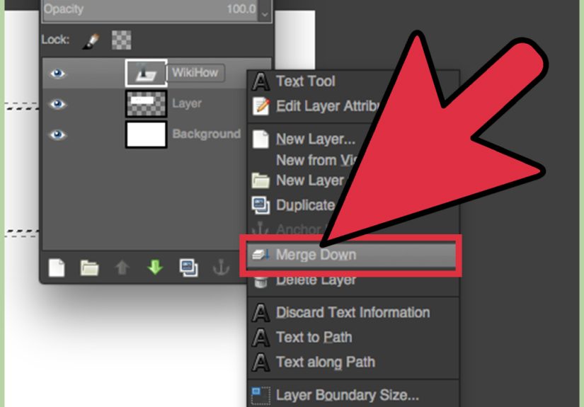
One frustration beginners run into is that some outlining methods make the text harder to edit later. A smart workaround is to duplicate the text layer, use the duplicate to create the outline, and keep the original text layer editable on top.
How to Do It
First, create your text. Then right-click the text layer and choose Duplicate Layer. Move the duplicate below the original. Use the duplicate layer for your outline steps: Alpha to Selection, Grow, and Fill. Keep the original text layer untouched above it.
This method is helpful when designing thumbnails, ads, or banners where the wording may change. If your client says, “Can we change Grand Opening to Mega Grand Opening Super Weekend Event?” you can edit the top text layer and regenerate the outline without rebuilding the whole design from scratch. You may still sigh deeply, but at least the file structure will not betray you.
How Thick Should a Text Outline Be?
The right outline thickness depends on the font size, background, and purpose of the graphic. A small caption may only need a 1- or 2-pixel outline. A large title on a busy image may need 6 to 10 pixels. A dramatic poster headline might use a thick 15-pixel stroke or a double outline.
Here is a simple rule: the outline should improve readability without swallowing the letters. If the border becomes more noticeable than the word, it may be too heavy. On the other hand, if you have to squint to see the outline, it is probably too thin.
For web graphics, zoom out to the size at which people will actually see the image. A design that looks perfect at 200% zoom may look muddy at thumbnail size. Always test your text at real viewing size before exporting.
Best Color Combinations for Outlined Text
Color contrast is the secret sauce of readable outlined text. The outline should separate the text from the background. If the text is light, use a dark outline. If the text is dark, use a light outline. Simple? Yes. Often ignored? Also yes.
Reliable Combinations
White text with a black outline is one of the most readable combinations for photos. Yellow text with a dark brown or navy outline creates a warm promotional look. Red text with a white outline feels energetic and works well for sale graphics. Black text with a white outline is useful on dark backgrounds, especially when you want a sticker-like effect.
For a softer look, avoid pure black and pure white. Try charcoal instead of black, cream instead of white, or a darker shade of the text color for the outline. These small choices can make the design feel less harsh and more professional.
How to Create a Double Outline in GIMP 2
A double outline gives text a layered, bold style. It is common in sports graphics, retro designs, gaming thumbnails, and stickers. The process is basically the same as the simple outline method, repeated with a larger selection.
Start with your first outline. For example, create white text with a black 5-pixel outline. Then create another transparent layer below the black outline layer. Return to the original text layer, choose Alpha to Selection, then go to Select > Grow again. This time, grow the selection more than before, such as 12 pixels. Fill the new lower layer with a second color, such as red, blue, or yellow.
The layer order should be original text on top, first outline in the middle, and second outline at the bottom. This creates a stacked border effect. You can repeat the process for even more outlines, but use restraint. At a certain point, your typography may start looking like it is wearing five inflatable pool rings.
How to Make Hollow Outlined Text
Hollow outlined text shows only the border while the inside of the letters remains transparent or shows the background. This effect works well for modern posters, watermarks, and minimalist designs.
To create hollow text, first make a regular outline using the Grow method. Then hide or delete the original text fill layer. If the outline layer still includes the filled center, use the original text shape as a selection and cut the center out of the outline layer. The result is a clean border with no filled letter interior.
This can look especially good over a photo, because the background shows through the inside of the letters while the outline keeps the words readable. Use a medium or thick stroke for the best result. Very thin hollow text can be hard to read.
How to Fix Jagged or Messy Text Outlines
If your outline looks rough, pixelated, or uneven, several things may be happening. First, your canvas may be too small. Text effects look cleaner when created at a larger size and scaled down later. Second, the font may have very thin details that do not outline well. Third, the Grow value may be too large for the font style.
Try using a bolder font, increasing the canvas resolution, or reducing the outline thickness. You can also use the Text to Path method for cleaner edges. If you are exporting for the web, use PNG when you need transparency and JPEG when you have a full background photo and do not need transparent edges.
Another useful trick is to zoom out. Designers sometimes panic over tiny edge imperfections at 800% zoom that no human will ever notice. Unless your audience is a colony of pixel-inspecting ants, judge the design at normal size too.
Common Mistakes When Outlining Text in GIMP 2
Putting the Outline Layer Above the Text
If your outline covers the letters, your layer order is probably wrong. Move the outline layer below the original text layer.
Forgetting to Select the Correct Layer
Before filling the outline, make sure the transparent outline layer is active. If you accidentally fill the text layer or background layer, undo and try again.
Using Too Little Contrast
A dark blue outline around black text may technically be an outline, but it will not help much. Choose colors that clearly separate the letters from the background.
Flattening Too Early
Do not flatten your image until you are done editing. Save a working copy as an XCF file so your layers remain editable. Export a PNG or JPEG only when you need the final image.
When Should You Use Each Method?
Use Alpha to Selection plus Grow when you want the fastest and easiest way to outline text. It is perfect for social graphics, thumbnails, simple posters, and beginner projects.
Use Text to Path plus Stroke Path when you want more precision or when you are working on a design that needs cleaner typography. This method is better for logos, badges, and polished graphic layouts.
Use the duplicate-layer method when you want to keep the original text editable. This is the best workflow for client projects, templates, and designs where the wording may change later.
Practical Example: Outlining Text for a YouTube Thumbnail
Imagine you are creating a thumbnail with the words Easy GIMP Tricks over a colorful background. Start with a large, bold font. Set the text color to white. Right-click the text layer and choose Alpha to Selection. Grow the selection by 8 pixels. Add a transparent layer below the text and fill it with black. Then add a second outline layer below that, grow the original text selection by 14 pixels, and fill it with yellow.
The result is white text with a black inner outline and a yellow outer outline. This kind of layered stroke can help the title stand out on a busy image. It also gives the design a bold, clickable look without needing complicated effects.
Experience Notes: What I’ve Learned From Outlining Text in GIMP 2
After working with outlined text in GIMP 2 for real design projects, the biggest lesson is that the best outline is not always the biggest outline. Beginners often crank the Grow value up too high because the effect feels exciting at first. The problem is that a huge border can make the letters look bloated and awkward. A clean 4-pixel outline often looks more professional than a 20-pixel monster stroke that makes every word look like a cartoon tire.
The second lesson is to design for the final size, not the editing zoom. When you are zoomed in closely, every edge looks important. But most web graphics are viewed much smaller. A YouTube thumbnail, blog image, or social media post must be readable in a feed, not just beautiful at full resolution. I usually zoom out several times while working. If the words are readable when small, the outline is doing its job.
Another useful habit is to save outline settings mentally by project type. For small captions, I usually start with 2 or 3 pixels. For medium blog graphics, 4 to 6 pixels is often enough. For large thumbnail titles, 8 to 12 pixels can work well. These are not strict rules, but they provide a helpful starting point. From there, the background decides the rest.
Layer organization also matters more than people expect. A simple text effect can quickly become messy if you add multiple outlines, shadows, highlights, and background elements. Naming layers clearly saves time. Names like Main Text, Black Outline, Yellow Outer Stroke, and Soft Shadow make the file easier to edit later. This is especially important if you create templates or reusable graphics.
I have also learned that font choice can make or break the result. Bold fonts with clear shapes outline beautifully. Thin decorative fonts can become messy, especially if the outline fills tiny gaps inside letters. Script fonts can work, but they require more careful stroke sizes. If an outline looks bad, do not blame yourself immediately. Sometimes the font is simply being dramatic.
Color testing is another underrated step. A black outline is useful, but it is not always the best choice. On softer designs, dark gray may look better. On warm images, brown or deep red can feel more natural. On cool images, navy or charcoal may blend more tastefully. The outline should support the design, not shout over it like a guy with a megaphone in a library.
For professional-looking results, I recommend keeping the original text layer editable whenever possible. Duplicate the text layer and build the outline from the duplicate. That way, if the wording changes, you still have a live text layer. This workflow is slightly slower at the beginning but much faster when revisions happen. And revisions always happen. The universe loves revisions.
Finally, always save your working file as XCF before exporting. PNG and JPEG files are great for publishing, but they flatten away your editable structure. An XCF file keeps your text, outline layers, masks, and background elements available for future changes. That one habit can save you from rebuilding an entire graphic just because you noticed a typo five minutes after publishing.
Conclusion
Learning how to outline text in GIMP 2 is a simple skill that makes a big difference. Whether you use Alpha to Selection, Select > Grow, Stroke Selection, or Text to Path, the goal is the same: make your words clearer, stronger, and more visually appealing. The easiest method is to create a selection from your text, grow it, fill the expanded shape on a layer below, and keep your original text on top. Once you master that, you can experiment with double outlines, hollow text, path strokes, shadows, gradients, and more advanced typography effects.
The best outlined text is readable, balanced, and suited to the background. Keep your layers organized, choose strong contrast, avoid overdoing the stroke thickness, and save an editable XCF file before exporting. With a little practice, GIMP 2 can handle text effects that look clean enough for web graphics, promotional images, thumbnails, posters, and creative projects of all kinds.