Table of Contents >> Show >> Hide
- Why Picture Arrangement Matters
- What You’ll Need
- The 14 Steps to Arrange Pictures on a Wall
- Step 1: Decide What Story You Want the Wall to Tell
- Step 2: Choose the Right Wall
- Step 3: Pick an Anchor Piece
- Step 4: Edit Your Frames Before You Hang Anything
- Step 5: Measure the Wall and the Furniture Below It
- Step 6: Find the Right Hanging Height
- Step 7: Lay Everything Out on the Floor First
- Step 8: Create Paper Templates
- Step 9: Tape the Templates to the Wall
- Step 10: Keep Spacing Consistent
- Step 11: Start Hanging from the Center or Bottom Row
- Step 12: Use the Right Hardware for the Wall and the Weight
- Step 13: Add Variety Without Losing Cohesion
- Step 14: Step Back, Adjust, and Leave Room to Grow
- Common Picture Wall Mistakes to Avoid
- Best Layout Ideas for Different Rooms
- Real-World Experiences and Lessons From Arranging Picture Walls
- Conclusion
- SEO Tags
Blank walls are sneaky. They sit there looking innocent, and then suddenly the whole room feels unfinished, awkward, or like it’s waiting for adult supervision. That’s where a well-arranged picture wall comes in. Done right, it can make a room feel collected, warm, and intentional. Done wrong, it can look like your frames lost a bet and landed on the wall at random.
The good news is that arranging pictures on a wall is not some mysterious talent granted only to interior designers and people who casually say things like “visual rhythm.” It’s a process. If you follow a few practical rules about spacing, height, balance, and scale, you can create a wall display that looks polished without feeling stiff. Whether you’re hanging family photos, art prints, travel memories, thrifted paintings, or a mix of all four, these 14 steps will help you build a picture arrangement that feels stylish, personal, and easy on the eyes.
Why Picture Arrangement Matters
Before you reach for the hammer, it helps to know what you’re trying to achieve. A picture wall should do more than simply fill space. It should connect to the furniture below it, complement the room’s color palette, and guide the eye naturally around the space. Great wall arrangements create balance. They can make a narrow hallway feel interesting, a large living room feel grounded, or a staircase feel like it belongs in a design magazine instead of a home where someone definitely leaves socks on the stairs.
The most successful arrangements usually share a few qualities: they have a clear anchor point, consistent spacing, and a sense of cohesion. That doesn’t mean everything must match perfectly. It simply means your display should look intentional rather than accidental.
What You’ll Need
A successful picture wall starts with the right tools. Gather your frames, a tape measure, painter’s tape, paper for templates, a pencil, a level, and your hanging hardware. If any piece is heavy, check the wall type and use the proper anchors or hang into studs when possible. This is the least glamorous part of the project, but it is also the part that prevents your favorite frame from crashing down at 2:00 a.m. and scaring the soul right out of you.
The 14 Steps to Arrange Pictures on a Wall
Step 1: Decide What Story You Want the Wall to Tell
Start by choosing the mood of the arrangement. Do you want it to feel formal and tidy, or layered and collected over time? A grid layout with matching frames looks neat and modern. A looser arrangement with varied sizes feels more personal and relaxed. You can also organize your wall by theme, such as black-and-white family photos, botanical prints, abstract art, travel photography, or a colorful mix that shares a common palette.
This step matters because it helps you make every other decision faster. If you know you want a clean, tailored look, you’ll lean toward even spacing and similar frames. If you want a more eclectic gallery wall, you’ll have more freedom to mix shapes, finishes, and art styles.
Step 2: Choose the Right Wall
Not every wall needs a gallery treatment. Pick a wall that benefits from extra visual interest: above a sofa, over a console, along a hallway, up a staircase, or behind a bed or dining bench. A good picture wall usually has a relationship with something nearby, such as furniture, molding, or an architectural feature. That connection helps the arrangement feel grounded instead of like it’s floating in open space for no particular reason.
If you are hanging above furniture, aim for an arrangement that feels proportional to it. A display that is too small will look timid. One that is too wide or too tall can swallow the furniture and throw off the room.
Step 3: Pick an Anchor Piece
Every strong arrangement needs a visual leader. This is often the largest frame, the boldest artwork, or the piece with the strongest color. Your anchor piece does not have to sit exactly in the center, but it should help organize the rest of the grouping.
Think of it as the lead actor in your wall’s little production. The supporting cast can be quirky, dramatic, or understated, but somebody has to carry the plot.
Step 4: Edit Your Frames Before You Hang Anything
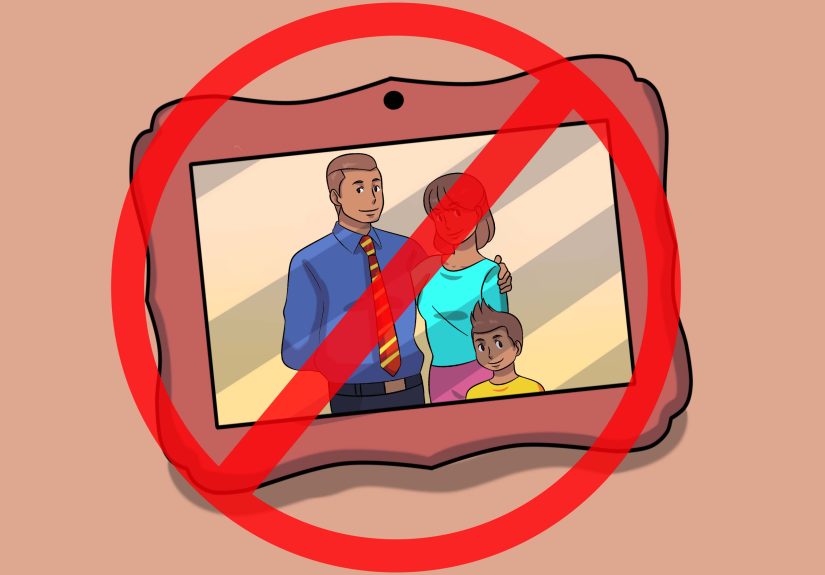
One of the biggest mistakes people make is trying to hang every frame they own just because it technically exists. Be selective. Lay out all your options and remove anything that feels off in size, style, or color. If one frame looks too tiny, too shiny, too orange, or too “why do I still have this,” set it aside.
You don’t need identical frames, but you do need some kind of visual connection. That might be a shared finish, similar matting, a common color palette, or repeated materials like black metal, natural wood, or white frames.
Step 5: Measure the Wall and the Furniture Below It
Now it’s time to get practical. Measure the width and height of the wall area you plan to use. If the pictures are going above furniture, measure the furniture too. In many rooms, the arrangement looks best when it spans roughly two-thirds of the furniture width. That rule keeps the wall art feeling related to the piece below it.
For example, if your sofa is 90 inches wide, your picture arrangement will often look balanced at around 60 inches wide. This is not a law written in decorative stone, but it is a very reliable guideline.
Step 6: Find the Right Hanging Height
Height is where many picture walls go wrong. People often hang art too high, as if they are decorating for a family of very elegant giraffes. In most cases, the center of the arrangement should land around eye level. If you are hanging above furniture, the bottom of the arrangement should usually sit several inches above the top edge of the piece below it, close enough to feel connected but not crowded.
That one adjustment can make the difference between a wall that feels cohesive and one that looks like it drifted upward in search of better lighting.
Step 7: Lay Everything Out on the Floor First
Before the wall gets involved, test your arrangement on the floor. Spread out the frames and experiment with different layouts. Put the largest piece in first, then build outward using medium and smaller frames. Step back and look at the overall shape. Does it feel balanced? Is one side too heavy? Are all the dark frames clumped together like they’re in a secret meeting?
Take a photo once you like the layout. That snapshot becomes your cheat sheet when it’s time to hang the real thing.
Step 8: Create Paper Templates
If you want fewer wall holes and less frustration, make paper templates for each frame. Trace the frame shapes onto kraft paper, butcher paper, or recycled paper, cut them out, and label each one. Mark the hanging point on the template so you know exactly where the nail or hook goes.
This step may seem slightly extra, but it is the good kind of extra. It lets you move things around freely and test spacing on the wall before committing to hardware.
Step 9: Tape the Templates to the Wall
Use painter’s tape to place the templates on the wall according to your floor plan. Adjust until the arrangement looks right from different angles in the room. A wall display can look one way when you’re standing directly in front of it and another way when you walk in from the hallway or sit on the sofa.
Templates make it easier to catch spacing issues, awkward gaps, or a layout that leans too heavily to one side. This is the part where you save yourself from fifteen unnecessary nail holes and a mild decorating meltdown.
Step 10: Keep Spacing Consistent
Spacing is what makes a picture wall look intentional. In most arrangements, keeping about 2 to 6 inches between frames works well, depending on the size of the wall and the scale of the pieces. Smaller frames usually look best with tighter spacing, while larger art benefits from a little more breathing room.
The exact number matters less than consistency. Repeated spacing creates order, even in eclectic arrangements. If your gaps jump from tiny to huge without a reason, the whole wall can start to look accidental.
Step 11: Start Hanging from the Center or Bottom Row
Once your layout is set, start with the anchor piece or the bottom row above furniture. Use a level. Then use it again. A slightly crooked first frame can quietly sabotage the whole arrangement, because every other piece will end up visually reacting to that first mistake.
If you are hanging above a sofa, console, or bed, building from the bottom row upward often works best. It helps you maintain the right distance from the furniture and keeps the whole display from drifting too high.
Step 12: Use the Right Hardware for the Wall and the Weight
This is where style meets physics. Lightweight frames may work with basic picture hooks or adhesive solutions, especially in rentals. Heavier frames need proper support. Use studs whenever possible, and use appropriately rated anchors when studs are not available. Check the frame’s hanging hardware too. Secure hardware matters just as much as the nail or anchor in the wall.
In other words, a beautiful gallery wall is lovely. A beautiful gallery wall that stays on the wall is even better.
Step 13: Add Variety Without Losing Cohesion
A good picture wall has rhythm. That often means mixing sizes, frame depths, orientations, and subjects while maintaining a common thread. You might pair landscapes with portraits, or combine photos with illustrations and small objects like mirrors or sculptural pieces. Variety keeps the wall interesting. Cohesion keeps it from becoming visual soup.
If you want a safer approach, repeat one design element throughout the arrangement, such as black frames, white mats, warm wood tones, or a consistent palette of neutrals and earth colors.
Step 14: Step Back, Adjust, and Leave Room to Grow
After everything is hung, step back and study the wall from several points in the room. Make small tweaks if needed. Sometimes one frame needs to shift half an inch, and suddenly the whole arrangement clicks into place. That is the annoying magic of wall styling.
Also, leave a little flexibility in the arrangement if you think you’ll add pieces later. The best picture walls often evolve over time. New photos, new art, and new memories can be added without forcing you to start from scratch.
Common Picture Wall Mistakes to Avoid
The most common mistake is hanging pictures too high. The second is ignoring scale. Tiny frames scattered across a huge wall often look lost, while oversized pieces on a narrow wall can feel cramped. Another frequent problem is inconsistent spacing. Even an eclectic arrangement needs a visual system. Finally, avoid choosing frames or art in isolation from the room. Your wall should make sense with the furniture, paint color, lighting, and overall style of the space.
If you are nervous, start with a simple layout: a clean grid, a centered trio, or one large piece with two smaller companions. Complexity is optional. Balance is not.
Best Layout Ideas for Different Rooms
Living Room
A gallery wall above the sofa works best when it feels tied to the sofa’s width and sits low enough to relate to it. Use larger frames if the room is spacious, and let one standout piece anchor the arrangement.
Hallway
Hallways are perfect for linear arrangements. Use a row of evenly spaced frames or a looser salon-style grouping that stretches the eye down the corridor. Family photos and travel prints work especially well here.
Staircase
Follow the angle of the stairs for a natural flow. Keep the spacing between frames visually consistent, even if the layout rises with the stair line.
Bedroom
Above a bed, calmer art and softer frame finishes tend to work best. You want the wall to feel restful, not like it’s pitching a loud design opinion while you’re trying to sleep.
Real-World Experiences and Lessons From Arranging Picture Walls
In real homes, picture walls rarely come together in one perfectly cinematic afternoon where the sunlight is flattering and nobody argues about whether the black frame or the walnut frame looks better. Most people build them through trial, error, and at least one moment of standing across the room with narrowed eyes, muttering, “Something is weird here.” That is normal.
One common experience is realizing that what looked balanced on the floor feels completely different on the wall. This happens because the wall introduces context: furniture, ceiling height, windows, lamps, and traffic flow all change how the arrangement reads. A grouping that seemed centered on the floor may look too far left once it’s above a console table. That is why templates and painter’s tape help so much. They let you test the layout in the actual room, where the real visual story happens.
Another lesson people learn quickly is that frame color matters more than expected. You can mix frames successfully, but if every finish is fighting for attention, the eye gets tired. Many homeowners discover that once they unify just one element, such as using similar mats or repeating black, brass, or wood tones, the arrangement suddenly feels sophisticated instead of scattered. It is not about making everything identical. It is about giving the eye a pattern to recognize.
Scale is another frequent teacher. A lot of people begin with frames that are too small because smaller pieces feel safer. But on a large wall, tiny frames can disappear unless they are grouped tightly and intentionally. In real decorating projects, adding one or two larger anchor pieces often solves the problem immediately. Bigger art gives the wall confidence. The smaller pieces can then support it instead of trying to carry the whole design on their tiny decorative backs.
People also tend to remember the moment they stop hanging art too high. It is almost a rite of passage. Once a picture arrangement is lowered closer to furniture or centered more realistically at eye level, the whole room feels more connected. The wall stops floating. The furniture and art begin to feel like they belong in the same sentence.
Finally, the most satisfying picture walls are usually the ones that grow over time. A home feels more personal when the wall includes a mix of meaningful pieces rather than a one-day rush of random filler. Maybe the first version includes wedding photos, art prints, and a vintage landscape. A few months later, you add a child’s drawing, a vacation photo, or a flea-market frame that somehow works perfectly. Those layers of history are what make a picture wall feel lived in. The trick is to begin with a solid layout, strong spacing, and a clear visual thread. After that, the wall can evolve naturally without losing its sense of order.
Conclusion
Learning how to arrange pictures on a wall is really about blending measurement with instinct. The technical side gives you structure: proper height, consistent spacing, balanced scale, and safe hanging hardware. The creative side gives your wall personality: the mix of photos, art, color, and memory that makes it feel like your home and not a furniture showroom trying very hard to impress you.
If you follow these 14 steps, you will end up with more than a decorative wall. You will create a focal point that adds warmth, character, and story to the room. And perhaps most importantly, you will avoid the classic mistake of hammering first and regretting everything second.