Table of Contents >> Show >> Hide
- What “Add a Column” Means in a Pivot Table
- Start With Clean Source Data
- How to Add a Column Label in a Pivot Table
- How to Add Another Value Column in a Pivot Table
- How to Add a Calculated Field in a Pivot Table
- How to Add a Difference or Percentage Column
- Calculated Field vs Calculated Column vs Measure
- Why the Calculated Field Option Is Grayed Out
- Best Practices for Adding Columns in Pivot Tables
- Mistakes to Avoid
- Quick Example You Can Recreate in Excel
- Final Thoughts
- Real-World Experiences and Practical Lessons
- SEO Tags
If Excel had a personality, PivotTables would be the clever friend who can turn a mountain of messy data into a tidy summary before you finish your coffee. But then comes the classic question: how do you add a column in a PivotTable? That sounds simple until you realize it can mean three different things.
You might want to add a new column label, create a new value column, or build a calculated column-like result inside the PivotTable. Excel can do all three, but the method changes depending on what you actually want the report to show.
In this Microsoft Excel guide, you will learn the easiest ways to add a column in a PivotTable, when to use a calculated field, when to use Show Values As, and what to do when Excel acts like the option you need has been abducted by spreadsheets from another dimension.
What “Add a Column” Means in a Pivot Table
Before clicking random ribbon buttons and hoping for the best, it helps to define the goal. In Excel, adding a column in a PivotTable usually means one of these:
1. Add a field to the Columns area
This creates new column headings across the top of the PivotTable. For example, if your dataset includes Month, you can drag Month into the Columns area so the report shows January, February, March, and so on as separate columns.
2. Add another value column
This adds another measure to the Values area, such as Sum of Sales, Average of Sales, or Count of Orders. It is perfect when you want the PivotTable to show more than one number side by side.
3. Add a calculated field
This is the move to use when the column you want does not exist in the source data. For instance, if you have Sales and Quantity, you can create a new field called Unit Price with a formula like =Sales/Quantity.
Once you know which version of “add a column” you need, Excel becomes much less mysterious and far less likely to make you mutter at your screen.
Start With Clean Source Data
PivotTables reward organized data and punish chaos with great enthusiasm. If your source range contains blank headers, merged cells, subtotal rows, or inconsistent data types, your PivotTable will become a grumpy little report.
For best results, make sure your source data:
- Uses one row for headers
- Has no completely blank columns
- Keeps each column to one data type
- Avoids manual subtotals in the source range
- Uses an Excel Table when possible
Converting your raw data into an Excel Table before building the PivotTable is a smart move because the range expands automatically when you add new records. That means fewer refresh headaches later and fewer opportunities to whisper, “Why is this report missing April?”
How to Add a Column Label in a Pivot Table
If you want a new column across the top of the report, you are not creating a formula. You are simply placing another field in the Columns area.
Step-by-step
- Click anywhere inside the PivotTable.
- Open the PivotTable Fields pane if it is not already visible.
- Find the field you want to appear as a column heading.
- Drag that field into the Columns area.
Example: Let’s say your source data includes Region, Month, and Sales.
- Put Region in Rows
- Put Month in Columns
- Put Sales in Values
Now your PivotTable shows sales by region in rows and month as separate columns. That is the fastest way to “add a column” when what you really mean is “show categories across the top.”
Tip for nested columns
You can drag more than one field into the Columns area. For example, placing Year above Month creates grouped column headings so the PivotTable feels delightfully organized instead of aggressively alphabetical.
How to Add Another Value Column in a Pivot Table
Sometimes the column you want is not a category. It is another calculation. Maybe you already have Sum of Sales and now you also want Average of Sales or Count of Orders.
Method 1: Drag the same field into Values again
This is one of the most useful Excel PivotTable tricks. Just drag the same numeric field into the Values area more than once.
Example:
- Drag Sales into Values once for Sum of Sales
- Drag Sales into Values again
- Change the second one to Average or % of Grand Total
How to change the calculation
- Click the drop-down for the value field in the PivotTable or in the Values area.
- Select Value Field Settings.
- Choose the summary type you want, such as Sum, Count, Average, Max, or Min.
- Rename the custom label if needed.
This approach is perfect when you want multiple side-by-side value columns without touching the source data at all.
How to Add a Calculated Field in a Pivot Table
Now we arrive at the method most people actually mean when they say, “I need to add a column in my PivotTable.” A calculated field lets you create a brand-new field using existing fields from the source data.
This is especially useful when the raw dataset does not already contain the metric you want.
Example: Create a Unit Price column
Suppose your data has these fields:
- Product
- Sales
- Quantity
You want a new column that calculates Sales divided by Quantity. Instead of editing the source sheet, you can create a calculated field.
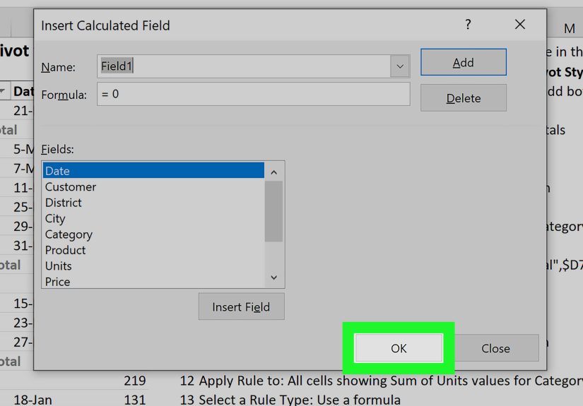
Step-by-step to insert a calculated field
- Click anywhere inside the PivotTable.
- Go to the PivotTable Analyze tab.
- Choose Fields, Items & Sets.
- Click Calculated Field.
- Enter a name, such as Unit Price.
- In the formula box, create your formula, for example:
=Sales/Quantity - Click Add or OK.
The new calculated field appears in the PivotTable Fields list and is added to the Values area. In other words, Excel has created your new value column without asking you to rebuild the source data from scratch. Very polite of it.
More calculated field examples
=Sales*10%for commission=Revenue-Costfor profit=Actual/Targetfor achievement percentage=Sales*1.07for tax-included totals
How to Add a Difference or Percentage Column
Here is where many users take a detour. If your goal is to compare values, you might not need a calculated field at all. Excel often handles this better with Show Values As.
For example, if your PivotTable shows sales by year and you want a new column for year-over-year change, Excel can calculate that directly.
Example: Add a difference column
Let’s say the PivotTable shows:
- Rows: Product
- Columns: Year
- Values: Sum of Sales
To add a difference column:
- Drag Sales into Values a second time.
- Open Value Field Settings for the second copy.
- Go to the Show Values As tab.
- Choose Difference From or % Difference From.
- Select the base field, such as Year.
- Select the base item, such as Previous.
Now the PivotTable shows the original sales and a comparison column side by side. That is much cleaner than trying to force a calculated field to compare one displayed subtotal with another.
Calculated Field vs Calculated Column vs Measure
This is where Excel vocabulary gets just confusing enough to make smart people open three tabs and sigh deeply.
Calculated field
Used in a standard PivotTable. It creates a virtual field inside the PivotTable based on other fields.
Calculated column
Created in Power Pivot or the Data Model. It adds a new column to the underlying model and can then be used in Rows, Columns, Filters, or Values.
Measure
Also used in Power Pivot or the Data Model. A measure is usually the right choice when you need a custom aggregation in the Values area.
If your PivotTable was built with Add this data to the Data Model, the regular Calculated Field option may be unavailable. In that case, you usually need a measure or a calculated column instead.
Why the Calculated Field Option Is Grayed Out
If the Calculated Field command is grayed out, Excel is trying to tell you something. The message is not friendly, but it is there.
Common reasons
- The PivotTable is based on the Data Model
- You created it through Power Pivot
- The data source is OLAP or another external model
How to fix it
If you need a standard calculated field, rebuild the PivotTable from the original source range and make sure Add this data to the Data Model is not selected. If you need the Data Model features, create a measure or calculated column instead.
Best Practices for Adding Columns in Pivot Tables
Use clear field names
Names like Field1 and Amount2 are technically legal, but they are also a small act of sabotage against your future self. Use labels like Gross Profit, Avg Order Value, or Variance %.
Format the new column immediately
A currency formula that displays as a long decimal feels like unfinished homework. Right-click the value field, choose Number Format, and set the appropriate format right away.
Refresh after source changes
If you add data to the source sheet, the PivotTable will not magically update by telepathy. Right-click the PivotTable and choose Refresh.
Use formulas in source data when needed
Some calculations are better handled before the PivotTable is built. If the logic requires row-by-row evaluation, a source-data formula or Power Pivot calculated column may be more accurate than a standard calculated field.
Mistakes to Avoid
- Using cell references in a calculated field: PivotTable formulas use field names, not worksheet cell references.
- Comparing displayed subtotals with a calculated field: Use Show Values As when comparing periods or categories.
- Ignoring data type issues: Text stored as numbers can break summaries and calculations.
- Forgetting the Data Model distinction: If the option is unavailable, check how the PivotTable was created.
- Overcomplicating the report: Just because Excel allows six nested columns does not mean your coworkers will thank you.
Quick Example You Can Recreate in Excel
Imagine a sales dataset with these columns:
- Date
- Region
- Product
- Sales
- Quantity
- Cost
You can build a helpful PivotTable like this:
- Rows: Region
- Columns: Product
- Values: Sum of Sales
Then add more columns by:
- Dragging Sales into Values again and changing it to Average
- Creating a calculated field for Profit with
=Sales-Cost - Creating another calculated field for Unit Price with
=Sales/Quantity
Within a few clicks, your once-boring data dump turns into a compact report that answers actual business questions. That is the real charm of Excel PivotTables: they make spreadsheets look like you had a plan all along.
Final Thoughts
Learning how to add a column in a PivotTable is less about memorizing one trick and more about choosing the right tool. If you want a new heading across the top, drag a field into Columns. If you want another metric, add the field again in Values. If you need a custom result that is not in the source data, use a calculated field. And if you are working in the Data Model, think in terms of measures and calculated columns.
Once that clicks, PivotTables stop feeling intimidating and start feeling useful. Maybe even fun. Yes, I said fun. We are all spreadsheet people here.
Real-World Experiences and Practical Lessons
One of the most common real-world experiences with PivotTables is that users think Excel is broken when the “new column” they expected does not appear where they imagined it would. In reality, PivotTables follow a very specific logic. Rows, Columns, Values, and Filters each serve a different purpose, and the report only becomes easy when you stop fighting that structure and start using it to your advantage.
In office settings, a frequent scenario goes like this: someone has a sales report due in ten minutes, the raw export has 12,000 rows, and the manager wants to see revenue by month, average order value, and variance from last quarter. That is exactly when PivotTables earn their reputation. The first version of the report usually starts simple with Month in Columns, Sales in Values, and Region in Rows. Then the next request appears, because of course it does: “Can you add one more column for profit margin?”
That is where experience matters. A newer Excel user often tries to type directly into the PivotTable and quickly learns that Excel does not appreciate freelancing inside a Pivot report. A more experienced user knows to ask one question first: is this a source-data problem, a calculated field problem, or a Show Values As problem? That one habit saves a surprising amount of time.
Another practical lesson comes from messy datasets. In theory, adding a calculated field should be easy. In practice, if the source data has blank headers, inconsistent numeric formats, or duplicate-looking field names, the PivotTable can become confusing fast. People sometimes blame the PivotTable when the real villain is the source data that arrived looking like it survived a tornado.
There is also a strong formatting lesson hidden in this topic. A newly added column might calculate correctly but still look wrong. Profit ratios may appear as decimals instead of percentages. Currency may show too many decimal places. Large totals may lack commas and suddenly look like secret government account numbers. Experienced Excel users know that building the number is only half the job; formatting it is what makes the report readable.
One especially useful experience-based tip is to keep a small test PivotTable before building the final one. Instead of experimenting on the polished report, create a quick draft version in another worksheet. Try the calculated field there. Test whether Show Values As gives a better result. See whether the Data Model is blocking the feature you want. This sandbox approach makes troubleshooting much less stressful.
Over time, most Excel users also learn that the best PivotTables are not the most complicated ones. They are the ones that answer a clear question quickly. Adding columns is helpful only when each column gives the reader another meaningful angle on the data. If the report becomes too wide, too layered, or too clever, people stop reading it and start asking for a “simple version,” which is business-speak for “please rescue me from this spreadsheet maze.”
So the deeper experience behind learning how to add a column in a PivotTable is really this: great Excel work is not just about knowing which menu to click. It is about understanding what the report needs to say, then choosing the cleanest way to say it.