Table of Contents >> Show >> Hide
- What Color Is Deep Silver 2124-30, Really?
- Undertones: The Secret Personality Living Under the Gray
- Where Deep Silver Looks Best
- Lighting Tips: How to Avoid the “Wait, Why Is It Blue?” Moment
- Coordinating Colors That Make Deep Silver Look Expensive
- Finish Matters: Picking the Right Sheen
- Application Tips: How to Make Deep Silver Look Smooth and Intentional
- Design Styles That Pair Naturally with Deep Silver
- Common Mistakes (and How to Dodge Them)
- FAQ: Deep Silver 2124-30
- Conclusion: Why Deep Silver Is a Smart, Stylish Gray
- Extra: of Real-World “Experience” Tips (What People Usually Notice After Painting)
Some paint colors whisper. Others walk into the room, steal your snacks, and somehow still get invited back.
Benjamin Moore Deep Silver 2124-30 is the second kindconfident, modern, and just cool enough
to feel tailored without turning your living room into a spaceship hallway (unless that’s the goal… in which case,
excellent choice).
Deep Silver is a medium-dark gray with a subtle bluish glint that reads “clean” rather than “muddy,” especially when
you give it decent lighting and a trim color that knows how to behave. In this guide, we’ll break down what it looks
like in real homes, how to choose finishes, what it pairs with, and how to avoid the classic gray-paint plot twist:
“Why does this look different at 9 a.m. than it did at the store?”
What Color Is Deep Silver 2124-30, Really?
Deep Silver 2124-30 sits in that sweet spot between “soft slate” and “steel gray.” It’s not a pale whisper-gray,
and it’s not a near-black charcoal either. It’s a medium-dark gray with a cool lean
(thanks to that slight blue glint). It’s often referenced as part of Benjamin Moore’s Color Preview
collection, which is known for saturated, clear hues.
Quick Specs (Because We All Love Receipts)
- Color family: Cool-leaning gray (subtle blue cast)
- Approx. LRV (Light Reflectance Value): ~27–28 (mid-range, not super dark, not super light)
- Approx. RGB listing seen online: around 140 / 145 / 149 (digital references vary by display)
- Vibe: Modern, crisp, slightly urbanlike a great blazer for your walls
Translation: Deep Silver reflects enough light to feel substantial and grounded, but it won’t swallow a room whole
the way deeper charcoals can. Still, it’s not “brightening” paintthink “refined backdrop,” not “fresh white tee.”
Undertones: The Secret Personality Living Under the Gray
Gray paint undertones are basically mood rings with a mortgage. Deep Silver’s undertone reads subtly blue, which can
show up more in north-facing rooms, shadowy corners, or alongside very warm woods and warm whites. If you’ve ever
painted a gray and suddenly felt like your wall became “cooler” than your friend who collects vinyl… undertones did that.
How the Blue Glint Shows Up
- Bright natural light: Deep Silver can look cleaner and a touch lightermore “steel” than “storm.”
- Low light / evening: The color deepens and the coolness becomes more noticeable.
- Next to warm elements: Honey oak, warm brass, or creamy beiges can make the blue undertone pop.
The smartest move: test a sample on multiple walls and check it morning-to-night. Paint is the only “product” that
changes its mind depending on the sun’s schedule.
Where Deep Silver Looks Best
Deep Silver is versatile enough for a whole-home neutral, but it really shines when you use it with intention.
Here are the spots where it tends to look the most “designer,” without requiring a designer budget.
1) Living Rooms and Great Rooms
If you want a living room that feels calm but not bland, Deep Silver is a strong contender. It reads sophisticated
behind artwork, makes white trim look crisp, and plays nicely with both modern and transitional furniture. Add texture
(linen, boucle, wool) to keep the vibe cozy rather than corporate.
2) Bedrooms
A medium-dark cool gray in a bedroom can feel like instant calm. Deep Silver works especially well when paired with
soft whites, layered bedding, and warm wood accents so the room doesn’t skew too cold.
3) Offices and Libraries
Want “I’m productive” energy without fluorescent-light trauma? Deep Silver can add focus and depth. Pair it with
walnut or espresso tones, matte black hardware, and a warm desk lamp so the space feels intentional, not icy.
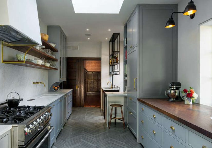
4) Accent Walls, Built-Ins, and Cabinets
This is where Deep Silver can look especially premium. It adds structure to built-ins and cabinetry while staying
softer than a true charcoal. Consider it a “gentle drama” colorbig feelings, polite volume.
Lighting Tips: How to Avoid the “Wait, Why Is It Blue?” Moment
Lighting is the boss fight of paint selection. Deep Silver will read differently depending on exposure, bulb temperature,
and how much white you surround it with.
Use This Simple Lighting Cheat Sheet
- North-facing rooms: Expect a cooler, slightly bluer read. Add warm textures and warmer lighting.
- South-facing rooms: Expect a balanced read, sometimes slightly lighter in midday sun.
- East-facing rooms: Brighter in the morning, moodier latercheck both.
- West-facing rooms: Warm late-day light can soften the coolness.
Pro tip: If you’re replacing bulbs anyway, aim for a warm-white range for a cozy feel, or a neutral-white range for a
cleaner modern look. Consistency mattersmixed bulbs make paint look like it’s multitasking badly.
Coordinating Colors That Make Deep Silver Look Expensive
Deep Silver is a team player. It gets along with crisp whites, moody charcoals, and even bold accent colorsas long as
you give it a palette that respects its cool-leaning nature.
Trim and Ceiling Ideas
- Crisp, bright white trim: Makes Deep Silver look sharper and more modern.
- Soft warm-white trim: Adds comfort and reduces the “cool” edgegreat for traditional homes.
- Same-color ceiling: Cozy and cocoon-like (especially in bedrooms), but test first.
Accent Colors That Pop Without Looking Random
- Inky navy: Elevates the cool undertone and feels classic.
- Forest green: Adds richness and contrast, especially with warm woods.
- Terracotta or clay: A warm counterbalance that makes Deep Silver feel more inviting.
- Soft blush or muted rose: Surprisingly chiclike a modern boutique hotel palette.
Metal Finishes and Hardware
- Brushed nickel / chrome: Sleek, coordinated, and contemporary.
- Matte black: Graphic contrast; looks especially good on doors and built-ins.
- Warm brass: Adds warmthbut it will also highlight Deep Silver’s coolness (which can be great!).
Finish Matters: Picking the Right Sheen
The same color can look completely different depending on sheen. A higher sheen reflects more light and can make a
mid-tone color appear brighter (and also more revealing of wall texture). A lower sheen softens the look but may be
less washable, depending on the product line.
Practical Sheen Pairings for Deep Silver
- Walls (living rooms/bedrooms): Matte or eggshell for a smooth, upscale look.
- High-traffic walls (hallways/kids’ spaces): Eggshell or satin for easier cleaning.
- Trim/doors: Satin or semi-gloss for durability and crisp contrast.
- Cabinets/built-ins: Satin or a cabinet-grade enamel for a more wipeable finish.
If your walls aren’t perfectly smooth, avoid very glossy sheens on large wall areas. Shine is basically a spotlight
for every drywall patch you’ve ever regretted.
Application Tips: How to Make Deep Silver Look Smooth and Intentional
1) Sample Like a Pro (Not Like a Panicked Squirrel)
Don’t rely on a tiny chip under store lighting. Paint a large sample area or use a movable sample, then check it in
morning, afternoon, and evening. Also, view it next to your flooring, sofa, and the world’s loudest rug.
2) Prep Is the Unsung Hero
- Clean the walls (yes, even if they “look” clean).
- Patch and sandsmoothly.
- Use primer where needed (especially over stains, repairs, or drastic color changes).
3) Use the Right Tools
A quality roller cover and a good angled brush reduce stipple and streaks. Deep Silver is forgiving, but clean edges
and consistent texture make it look more “custom finish,” less “I painted during halftime.”
Design Styles That Pair Naturally with Deep Silver
- Modern / Minimal: Pair with crisp white, black accents, and clean-lined furniture.
- Industrial: Add concrete textures, black metal, exposed wood, and warm lighting.
- Transitional: Mix classic silhouettes with modern finishesDeep Silver bridges both worlds.
- Scandinavian: Combine with pale woods, soft textiles, and a restrained palette.
Common Mistakes (and How to Dodge Them)
Mistake #1: Pairing it with the wrong “white”
A very creamy warm white can make Deep Silver look extra cool (sometimes even slightly steely). That might be perfect,
but if it feels chilly, switch to a cleaner white or a more balanced warm-white.
Mistake #2: Skipping sampling in your lighting
Gray paint is famous for changing personality based on light. Sample first. Always.
Mistake #3: Going too glossy on textured walls
Higher sheen = more reflection = more visible wall texture. If your walls have orange peel texture or patchwork,
a softer sheen often looks more polished.
FAQ: Deep Silver 2124-30
Is Deep Silver warm or cool?
It leans cool, with a subtle blue glint. In warm rooms (warm floors, warm bulbs, warm decor), it can still feel balanced
but it’s not a warm greige.
Will it make a small room feel smaller?
Any medium-dark color can visually “pull in” the walls a bit, but Deep Silver’s mid-range LRV helps. Use lighter trim,
good lighting, and mirrors or art to keep it airy.
Is it good for exteriors?
It can work on siding, shutters, or doors for a modern look, but exterior light is intense and can shift the read.
Always test outdoors and consider your roof, stone, and permanent finishes.
What’s a safe trim color with Deep Silver?
A crisp white trim gives a clean, modern contrast. A softer white can warm the whole palette. The “best” choice depends
on your floors, lighting, and how modern you want the final look.
Conclusion: Why Deep Silver Is a Smart, Stylish Gray
Deep Silver 2124-30 is a confident gray that brings structure and sophistication without tipping into gloomy charcoal
territory. It’s cool-leaning, clean, and modernideal for anyone who wants a neutral with personality. Pair it with the
right trim, test it in your lighting, choose the right sheen, and you’ll get a finish that feels intentional, not accidental.
Extra: of Real-World “Experience” Tips (What People Usually Notice After Painting)
Here’s the part nobody tells you on the tiny paint chip: the first 24 hours after painting Deep Silver can feel like a
trust fall. People often expect “gray” to behave like a simple neutral, but Deep Silver has just enough cool character
that you’ll notice it reacting to your home like it’s alive. In the daytime, especially with strong natural light,
many homeowners say it reads like a refined steelclean, calm, and quietly modern. Then evening hits, lamps come on,
and the color can deepen into something moodier. That’s not the paint “changing,” it’s the lighting finally telling the truth.
A common practical lesson: the trim color becomes a major supporting actor. When people pair Deep Silver
with a crisp white trim, the room often feels sharper and more contemporaryalmost like the walls were tailored.
But when the trim is a creamy warm white, some notice the walls feel cooler by comparison. Sometimes that’s a win,
especially if you’re balancing warm wood floors or tan leather furniture. Other times it’s a surprise, and that’s where
sampling saves your weekend (and your relationship with your roller).
Another “lived-in” observation: Deep Silver tends to make artwork and metals look expensive. Frames pop,
black accents look intentional, and brushed nickel or chrome can feel extra sleek. But the same effect can also amplify
clutter. If you have a wall full of random cords, mismatched decor, or that one shelf that became a “temporary” storage
system in 2021, Deep Silver can gently expose the chaos. The fix isn’t to abandon the colorit’s to edit what sits in
front of it. Think fewer, larger pieces instead of many small ones. The wall becomes a backdrop, not a bulletin board.
People also report that Deep Silver is forgiving for everyday life if you choose the right finish. Matte can
look gorgeous and velvety, but in high-traffic areas it might need more careful cleaning. Eggshell or satin tends to
feel like a sweet spot: still classy, but more wipeable for fingerprints, hallway scuffs, and the mysterious marks that
appear when nobody is home. On doors and trim, a higher sheen often looks crispjust remember that shinier finishes
can highlight dents and brush marks, so prep and technique matter more than you think.
Finally, the biggest experience-based takeaway is emotional: Deep Silver often makes a home feel more “finished.”
It’s the kind of gray that can pull together mixed materialswood, stone, metal, textileswithout looking flat. If you
want a modern neutral that’s not afraid of a little depth, Deep Silver is the friend who shows up on time, looks good
in photos, and doesn’t eat all your snacks. (Maybe just one.)