Table of Contents >> Show >> Hide
- Quick Bite Table of Contents
- What Cupcakes And Canals Is About
- Why Cupcakes? Why Canals?
- Making It Readable on Phones (Without Eye Strain)
- The Collaboration Recipe
- File Sizes, Thumbnails, and Other Necessary Evils
- Lettering That Doesn’t Betray the Art
- Launch + Promotion (Without Becoming “That Account”)
- Monetization That Feels Human
- Protecting the Work (and the Sleep Schedule)
- A Final Sprinkle of Story
- Creator Notes: From the Canal Bank
Some people launch a webcomic with a sword fight, a space explosion, or a tragic monologue in the rain.
I launched mine with cupcakes… and a London canal that absolutely does not feel like a safe place to lick frosting.
Cupcakes And Canals is my love letter to urban fantasy, cozy comfort foods, and the kind of water that looks calm until it suddenly decides
it has opinions. It’s also my attempt to prove that “delightful” and “deeply unsettling” can absolutely share a panellike roommates who don’t talk
but keep borrowing each other’s mugs.
What Cupcakes And Canals Is About
At the center of Cupcakes And Canals is a disenfranchised, budding magiciansmart, stubborn, and the exact kind of person who would
hunt for “leftover magic” near old canal estuaries because (1) it’s there, and (2) she has bills, feelings, and a complicated relationship with hope.
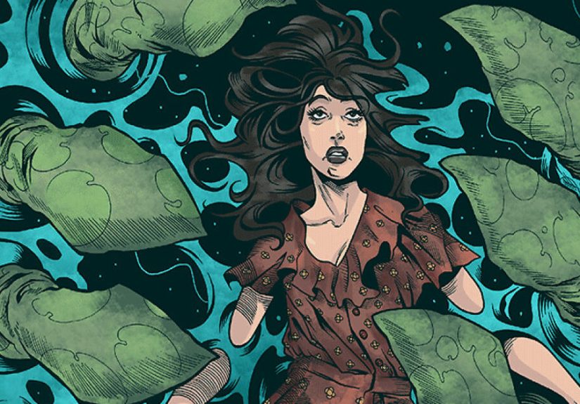
She’s searching the watery seams of London where the modern city meets older storiesonly to discover something far more ancient than she expected.
Think: urban horror meets fairy tale logic. The kind of world where a sweet treat can be comfort… or bait.
The vibe: frosting on top, folklore underneath
Genre-wise, I sit happily in the overlap of fantasy, urban horror, and “wait, did that shadow blink?”
There are rumors of mermaids, magic with a price tag, and the feeling that the canal is not just a locationit’s a character with boundary issues.
If you like stories where the supernatural doesn’t sparkle politely but instead shows up like: “Hello. I live here. Also, you shouldn’t have said my name
three times near water,” you’re in the right place.
Why Cupcakes? Why Canals?
Let’s talk symbolism, because I’m a comic creator and therefore legally obligated to overthink my own title at least twice a week.
Cupcakes: small joy with suspicious energy
A cupcake is a tiny celebration you can hold in your hand. It’s soft, sweet, and looks harmlessuntil you remember it’s basically sugar wearing a hat.
In the comic, cupcakes represent comfort, coping, and the everyday rituals people use to feel safe. They also represent temptation: the easy “yes,” the
quick fix, the thing you accept before asking who offered it and why.
Canals: beautiful boundaries that hide things
Canals are engineered waternature shaped by humansyet they still behave like water: reflective, unpredictable, and extremely committed to keeping secrets.
They’re perfect for an urban horror webcomic because they’re liminal spaces. You’re still in the city, but you’re also… not entirely.
Put them together and you get the core tension of the series:
comfort vs. curiosity, sweetness vs. depth, and the question that haunts the whole project:
What do you trade for magic when you’re tired of being ordinary?
Making It Readable on Phones (Without Eye Strain)
If a webcomic doesn’t read smoothly on mobile, it’s like frosting a cake and then serving it on a trampoline. Technically food is present, but no one
is having a calm time.
Vertical scroll pacing: letting the reader “discover” the scare
Vertical scroll storytelling is powerful because it controls reveal. In print, the reader can accidentally peek at the next panel. In scroll format,
you can build timingpause, silence, then the next image lands like a door slamming in an empty house.
For Cupcakes And Canals, that’s a gift. Horror loves timing. So do jokes. (Surprise! They’re cousins.)
I use space between panels the way filmmakers use quiet in a hallway scene: it lets anticipation do half the work.
Practical readability rules I follow religiously
- Bigger text than you think. If it’s “fine on desktop,” it may be microscopic on phones.
- One main idea per beat. Each scroll “chunk” should deliver a clear moment: a laugh, a clue, a chill, a turn.
- Protect the reader’s flow. Confusing reading order is the fastest way to lose trustespecially in tense scenes.
- Endings matter. Each episode needs a satisfying button: a hook, a reveal, a character decision, or a clean emotional landing.
A specific example: if my magician is following a trail of “magic residue” near the canal, I might pace the sequence like this:
- Close-up: her hand hovering above the water.
- A small, almost silly detail (a cupcake wrapper stuck to a reed).
- Silence: an empty stretch of water.
- Then the reveal: a shape beneath the surface that is definitely not a fish and definitely too confident.
The cupcake detail disarms you. The canal detail re-arms the fear. Emotional whiplash, but in a fun way. Like a haunted bakery.
The Collaboration Recipe
Webcomics look effortless when they’re working. Behind the scenes, it’s a relay race where everyone is holding a different kind of fragile glass.
For this project, I’m working with collaborators for pencils/inks and color, and I handle the writing and lettering.
How we keep the vision consistent
-
A shared “tone bible.” Not fancyjust a living document of what the world feels like: color moods, lighting rules, and what “magic”
looks like when it’s subtle versus when it’s ancient. -
Reference boards with purpose. London canal textures, brick patterns, fog density, cupcake decorationsanything that helps avoid
“generic city” syndrome. -
Clear handoffs. Script → rough layout → pencils/inks → color → lettering → export/upload.
If we skip clarity at one stage, we pay for it later with stress.
My favorite part of collaborating is watching a scene become smarter than what I wrote. An artist can add a glance, a posture shift, a background detail
that turns “spooky” into “I have goosebumps and I don’t know why.” Those are the wins you can’t fully planbut you can create the conditions for them.
File Sizes, Thumbnails, and Other Necessary Evils
I love art. I love storytelling. I do not love the part where you discover your upload is 0.2 MB too large and now you’re bargaining with a JPEG
like it’s a hostage negotiation.
Design for the platform, not against it
Most webcomic platforms have specific width requirements and file-size limits. The trick is to work larger (for quality) and
export smaller (for upload sanity). That way details stay crisp after compression.
My export workflow (simple, repeatable, and low-drama)
- Create at higher resolution (example: double the target width) so linework survives resizing.
- Slice intentionally so each segment ends on a clean beat (not mid-sentence, not mid-scream).
- Compress gentlyaim for clarity, not perfection. Nobody awards medals for “largest file size.”
- Test on a phone before publishing. If text is hard to read, fix it now, not after comments roast you.
Thumbnails deserve their own warning label. Your thumbnail is your comic’s handshake. If it’s muddy, tiny, or confusing, readers won’t clickeven if your
story is brilliant. I treat thumbnails like mini movie posters: clear focal point, readable silhouette, strong mood.
Lettering That Doesn’t Betray the Art
Lettering is the invisible engine of comics. When it’s good, nobody notices. When it’s bad, readers feel tired and can’t explain why. And then they leave.
(Quietly. Like a ghost. Which, to be fair, fits my genre.)
Reading order: the sacred law
In dialogue-heavy scenesespecially when characters are close togetherballoon placement matters as much as the dialogue itself. I plan balloon space early
so art and words don’t fight. If two balloons should read top-to-bottom, I keep them physically close so the eye moves naturally.
Small lettering rules that improve everything
- Leave breathing room. Text should never hug the balloon edge like it’s clinging to a life raft.
- Avoid tangents. Don’t let balloons awkwardly “kiss” panel borders or artwork lines in distracting ways.
- Respect the art. If a background detail is important, don’t cover it with a balloon because you got lazy.
- Be consistent. Consistency makes your comic feel professional faster than almost anything else.
In Cupcakes And Canals, I also use subtle lettering choices to cue tone: cleaner balloons for ordinary dialogue, slightly altered shapes
and spacing when the canal’s “older” presence is speaking through someone. Nothing over-the-topjust enough to make your brain go, “Oh. That’s not normal.”
Launch + Promotion (Without Becoming “That Account”)
The internet is loud. Promoting a webcomic can feel like trying to whisper your life’s work into a stadium while someone nearby is yelling,
“HERE’S A HOT TAKE ABOUT BREAD.”
Consistency beats intensity
I’d rather publish reliably than sprint for three weeks and disappear for six months. Readers don’t need perfectionthey need trust. So I built a buffer,
set a realistic update pace, and planned episodes like a tiny TV season: each one advances character, reveals something, and ends with a reason to return.
Promotion that respects the reader
- Show the comic, not just the link. Post a strong panel or a short vertical snippet that stands on its own.
- Make it easy to understand. One-sentence hook + genre + vibe. “Urban horror with cupcakes and canals” is weird enough to be memorable.
- Engage like a person. Talk to other creators, celebrate their wins, and be present in communities without treating them as vending machines.
- Cross-promote thoughtfully. If another creator’s audience overlaps with yours (horror, fantasy, folklore), team up for art trades or shout-outs.
If you want a practical mindset: treat your webcomic launch like opening a small shop. Your story is the product, surebut your experience
is the brand: how you communicate, how you update, how you handle feedback, how you show up.
Monetization That Feels Human
Let’s say the quiet part out loud: webcomics cost time and money. Tools cost money. Food costs money. And yes, even cupcakes cost moneyespecially if you’re
stress-baking as a creative coping mechanism (not naming names).
Membership (Patreon-style): give superfans a cozy corner
Membership works best when it’s not “paywalling the story” but adding value: early pages, behind-the-scenes notes, process videos, Q&A,
high-res downloads, or bonus mini-comics. The key is sustainability: offer rewards you can deliver without burning out.
Crowdfunding (Kickstarter-style): fund a milestone
Crowdfunding is great for tangible goals: printing a volume, producing enamel pins, commissioning extra cover art, or paying collaborators fairly for a new arc.
It’s also a marketing momentif you do it with clarity: what you’re making, why it matters, and what backers get.
Digital/print distribution: keep options open
If the series grows, I like having a path to collectionsdigital and printso readers can support in different ways. Some want to binge. Some want a book
on the shelf. Some just want to throw money at a story that made them feel something. (Valid, iconic behavior.)
Protecting the Work (and the Sleep Schedule)
I’m not here to turn you into a lawyer, but I am here to tell you this: creators do better when they treat their work like real intellectual property,
not like a hobby the internet is entitled to.
Copyright basics (practical, not scary)
Keep dated files. Keep your layered art when possible. Track who created what in collaborations. If you’re working with other artists, use written agreements
that clarify rights, credits, and payment. Clarity protects friendships.
Fair use and inspiration: be careful, be respectful
Inspiration is normal. Copying is messy. If you’re referencing folklore or public-domain myth, greatmake it yours. If you’re using modern copyrighted
material, learn what fair use actually covers and don’t assume “I changed it a little” is a force field.
A Final Sprinkle of Story
Cupcakes And Canals is a webcomic about a magician looking for leftover magic in the wrong (right?) placeand discovering the canal has its
own idea of what she deserves. It’s about hunger: for power, for belonging, for sweetness in a world that keeps handing you bitter tea.
If you’re here for urban horror webcomic vibes, folkloric creatures, and the occasional emotionally irresponsible baked good, I’m genuinely thrilled you found
your way to my little corner of the internet.
Creator Notes: From the Canal Bank
The first time I told someone the title Cupcakes And Canals, they blinked like their brain had to reboot. “So… is it cute?” they asked.
I said, “Yes.” Then I paused and added, “Also no.” Which is basically the entire mission statement.
Launching this webcomic felt like throwing a paper boat into dark water and hoping it comes back with fan mail instead of a curse. I had the story in my
head for agesthis idea of a young magician scraping the edges of a city for leftover wonder, the way people scrape frosting off a wrapper because they
don’t want to waste sweetness. But a story in your head is private. Publishing is public. Publishing is letting strangers walk into the room and look at
your metaphor collection.
The surprisingly hardest part wasn’t the writing. It was the workflow discipline. Early on, I’d finish a page and think,
“That’s it. Done. I’m a genius.” Then I’d export it and discover the text was too small on mobile, the contrast wasn’t working, and the file size was
so chunky it could be used as a medieval weapon. I learned to love the boring checklist: resize, test on phone, adjust lettering, compress, test again.
Boring saves you. Boring is the life raft.
Collaboration was the best kind of humbling. You can write, “The canal looks wrong,” and think you nailed itthen an artist draws the surface with this
subtle tilt, like the water is leaning toward you. Suddenly the scene is smarter than your sentence. It taught me to write with space for the art to speak,
and to communicate tone clearly without over-directing. We started doing tiny “mood notes” alongside panels: “sweet but uneasy,” “quiet like a held breath,”
“comedic relief, but don’t break the spell.” Those notes helped more than paragraphs of technical direction.
Promotion was its own emotional obstacle course. The internet rewards loudness, but I didn’t want to become a megaphone for my own work. I tried a bunch of
approachesteaser panels, short vertical snippets, behind-the-scenes sketchesand the posts that did best weren’t the ones where I begged people to click.
They were the ones where I gave them a moment: a creepy smile from beneath the canal surface, a cupcake with an unsettling detail, a line of dialogue that
felt like a hook. Readers respond to story, not announcements.
The biggest lesson so far: a webcomic isn’t one big creative act. It’s a hundred small ones done consistently. It’s showing up when the scene is easy,
and when it’s stubborn, and when you’re tempted to “just upload it” without testing because you’re tired. Every time I choose patienceclean lettering,
readable pacing, a clear thumbnailI’m choosing the reader. And in return, the reader chooses to come back. That’s the whole magic trick. No canal required.