Table of Contents >> Show >> Hide
- Why This Set Feels Different From Standard Talk Show Design
- Maximalism Done Right: Not Clutter, but Curated Abundance
- The Orange Sectional Is the Hero Piece
- Wallpaper, Pattern Mixing, and the Confidence of Going Big
- The Best Maximalist Rooms Tell a Story
- Why the Set Matches the Show’s Format So Well
- What Homeowners Can Learn From Busy Philipps’ Set
- Why Maximalism Feels So Right Right Now
- Extra Reflections: The Experience of Watching a Set Like This
- Conclusion
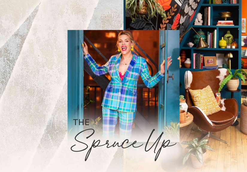
Some talk show sets are built to disappear. They are sleek, polished, and professionally anonymous, like the visual equivalent of a hotel lobby candle that smells “pleasant” but leaves no memory behind. Busy Philipps’ new talk show does the exact opposite. It walks into the room wearing floral wallpaper, kicks off its shoes on a blazing orange sectional, pours a drink from a Murphy bar, and tells you to stay a while.
That is why Busy This Week feels so refreshing. The show is not just another celebrity-chat setup with better lighting and trendier mugs. It is a full-on design statement, one that embraces maximalism with confidence, humor, and enough personality to make most beige sets file a formal complaint. If modern minimalism has spent years whispering, “Please do not touch anything,” Busy Philipps’ set says, “Come sit down, have a snack, and look at all my weird wonderful stuff.”
And that is the magic. The set does not merely use maximalist decor as a fashionable costume. It understands the real point of maximalism: a room should feel collected, layered, emotional, and alive. In other words, the space should look like a person actually exists there. Busy Philipps’ talk show nails that idea so well that the set becomes part of the conversation. It is not background noise. It is the co-host with the best outfit in the room.
Why This Set Feels Different From Standard Talk Show Design
The first reason the set works is that it rejects the usual talk show formula. Traditional late-night environments often rely on a desk, a couple of guest chairs, a polished backdrop, and some visual shorthand for “urban sophistication.” It is functional, but rarely intimate. Busy Philipps’ show leans in the opposite direction. The design feels more like a New York apartment fantasy than a broadcast stage. That choice immediately changes the energy.
Instead of asking viewers to admire a studio from a distance, the set invites them in. The orange sectional is a huge part of that. Sofas create a fundamentally different dynamic than isolated chairs. They imply conversation instead of performance, lounging instead of posturing, and comfort instead of competition. The result is subtle but powerful: guests do not look like they are entering a formal interview arena. They look like they are dropping by a very stylish friend’s place, where the cocktails are strong and the opinions are stronger.
That kind of visual informality matters because Busy Philipps has always worked best in spaces that feel lived-in rather than controlled. Her appeal has long come from being witty, candid, slightly chaotic in the best way, and deeply human. A sterile set would flatten that. A layered, colorful, emotionally expressive room amplifies it. Good set design should reflect the host’s persona, and this one absolutely does.
Maximalism Done Right: Not Clutter, but Curated Abundance
Let us clear something up, because maximalism gets accused of being clutter in a nice jacket. Real maximalism is not the same as throwing every object you have ever loved into one room and hoping for the best. The best American design coverage on the subject keeps returning to the same point: maximalism is intentional. It is curated abundance. It is color, pattern, texture, and memory arranged in a way that feels expressive rather than accidental.
Busy Philipps’ set gets that distinction exactly right. The room is full, but it is not messy. It is busy, yes, but not visually sloppy. There is a difference. The floral wallpaper establishes the tone immediately. It is bold, oversized, and impossible to ignore, which is exactly what strong maximalist wallpaper is supposed to be. But once that visual volume is on the wall, the rest of the room responds intelligently. Plants soften the edges. Lamps create warmth. Collected objects add personality. Upholstery brings saturation. Shelving gives the eye places to wander.
This is classic maximalist strategy. You begin with a statement. Then you layer around it using contrast, repetition, scale, and story. If every element screams at the exact same pitch, a room turns into chaos. If some pieces sing lead and others harmonize, suddenly you have composition. That is what this set understands. It does not look random. It looks orchestrated.
Even the supposed excess feels edited. The room has a lot going on, but it also has zones. The sofa anchors the social center. The wallpaper energizes the envelope. The bar becomes a functional surprise. The fire escape detail adds character and theatricality. The bookshelves and decor objects make the room feel accumulated over time rather than installed in a hurry by someone who just discovered the word “eclectic” on Pinterest.
The Orange Sectional Is the Hero Piece
Every memorable room has a hero piece, the item that tells you what game the designer is playing. In this set, that piece is absolutely the bright orange sectional. It is cheerful, slightly outrageous, and impossible to classify as polite. Which is precisely why it works.
Orange is not a shy design color. It brings warmth, optimism, and a little theatrical mischief. On a talk show set, it also solves a practical problem: it reads beautifully on camera. Neutrals can look sophisticated, but they can also go flat under studio lighting. Orange fights back. It makes the room feel energized before anyone says a word.
More importantly, the sectional shifts the emotional tone of the show. It tells guests and viewers that this is not a place for stiff, transactional celebrity publicity. It is a place for sprawling conversation. The couch says what the format says: relax, settle in, let’s talk. That matters because the best interview environments are never just about lighting and lenses. They are about emotional temperature.
And yes, the sofa is a maximalist move in every sense. It is large, saturated, and unapologetically attention-grabbing. A minimalist room might try to calm you down. This room wants to wake you up.
Wallpaper, Pattern Mixing, and the Confidence of Going Big
The floral wallpaper is another reason the set lands so hard. Large-scale pattern is one of the oldest tricks in the maximalist playbook, but it only works when the designer commits. Busy Philipps’ set commits. There is no timid accent wall here pretending to be brave. The wallpaper establishes a mood that is romantic, playful, and just a little unruly.
That is smart because maximalism depends on conviction. A room that is half-minimalist and half-maximalist often feels like it is having an identity crisis in public. A room that fully leans into pattern, texture, and contrast feels deliberate. The show’s set clearly understands that “more is more” is not a joke here. It is a working method.
Pattern mixing also succeeds because the room respects scale. This is a principle designers return to again and again: when mixing prints, vary the size of the patterns and unite them with some common logic, usually color or mood. That is why the set feels rich instead of reckless. The wallpaper can be dramatic because the other elements do not all compete with it the same way. Some pieces echo its energy. Others provide balance. The eye keeps moving, but it does not crash.
That sense of movement is essential. Great maximalist rooms are visually generous. They reward looking. Busy Philipps’ set has that quality. You notice one thing, then another, then another. It is the rare talk show environment that encourages rewatching partly because your eyes are still wandering through the room on the second pass.
The Best Maximalist Rooms Tell a Story
What elevates this design from “pretty set” to “masterclass” is the storytelling. Reports about the show have emphasized that the room reflects Philipps’ own sensibility, and that matters more than any individual decor choice. A maximalist room without autobiography is just expensive noise. A maximalist room with personal meaning becomes a portrait.
That is why the set feels convincing. It includes objects and details that suggest memory, taste, humor, and lived experience. It does not feel like a corporate team brainstorming what a quirky woman might like. It feels like a space informed by actual collecting, actual preferences, and actual life. The difference is enormous.
Maximalism works best when it answers a simple question: Why is this here? In a strong room, the answer is never “because we needed to fill the space.” The answer is “because this contributes to the story.” The lamps, the books, the greenery, the decorative touches, the apartment-like staging, the sly theatricality of the fire escape, the surprise of the fold-out bar, all of it builds a character-driven environment. It feels personal, and that is the whole point.
There is also a smart bit of cultural storytelling happening here. The set channels the fantasy of an East Coast media life: intimate, artsy, slightly eccentric, and always ready for guests. It has the spirit of a room where people gather, gossip, snack, laugh too loudly, and stay longer than planned. That fantasy fits Busy Philipps perfectly because her hosting style has always felt more like hanging out than managing a formal program.
Why the Set Matches the Show’s Format So Well
Busy This Week is not trying to be a traditional, buttoned-up late-night machine. It blends celebrity conversation, personal stories, humor, and commerce in a way that is deliberately more relaxed and lifestyle-driven. The set supports that hybrid identity beautifully.
A room this layered makes the show’s format feel natural. Of course there is shopping built into the ecosystem. Of course decor and fashion matter here. Of course the room itself feels like part of the entertainment. This is one of the cleverest aspects of the whole design. Rather than awkwardly separating content and commerce, the set fuses them. The decor is not just decoration; it is part of the show’s logic.
That could have felt gimmicky. Instead, it feels coherent, because the room is expressive first and commercial second. Viewers respond to style when it feels authentic. They resist it when it feels like a showroom with dialogue. Busy Philipps’ set avoids that trap by looking genuinely inhabited. It sells the fantasy before it sells anything else.
There is a larger lesson here for television and branded content. Audiences are much more forgiving of commerce when the surrounding creative world has personality. A beautifully realized environment can make mixed-purpose programming feel intentional instead of cynical. This set understands that perfectly.
What Homeowners Can Learn From Busy Philipps’ Set
You do not need a streaming platform, celebrity guests, or a Murphy bar hidden in your wall to steal lessons from this room. The design is surprisingly useful for ordinary homes, especially for people who love color but worry about crossing the line into visual overload.
First, choose a confident anchor. In this set, it is the orange sectional. In a home, it could be a patterned rug, a painted bookcase, a floral wallpaper, or one gloriously dramatic chair that looks like it has opinions on art films. Maximalism gets easier when the room has a lead actor.
Second, layer with purpose. Mix textures, but vary them. Combine prints, but change scale. Use color generously, but repeat it enough that the room feels related to itself. A maximalist room should feel full of surprises, not full of strangers.
Third, use lighting as decoration. One reason Busy Philipps’ set feels warm is that it relies on lamps and glow rather than only overhead studio brightness. That is a huge takeaway for real homes. Pools of light make even bold rooms feel intimate.
Fourth, let your collections work for you. Books, framed photos, travel finds, ceramics, odd little treasures, these are not clutter when they are edited and arranged thoughtfully. They are narrative devices. A room becomes memorable when it contains evidence of a life.
Finally, leave breathing room. This may sound like suspicious advice in an article about maximalism, but it is exactly why the best maximalist spaces succeed. You do not need to crowd every surface to create abundance. You need rhythm. A packed shelf looks better next to a more open one. A loud wallpaper looks better when paired with seating that grounds the room. Even chaos needs choreography.
Why Maximalism Feels So Right Right Now
Busy Philipps’ set also arrives at a moment when design culture is clearly craving more personality. After years of minimalist sameness, many people are tired of rooms that look camera-ready but human-resistant. The return of maximalism reflects a broader desire for homes and public spaces that feel warm, individual, and emotionally legible.
That is part of why this talk show design resonates beyond television. It taps into a wider aesthetic mood. People want interiors that tell stories. They want color back. They want pattern, memory, eccentricity, and signs that an actual person with a pulse lives here. Busy Philipps’ set gives them all of that without apology.
And that may be the most appealing thing about it: the room has zero interest in being cool in a detached way. It is warm. It is funny. It is slightly over the top. It has charm. It likes itself. In design, that level of confidence is contagious.
Extra Reflections: The Experience of Watching a Set Like This
There is also an emotional experience to a maximalist set that is easy to underestimate until you spend time with one. Watching Busy Philipps in this environment feels different from watching a host against a slick, corporate backdrop. Your body reads the room before your brain finishes processing it. The effect is immediate. You feel less like you are watching a performance and more like you have been invited into a social space.
That sensation matters because television is always creating emotional architecture, even when viewers do not consciously register it. A cold set creates distance. A loud but impersonal set creates spectacle. A warm, layered, apartment-like set creates permission. It gives people permission to relax, permission to be curious, permission to notice details, permission to imagine themselves in the room. That is a powerful viewer experience.
Many people have had some version of this in real life. You walk into a friend’s apartment and immediately understand who they are before they say a full sentence. There are stacks of books with bent corners, art leaning instead of hanging perfectly straight, plants in different stages of thriving, a lamp that seems to have been rescued from a glamorous aunt, and a couch that makes you sit down for longer than you planned. The room feels generous. It has texture. It makes you want to talk. That is the feeling Busy Philipps’ set recreates.
There is also joy in the visual discovery. In minimalist spaces, the experience is often about calm and clarity. In maximalist spaces, the experience is about delight and revelation. You keep spotting something new. A room becomes interactive. The eye travels from wallpaper to shelf to lamp to fabric to art object, and each stop adds another layer to the mood. That kind of design rewards attention, which is one reason it works so well on camera. It keeps the frame alive.
For viewers who grew tired of algorithm-friendly interiors that all seem to share the same oat-milk palette and fear of commitment, this kind of set can feel almost rebellious. It reminds you that taste does not have to be quiet to be sophisticated. It can be loud, playful, sentimental, theatrical, and still look polished. In fact, that combination may be more sophisticated because it is harder to pull off.
And then there is the social experience. A maximalist room often makes guests feel they have something to respond to. There is a built-in conversation starter everywhere you look. The wallpaper gets a comment. The couch gets a comment. The tiny object on the shelf gets a comment. The fold-out bar definitely gets a comment. In that sense, the design is not just visually rich; it is socially productive. It helps people open up.
That is why Busy Philipps’ set feels so right for her. Her style as a host depends on openness, candor, and a little looseness around the edges. The room supports all of that. It is not a passive shell. It is a participant. And the experience of spending time in a room like that, whether on television or in real life, is memorable because it feels like being around a person who is comfortable enough to be fully themselves. That, in the end, is the best definition of maximalism there is.
Conclusion
Busy Philipps’ new talk show is a masterclass in maximalism design because it understands that maximalism is not about excess for its own sake. It is about building a world with point of view. Through bold wallpaper, a scene-stealing orange sectional, layered lighting, playful details, and a deeply personal sense of curation, the set turns the usual talk show formula into something warmer, richer, and far more memorable.
More than that, it proves a larger design truth: rooms do not have to whisper to feel elegant. Sometimes the smartest space is the one that talks back, tells a story, and offers you a drink from a Murphy bar while it does it. Busy Philipps’ set is vivid, welcoming, funny, and gloriously unafraid of being too much. In the world of maximalism, that is not a flaw. That is the whole achievement.