Table of Contents >> Show >> Hide
- 1. Diagonal Tile Layouts That Try Too Hard
- 2. Chevron Tile That Instantly Dates the Room
- 3. Accent Stripes and Tile Borders That Chop Up the Bathroom
- 4. Faux Wood-Look Tile That Pretends to Be Something It Is Not
- 5. Tiny Mosaics, Penny Tile, and Other Grout Factories
- 6. High-Contrast Mini Hex and Checkerboard Looks That Feel Too Trend-Heavy
- 7. All-White Patchwork and Faux Marble Overload
- How to Choose Bathroom Tile That Will Not Feel Tacky in Two Years
- Real-Life Experiences With Tacky Bathroom Tile Patterns
- Final Thoughts
Bathroom tile is one of those decisions that feels small in the showroom and enormous once it is permanently attached to your house with the commitment level of a tattoo. Choose well, and your bathroom feels polished, calm, and expensive. Choose poorly, and suddenly you are brushing your teeth in a room that looks like it was designed by three Pinterest boards, one impatient contractor, and a coupon for “free upgrade grout.”
That is why designers keep sounding the alarm on certain tacky bathroom tile patterns and overly familiar looks. Not because every trend is objectively awful, but because some bathroom tile ideas have been repeated so often, or executed so badly, that they now make a room feel busy, dated, or weirdly cheap. And in a space that is supposed to feel clean and restful, that is a problem.
The good news is that you do not need a massive budget to avoid outdated bathroom tile trends. In most cases, the better choice is actually simpler: cleaner layouts, fewer visual interruptions, more thoughtful materials, and tile that does not scream for attention like it just discovered caffeine.
1. Diagonal Tile Layouts That Try Too Hard
There was a time when setting bathroom floor tile on the diagonal was treated like a clever design move. It was supposed to make a small room feel more dynamic, more custom, more special. Today, it often does the opposite. Instead of looking sophisticated, a diagonal layout can feel forced, fussy, and overly busy, especially in smaller bathrooms where every line already competes for attention.
Part of the issue is visual noise. A diagonal tile pattern creates instant movement, but not always the calm kind. In a bathroom filled with a vanity, mirror, shower glass, fixtures, and storage, that extra angle can push the room from “interesting” into “why is the floor yelling at me?” territory. It also tends to highlight awkward cuts along the walls, which is not exactly the spa vibe most people are chasing during a bathroom remodel.
What to do instead
Go with a straightforward stacked or offset layout that lets the material shine. If you want movement, use subtle texture or variation in tone rather than a hyperactive layout. Clean geometry usually ages better than design gymnastics.
2. Chevron Tile That Instantly Dates the Room
Chevron had a huge moment. Then it had another moment. Then it somehow wandered into bathrooms and refused to leave. The problem is not that chevron is illegal. It is that it now feels tied to a very specific era of trend-chasing interiors. Designers are increasingly tired of seeing it because it reads less like timeless style and more like a greatest-hits album from the 2010s.
Chevron also brings a lot of visual intensity to a room that does not usually need it. On a bathroom wall or shower floor, the pattern can feel aggressive, especially when paired with bold grout or high-contrast color choices. Instead of making the room feel tailored, it often makes it feel overly “designed,” which is a polite industry way of saying it looks like it is trying a little too hard to be photogenic.
What to do instead
If you love directional patterns, herringbone is the more flexible cousin that tends to wear better over time. It still adds movement, but with less drama and more polish. Think classic trench coat, not sequined jumpsuit.
3. Accent Stripes and Tile Borders That Chop Up the Bathroom
Accent strips were once everywhere: a narrow band of mosaic running through the shower, a decorative border at eye level, a contrasting line slicing through otherwise plain tile. The idea was to add interest. The result, too often, is a bathroom that looks like it was assembled from leftover sample boards.
Designers have grown tired of these tile borders because they interrupt the eye instead of guiding it. Rather than making the room feel taller, wider, or more intentional, they visually cut the space into sections. In a small bathroom, that can make the whole room feel more cramped. In a large bathroom, it can still look oddly builder-grade, as though the design needed a quick flourish to seem upgraded.
Another issue is longevity. Accent stripes are usually trend-specific. Once the look falls out of favor, the bathroom advertises exactly when it was renovated. That is not ideal when tile is supposed to last longer than your current shower curtain phase.
What to do instead
Let one surface be the star. Use continuous tile from floor to ceiling, or create one intentional feature wall rather than a random stripe circling the room. A bathroom looks more expensive when the tile feels uninterrupted and confident.
4. Faux Wood-Look Tile That Pretends to Be Something It Is Not
Wood-look tile became popular because it promised the warmth of wood with the durability of porcelain. In theory, that sounds great. In practice, many versions look like the flooring equivalent of a fake mustache: technically there, but nobody is fooled. Designers are increasingly over this look because it often lands in an awkward middle zone. It is not the richness of real wood, and it is not the honesty of tile. It is costume design for your bathroom floor.
The tackiest versions tend to be gray-washed planks, overly rustic grain prints, or layouts that mimic hardwood so literally they feel gimmicky. In bathrooms, where moisture and light already affect how materials read, faux wood can quickly look flat, repetitive, and oddly cold. It may be practical, but it rarely feels elevated.
There is also a larger design principle at work here: good interiors usually let materials be themselves. When tile tries too hard to imitate wood, it can make the whole bathroom feel less authentic.
What to do instead
Choose a tile that embraces being tile. Stone-look porcelain, matte ceramic, terracotta-inspired finishes, or gently textured large-format pieces can bring warmth without the impersonation act. Authenticity ages better than imitation almost every time.
5. Tiny Mosaics, Penny Tile, and Other Grout Factories
Small-format mosaics can be beautiful in the right setting. The problem is that they have been overused in bathrooms that are already short on breathing room. Pebble floors, penny tile fields, tiny glass mosaics, and intricate mesh-mounted designs often create a surface that is visually chaotic and maintenance-heavy. Designers are tired of seeing them because they ask a lot from the eye and even more from the person holding the grout brush.
This is where style and real life collide. Tiny tile means lots of grout lines. Lots of grout lines mean more places for soap residue, moisture, discoloration, and general bathroom gloom to settle in. What looks charming in a styled photo can become frustrating in daily use, especially on shower floors or bathroom walls that need regular cleaning. The effect is even worse when bright white grout is involved. That is not a design choice; that is a future weekend chore list.
Visually, small mosaics can also make a bathroom feel busier than it is. In a room where you want calm, a thousand little dots, stones, or squares may not be the soothing solution.
What to do instead
Use smaller tile sparingly. A niche, a shower floor with a tonal mosaic, or a contained decorative moment can work. For larger surfaces, medium- and large-format tile usually feels cleaner, quieter, and easier to live with.
6. High-Contrast Mini Hex and Checkerboard Looks That Feel Too Trend-Heavy
Some classic patterns never really disappear, but they do go through awkward phases. Right now, one of the biggest offenders is the high-contrast version of old favorites: tiny glossy white hex tile with dark grout, or stark black-and-white checkerboard layouts copied without much thought for the rest of the room. These looks are not doomed in every context, but designers are tired of seeing them used as a shortcut to “timeless.”
Why? Because high contrast emphasizes every line, every cut, every grout joint, and every moment of visual clutter. In bathrooms with lots of fixtures and reflective surfaces, that can create a loud, restless effect. The pattern may be classic on paper, but the execution often feels trendy and Instagram-led rather than truly enduring.
Checkerboard is especially tricky. Done in softer tones, larger scale, or a historic home, it can be charming. Done in tiny tiles with sharp contrast and no warmth anywhere else, it can feel like a diner floor wandered into your powder room and got confused.
What to do instead
If you love hex or checkerboard, soften the contrast. Use warmer neutrals, tonal grout, or larger tile sizes. The goal is to nod to tradition without making the bathroom look like it is cosplaying as 1927.
7. All-White Patchwork and Faux Marble Overload
White bathroom tile is not the villain. The villain is the all-white patchwork look: different white tiles on the floor, another white tile on the wall, a faux-marble shower insert, bright white grout, and just enough undertone mismatch to make everything feel accidentally off. Designers are exhausted by this formula because it has become the default “safe” bathroom, and safe does not always mean stylish.
When every tile is white but none of them are the same white, the room can feel disjointed instead of serene. Cool white, creamy white, veined white, glossy white, matte white: put them all together and suddenly your bathroom is doing fifty shades of confusion. Add builder-grade faux marble and the effect often tips into generic hotel bathroom territory.
This kind of bathroom also struggles in real life. All-white surfaces can read sterile, and they show dirt, scuffs, and soap film with very little mercy. It is not just bland. It is high-maintenance bland, which is somehow even more offensive.
What to do instead
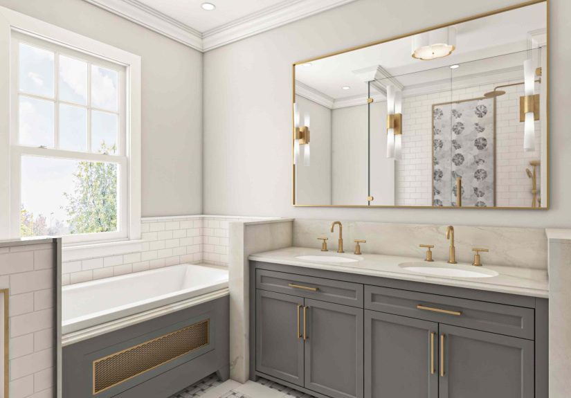
Bring in warmth and intention. That could mean creamy neutrals, handmade texture, warm stone looks, muted color, or simply using one tile consistently rather than mixing five similar-but-not-quite-matching options. Cohesion beats default whiteness every time.
How to Choose Bathroom Tile That Will Not Feel Tacky in Two Years
If there is one lesson running through all these outdated bathroom tile patterns, it is this: the best bathrooms are not the ones shouting the loudest. They are the ones where the tile supports the room instead of performing stand-up comedy in the middle of it.
For a more timeless look, prioritize scale, restraint, and material honesty. Use fewer competing patterns. Keep grout low-contrast unless you intentionally want every joint highlighted. Think about how the tile will look when wet, when steam hits it, when cleaning products touch it, and when you are half-awake at 6:30 a.m. trying to locate your toothbrush. Good design should survive both photo day and real life.
Most of all, remember that bathroom tile trends move faster than tile installation costs. Trendy is easy. Livable is smarter. And timeless does not have to mean boring; it just means the room still makes sense after the algorithm has moved on to something else.
Real-Life Experiences With Tacky Bathroom Tile Patterns
Talk to enough homeowners, renters, designers, or contractors and you start hearing the same stories about bathroom tile regret. It usually begins with excitement. Someone sees a dramatic pattern online, falls in love with a perfectly lit showroom display, or decides that their guest bathroom is the ideal place to “have fun.” Then the tile goes in, the grout dries, the room is styled for exactly six minutes, and reality enters wearing wet flip-flops.
One of the most common experiences is visual fatigue. A tile pattern that looked bold and charming in a sample board can become exhausting once it covers an entire shower wall or floor. That is because bathrooms are small, enclosed spaces. You do not glance at them from across the room the way you do a rug in the living room. You stand in them. You stare at them while brushing your teeth. You revisit them every day. If the tile is too busy, too contrast-heavy, or too gimmicky, you feel it constantly.
Then there is the maintenance surprise. Tiny mosaics and penny tile may seem sweet at first, but living with all those grout lines is a humbling experience. Homeowners often realize too late that every little joint is a magnet for soap film, dust, moisture, and discoloration. Even people who love to clean do not usually dream of scrubbing hundreds of grout lines on a Sunday afternoon. A bathroom should support your routine, not become a side hustle.
Another very real experience is that some tile patterns make a bathroom feel smaller, not bigger. Accent stripes can chop up the wall. Diagonal floors can make the room feel twitchy instead of expanded. Strong checkerboards or contrast-heavy hex tile can overwhelm a compact powder room. The intention may have been “designer look,” but the lived result is often “why does this room feel so crowded?”
There is also the resale and longevity issue. Homeowners may genuinely love an unusual pattern at first, but once the novelty wears off, they start seeing the bathroom through a more practical lens. Will this still feel good in five years? Does it match the rest of the house? Will buyers see charm, or will they mentally budget for demolition? Tile is expensive to remove, which means regret tends to linger longer here than with paint or wallpaper.
Perhaps the most relatable experience of all is the slow realization that “timeless” and “common” are not the same thing. Many people go with all-white patchwork bathrooms or faux-marble overload because it feels safe. But once everything is installed, the room can feel anonymous, sterile, or strangely off because the materials do not truly connect. Safe choices can still create an awkward bathroom if they are not thoughtful choices.
The happiest bathroom renovations usually come from balance. A bit of personality, a bit of restraint, and a healthy suspicion of anything that looks amazing only from one angle on social media. That is the real lesson people learn after living with tacky bathroom tile patterns: the best tile is not the one that grabs attention fastest. It is the one you can keep looking at, cleaning, and living with without wanting to stage an emotional breakup in the middle of the shower.
Final Thoughts
Designers are not tired of bathroom tile because tile is boring. They are tired of the same mistakes being repeated with expensive enthusiasm. The tackiest bathroom tile patterns tend to share the same flaws: too much contrast, too much imitation, too much interruption, or too much maintenance disguised as charm.
If you want your bathroom to feel fresh, focus less on what is loud and more on what is lasting. Choose tile that respects the size of the room, fits the architecture of the home, and makes daily life easier instead of more complicated. That is the difference between a bathroom that feels current and one that feels like a time capsule with plumbing.