Table of Contents >> Show >> Hide
- What You’ll Learn
- Why Some Living Room Paint Colors Fail (Even When They Look Great Online)
- The 4 Colors You Should Never Paint Your Living Room
- Love One of These Colors? Here’s How to Keep the Vibe Without Painting the Whole Room
- A Quick Testing Checklist to Avoid Repaint Regret
- Real-World Experiences: Paint Regrets Designers See All the Time (and the Fixes That Worked)
- Final Takeaway
Painting a living room is a lot like adopting a pet turtle: it sounds fun and low-commitment until you realize
you’re going to live with that choice for a long time. And unlike a turtle, wall paint can’t be bribed with lettuce
to behave better under overhead lighting.
Designers aren’t anti-color (many of them are basically walking mood boards). But they are very pro-“don’t turn the most-used room in the house into a visual jump-scare”.
Below are four shades designers routinely caution against for living room wallsplus exactly what to do instead so your space feels
welcoming, timeless, and easy to decorate around.
Why Some Living Room Paint Colors Fail (Even When They Look Great Online)
The internet is a magical place where every room has perfect sunshine, professionally styled shelves, and exactly one tasteful throw blanket.
Real life is… different. Your living room is a high-traffic, mixed-lighting, snack-eating, Netflix-bingeing headquarters. That means wall color
has to perform in conditions that are less “catalog shoot” and more “Tuesday at 9:47 p.m. under a ceiling fan light.”
Designers tend to watch out for these four paint “betrayal” factors:
- Undertones: A color that looks warm and cozy on a swatch can read icy, muddy, or neon once it’s covering 300 square feet.
- Lighting: North-facing rooms can make cool shades feel colder; warm afternoon sun can amplify yellows and reds.
- Scale: A bold color that’s fun on a pillow becomes a full-time job when it’s on every wall.
- Permanent backdrop problems: Your sofa, flooring, and wood tones don’t change as easily as a throw pillowand paint has to play nice with them.
With that in mind, let’s talk about the four colors designers most commonly flag as risky for living roomsand, more importantly, how to get the same vibe
without the “why does my room feel stressful?” side effect.
The 4 Colors You Should Never Paint Your Living Room
1) Bright or Neon Yellow
Yellow sounds cheerful. In practice, bright or neon yellow often reads less “sunny breakfast nook” and more “highlighter had a growth spurt.”
Designers caution against putting harsh yellows on large living room surfaces because they can feel visually jarring, especially in the evening under warm bulbs.
In many homes, that intensity turns “happy” into “restless.”
Why it backfires
- It reflects a ton of light: In rooms with lots of windows (or glossy finishes), it can look loud and glary.
- It’s hard to balance: Bright yellow competes with art, rugs, wood tonesbasically everything. Your decor ends up looking like it’s trying to talk over the walls.
- It shifts fast: Depending on undertones, it can swing green, acidic, or oddly dull.
What to use instead (same warmth, less chaos)
- Soft buttercream or creamy yellow: Looks sunny without shouting.
- Muted ochre or golden wheat: Feels rich and grounded (great with natural wood and linen textures).
- Warm off-white with a yellow undertone: Gives you brightness with fewer “why is this so intense?” moments.
Designer trick: If you love yellow, use it as an accent in pillows, art, or a single piece (like an armchair). You’ll get the energy without the full-wall commitment.
2) Full-Strength Red
Red is powerful. It’s also… a lot. Designers often describe strong red as energizingwhich is great if your living room’s main job is hosting dance-offs.
But most people want the living room to feel welcoming and relaxed. When red covers big wall surfaces, it can dominate the mood and make everything else look “off,”
even when the decor is objectively nice.
Why it backfires
- It’s emotionally intense: Many people experience red as stimulating, which can feel less restful over time.
- It visually shrinks a room: Saturated red can make walls feel closer, especially in smaller spaces.
- It’s a decor dictator: Reds can clash with common finishes (oak floors, warm leathers, brass, certain whites) unless you carefully curate everything.
What to use instead (still warm, more livable)
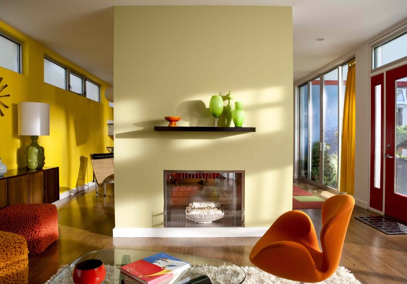
- Terracotta / clay: Earthy reds feel cozy and timelessless “stop sign,” more “sun-baked pottery.”
- Brick or muted cinnamon: Keeps warmth while playing nicer with wood and neutral upholstery.
- Dusty rose or warm blush: Softer, flattering, and surprisingly easy to decorate around.
Designer trick: Want the drama? Use red in a patterned rug, artwork, or a lacquered side tablethen let your wall color be the calm best friend in the background.
3) Dark Chocolate Brown
Brown can be gorgeousjust usually not as a big, dark wall color in a living room. Designers tend to warn against deep chocolate browns because they can
absorb light and make a space feel heavy or dated, particularly if the room doesn’t get strong daylight. The irony: people often choose dark brown hoping for “cozy,”
then end up with “cave.”
Why it backfires
- It eats light: Dark brown can dull the room, especially with standard ceiling lighting.
- It can look muddy: Some browns read flat or dirty next to common trim whites and modern flooring tones.
- It’s tough with undertones: Brown can go red, orange, green, or gray depending on light, making it harder to coordinate with furniture.
What to use instead (cozy, but not cave-like)
- Warm taupe or “mushroom” neutral: Gives depth and sophistication without swallowing the room.
- Greige (warm gray-beige): A flexible backdrop for both warm and cool decor.
- Deep olive or warm charcoal: If you want a darker wall, these can feel more modern and intentional than chocolate brown.
Designer trick: Put brown where it shines: leather seating, wood furniture, woven textures, and natural fibers. Let the walls stay lighter so those rich materials stand out.
4) Cool White (a.k.a. Stark, Blue-Leaning White)
White walls can be beautiful. The problem is which white. Designers often caution against cool whitesespecially the “stark” whites with blue, green, or gray undertones
because they can make a living room feel sterile, chilly, or flat. In the wrong lighting, cool white also exaggerates shadows, which can make a room feel less “airy” and more “clinical.”
Why it backfires
- It can feel cold: Many living rooms need warmth, and cool white can work against that.
- It highlights every shadow: Corners, hallways, and north-facing light can make cool white look grayish or gloomy.
- It’s unforgiving: Stark white shows scuffs, patch repairs, and texture inconsistencies more than most people expect.
What to use instead (still bright, way more welcoming)
- Warm white / creamy off-white: Looks clean but feels softer.
- Ivory or eggshell: Adds subtle warmth without reading “yellow.”
- Very light greige: Keeps the calm, neutral vibe with less harshnessespecially great in open-concept spaces.
Designer trick: If you want that “gallery” feel, pair a warm white wall with layered textureslinen curtains, boucle, natural wood, and warmer metalsso the room doesn’t feel empty or icy.
Love One of These Colors? Here’s How to Keep the Vibe Without Painting the Whole Room
You’re allowed to love bold colors. Designers just want you to use them strategicallylike hot sauce. A little transforms the meal; too much and you start sweating
and questioning your life choices.
Safer ways to use “risky” living room colors
- Accent pieces: A yellow velvet chair, a red side table, or a brown leather sofa gives color without taking over the room.
- Art and textiles: Rugs, curtains, and large artwork introduce saturated color in a way that’s easy to swap later.
- Small zones: Try a hallway nook, a reading corner, or built-insplaces where color feels intentional, not overwhelming.
- Color in the details: Lampshades, books, vases, and throw pillows can deliver the punch you want with minimal commitment.
Translation: you can still have personality. You just don’t need your walls to scream it from across the street.
A Quick Testing Checklist to Avoid Repaint Regret
Designers repeat this advice because it works: test the color in the room. The swatch is a suggestion. Your living room is the final judge.
Before you commit, try this simple process:
- Pick 2–3 candidates per “direction.” For example: one warm white, one neutral off-white, one light greige.
- Paint large samples. Think poster-size blocks on multiple walls (or use big sample sheets). Tiny swatches lie.
- Check morning, afternoon, and night. Your lighting changesand so will the color’s mood.
- Stand next to your permanent elements. Flooring, sofa, brick, built-ins, and trim are the real compatibility test.
- Choose the right finish. For living rooms, many designers prefer eggshell or satin for durability without “glow stick” shine.
- Sleep on it. If you still love the color after 24–48 hours, it’s probably safe.
This may sound extrauntil you remember that repainting is also extra, just with more drop cloths and fewer good moods.
Real-World Experiences: Paint Regrets Designers See All the Time (and the Fixes That Worked)
The best way to understand “colors to avoid” is to see how regret actually shows up in real homes. Below are common scenarios designers talk abouteach one
starting with a totally reasonable idea and ending with a simple lesson: your walls will amplify whatever you pick.
Experience #1: The Neon Yellow That Looked “Happy” Until 7 p.m.
A homeowner fell in love with a bright yellow swatch because it made their living room feel upbeat in daylight. Once the sun went down, the same walls turned
harsh under warm lampsalmost fluorescentmaking everyone feel oddly restless. The fix wasn’t repainting the entire house in despair. Instead, the solution was a
softer, creamier yellow with a warmer undertone, plus warmer bulbs and more layered lighting (a floor lamp and two table lamps instead of one overhead light).
They kept the “sunshine” idea but removed the highlighter effect. Bonus: artwork suddenly looked better because it wasn’t competing with the walls for attention.
Experience #2: The Red Living Room That Became a Decor Dead End
Another common story: someone paints the living room a bold red to feel dramatic and cozy. The first week feels exciting. The third week feels… exhausting.
Red demanded constant stylingneutral furniture looked washed out, wood tones felt too orange, and the room became hard to “settle.” The fix was swapping to a
terracotta-inspired shade that still felt warm but read more earthy than intense. Then they used red as a controlled accent: one patterned rug with red details,
a piece of art with a red focal point, and a few pillows. The room kept its personality, but decorating stopped feeling like a daily negotiation.
Experience #3: Chocolate Brown Walls That Made the Room Feel Smaller (and Older)
Dark brown is often chosen for “richness,” especially in living rooms with leather furniture or dark wood. But in many homes, chocolate brown walls soak up light,
making the space feel smaller and dimmerespecially if the ceiling isn’t high or the windows aren’t huge. One practical fix designers love: move the darkness to
materials (wood, leather, textiles) and let the walls go lighter. A warm taupe or light greige instantly lifted the room while keeping a grounded feel.
The homeowner kept their brown leather sofa and wood coffee tablenow those pieces looked intentional and luxe instead of blending into a single dark mass.
Experience #4: The Cool White That Turned “Crisp” Into “Clinical”
A cool white living room can look clean online, but in a north-facing space it often reads blue-gray and chilly, especially at night. People describe the feeling as
“sterile” or “flat,” even with nice furniture. The fix wasn’t to abandon white entirelyit was to choose a warm white with subtle cream undertones and add texture:
linen curtains, a cozy rug, warm wood accents, and softer lighting. The room still looked bright and minimal, but it finally felt welcoming. The biggest lesson:
if you want white walls, pick the right undertone and make sure the room has enough texture to avoid feeling unfinished.
The common thread in every one of these experiences is simple: the living room is not a place to gamble on extreme color.
Choose a wall color that supports the room’s purpose (comfort, connection, and flexibility), then add bolder shades through layers you can change anytime.